Society of Visual Storytelling

    SVSLearn Forums

    • Register
    • Login
    • Search
    • Recent
    • Tags
    • Popular
    • Users
    • Groups
    • Search

    Godzilla's next challenger WIP

    Artwork
    7
    22
    1676
    Loading More Posts
    • Oldest to Newest
    • Newest to Oldest
    • Most Votes
    Reply
    • Reply as topic
    Log in to reply
    This topic has been deleted. Only users with topic management privileges can see it.
    • rachy
      rachy last edited by rachy

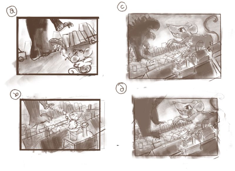
      Ello! Here's my thumbnails for Godzilla's next challenger. Fairy mouse wants to take on Godzilla. In the left two fairy mouse is going to take on Godzilla with just her wand in the right two fairy mouse is conjuring a giant mouse rat creature-thing to help her. Which idea do you think works best as a starting point? Any other thoughts?

      Untitled_Artwork.jpg

      Chip Valecek 1 Reply Last reply Reply Quote 2
      • ArtofAleksey
        ArtofAleksey last edited by

        For a second I thought you were going for β€œeven godzilla is scared of mice” kinda thing and chuckled.

        instagram and twitter: @artofaleksey
        alekseyillustration.com

        rachy 1 Reply Last reply Reply Quote 1
        • Chip Valecek
          Chip Valecek SVS Team SVS OG @rachy last edited by

          @rachy I like B the best because I can tell from the thumbnail what is happening. Although I like the idea behind C and D, I just couldn't see the little mouse but that's because its a thumbnail. So maybe those will work once you get into it more.

          As far as cropping go, I do prefer B and C where you only see Godzilla's feet. But if you go with C it think it would work cause you will see his spine which is very unique to him. So yeah I am no help to you LOL


          https://www.instagram.com/chipvalecek/
          https://www.facebook.com/cvalecek
          http://www.cshellmedia.com/

          rachy 1 Reply Last reply Reply Quote 1
          • rachy
            rachy @Chip Valecek last edited by

            Lol! Thanks @Chip-Valecek . It's so kind of you to share your thoughts. I think I'll play with the thumbnails a bit more. I'm erring on the side fairy mouse magicking a giant mouse idea as it tickles me more somehow. I will see if I can make the little fairy mouse more visable somehow.

            rachy 1 Reply Last reply Reply Quote 1
            • rachy
              rachy @ArtofAleksey last edited by

              @Aleksey tee-hee! Yay it's there! I kinda wanted to play with that a little bit but not too literally πŸ˜€

              1 Reply Last reply Reply Quote 1
              • ShannonBiondi
                ShannonBiondi SVS OG last edited by

                I really like your C thumbnail. I like the conjuring idea but also like how everything works together in this one in term of composition. You get a good sense of everything that's going on.

                @abhainn_fionn

                rachy 1 Reply Last reply Reply Quote 1
                • rachy
                  rachy @rachy last edited by

                  Untitled_Artwork.jpg

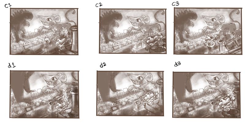
                  I've played with the thumbnails a bit more here to try out different placements of the fairy mouse. I quite like C2 or D1 what do you think?
                  Xx

                  ShannonBiondi Heather Boyd 2 Replies Last reply Reply Quote 1
                  • rachy
                    rachy @ShannonBiondi last edited by

                    @ShannonBiondi thanks Shannon! 😊

                    1 Reply Last reply Reply Quote 0
                    • theprairiefox
                      theprairiefox last edited by

                      I think I like C2 over D1. I like having godzilla's shape. It helps it read.

                      -The Prairie Fox
                      https://www.instagram.com/theprairiefox
                      https://www.theprairiefox.com

                      1 Reply Last reply Reply Quote 1
                      • ShannonBiondi
                        ShannonBiondi SVS OG @rachy last edited by

                        @rachy I love D3 but I think the Godzilla silhouette from C1-C3 would work better. So a combination of C1 and D3 basically!

                        @abhainn_fionn

                        rachy 1 Reply Last reply Reply Quote 1
                        • Heather Boyd
                          Heather Boyd @rachy last edited by Heather Boyd

                          @rachy C1/D1 are my favorite of your changes because their is space from your fairy mouse and the edge of the paper (helped by the smoke stack). I wish C1 fairy mouses wand zapper more closely resembled D1's -coming out closer to the fairy mouse. I agree though I prefer seeing Godzilla in C1!

                          πŸ™‚

                          Instagram: www.instagram.com/heatherboyd.illustration/
                          Website: https://heatherboydillustration.ca
                          Shop: https://www.inprnt.com/search/products?q=HeatherBoydIllustration
                          Ko-Fi: https://ko-fi.com/heatherboydillustration

                          Be blessed,

                          rachy 1 Reply Last reply Reply Quote 1
                          • rachy
                            rachy last edited by

                            This post is deleted!
                            1 Reply Last reply Reply Quote 0
                            • rachy
                              rachy @Heather Boyd last edited by

                              This post is deleted!
                              1 Reply Last reply Reply Quote 0
                              • rachy
                                rachy @ShannonBiondi last edited by rachy

                                @ShannonBiondi @Heather-Boyd @theprairiefox thank you 😊 I'm going to take C1 and mix some of the other bits in like the wand from D1 , I'm trying to work out how to make the conjured mouse look a bit more monsterous here's how that's going so far...

                                Untitled_Artwork.jpg

                                1 Reply Last reply Reply Quote 2
                                • rachy
                                  rachy last edited by

                                  Untitled_Artwork.jpg
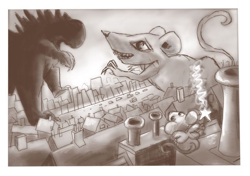
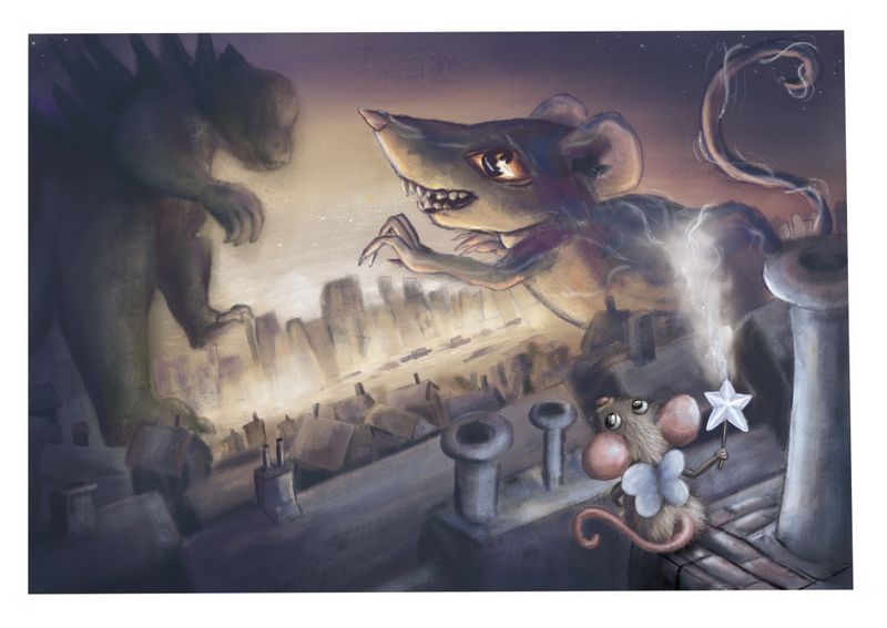
                                  I've been colouring it in, I want to give the feeling that it's in a polluted city and have tried to use colder colours for the mouse and her magic to highlight her a bit more.
                                  I could just keep painting and painting this one so knowing when to call it done is hard! I kinda want to keep the city loose, but how loose? I'd be grateful if you have any thoughts or if there are any glaring mistakes?

                                  Thanks
                                  Rach
                                  Xx

                                  theprairiefox 1 Reply Last reply Reply Quote 0
                                  • theprairiefox
                                    theprairiefox @rachy last edited by

                                    @rachy this is coming along nicely. I wanted to let you know that initially I didn't read that the smoke from the wand was what was creating the large mouse. I saw it as smoke from a smokestack or something. I think it might be to do with the perspective and that the electricity lines are the same width even as they travel away from the viewer.

                                    I think if you played with that a bit it might read more powerfully.

                                    Good luck!

                                    -The Prairie Fox
                                    https://www.instagram.com/theprairiefox
                                    https://www.theprairiefox.com

                                    1 Reply Last reply Reply Quote 1
                                    • K
                                      Kat SVS OG last edited by

                                      I think the city looks good - muted colors, not too many details. I'm thinking that the expression on the large mouse doesn't quite seem challenging. With a small smile and the eyebrow shape, it almost seems placating, like the mouse doesn't want godzilla to get mad or something. Maybe tweak that, add a little more vibrance to the fairy mouse so she doesn't fade into the surroundings. I love the angle you used, very dramatic πŸ™‚ Nice work!

                                      rachy 1 Reply Last reply Reply Quote 0
                                      • rachy
                                        rachy @Kat last edited by

                                        Thank you @Kat and @theprairiefox I've tweaked it from your suggestions πŸ™‚

                                        I've tried to give more perspective to the magic and tried to make the conjured mouse/rat avatar thingy a bit more angry and challenging looking.. Untitled_Artwork.jpg

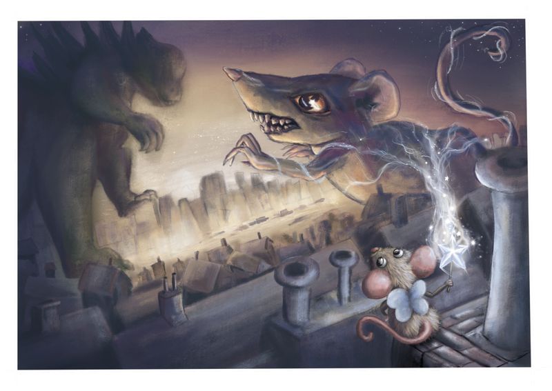
                                        What do you think are there any other tweaks you would make?

                                        Xx

                                        theprairiefox 1 Reply Last reply Reply Quote 2
                                        • K
                                          Kat SVS OG last edited by

                                          That definitely looks more challenging, good job!

                                          1 Reply Last reply Reply Quote 1
                                          • rachy
                                            rachy last edited by

                                            Thanks so much for your thoughts everyone it's really helped me push this one and learn some things πŸ˜ƒ xX

                                            1 Reply Last reply Reply Quote 0
                                            • First post
                                              Last post