Godzilla wip, help and critique please
-
Hey guys,
Finally got round to starting this Godzilla piece. Really rough thumbnails I wondered which one you thought makes the best composition.
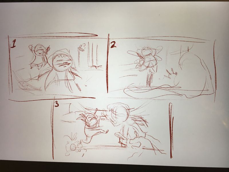
I had the idea of two siblings dressed up like monsters and launching into an epic living room battle.
All critique and suggestions appreciated
")
-
The idea is cool, I like the thumbnails too!
If you'd ask me, I'd go for the second one, the composition is clean and the realation between both characters is the most interesting here.The third one has some nice intensity too, so it'a an option. I kinda feel that those toys got some potential there! Maybe instead of making them lay on the ground siblings could use them as weapons? That'd be cool

-
thanks @IgorWoznicki I really like the idea of incorporating the toys, I like the suggestion of them as weapons

-
Hi @sarahlawrence I like the idea you have. I like the first one because it looks like the kid is running away and has no idea the other kid is about to launch onto his back. It has a lot of movement and the faces pull you into the composition. I think if you framed the kid running through a door into a darkened room that could look really cool.
-
@sarahlawrence second one. Lovely idea
-
Great idea I like 2
-
This is so fun! Lol I personally think 2 and 3 would make great pieces but for the most dramatic composition, i’ll go with 2.
-
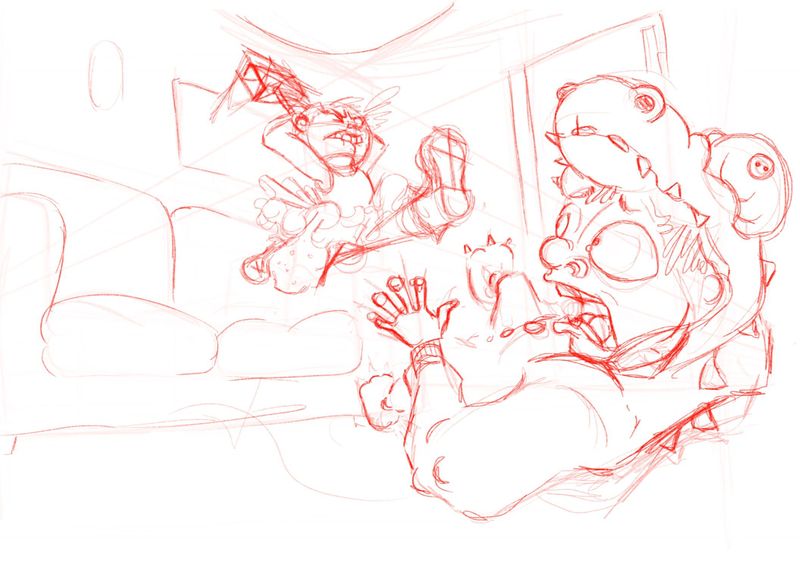
Here’s progress so far. Can you tell I’ve been doing perspective classes recently.
How do you guys think it’s working compositionally?
Hope your all doing well x
-
@sarahlawrence I love the expressions. I think I would pull the jumper to the left. There is a large amount of inactive space to the left. You could try to line up Godzilla on the right 1/3 and the the face of the jumper on the 1/3s hot zone on the left side.
Godzilla's eyes are doing a great job focusing the viewer on the jumper and you could use the jumper's leg to bring the viewer's focus back to godzilla.
Looking very nice... can't wait to see more.
-The Prairie Fox
https://www.instagram.com/theprairiefox
https://www.theprairiefox.com -
@theprairiefox thanks for the advice, it’s really helpful I’ll shufty things about a bit and post again soon

-
I agree with @theprairiefox also because your characters right in the middle. I’d also suggest moving the kids left leg more on the angle down towards your second character and also relate towards us so that the kids leg might collide with the second character and not over and beyond. But I like the idea of Godzilla character cowering in the corner, lols.
-
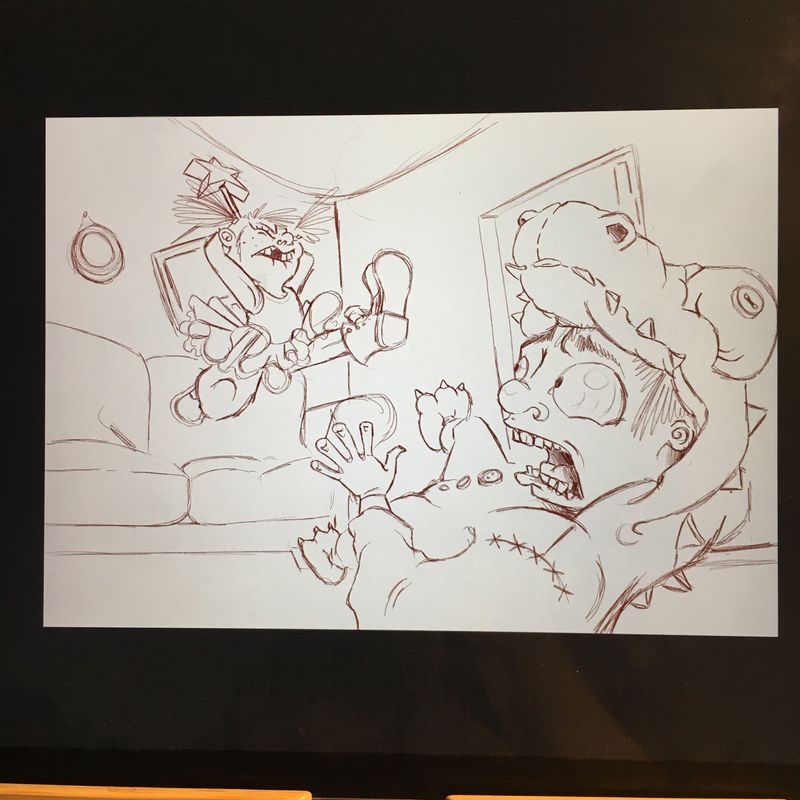
Progress. Going to be doing a lot of work in this this evening to get it done in time
-
@sarahlawrence really like the layout improvements!
-
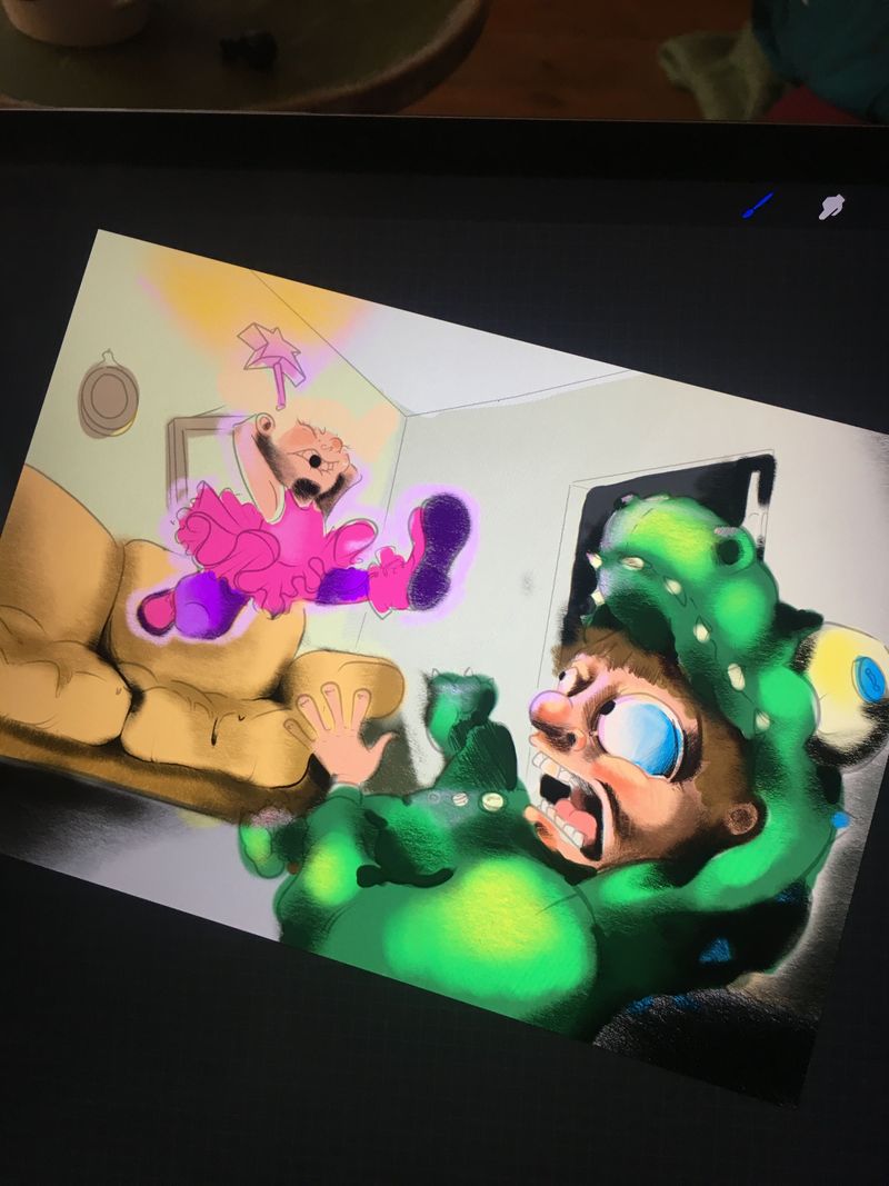
Slogging through the colour now and wishing so much I’d got round to the colour and light lessons
