Society of Visual Storytelling

    SVSLearn Forums

    • Register
    • Login
    • Search
    • Recent
    • Tags
    • Popular
    • Users
    • Groups
    • Search

    Which composition is better?

    General Discussion
    15
    17
    826
    Loading More Posts
    • Oldest to Newest
    • Newest to Oldest
    • Most Votes
    Reply
    • Reply as topic
    Log in to reply
    This topic has been deleted. Only users with topic management privileges can see it.
    • MichaelaH
      MichaelaH last edited by

      Liek version 1 the most, great view and not so much of sky

      https://www.instagram.com/michaelaheimlich/
      https://www.heimlich-illustration.de/

      1 Reply Last reply Reply Quote 0
      • TessaW
        TessaW last edited by

        I think a combo of the two would be good. I like the openess and distance of 2, but think it could do with some buildings to frame it. It would provide more depth and be more dynamic.

        Website: www.tessawrathall.com

        Instagram: www.instagram.com/tessawrathall_art/

        1 Reply Last reply Reply Quote 0
        • Erin.Cortese
          Erin.Cortese Moderator @jwing last edited by

          @jwing I like the second one. The use of negative space seems to put more focus on the character. Overall it has a nicer feel.

          1 Reply Last reply Reply Quote 0
          • ?
            A Former User last edited by

            I like version 1, the framing of the character using the buildings is great!

            1 Reply Last reply Reply Quote 0
            • H
              Heindel last edited by

              I like version 1, I feel like the other buildings give it depth, but I would like to see version 1 with the small distant buildings in the background worked in... and possibly a something in the foreground?

              1 Reply Last reply Reply Quote 0
              • MOO
                MOO SVS OG last edited by

                I like number one I think. The buildings in the background show the environment and it feels more solid to me.

                Marsha Ottum Owen

                1 Reply Last reply Reply Quote 0
                • ArtofAleksey
                  ArtofAleksey last edited by

                  For my own curiosity I see often that artists create imagery where part of the subject is cut off a little because they are big for the frame. Like the ear here. The thing I'd like to know is, and I'm not trying to critique your work I'm just genuinely curious, are there reasons to do that intentionally and what are those reasons?

                  instagram and twitter: @artofaleksey
                  alekseyillustration.com

                  jwing 1 Reply Last reply Reply Quote 0
                  • Pernille Horgen Bø
                    Pernille Horgen Bø last edited by

                    I like the first best 🙂

                    Spread love and equality with every drawing.

                    1 Reply Last reply Reply Quote 0
                    • sailorriceball
                      sailorriceball last edited by

                      I like the first version best. However, I would slightly move the light grey building left of him to the left to give the character a little more space.

                      https://www.instagram.com/sailorriceball/

                      1 Reply Last reply Reply Quote 0
                      • djly
                        djly last edited by

                        I like the first one for framing but wonder if you might be able to replace the third building from the left with the horizon view of buildings in the second. It might give some nice depth and variety in shapes?

                        1 Reply Last reply Reply Quote 0
                        • chrisaakins
                          chrisaakins last edited by chrisaakins

                          Well, the first has a cast shadow so it looks more realistic and centers the subject in the setting. I also think the complex background gives it more a sense of place. Cool vibe on the drawing. Reminds me of Ancient Egypt.

                          Chris Akins
                          www.chrisakinsart.com
                          www.instagram.com/chrisakinsart/

                          1 Reply Last reply Reply Quote 0
                          • Dawn Lawson
                            Dawn Lawson last edited by

                            I like the first one because it feels more balanced to me and seems to meet all your goals better. I also think that the structures around the cat mimic them in terms of height and color (visual weight), so it's visually engaging for me. The one on the bottom appears as if the cat is about to fall over compared to the first one 🤔

                            pennydoth.com
                            https://www.instagram.com/pennydoth/
                            https://www.facebook.com/pennydoth/
                            https://twitter.com/pennyDoth
                            https://www.artstation.com/pennydoth

                            1 Reply Last reply Reply Quote 0
                            • jwing
                              jwing @ArtofAleksey last edited by

                              @Aleksey I usually do it so that it feels more real; like if I were to take a similar photo of a cat, the whole cat might not fit neatly into the photo without losing the angle/feel of the photo. It also helps me to avoid tangents, heh 🙂

                              1 Reply Last reply Reply Quote 0
                              • jwing
                                jwing last edited by

                                Thanks everyone for all the feedback!
                                I decided mainly on the first composition, and the final thing is: scourge redraw.png
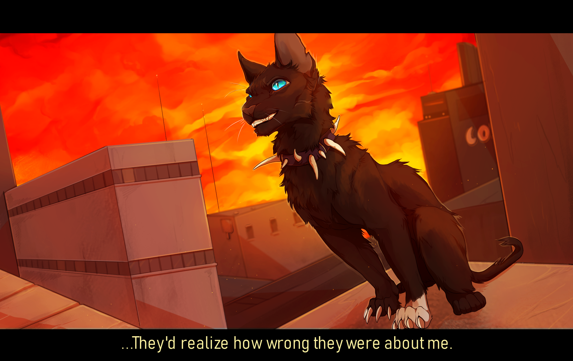
                                There are a lot of things I'm not satisfied with but I think I'm just going to accept it and move on from this one heh 😊

                                1 Reply Last reply Reply Quote 3
                                • First post
                                  Last post