Composition Problem Solving - Help?
-
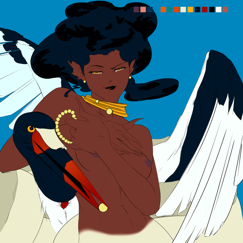
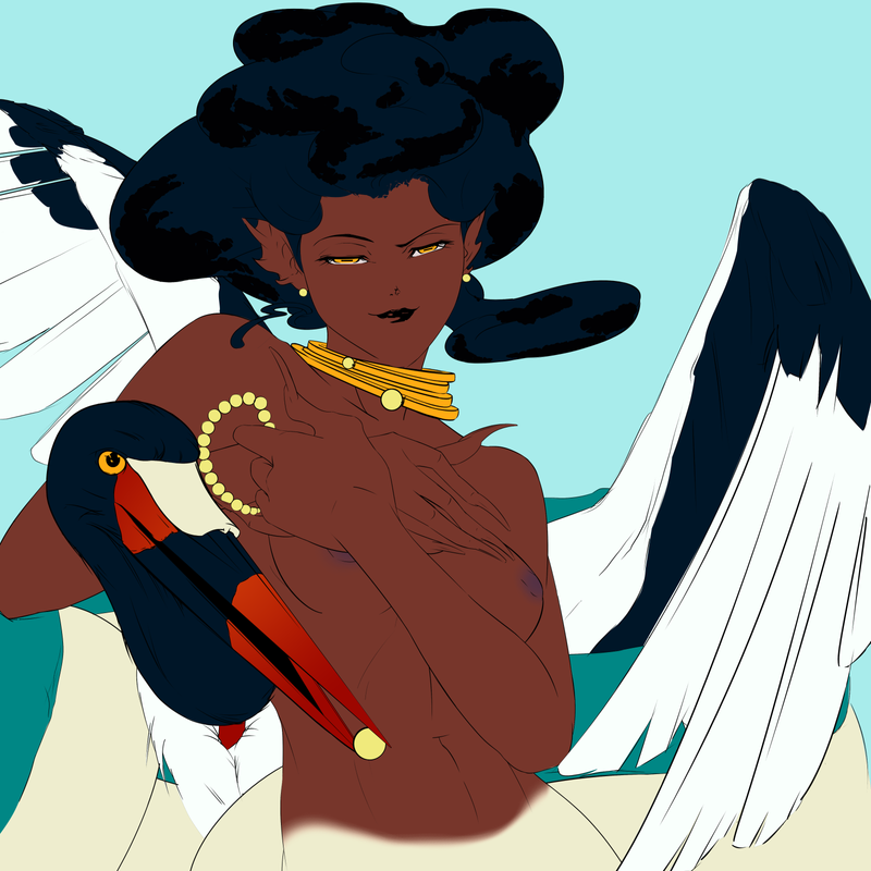
I'm sharing some flat color compositions because I'm trying to decide which color palette to use. I want the main focus to be the woman in the image, but both she and the bird have high-contrast palettes. I don't want the eye to be confused with competing, high-contrast areas. But at the same time, I don't wait to change the colors of the bird nor the skin tone of the woman
 .
.Should I play around with hues and atmospheric perspective? I want to keep an underwater theme with the color scheme, but I'm thinking I'll have to change the palette completely. If anyone has some input, it's more than welcome


-
I think it's working pretty good so far, especially if you keep her skin simple, then she's contrasted by texture, much like Gustav Klimt did with his paintings. A fairly large block of smooth color, surrounded by detailed elements. I do feel the comp is feeling a little top heavy due to the light, un-textured bottom. What are your plans for that area?
Website: www.tessawrathall.com
Instagram: www.instagram.com/tessawrathall_art/
-
@TessaW I plan to add a lot of texture there actually! Snake skin
")
-
I think you're on the right track. My eye automatically goes to the womans face before the bird. I think her hair being such a large dark shape helps with that. I prefer the second composition with the lighter background as it helps bring the characters forward more.
-
@Dawn-Lawson I think it works pretty great as it is, although if there is a problem area it would be the black/white contrast on the bird's wings, which is quite eye-catching. But there's no reason just because the real life bird is like this that you need to have it as contrasted though. You can make the black a lighter grey for instance. There's also a nice contrast of detailed against less detailed that you could use here: for instance the girl (especially her face and hands) could be very high detailed, whereas the bird's wings and background could be less detailed (painted in a looser, less defined style). This could also help put all the attention on girl.
-
My eyes go to the woman's face first and then drop to the bird where they like to stay. So I am drawn to the bird more than the woman, I would say. I am wondering if you could add just a bit of white or color to the woman's hair, not much, but enough to bring my eyes back again since she is the main object you want to emphasize? I like the bluer sky in the first one in contrast to the woman, I think the woman pops more.
Now, I just took another look and I think I am drawn back to the woman more than I thought so, I guess I don't really know what I'm talking about
The yellow eyes are what draws mw back. I love the colors and it looks good!