Society of Visual Storytelling

    SVSLearn Forums

    • Register
    • Login
    • Search
    • Recent
    • Tags
    • Popular
    • Users
    • Groups
    • Search

    Illustration Process - Feedback Appreciated!

    Artwork
    11
    28
    2213
    Loading More Posts
    • Oldest to Newest
    • Newest to Oldest
    • Most Votes
    Reply
    • Reply as topic
    Log in to reply
    This topic has been deleted. Only users with topic management privileges can see it.
    • ?
      A Former User last edited by

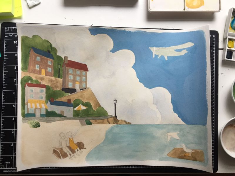
      More progress. This piece should be finished with another watercolor coat and some final colored pencil details. Not sure if the color of the sky is too light.
      IMG_2021.jpg

      1 Reply Last reply Reply Quote 0
      • sarahlawrence
        sarahlawrence last edited by

        @Alicja-W I love watching your process πŸ™‚ it’s looking really good

        https://www.instagram.com/artshouldsqueak

        https://www.facebook.com/artshouldsqueak/

        1 Reply Last reply Reply Quote 0
        • ?
          A Former User last edited by

          @sarahlawrence @animatosoor thank you both!

          1 Reply Last reply Reply Quote 0
          • ?
            A Former User last edited by

            All done with this piece!
            IMG_2022.jpg

            Heather Boyd 1 Reply Last reply Reply Quote 6
            • jwing
              jwing last edited by

              Wow, that looks amazing! I love the smooth feel of it, the stylization is very charming πŸ™‚

              1 Reply Last reply Reply Quote 0
              • ?
                A Former User last edited by

                @jwing thank you! πŸ™‚

                1 Reply Last reply Reply Quote 0
                • ?
                  A Former User last edited by

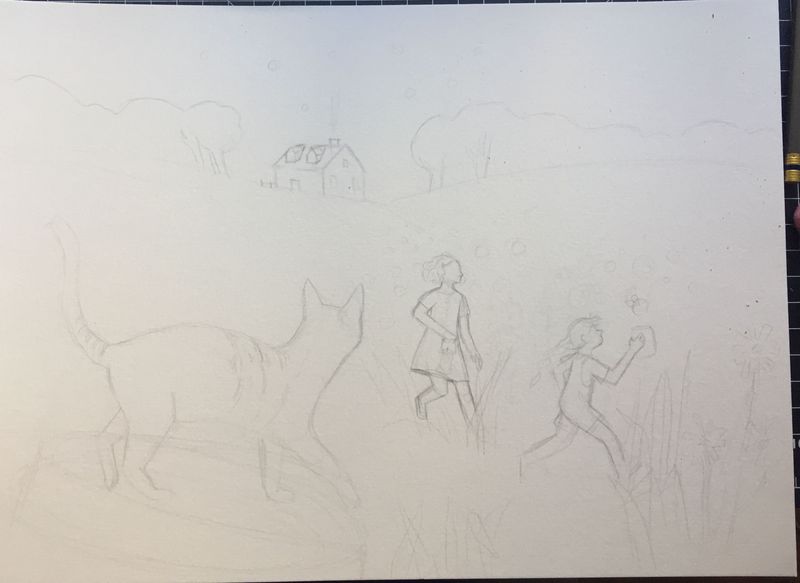
                  I figured I would just re-use this thread to show my works in progress, and today I wanted to get some feedback on this piece that I'm currently working on. In this one two girls are catching fireflies in the field in front of their house. The cat and some of the flowers/blades of grass are in the foreground, but I'm worried I made them a bit too big. I haven't taken a perspective class yet so I'm not sure this makes sense perspective-wise. Any feedback would be appreciated!
                  IMG_2042.jpg

                  1 Reply Last reply Reply Quote 1
                  • ?
                    A Former User last edited by

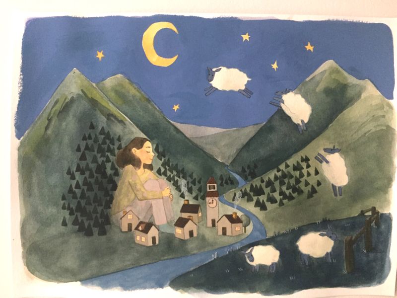
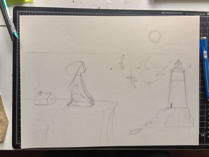
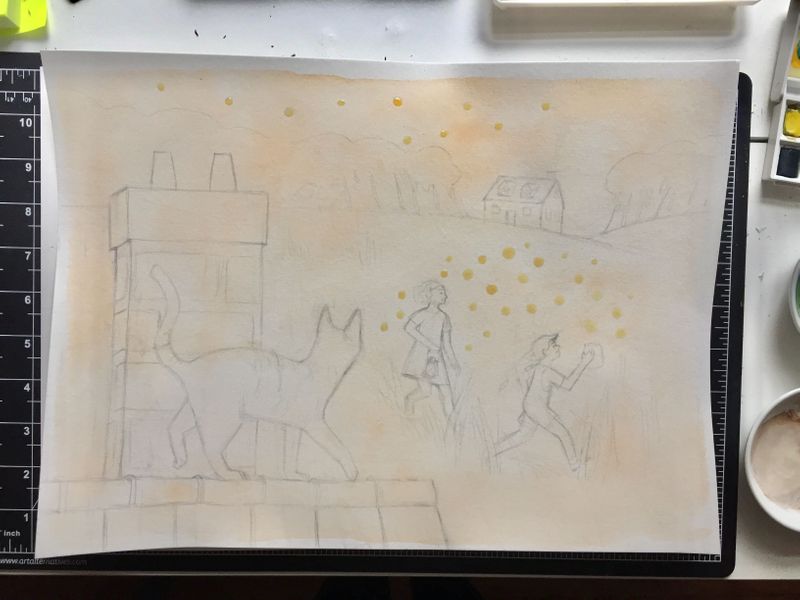
                    Hello SVS! I'm working on three illustrations at the moment (all three of which I'm hoping to finish today so I'm feeling very motivated and committed to them!) I've been taking a few more classes and finished off the first level of courses, and now am making progress on level 2. Excited to find that the way I compose scenes now is more calculated and considered. I pondered the scene with the cat and girls in the field for a while until I came up with a composition that I thought worked better than the one I posted prior. As always, feedback is appreciated!
                    IMG_2074.jpg
                    IMG_2075.jpg
                    IMG_2076.jpg

                    NelsonYiap Heather Boyd 2 Replies Last reply Reply Quote 1
                    • NelsonYiap
                      NelsonYiap @Guest last edited by

                      @Alicja-W Lovely work. I really like the plane on the seaside! Reminds me of Ghibli's work πŸ˜ƒ

                      www.nelsonyiap.com
                      www.facebook.com/nelsonyiapart
                      www.instagram.com/nelson.yiap

                      Lee White 1 Reply Last reply Reply Quote 0
                      • Lee White
                        Lee White SVS Team SVS Instructor Pro SVS OG @NelsonYiap last edited by

                        @Alicja-W very nice!

                        You may want to take a look at our new class from Vesper Stamper that talks about getting more saturation and luminosity in watercolor. Starting with a brighter undertone could really make these paintings glow.

                        Good luck and keep it up! : )

                        -Lee

                        SVS Faculty Instructor
                        www.leewhiteillustration.com

                        ? 1 Reply Last reply Reply Quote 0
                        • Heather Boyd
                          Heather Boyd @Guest last edited by

                          @Alicja-W

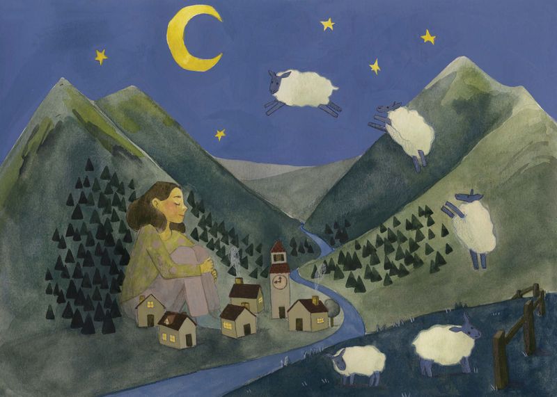
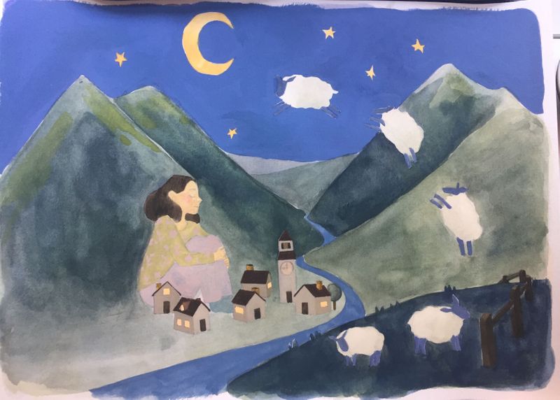
                          I have come late in this but in the future I would avoid spacing the sheep so evenly as they jump.

                          Instagram: www.instagram.com/heatherboyd.illustration/
                          Website: https://heatherboydillustration.ca
                          Shop: https://www.inprnt.com/search/products?q=HeatherBoydIllustration
                          Ko-Fi: https://ko-fi.com/heatherboydillustration

                          Be blessed,

                          1 Reply Last reply Reply Quote 0
                          • Heather Boyd
                            Heather Boyd @Guest last edited by

                            @Alicja-W

                            That blue sky and those clouds are looking fabulous, I love the richness of the blue!

                            Instagram: www.instagram.com/heatherboyd.illustration/
                            Website: https://heatherboydillustration.ca
                            Shop: https://www.inprnt.com/search/products?q=HeatherBoydIllustration
                            Ko-Fi: https://ko-fi.com/heatherboydillustration

                            Be blessed,

                            1 Reply Last reply Reply Quote 0
                            • ?
                              A Former User @Lee White last edited by

                              @NelsonYiap Thank you!

                              @Lee-White Thanks for the tip! I do start my underpainting pretty desaturated and never thought to try a bright underpainting, so I'll be sure to do just that when I start my next illustration. I had watched Vesper's video a few weeks ago and just bought the paints she recommended for luminosity. I haven't done much with them yet, but I have no doubt the pigments will result in a brighter palette.

                              @Heather-Boyd Thanks for the feedback! Do you think the even spacing results to it looking less dynamic and more predictable?

                              Heather Boyd 1 Reply Last reply Reply Quote 0
                              • Heather Boyd
                                Heather Boyd @Guest last edited by Heather Boyd

                                @Alicja-W

                                Less realistic, they are herd creatures, form little clumps or overlaps. And less natural -yes more predictable -orderly or stiff.

                                And if they are all on the same plane keep the same size if they are receding slowly change accordingly. If something is further up in the air would they recede as well? As they are further away. Lols

                                Instagram: www.instagram.com/heatherboyd.illustration/
                                Website: https://heatherboydillustration.ca
                                Shop: https://www.inprnt.com/search/products?q=HeatherBoydIllustration
                                Ko-Fi: https://ko-fi.com/heatherboydillustration

                                Be blessed,

                                1 Reply Last reply Reply Quote 0
                                • ?
                                  A Former User last edited by

                                  @Heather-Boyd
                                  True! I envisioned them all just in the foreground but didn't even take into consideration how their size would change in space. Thanks Heather!

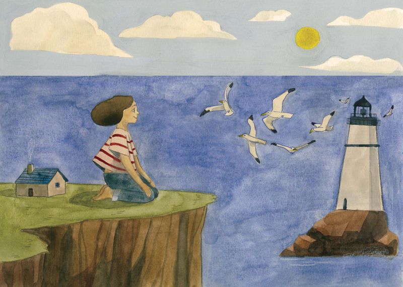
                                  I'm also posting the finished + photoshop edited versions of all the illustrations below. I had issues with all of them, and they all brought up different things to consider. I worked pretty big on these (11 x 17'') and found it hard to keep a consistent wash of watercolor from looking streaky and messy (see firefly illustration). Sometimes I liked the effect, but this time I definitely didn't. I know reactivating certain gouaches will give you a solid coat of color, so I might explore that more in my next illustration and see if it gives me a streak-less appearance. As always, any feedback is appreciated! Even though these are finished, it helps me to know where the illustration could be stronger so that I won't make the same mistakes in the future.
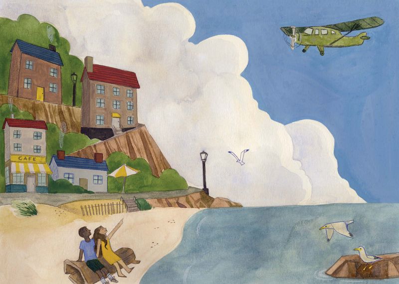
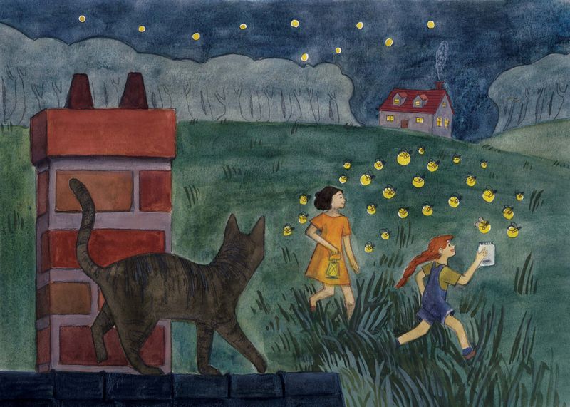
                                  Beach2019.jpg

                                  Fireflies2019.jpg

                                  Sheep2019.jpg

                                  Gulls2019.jpg

                                  Heather Boyd 1 Reply Last reply Reply Quote 2
                                  • Heather Boyd
                                    Heather Boyd @Guest last edited by Heather Boyd

                                    @Alicja-W

                                    Was there a reason why your first two works didn’t have larger characters like the last two? To keep them consistent and I also think they give your work more interest. πŸ™‚

                                    Instagram: www.instagram.com/heatherboyd.illustration/
                                    Website: https://heatherboydillustration.ca
                                    Shop: https://www.inprnt.com/search/products?q=HeatherBoydIllustration
                                    Ko-Fi: https://ko-fi.com/heatherboydillustration

                                    Be blessed,

                                    1 Reply Last reply Reply Quote 0
                                    • ?
                                      A Former User last edited by

                                      @Heather-Boyd
                                      Well originally I had come up with concepts that I wanted to execute and the nighttime sheep illustration happened as a spur of the moment thing, so I wanted to tie that piece to the rest of the work by maintaining a night/day theme. But I think you're right that it doesn't keep the series as consistent, so next time around I think I'll start a series with one character and have them present in the 4 illustrations. I'm thinking of going small and doing some tiny characters so we'll see what happens! Thanks Heather!

                                      1 Reply Last reply Reply Quote 1
                                      • First post
                                        Last post