Little Red Riding Hood Thumbnails - Feedback wanted :)
-
Hi everyone!
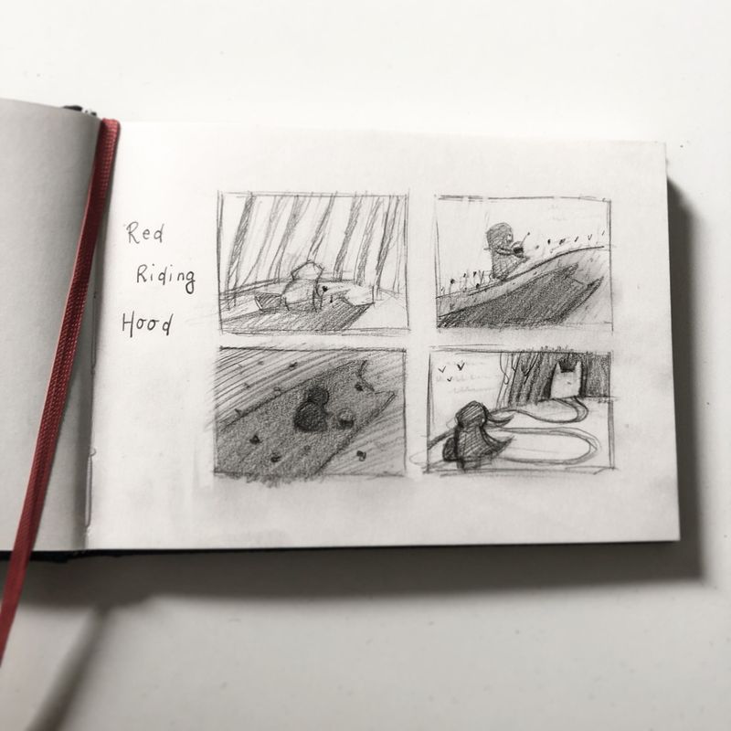
So I’m giving myself 6-7 months to create an entirely new portfolio, kid lit illustration to be specific, and then I hope to reach out to publishers. I’m following SVS classes of course, and I would really like to get some feedback on these thumbnails. They’re preparations for a Red Riding Hood themed illustration for my portfolio.
They’re not quite there yet, I haven’t finished the composition class. But the idea popped up in my head and I wanted to put it on paper.What do you think? Is there a possible candidate between these comps?
Lovely greetings,
Nadya
-
I’m torn between 3 and 4. I love the feeling of 3 with the wolf’s shadow and I like the angle of 4 and the way it leads your eye.
Excited to see your work, good luck for the epic revamp

-
I like 4 they are all cool
-
@DOTTYP They are all great, like the simpliness of the. The most the 1,3,4.
-
@nadyart thumbnail number 3 is very sinister looking and Red riding hood being completely enveloped in the wolfs shadow is a great way to express the danger she's in. I'm looking forward to seeing which one you choose to go ahead with.

-
@nadyart they’re all so good! What I like best the one at the bottom left. It’s just so ominous. Good luck on your portfolio.
-
Thank you everyone for your input and feedback! I think I may go for number 3

-
Hi everyone!
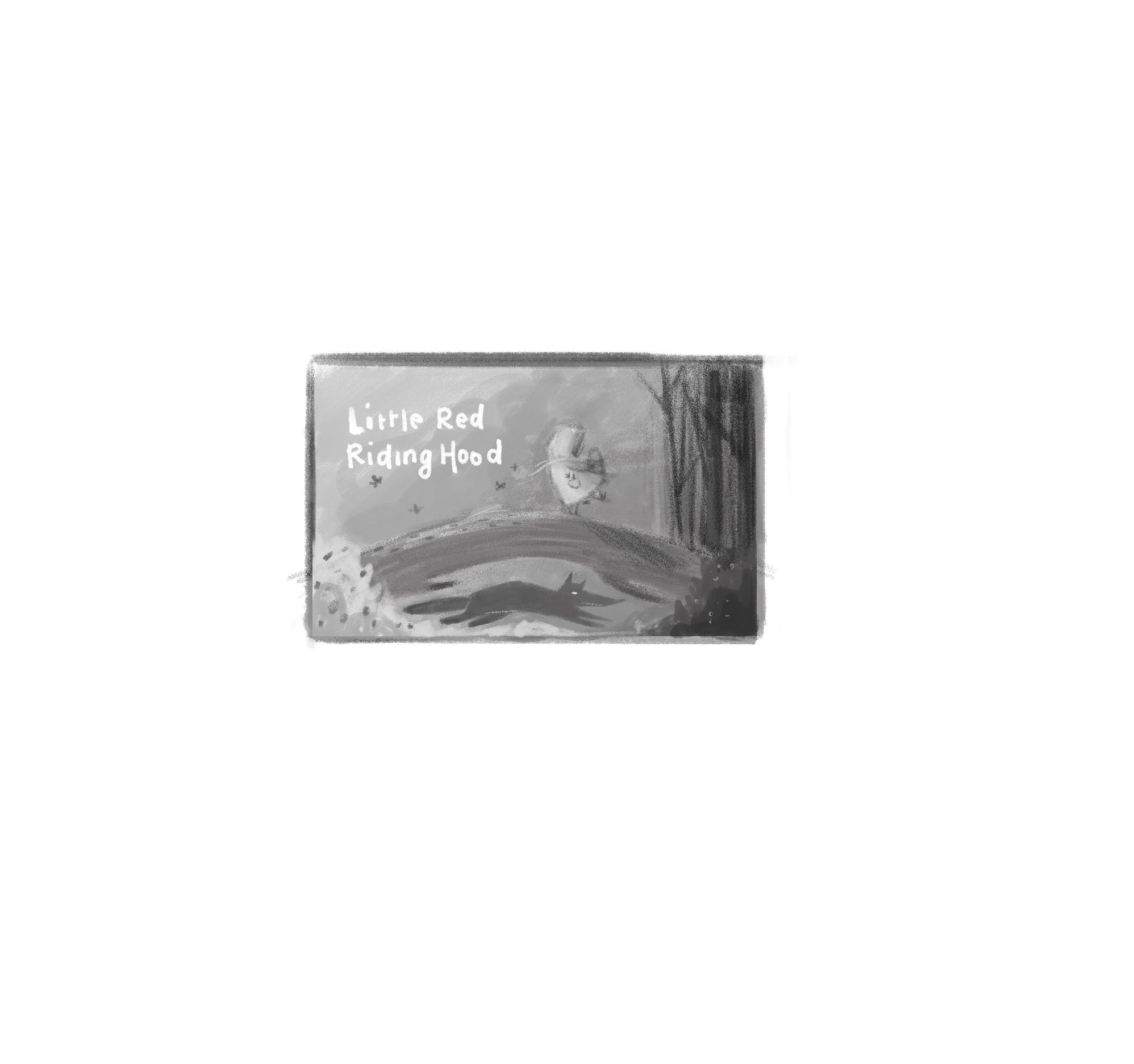
It has been a little while since I worked on this illustration since I kept hesitating about the thumbs and I also was (am) following @Will-Terry 's Composition class.
So I started from scratch and created a new thumbnail sketch and after that, a value thumbnail for the composition. The shadow did not quite work for me, since I did not want to make the cover too scary for little children.I would really like to start working on the final illustration and I'm very curious about your opinion and feedback for the new comp :).
I wanted the focus to be on little red riding hood, the wolf being visible at a second glance, fitting right into the space underneath the tree. I also wanted do create a contrast between the right and the left side of the illustration: the further Little Red reaches the forest, the darker the image becomes. The image feels heaver in the right side, but I wanted to even this out by adding the title text on the left. I hope this all comes across
")
-
Fantastic comps! Wasn't it mentioned in the portfolio class that it's good to have a series to show you can carry a story? I'd pick 3, even all 4 and include them. Just make sure each clearly covers a different part of her journey. It's reading to me right now as a wordless story and it's brilliant!
-
I like the way the path winds into the woods in 4. I think I would like to see more trees further up toward her though.