Picture Book Front Cover - Critique Please
-
Thanks @thousandwrecks and @hannahmccaffery Brilliant observations!
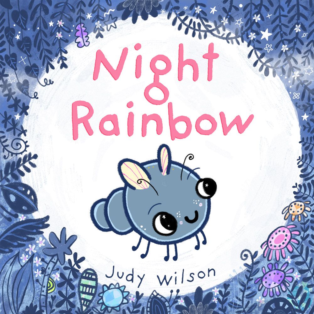
Hannah, I tried some different colours for the title, in the end this redder pink looks best. Light pink looked amazing however thinking about how parents choose books I thought they might thinkthis story was geared towards girls, both characters are boys. I took the jewels out of the holes in the letters to simplify. Also tightened the kerning and curvedthe author name to the shape of the border.What do you think about the new blue line of the firefly. I think it looks fantastic and way better than hard black.
I added some soft clouds and some details into the jungle border like little flowers and some textures.
On the moon I drew on some texture in blue and I think this can be pushed further.
What do you think now?

Thanks so much!

-
This is so beautiful! Changing the colour of the outline of your character has changed it wonderfully and it works really well

I love the colour you've chosen for the title, to me that stands out so much more now, I know what you mean about not wanting it to be solely aimed at girls, but I'm assuming this is aimed at quite young early readers? If so then the brighter the colours the better, even if they are pinks Plus you also have a lot of blue to aim at young boys too, so you've balanced it out nicely!
A great piece for your portfolio yay!
-
Just a beautiful design, but I LOVED your first version-sorry, other than leaving a little more space around the fonts and the edge of the moon (breathing room) I loved the first one especially the rainbow coloring in the moon- Just my opinion though...…..
-
@Judy-Elizabeth-Wilson This is SO CUTE, gosh. I love how it's developing!! I'd go ahead and make the eyes/mouth lines blue as well if you're gonna go with blue lines everywhere else, but really that's up to you. This is precious and I think it's super-sweet. The moon looks lovely as well!!! the texture makes it feel so tangible. Lovely work!
-
@Judy-Elizabeth-Wilson said in Picture Book Front Cover - Critique Please:
Please comment, critique and tell me what you think. Thanks so much!

Words that popped onto my head when I first looked at it ... Mystery and Happiness

I really like it, has a sort of Yoshi's Island vibe to it, like it's a world you could go into and start taking bites out of the scenery lol Tasty looking.
-
@lmrush Hi Lisa, thanks for your comment. I still like the first one and with the kerning tightened I'm going to put them side by side and choose later today.

-
@Sophie-Lawson Hi Sophie. What a beautiful comment.
 Thank you! The story has an element of mystery and there is certainly a happy ending.
  :white_medium_star:
 -
@Judy-Elizabeth-Wilson I kind of liked the background colors and the patterns in the letters in your first one. It fits your style. I do see where the letters could be a bit closer together though.
-
@Marsha-Kay-Ottum-Owen Thanks Marsha. The letters are closer together now and it does look better.
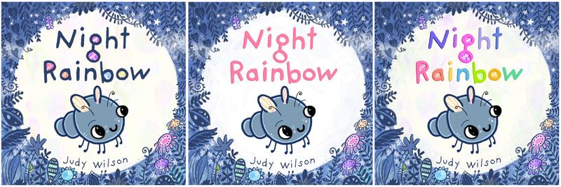
Thanks for everyones feedback. Which would you choose from these 3 covers?

-
@Judy-Elizabeth-Wilson This looks great! Nice edits! I like the dark blue letters with the jewel fillings.
-
@Judy-Elizabeth-Wilson I really like #1 up close but when I zoom out, #2 calls me more (I wish I could explain why).
-
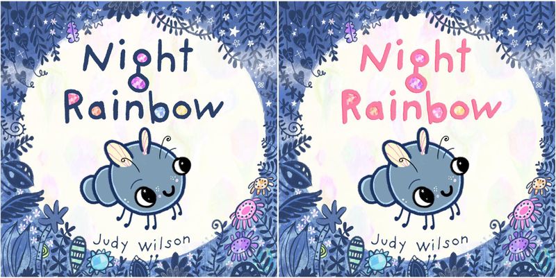
@BichonBistro Thank you. I think it's the pink text that sings. I have made a pink text with jewels to see how it looks.
The blue text looks more dominant and clear though.
-
@Adriana-Bergstrom Thank you. I Adriana. I'm drawn to the blue too. It was worth to experiment though. You never know what cool surprises you'll find if you don't try.
-
@Judy-Elizabeth-Wilson I still like number 1 but the pink text pops out more. I wonder what would happen if there was a very thin outline of pink around the letters in number 1? Would they pop more from a distance?
-
@Marsha-Kay-Ottum-Owen That's a nice idea Marsha. I'll play around with the shadow and see if something good shows up. Thank you!