Critique Two PictureBook Sketches
-
Hi Fellow Illustrators,
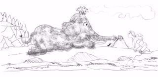
I'm working on a full spread from the already existing picture book, How to Wash a Wooly Mammoth, by Michelle Robinson. This is an SCBWI Illustrator Day assignment, and I'm looking for feedback about this two different girls I've sketched...I'm still sketching others, but wanted to get some initial comments.I picked the first speed in the book....here is the text for that spread:
Does your wooly mamouth need a bath?
It's not a very easy thing to do.
Wooly mammoths are quite BIG,
and Wool is notoriously tricky to clean.
Don't worry, just follow this step-by-step-guide.Thank for looking....
")
Robin
-
@RobinCampbellArt i like the first one because the characters seem engaged with one another, more connection, like she is looking at him closely to figure out how to wash him.
-
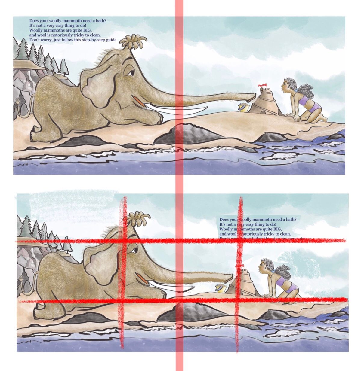
I also like the interaction between the characters in the first option. One thing to look out for, if this is a two-page spread, the gutter is running right through the center of your mammoth's head
-
I also vote for the first one.
-
Hi StudioLoong, BichonBistro, & TessaW:
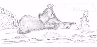
Thank you...#1 it is. I’ve moved the elephant and changed it’s expression. I’ve tried to move the elephant’s face out of the center gutter....the trunk is still there....is that ok looking?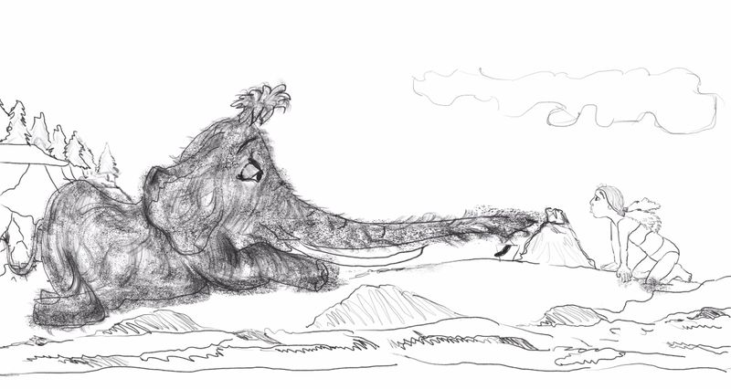
-
Hello Fellow Illustrators,
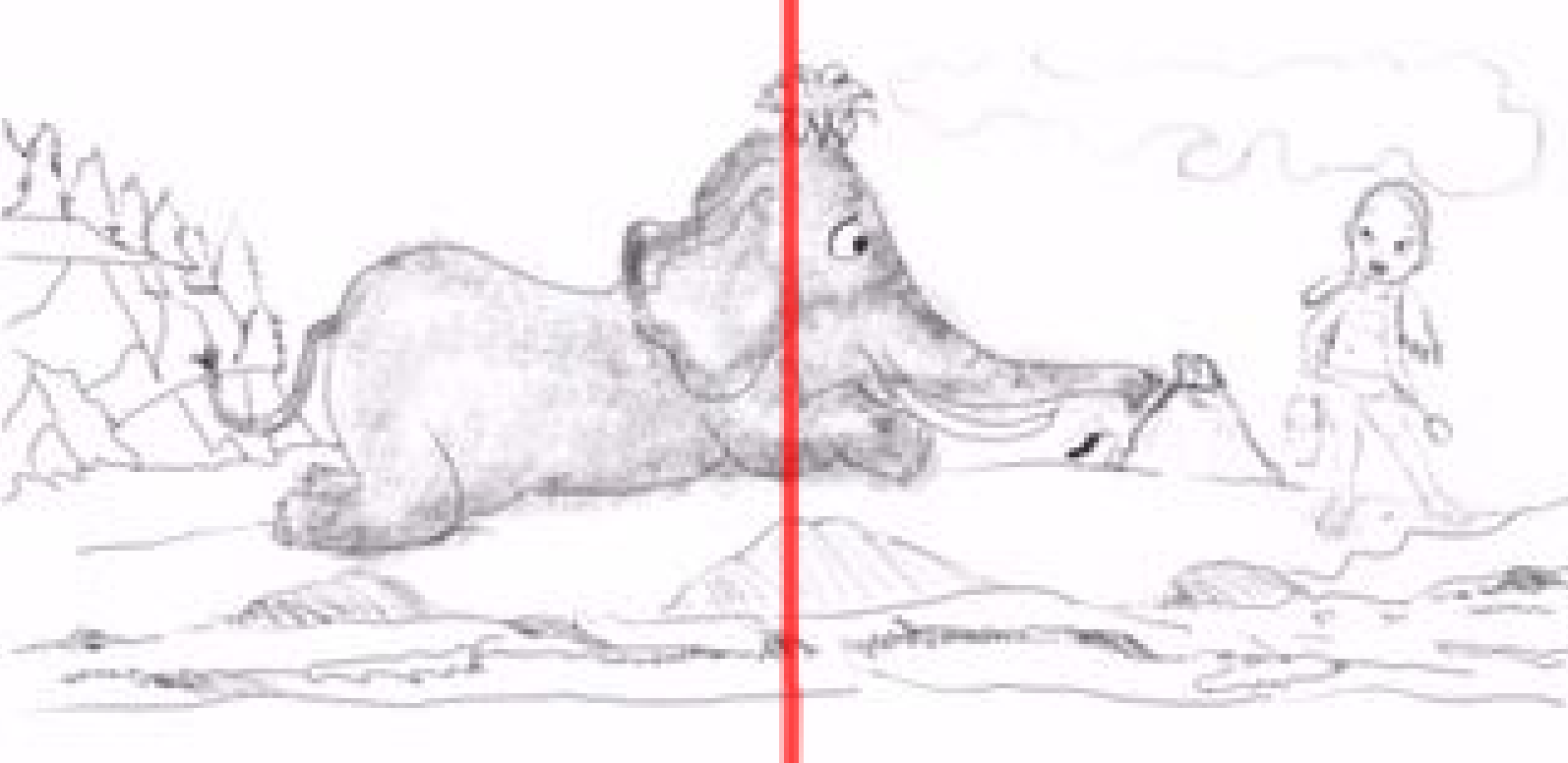
After a few sketch revisions I’ve got another draft for critique. I appreciate your feedback.
I hope the image is clear enough....the jpeg from procreate was too big for my SVS forum upload.
Robin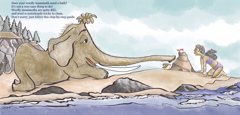
-
@RobinCampbellArt I think the feels a little tight in that spot. I like the girls expression
-
@Zachary-Drenski ....Hi- just wanted to ask for clarification...what spot feels tight?
-
Woah! That’s a long trunk.
Portfolio: nyrrylcadiz.com
Instagram: https://www.instagram.com/nyrryl_cadiz/
YouTube: https://www.youtube.com/channel/UCbJCF1Im8ZO7hpGWTKOJMuA -
@RobinCampbellArt The text looks squeezed into that little space. It is almost touching the top of the page, the trees, and the mammoths head. The text also looks small, making me think that it was shrunk down to be squeezed into that space. My suggestion, make the font black, a little bigger, center the alignment (not left alignment, I don't know if I'm wording that correctly), and move most of it to the other page. You'll have to play with it to get it right. Ultimately, you may decide to keep it how it is, but mess around with the placement and see if you find something else that works. I hope that helps and bear in mind, it's just my opinion.
-
@RobinCampbellArt I really love the right hand side of the illustration and the coloring is beautiful but I have to agree that the mammoth seems a little squeezed in to the left hand side I would consider allowing the body more room even if you werent able to see the full back end of him and possibly rounding out the tusk so it doesn't follow the trunk too much possibly having it dug into the sand a bit and then poking out just because they were pretty round.
Sorry I know it can be frustrating redoing something a bunch of times but either way its a lovely illustration and love the story it tells even with out words

-
Hi! Here’s what I think what you can do. I feel like the Mommoth’s trunk was too long so I moved the girl a little bit closer. Coincidentally, she and the sand castle now fall directly on the thirds of the illustration. Also, I think yuor text would do better on that empty sky on the right. It’s so closed in on the left while there’s this huge empty space on the right. These are my thoughts. I hope this helps.
Portfolio: nyrrylcadiz.com
Instagram: https://www.instagram.com/nyrryl_cadiz/
YouTube: https://www.youtube.com/channel/UCbJCF1Im8ZO7hpGWTKOJMuA -
What if you made your mammoth a different color, like pink or blue or yellow or orange? It's a picture book, so you can make mammoths any color of the rainbow, and he'd stand out more if he was a different color. Then you could put dirty patches on him since he needs a bath. Maybe have bits of grass stuck to him, too, or old food. I have a fluffy dog and she's had food stuck in her fur before, so it definitely happens.
http://twiggyt.com
Instagram: www.instagram.com/twiggyt_art/
Twitter: @twiggyt_art -
@Nyrryl-Cadiz - Hi....ok....made another draft based on a bunch of comments. I reworked the mammoth, used the rule of thirds, and reset the text. I think it’s much improved.
Thanks for looking and commenting...:-)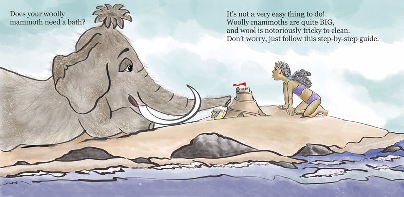
-
@Nyrryl-Cadiz- yeah...too long in the long run. I went back to an earlier mammoth sketch. Part of the trunk is in the gutter, but hopefully now the mammoth fits better in the composition.
Thanks for pointing that out -
@TwiggyT - thanks for your comments....hearing you, I was able to think more openly about possible changes. The latest draft is a more simplified layout. I wrung my hands over not showing the whole mammoth, but moving things around it made sense to me to have the mammoth head on a thirds line, and that is helping show the size difference to the girl.
I liked the trees on the cliff face, but ...sob sob....they are gone now. I don’t think anybody will miss them. I didn’t change the mammoth’s body color, but I did think about your suggestion, where before that thought hadn’t occurred to me.
thanks. -
@Zachary-Drenski - I see what you mean now....so I’ve revised the spread with your feedback in mind. I moved the mammoth and fixed proportion. The text did need some more thoughtful positioning and resizing. Better?
Thanks for comments -
@ambiirae - Yes...I see that now too. The mammoth proportions were off and the tusks needed revising. I’m losing count on the number of revisions now...it’s all worth it if/when an illustration visually improves from feedback.
Thank you for your thoughtful comments...it’s helping -
@RobinCampbellArt
 I think it looks wonderful the changes to the mammoth make it look much more proportional ️ I wouldn’t say no one will miss the trees on the cliff side they were beautiful and you had done a great job on them