Jake Crowe's Sketchbook
-
-
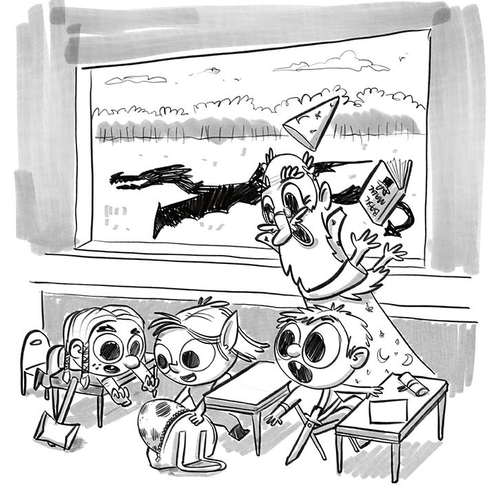
I've reworked my sketch and brought it down to what I think are the minimal needed parts to tell the story. I feel like I need a few details, like perhaps some things outside to indicate an Adventure School schoolyard? Does anyone think it's weird they have weapons in class? I figured it's DnD school and in DnD, you'd never be without your weapon!
-
I feel like the fact that she took a dragon egg should be clarified more. If you were to just look at it you wouldn't know that the dragon outside was the parent. My suggestion would be to show the egg hatching with the baby coming out, maybe just showing the snout. And to show the dragon angered you can have it breathing fire and maybe the gym teacher blocking with a shield. I think the chaotic background would be a great contrast to the joy of birth in the classroom.
I really like the idea keep going

-
But still keep it in shadow
-
@DarleneAnico great idea about the hatching of the egg, that would certainly unite the dragons.
I’ll give some thought to the chaos of outside, I agree it needs more. My concern with bringing in fire is it would eliminate the shadow and become the main light source outside. Maybe I should reintroduce the student pointing out the window? Do you think that added to the story?
-
@jakecrowe ah that is very true about the fire...I'm just wondering if this is day time will it change the lighting much? But to keep from drawing chaos I would reintroduce a student. You can have the student looking outside and trying to get everyone else's attention.
-
It's looking nice with the refinement of the sketch, but I kind of miss the depth and energy that the two rows of desks gave the scene. I think it gives us more of an anticipation of action- we don't know what's gonna go down with the mama dragon- two rows of desks lead our imagination more toward possible chaos and pandemonium than just one tidy row.
As for the fire thing-I don't really have an opinion on if it's right for the scene- but fire is typically not a very strong light source. My suspicion is that it wouldn't eliminate that cast shadow, especially in daylight hours.
-
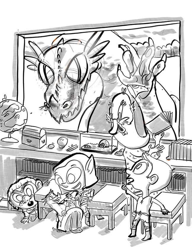
Okay, another go, any further critique much appreciated. I think I hit on all the weak spots pointed out thus far, and went in another direction with the mama dragon. I felt the shadow wasn't working the way I wanted it too, and I don't currently have the ability to pull it off successfully. I think I have come up with a solution that works well and will be more fun to draw.
")
@TessaW I tried another sketch with two sets of desks again, but found adding the desks required me to add more students and it was feeling too busy to me.
My wife says the kids were cuter before. I feel like they have better form now and are a bit more expressive. What do you think?
-
@jakecrowe it’s a style shift that’s totally fine. I don’t think either style is stronger. Just slightly shifted aesthetics.
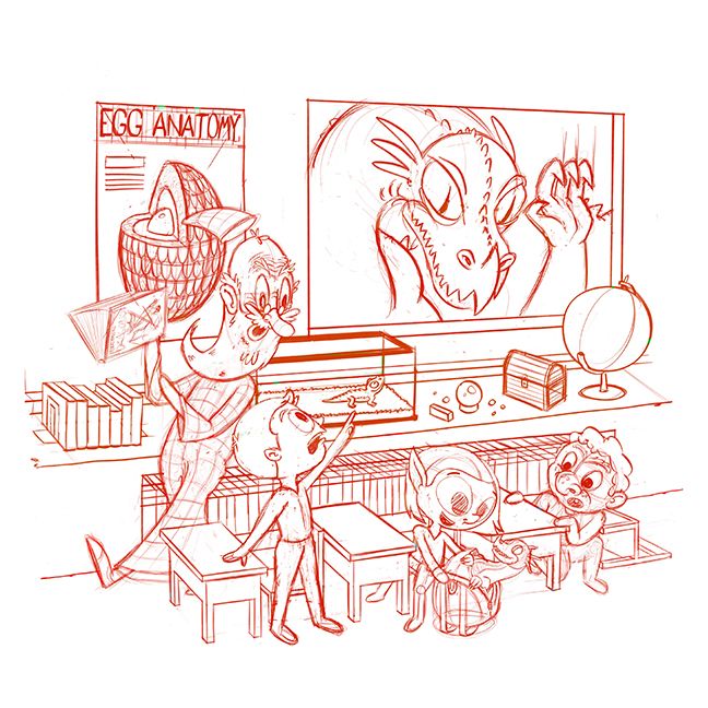
I do think adding the dragons in “person” does make it a faster, more exciting first read. It gives some really clear assumed story trajectory that could also go in unexpected ways. Which is fun!
One thing I noticed, but I like it better the way you have it now as an illustration, is that the boy looking at mama is more shocked by mama rather than by what the girl brought to school.
I like it with where he’s looking and reacting now to add more ways the characters are reacting to the situation, but I wonder if the guys judging this month might consider it a ding against prompt purity?
For me, I think it’s stronger and more entertaining overall. So I’d keep it. Just wanted to note it for consideration.
-
@jakecrowe Moving the mama dragon to the window was such a good choice! It makes the the story much stronger! I also really like the kid who has noticed mama dragon.
-
@Shara-Mills @baileymvidler Thanks so much for the feedback!
-
Cleaned up, flipped and a few more story details added but finally ready for inking. It'll be a miracle if I can find the time to even get color flats, but we'll see!
-
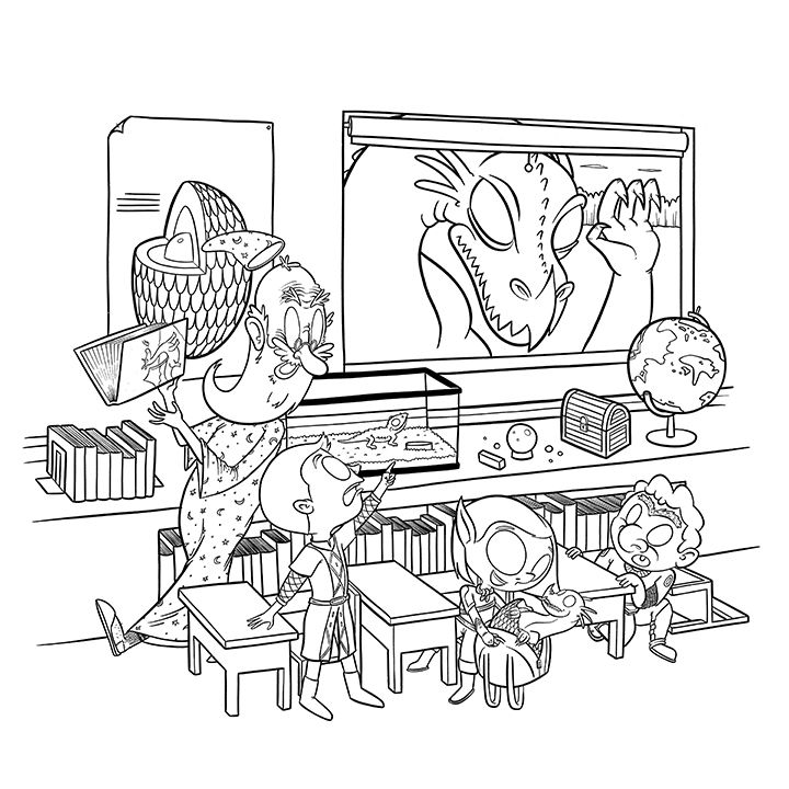
I had a few hours yesterday so I was able to get some decent inking done, I would have liked to have spent more time on them. Managing my time better is an October goal. I should have some time this afternoon for some flats (if color choice doesn't cripple me.) and maybe a tone. I'll at least grab a grey Copic and add a little dimension to the piece. Overall I'm pretty happy with the transformation of the piece.
-
@jakecrowe it's fun to see how this piece progressed. Each post here your image got a lot stronger and the final one is really cool!
-
I won the monthly contest this August and got the rad prize of getting to draw for an upcoming Three Point Perspective episode. I recently finished the art and got the go-ahead from @jake-parker to share my process here with you. I'll break it up into a few posts so it's a bit more digestible.
Also, for the whole process I followed along with @lee-white "How to Make Art That You Love!" video / checklist. I highly recommend it!
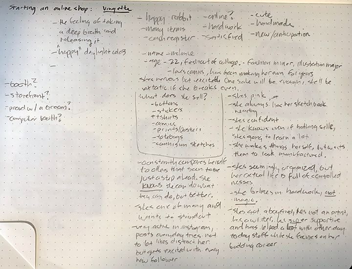
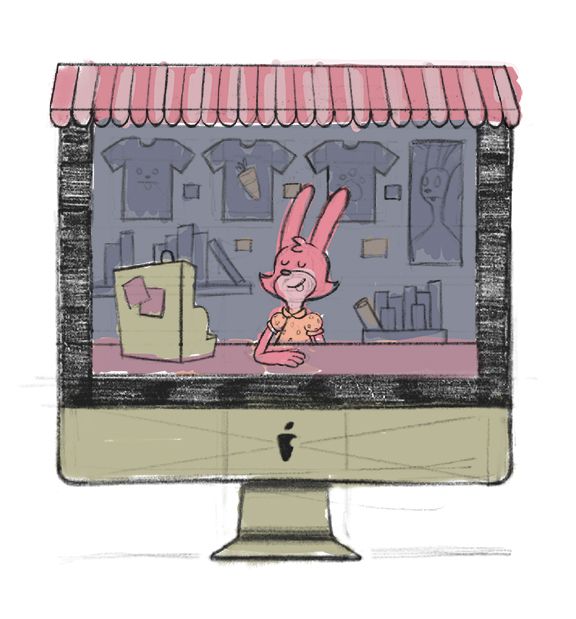
Before anything I started with a bunch of note taking on both what Jake was looking for in the drawing and who the character was I was going to be creating. Jake specified that he was looking for a vignette of a rabbit opening up an online shop. The bulk of the creative was in my hands! With my notes I went to Pinterest to see what kind of shop opening artwork existed out there.
My Pinterest board for the project: https://pin.it/hd53h5llhvqvtv
My chickenscratch on what I wanted to see/feel and a bio of my shopkeeper, Melanie:
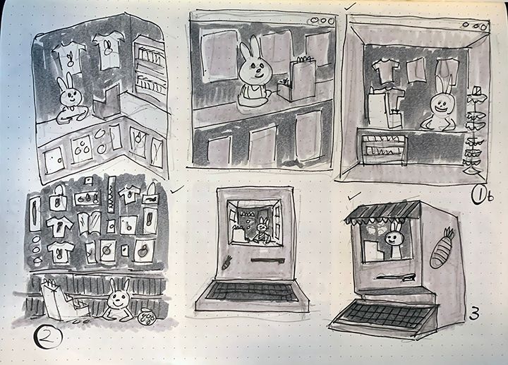
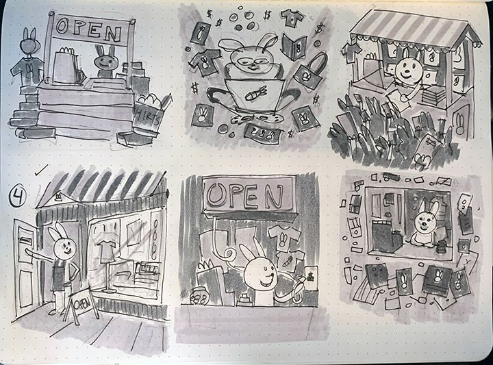
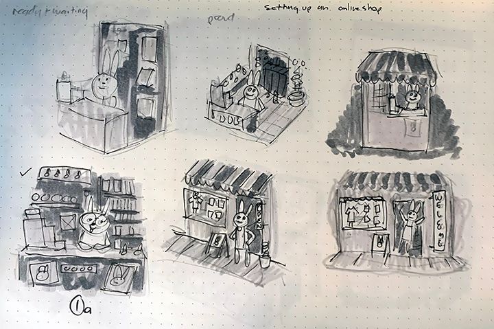
With a good research foundation I dove into thumbnailing. I didn't quite hit 50 but I was satisfied with what I was making and had started drawing the same thumbnails over so it was time to move on. In the future I will definitely be pushing this further.
-
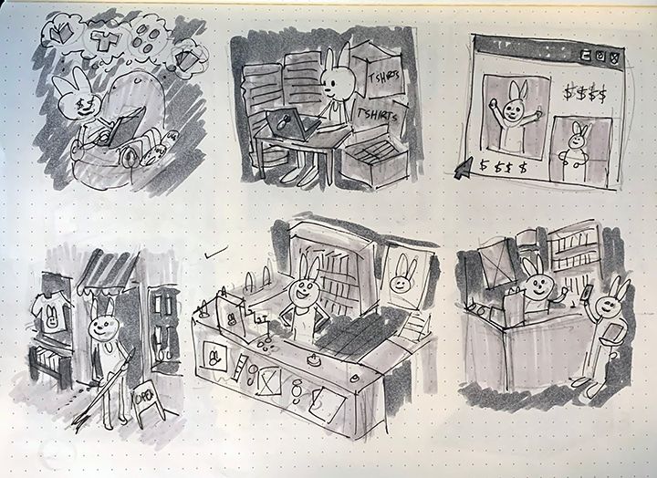
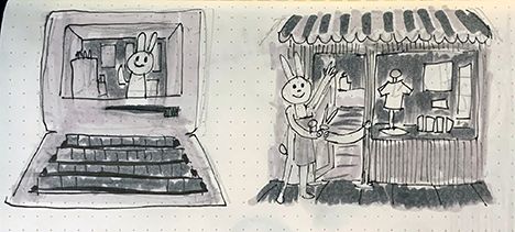
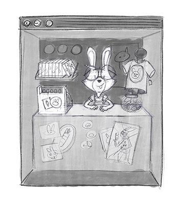
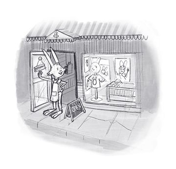
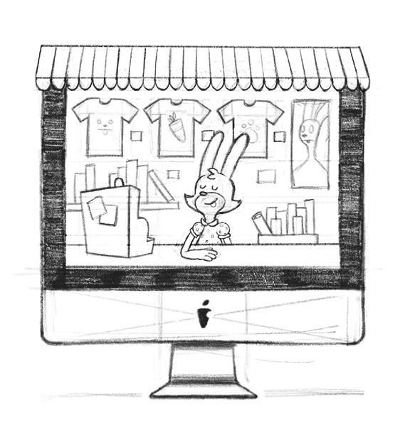
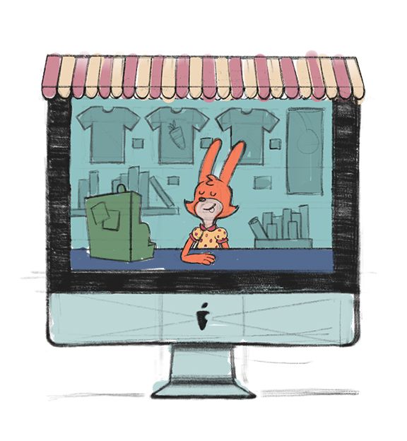
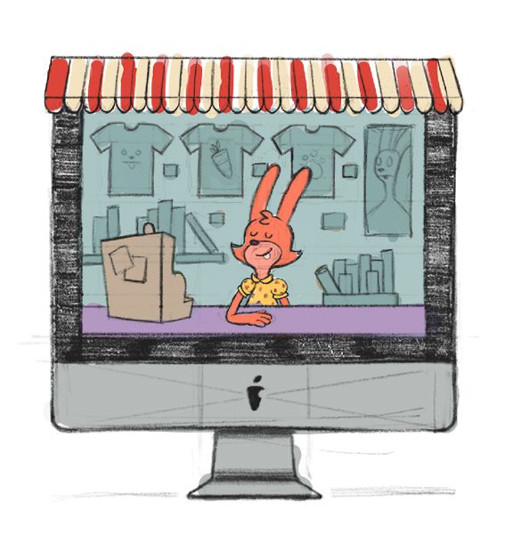
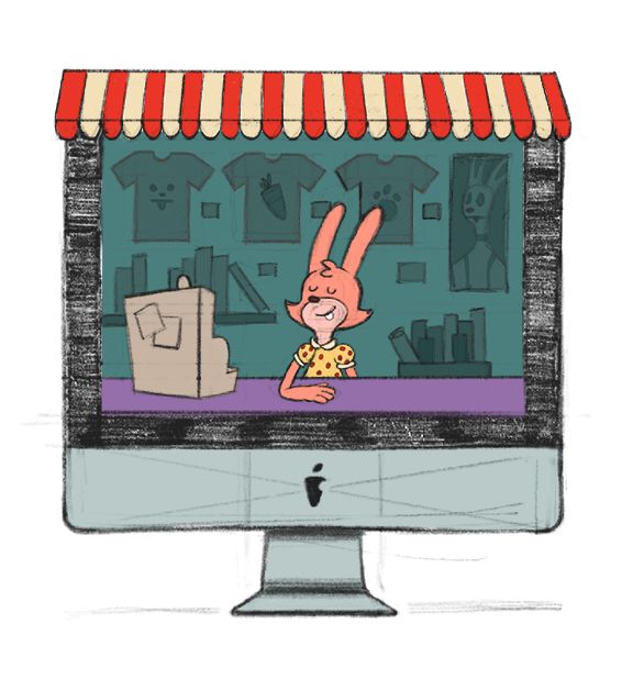
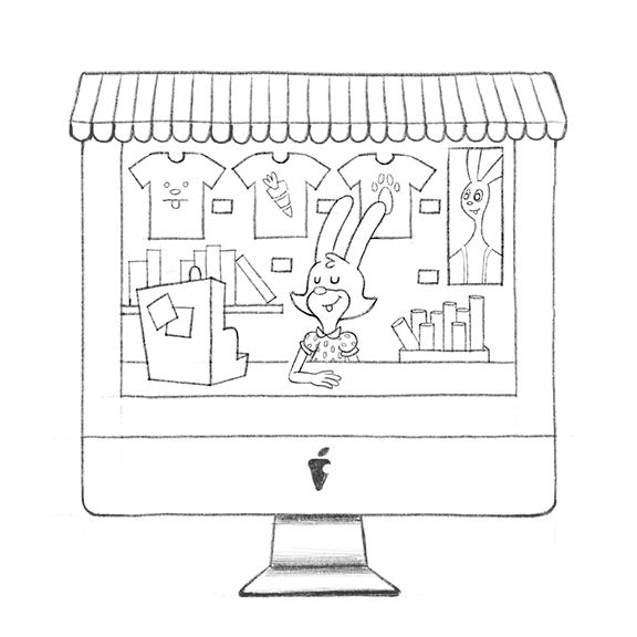
Here I redrew 4 (3.5, really) options that I thought were the best. with some better values. and sent them to Jake. He liked the one with Melanie's shop being the physical computer, (I thought that was the strongest too and presented it as the first image) and asked for a slight change; to make the computer a modern Mac. Agreed!
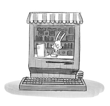
I resketched Melanie's shop with a modern Mac and did a few color studies. Color is really only something I've focused on for the last few months and it is definitely my weakest skill. I referenced some of the colors from my Pinterest board and brought my colors into Photoshop (I use procreate for the bulk of the illustration) to recheck their values by desaturating them. (My wife also went to school for painting and her eye is better than mine!)
-
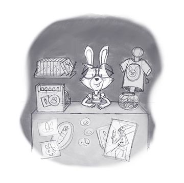
Like Lee says, these last two steps are the easy part, I blew my sketch up to size, and redrew it finalizing the little details.
Then I took my time painting the final work. I debated inking it as I tend to go over everything with a heavy line but in the end decided against it, for the better I think. I painted in ProCreate then brought the illustration into Photoshop for a bit of color editing and one last look in grayscale.

I hope you've found this helpful, or at least cool to see the way another artist works!
-
Thanks so much for sharing this process. Really cool to see how you work!
-
@jakecrowe this was really cool to see! Thanks for sharing and what a great image!
-
@Coley thanks! It was a great learning experience!