Halloween illustration WIP
-
@Kevin-Longueil Thanks again for such an helping comment! You're absolutely right that I am losing the boy's expression, I will definitely work on that! I am going to take advantage of your always extremely helpful comments... do you have any thoughts on colors for me ?? I know everything is fairly messy right now, I have changed the colors so many times I stopped counting! I am trying to limit my palette, but at the same time, the monsters need a little color! I feel like the pink monsters is stealing the focus a little to much... what do you think ?
-
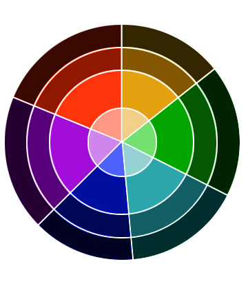
@NoWayMe I wish i could help with color but that is my greatest struggle - the limitless possibilities of the color picker - yikes! - i am reading James Gurney Color and Light at the moment - i am going to try to stick to a split complimentary palette on my next attempt at painting - i found an awesome resource at sacra.net - it is a spit complimentary palette - he does a great video on mixing colors using the tool - the tool is here http://www.sycra.net/splitcomppalette.png - the video is here https://www.youtube.com/watch?v=_iWiZikXSsc - Sycra has some great videos - so for me i'm going to try this to limit my pallet and force me to make better color choices - But to answer your question - i do agree that the pink monster is dominating ....maybe see what the split complimentary wheel says her color should be (what shade of purple) to harmonize with the rest - you could reduce her saturation though i think in the short term to knock her back a bit - anyways no real answers here..Sorry
 ...really looking forward to seeing this as is it progresses! ....here is a jpeg of the split compliment tool from Sycra.net (just to show what it is - but i would download the png file for use in Photoshop)
-
I have enjoyed watching the progress of this piece. It started so strong---and just keeps getting better! A few suggestions:
The pink character demands the most attention. In part because of the color and in part because of it's placement. The color is too strong. It distracts from the warm yellow's and reds surrounding the boy. Try a green, purple or blue...similar in saturation to the other monsters. Also, I feel the candle would be casting the boy's shadow onto that pink character which would make the face darker. As for placement...right now it is almost completely framed by negative space. If you nudge it down so it is slightly behind the pumpkin, it will blend more with the other characters.
I also find the candle on the table distracting. I suggest creating a less bright "off screen" light source over Dracula's right shoulder shining onto his carving. That way the boy will be the first place you look and the carving the second. I attempted a draw over to help explain. The color of the pink character is still not right...maybe a blue? But the placement and shading is what I was meaning. Hope it helps/makes sense. It really is an amazing illustration!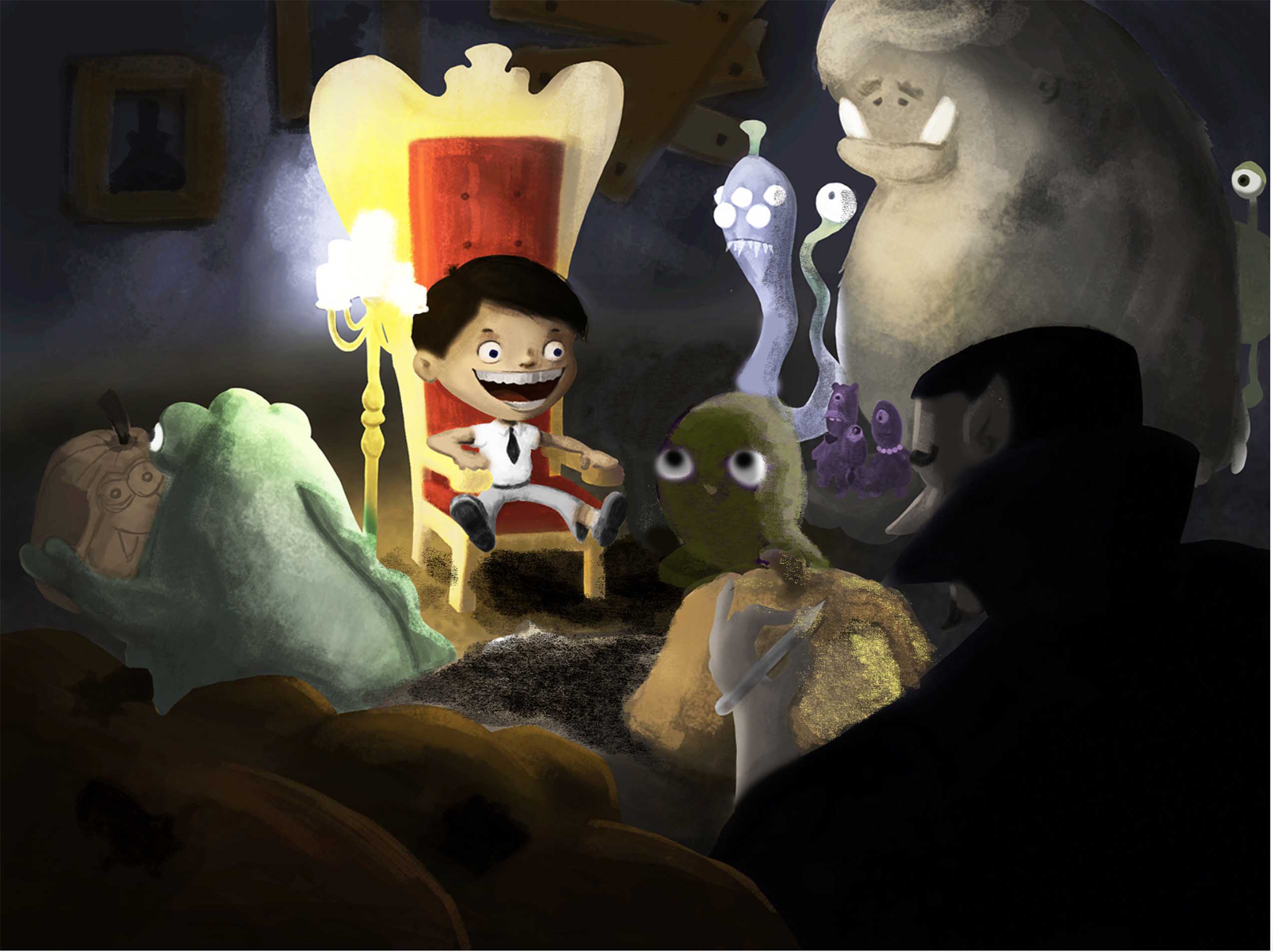
-
@NoWayMe Just want to say again that I love this image.
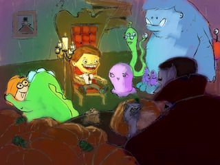
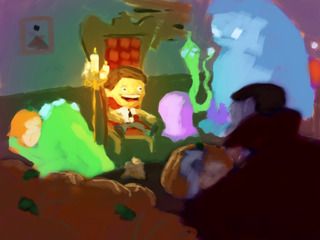
I did a paint over because I feel like, as a children's illustration, it might be getting too dark and muddy. In my opinion it should be brighter and more colorful. Especially since you have all those cool monsters--there is a great opportunity to get a lot of great colors in there.
Here is a really quick paint over. I didn't spend a whole lot of time deciding on the colors so a different scheme may be better.
One other really important thing to think about: Although that candle stand is AWESOME and adds a lot of character to the piece, it almost FORCES you to go with a very specific lighting scenario (one in which those candles are the main light source--and because candles do not give off a lot of light--the areas beyond that little spot need to be dark). One idea would be to just ditch them and free yourself to light it however you want. I'm not at all saying you should--just be aware that with the candles you are pretty much locked into one particular lighting scheme. @will-terry 's latest Santa piece would actually be an excellent reference for you.
Here they are, first with the lines, then without:
By the way: My kids saw me working on this and they were like: "Wow did YOU draw that?" Then I had to pause my paint over to let them color it first. One of my daughters didn't get the chance yet so she's excited that tomorrow she gets a turn at it.
-
Here's where I am at now!
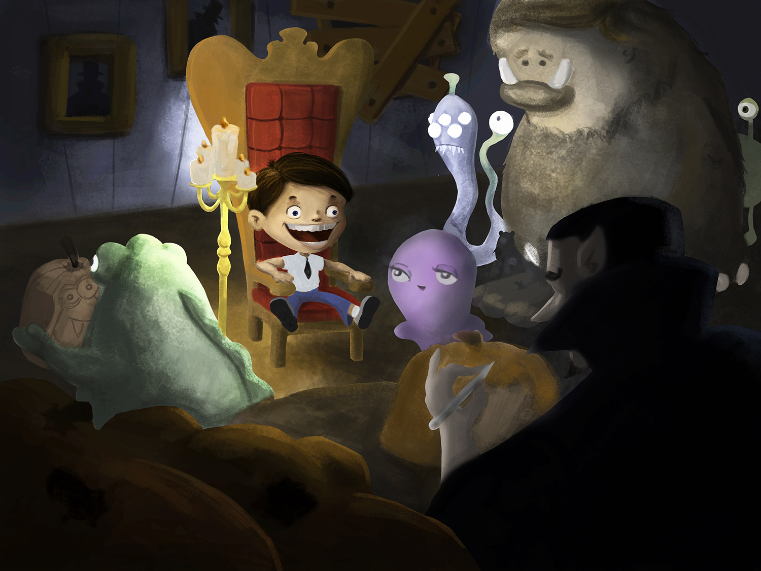
@mattramsey I just saw your comment! You are right that it is getting too dark for a children's illustration; I am in the process of making it lighter! I want it to have a hunted house feeling though, so I think I will keep the candle, but maybe by adding another "off camera" light source like @Joy Heyer suggested I will be able to lighten it up and keep the candles?! Also, one thing that adds to the problem is that I think I need to recalibrate my Cintiq, because colors appears WAY lighter on my Cintiq vs my computer!
@Joy Heyer Thanks so much for the great tips! I love the idea of adding a light source behind Dracula instead of the candle! I still have to shade the now purple monster, but you're right that having her behind the pumpkin is better! I am still not sure about the color though...
I will keep working on this tomorrow and post an update!
Thank you all so much again for helping! -
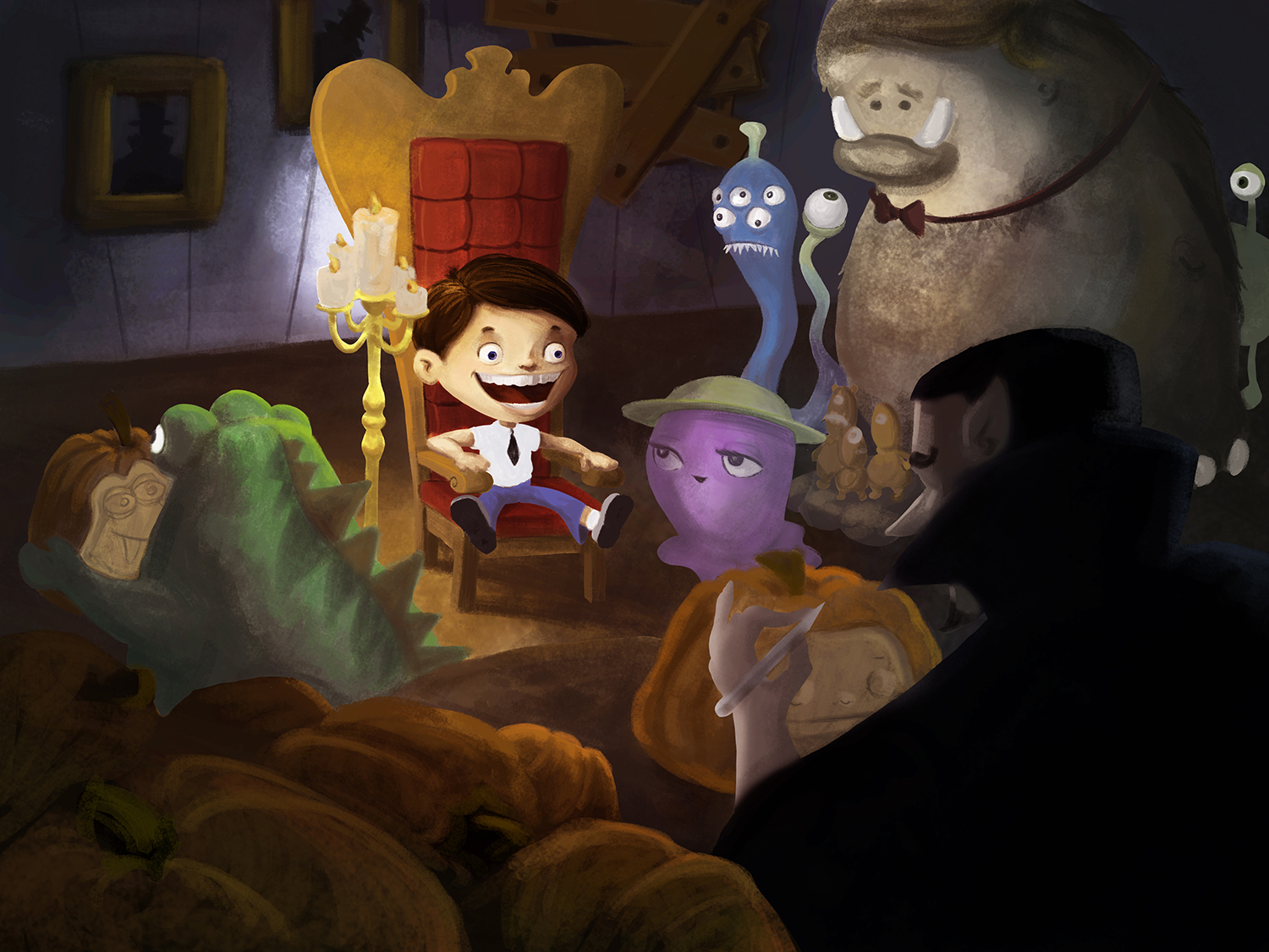
Another update!! I'm starting to like where it's going!
Critiques are more than welcome

-
@NoWayMe Definitely like how this is progressing--keep going!
-
Yes - this is looking good! - only thing i would like to see is the little green guy on the left looking down at his awesome new jack-o-lantern portrait! -...... i promise i won't mention it again though

-
You really tightened up the composition! Much better!
-
It is looking good! Can't wait to see more!
-
Wow you are really making some nice progress on this piece. Really starting to all come together nicely.
-
@NoWayMe You are doing an amazing job!! What a wonderful piece for your portfolio!
-
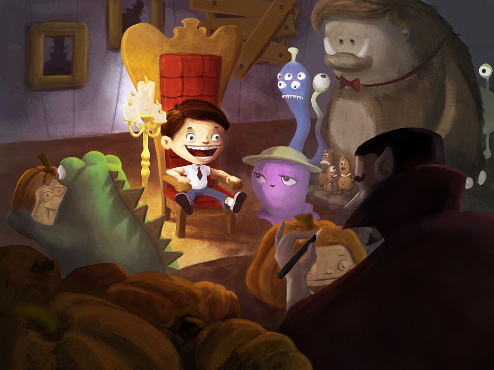
Another update on this piece! I hadn't worked on it for a while because I started my december 3rd Thursday illustration, but I really want to get it done soon!
I am not so sure how to push it further however... Any clues ? I still need to work on the big monster and the boy's clothes, and refine stuff here and there... If anyone has tips or suggestions, they are always welcome!
-
It's looking great @NoWayMe! I like that you've warmed it up and more colourful now. The orangey browny tones are great for a Halloween piece. The little details and refinements I'm sure will finish it nicely

-
Wow, fantastic!
-
Really nice! - i think texture is where to go next with this - most surfaces in the painting have a similar texture - so i think really deciding what the surface of each object is like and giving that impression would be the way to proceed - and also adding highlights in places would really add to it i think- - really looks great though -
-
Hello everyone!
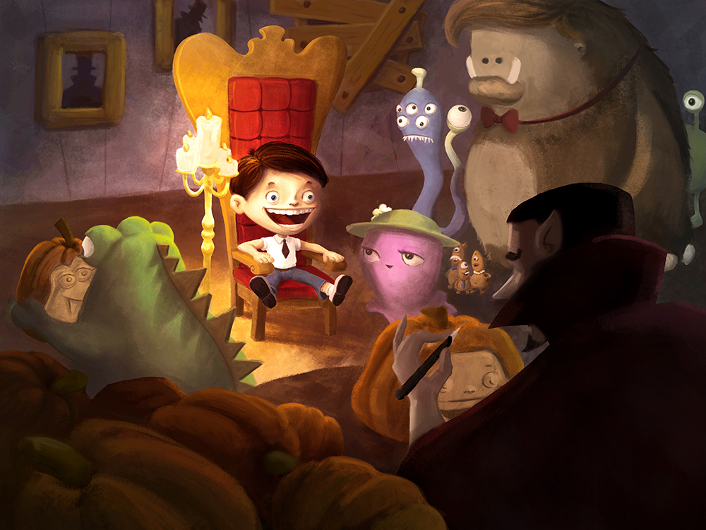
I am trying to finish this thing but I feel a little stuck! Does anyone has any opinion on things I should fix ? Do you think it's worth pushing it (to put it in my portfolio) or should I move to another project ? I haven't work on it for 2 months, and now looking back at it I think I didn't work my sketch enough before painting... One thing that is bugging me is the big monster, I feel there something wrong about him but I can't put my finger on how to fix it...
Thanks!
-
Forgive me for not reading all 65 posts, I did glance through most of the images though,, and seeing what you just wrote, here are my initial thoughts...
-
I think your large figure is fine, but because he has the largest size, he somehow has the ironically smallest eyes. That leads him to being inconspicuous to the others who have large expression filled eyes.
-
The candles are much too close to the boy, and his lighting comes up happy, not creepy. If you place it farther from the chair, to in front of the paintings, of which you could move the boarded window to where the full painting is, and move the painting to where the window is... then put the candles in front of it, and cast shadows up and high over the frames and the chair, then the light of everyone goes left... leaving deeper shadows to make one side of everyone's face be dark and foreboding.
-
The vampire's cape is a deep black hole in your composition, my eye just sinks into it. i would change it to deep satiny blues or purples, also watch the pen and bottom of the boy's feet doing the same thing.
It's a great piece, don't give up on it.
-
-
Just realized another solution might be to remove the candles altogether, and give everyone lit pumpkins, light coming up from a pumpkin would be like a flashlight under their faces, the creepiest kind of light. Just a thought...