Request for critique (first time posting)
-
@theprairiefox , Thank you. I will check out your IG. I have to start using IG as most artists are on it. Good to know about your process.
-
@Nyrryl-Cadiz , I tried several times reducing my size to under the limit and then I got an error again saying that the dimensions were too big. I did my spread on a 8.5x11 but on layout and the spread is twice the size and with extra margin for bleed it became 23"x 9.5" and that was probably too big to post. If there is another way to post it, please let me know and I will. Thanks.
-
You need to reduce the size of your image even more. 1000 pixels for landscape layout is good for the forums. I have to reduce all of my images before posting here. If you are using photoshop, the Export As feature makes this quick and simple.
Website: www.tessawrathall.com
Instagram: www.instagram.com/tessawrathall_art/
-
@TessaW
Thank you. I am redoing my image. I will try to reduce it to post it here. -
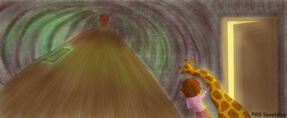
Here is the updated one. Do you think the colors work and would show up well on paper? How can I improve this spread? Thank you.
-
@RG-Spaulding hi! I’ve experience that trouble too. What’s you image dpi? I always use 300 dpi on mine and I’ve fond that when my canvas dimensions exceed 10 inches, my images becomes too big to post here. So probably aim to keep your dimensions smaller than 10. Better yet try to have a smaller image altogether. I hope this was helpful.
Portfolio: nyrrylcadiz.com
Instagram: https://www.instagram.com/nyrryl_cadiz/
YouTube: https://www.youtube.com/channel/UCbJCF1Im8ZO7hpGWTKOJMuA -
@Nyrryl-Cadiz , It helped thank you. I was able to post my revised art above.
-
@RG-Spaulding definitely getting better! The door they are peeking out of is much more readable. I think the text would fit on the floor pretty well too.
A few things to consider.
-
The bathroom door is still very near the gutter. If you moved it left into the 1/3s hotspot (1/3 in and 1/3 down on the left page) you might get more bang for your buck.
-
The perspective on your door is now off. The door frame should probably use the same vanishing point as the floor and tunnel.
-
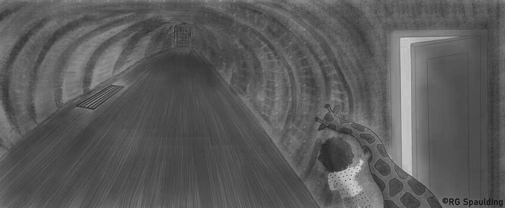
You may want to look at your values. Your light and dark areas don't vary much. See below. In greyscale, you cannot even see the bathroom door.
Good luck, it is coming along.
-
-
Thank you @theprairiefox for the valuable comments. I will work on it more. I need to learn more about working in grey scale. Learning much! Thanks.
-
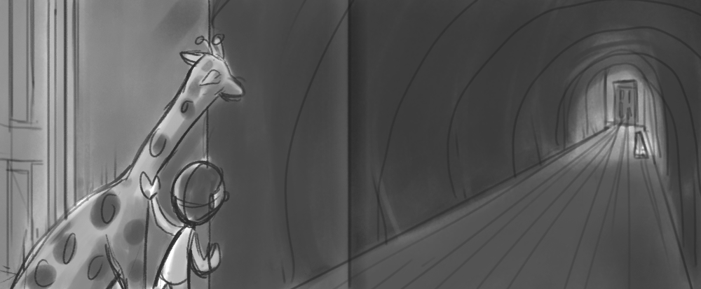
I have a couple of suggestions. Please take them with a grain of salt as I'm just offering up some brainstorming ideas. I've done a very rough composition to help me illustrate my points. I've indicated where the gutter would be so we can take that into consideration.
- Perspective- I Love your overall perspective. It's dramatic and helps drive home your mood. I think it could be tweaked slightly so we read it from left to right, the door doesn't get stuck in the gutter, and the characters are larger, so we see the hallway more from their point of view.
- Values- I think you could utilize the vent light to make the red doorway stand out so it doesn't get lost. I also think you could possibly simplify the contrast of most of the values, keeping most of the contrast to the area of the girl/giraffe and the red door at the end of the hall- the rest can be less contrasted so we keep the focal points. Once you get your values sorted out, you could have a lot of different color schemes and they would still work pretty well.
- Rendering- I haven't demonstrated this in my rough composition, but for your final, I'd consider making your rendering consistent. For example, your girl currently doesn't have line-work, but the door and the giraffe does. Keeping the rendering consistent will make the piece more unified.
Anyway, those are my thoughts. Thanks again for posting.
-
Wow @TessaW , Thank you for showing a different perspective. I will take your valuable input and see how else I can tweak it. Moving the vent closer to the bathroom door would allow me to light up the door better. You guys are so awesome. Thank you.