Society of Visual Storytelling

    SVSLearn Forums

    • Register
    • Login
    • Search
    • Recent
    • Tags
    • Popular
    • Users
    • Groups
    • Search

    Illustration for critique please

    Illustration
    12
    22
    8535
    Loading More Posts
    • Oldest to Newest
    • Newest to Oldest
    • Most Votes
    Reply
    • Reply as topic
    Log in to reply
    This topic has been deleted. Only users with topic management privileges can see it.
    • Kevin Longueil
      Kevin Longueil SVS OG last edited by

      Very nice piece of design! - just two thinks for me to suggest - it looks like possibly the top edge of the snake was defined by the lasso tool - it has very subtle flat spots and a very crisp edge - if this is correct maybe try putting the feather setting on something like 3 pixels to see if you can get a more rendered look to the line - the other thing is the curve of the top of the snake does not flow as well as the bottom or as smoothly as the text - i see the perfect gesture of the text and want the line of the snakes back to follow it - i guess by flow i am talking abut the anatomy really - i think you could adjust the center line to more closely reflect the top and bottom edge of the snake or adjust the top edge of the snake to more closely follow the curves of the middle and bottom - it is possible that the little hump on the snakes back closest to the cake should just be moved to the left or enlarged to the left and that this alone would help the flow - looks great as is really ..just giving feedback - 🙂 it is a really nice piece!

      Portfolio: kevinlongueil.com
      https://www.instagram.com/kevinlongueil/

      1 Reply Last reply Reply Quote 0
      • mattramsey
        mattramsey @audrey dowling last edited by mattramsey

        @audrey-dowling love it! design and coloring are really great!

        Kevin's tweaks are some good ideas.

        Very nicely done

        https://www.inprnt.com/gallery/mattramsey/
        https://mattramsey.artstation.com/
        https://twitter.com/mramseyART

        1 Reply Last reply Reply Quote 0
        • audrey dowling
          audrey dowling last edited by

          thanks for your feedback

          • very true @Chip Valecek I'm going to change some colors as you suggested

          • I see what you mean @Kevin Longueil . I never use the lasso tool, but I'm going to re-work that top curve, it's too crisp indeed. For the anatomy and the text, it was intentional. Being a child illustration, I didn't want the whole thing to be too anatomically right and symetrical. I actually like the way the body and text curves are off and irregular
            But you're making me doubt now... :s

          I just thought that the fold doesn't really make sense actually: the middle part of the snake should actually be inside, and the back of the card left blank... would it look weird if I did that? with the body of the snake continuing to the edges of the inside card, maybe with an insert with details for the party...? like this:

          website: https://audreydowling.wordpress.com/
          twitter: https://twitter.com/audreydowling
          facebook: https://www.facebook.com/Audrey-Dowling-Artist-Illustrator-498582176906242/timeline/?ref=bookmarks

          1 Reply Last reply Reply Quote 1
          • Lydia M
            Lydia M last edited by

            What about a tri-fold like this? You would immediately only see the snake's face, then you pull the back out to reveal the entire body with the cake. The cake is the surprise when you open it!

            snake.jpg

            www.lydiamueller.com
            Twitter @lydesigns

            1 Reply Last reply Reply Quote 2
            • audrey dowling
              audrey dowling last edited by

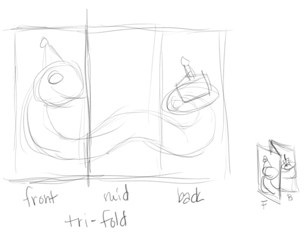
              but then, there wouldn't be the effect of the snake wanting to eat the cake though...

              website: https://audreydowling.wordpress.com/
              twitter: https://twitter.com/audreydowling
              facebook: https://www.facebook.com/Audrey-Dowling-Artist-Illustrator-498582176906242/timeline/?ref=bookmarks

              1 Reply Last reply Reply Quote 0
              • Lydia M
                Lydia M last edited by

                You'd have to re-do it so his head is facing the cake. He could still have the same expression and you'd see what he's so excited about when you open the card.

                www.lydiamueller.com
                Twitter @lydesigns

                1 Reply Last reply Reply Quote 1
                • audrey dowling
                  audrey dowling last edited by

                  yep that's a good idea. thanks @gimmehummus

                  website: https://audreydowling.wordpress.com/
                  twitter: https://twitter.com/audreydowling
                  facebook: https://www.facebook.com/Audrey-Dowling-Artist-Illustrator-498582176906242/timeline/?ref=bookmarks

                  1 Reply Last reply Reply Quote 0
                  • audrey dowling
                    audrey dowling last edited by

                    better isn't it?

                    website: https://audreydowling.wordpress.com/
                    twitter: https://twitter.com/audreydowling
                    facebook: https://www.facebook.com/Audrey-Dowling-Artist-Illustrator-498582176906242/timeline/?ref=bookmarks

                    1 Reply Last reply Reply Quote 6
                    • bharris
                      bharris last edited by

                      I like the adjustments you've made! Really cute idea!

                      www.brittanyharrisillustration.com/
                      www.instagram.com/britillustration/

                      audrey dowling 1 Reply Last reply Reply Quote 0
                      • audrey dowling
                        audrey dowling @bharris last edited by

                        thank you @bharris 🙂

                        website: https://audreydowling.wordpress.com/
                        twitter: https://twitter.com/audreydowling
                        facebook: https://www.facebook.com/Audrey-Dowling-Artist-Illustrator-498582176906242/timeline/?ref=bookmarks

                        1 Reply Last reply Reply Quote 0
                        • Kevin Longueil
                          Kevin Longueil SVS OG last edited by

                          That top edge looks better for sure - it is neat how in the first one you see the face and the cake right away and then open it up for the text..... i am just thinking out loud here - i like what you have done and think it looks great - but would it be possible to have an unequally folded card where the tail section of the trifold idea is longer than the other two sections? so that you see the cake and the head right away and then open it... it really is good the way you have it - just thought i would share that idea 🙂

                          Portfolio: kevinlongueil.com
                          https://www.instagram.com/kevinlongueil/

                          1 Reply Last reply Reply Quote 1
                          • audrey dowling
                            audrey dowling last edited by

                            I thought about it Kevin, and finally I went with this idea, as I won't really have this card printed anyway. it was more about practice. So I just kept it standard. But if it eventually gets printed, I will definitely suggest the idea to the client
                            thanks for sharing your thoughts 🙂

                            website: https://audreydowling.wordpress.com/
                            twitter: https://twitter.com/audreydowling
                            facebook: https://www.facebook.com/Audrey-Dowling-Artist-Illustrator-498582176906242/timeline/?ref=bookmarks

                            1 Reply Last reply Reply Quote 0
                            • Dulcie
                              Dulcie SVS OG last edited by

                              It's a great idea, he/she is a lot of fun and beautifully painted!

                              www.dulciemascord.com
                              https://www.instagram.com/dulciemascord
                              https://twitter.com/dulciemascord
                              https://www.facebook.com/dulciemascord

                              1 Reply Last reply Reply Quote 1
                              • Joy Heyer
                                Joy Heyer last edited by

                                This is a very cute card! Quick thought...you could keep the original fold with the snake looking at the cake and then paint the snake's head and tail on the inside of the flaps with the eyes looking the other way. Not sure that made sense... Basically you would draw two heads and two tails. One on the outside and one on the inside. Anyway, just a thought.

                                Twitter: @Joy_Illustrated
                                Instagram: joy_illustrated
                                Website: joyheyer.com

                                Chip Valecek 1 Reply Last reply Reply Quote 2
                                • Chip Valecek
                                  Chip Valecek SVS Team SVS OG @Joy Heyer last edited by

                                  @Joy-Heyer made a good point. I like that idea.


                                  https://www.instagram.com/chipvalecek/
                                  https://www.facebook.com/cvalecek
                                  http://www.cshellmedia.com/

                                  1 Reply Last reply Reply Quote 0
                                  • MOO
                                    MOO SVS OG last edited by

                                    Very cute and creative idea 🙂 I like it. I also liked hearing the others feedback. I think there are some who are better at seeing the little things that can enhance the work.

                                    Marsha Ottum Owen

                                    1 Reply Last reply Reply Quote 0
                                    • Lydia M
                                      Lydia M last edited by

                                      Looks great! There's a payoff (invitation to go eat cake) when they open it.

                                      www.lydiamueller.com
                                      Twitter @lydesigns

                                      1 Reply Last reply Reply Quote 0
                                      • Leontine
                                        Leontine last edited by

                                        Love it! There's the first card for your collection! Chapeau!

                                        Leontine
                                        "A picture is worth a thousand words."

                                        https://leontineillustrator.com
                                        https://www.instagram.com/leontine.illustrator/
                                        http://www.facebook.com/leontineillustration

                                        1 Reply Last reply Reply Quote 0
                                        • Lee Holland
                                          Lee Holland last edited by

                                          Really nice audrey well done. you painted it really well.

                                          https://www.facebook.com/pages/Lee-Holland-illustration/285517801577676?
                                          https://www.instagram.com/lee_holland_illustration/
                                          http://lholla56.wix.com/lee-holland

                                          1 Reply Last reply Reply Quote 0
                                          • First post
                                            Last post