Slowvember WIP
-
Hey all. I wanted to get a post up and for the most part to keep me honest so I'll actually follow through and spend the time to do it
")
I've had 2-3 ideas in my head for some time that I thought would be a great time to try and get them out and into finished pieces. I've mentioned before I'm relatively new to coloring my art, so I'm really looking to push on those limitations. I feel like I struggle with dynamic range and contrast when it comes to coloring.
The piece I'm thinking of is in a world I've wanted to build a bit more up of that's a feeling of Adventure Time meets Zelda where there is danger and monsters and magic but there are people trying to carve out a basic living. My daughter and I watch a lot of cartoons together, and I wanted to develop a character that was this tough as nails adventurer girl that just gets it done.
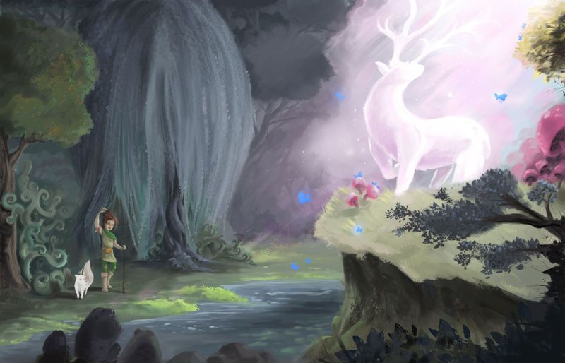
The scene in my mind is that to help a good friend that has been mortally injured, she's heard rumors that the spirit of the forest can heal ailments that kill most people. She's ventured into the deepest forest and has finally found the spirit.
-
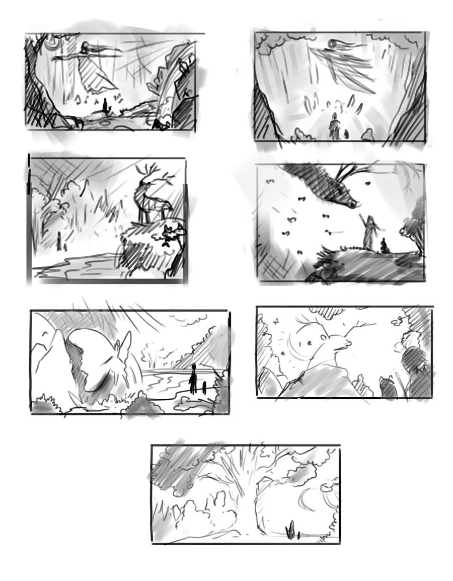
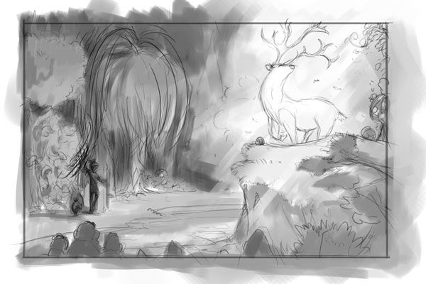
Some of the thumbnail compositions I've been toying with. I'm still not 100% sure what the spirit is going to be. I've toyed with the idea of it being a female, fairy, moth, and a stag. I liked the idea of a stag - maybe something akin to Harry Potter's patronus.
And I decided she's going to have a dog-like companion.
-
@jdubz These are nice thumbnails and any of them could work. To get more specific feedback from people, try adding in key words and how you want the image to come across. What should the viewer think when they see this image. That is how you go from a lot of usable thumbnails to the BEST thumbnail for the job.
-
@Lee-White Thanks Lee - good direction advice. I'll think about this in more detail and try and come up with some more pertinent comments.
Off the top of my head, I was trying to think of the forest itself being very dark and had a sinister overtone, but having this awesome (as in literally awe-inspiring) being in it. I wanted it to have some contrasting surprises, which is why I thought to use a moth, or even a silk worm or frog or something that people wouldn't have first thought of as a mystical being. The "glowing ghosty girl in the flowing dress" seems to be the obvious trope in this scenario
I kind of wanted you to see the girl in some detail to get some of her personality and maybe add some details about how the trip through the forest wasn't all roses. But I didn't want to make that a "must have" if the image would be better for not having her be as detailed (as in some of the more zoomed out shots). I'm trying to take to heart the idea that less can be more. I can definitely over detail things and they can be a mess.
-
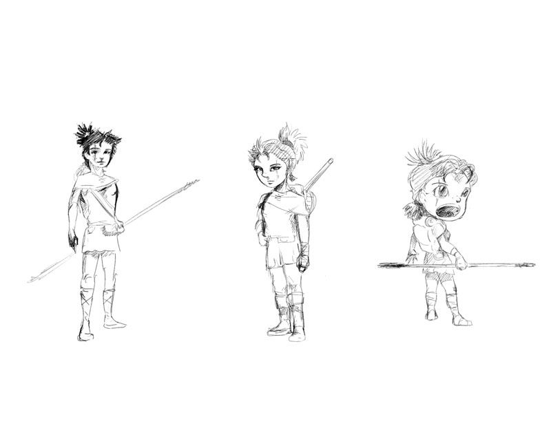
Still exploring some stylistic decisions, specifically with the characters because I want to be consistent with the feel. I've just been scribbling some different character style types to try and see what feels right. Here are some of those - I'm kind of going to extremes on these where it's a bit more life-life moving down the line to almost a "cal art" style.
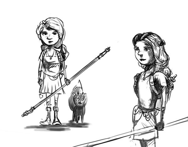
Few more here:
-
I sketched out a couple more ideas and I really liked the direction this felt like it was going...
-
So cool! It' giving me serious Princess Mononoke vibes; specifically reminding me of the Shishigami.
-
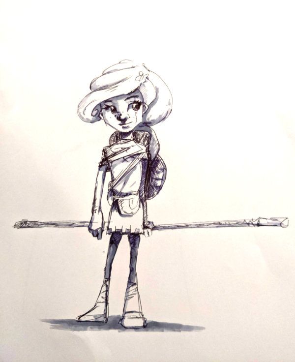
@jdubz Nice! From a sheer compositional standpoint I like the stag on the hill and the one below it with the "fairy butterfly." Every read the stag passage in Wind in the Willows? It has some of that, only not sinister.
As for the girl, I rather like the first one, but I don't really know what your style is. Good start!
-
@LauraA @Daisy Thanks for the feedback. I haven't read Wind in the Willows so I'll check that out. I do remember watching Princess Mononoke a while back and that's definitely a style I was trying to emulate back in my early college days. But it's been super long so maybe I need go watch it again.
"I rather like the first one, but I don't really know what your style is"
This is kind of the conundrum for me. I'm not precisely sure what my style is either. It seems I default to 2 or 3 different stylistic looks depending on the subject matter.
Thanks for the comp feedback. Originally I was kind of thinking the stag coming down and she was reaching out, but I tried to refine that one and it just didn't feel like it was working at all so I think you're right and I'll refine one of those next at least to a stage where I can see it moving forward.
-
Starting to flesh out the stag on the hill - I'm blocking in some more details along with some more value studies. This is one that I think is starting to work for me. I'm going to try and work on some color ideas based on this.
-
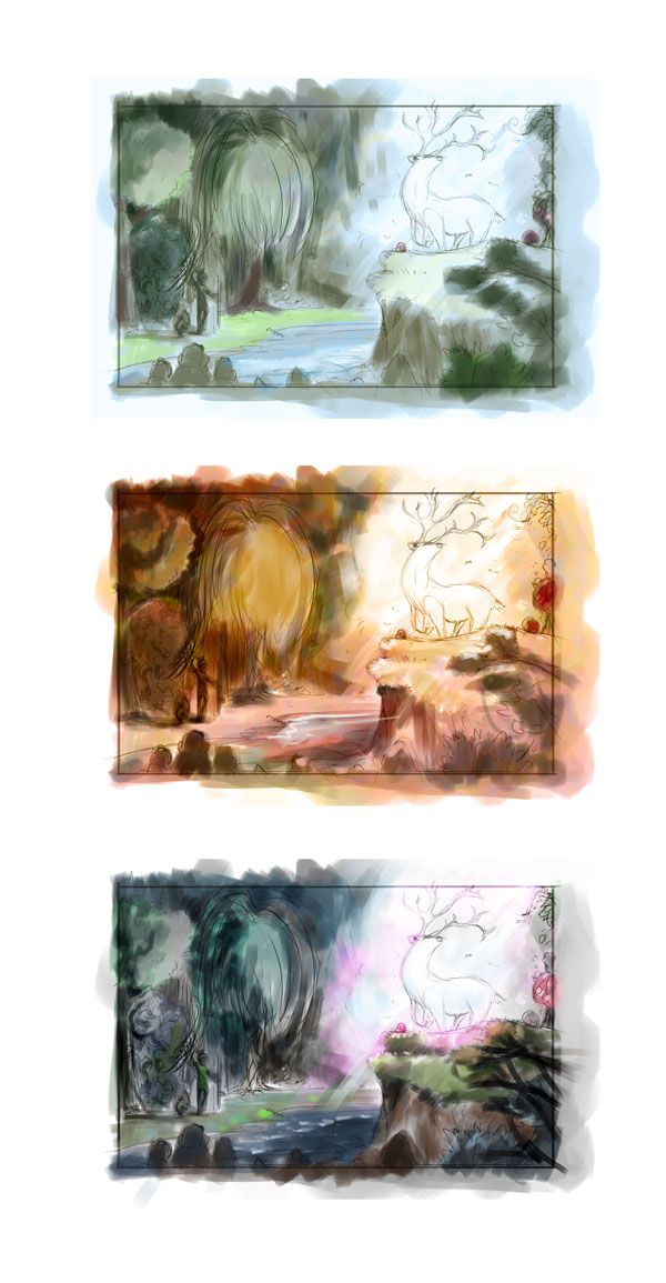
A few quick color thumbs - looking at something like more traditional forest colors, or maybe something more in the reds/oranges/autumn spectrum, and the bottom one I was messing with is something with mostly blues and then adding in pinks.
-
@jdubz awesome work! I like the last colour thumbnail the best .. I think it has a more magic vibe if that makes sense
-
@mads Thanks for the feedback on this and confirming the one I thought had the better feel also.
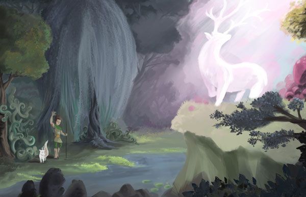
Starting to render out some of the details in a slightly larger canvas. Here's where it's at now.
-
I think I'm nearly done. I've been adding textures and details to the larger size, color correcting, and doing some swapping of the canvas to try and shore up some of the little issues I saw here and there.
Any feedback would be appreciated on how I can adjust this further to make it pop.
-
@jdubz looking really great, very magical. If you could piece more of the shadows on the deer. Also what if you brought some of the pink light down onto the ground in front of the girl. Most of that light would hit the cliff but some would go past the cliff and hit the lower ground. Do you know what I mean?
-
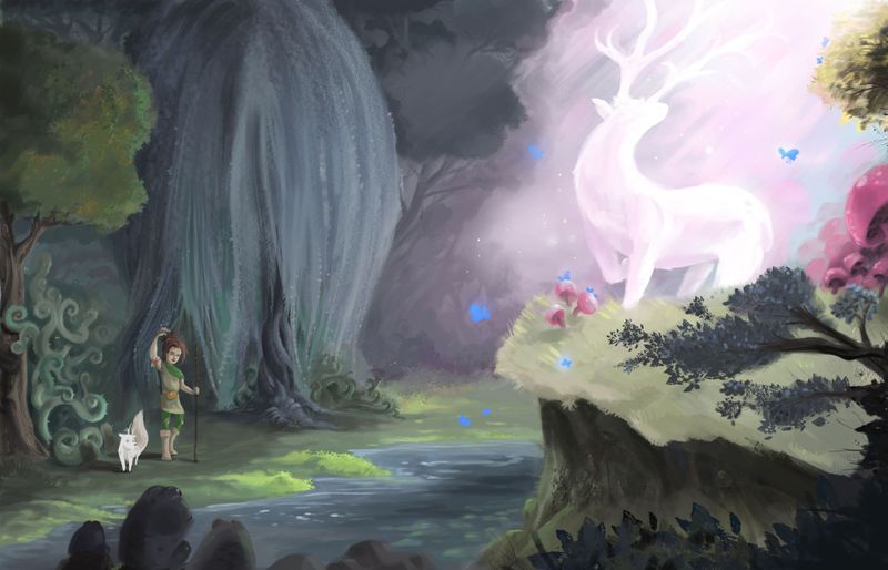
I think so - let me try it out and see how that feels.
On the deer I'm kind of torn. I think I accidentally painted myself into a corner a bit. The idea was that it was also generating a bunch of light, which then makes the beams of light less impactful. And if that were the case, it as an object wouldn't be shaded at all.
So I think you're right - if I keep the light coming into the scene from where it's at, the stag must be more shaded for it to make sense.
-
Here is the new version with those changes in mind - some of the pink light dappled and bouncing off the area in front of her, and I tried to add some rays leading down to help you see where it was coming from. Then the stag is mored shaded where the light would be coming from.
-
OK, so I did something that I wasn't supposed to do, but I did it anyway.
I ended up doing a totally different piece. I really like where I got with the original piece I was working on, but I just felt like I was sitting in my comfort zone. This is sort of where my style defaults to, so it just kinda felt like I took something I normally do and polished it up more and added more detail/elements.
So I started working on something that is outside of my normal comfort zone to try and push myself in a direction to work on some of my blindspots. I started with the intention of doing no linework at all - just straight paint, in colors that I hadn't normally worked with, and one thing I wanted to do was try and OVER simplify because I have a really bad habit of over illustrating my work and making it way too detailed.
The other thing I did was worked all on one layer, so it was pushing and pulling everything all at once without going layer to layer.
Here's where I landed:
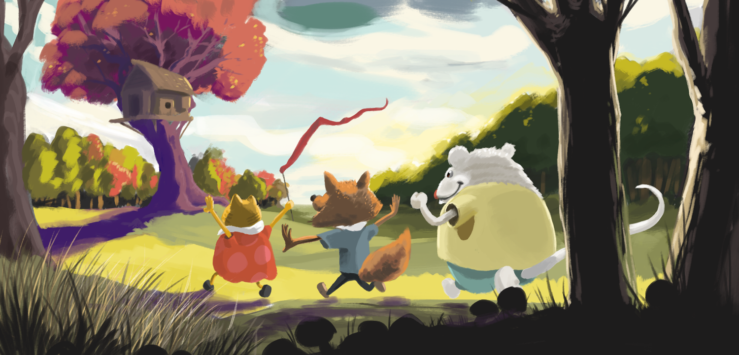
What do you guys think? Was the stronger piece the one I did originally, or the new one that went against the grain?
-
@jdubz I'm viewing on a smart phone, so there may be some details I miss, but I like the second piece a lot more. The composition and colors and values seem a lot more solid, plus the shapes look better thought out
-
@jdubz I feel your pain. I always wanna redo/do a different image near the end of these contests
I like the colours and composition of the first attempt, but I like the characters and use of foreground elements in the new piece.