Need your honest opinion
-
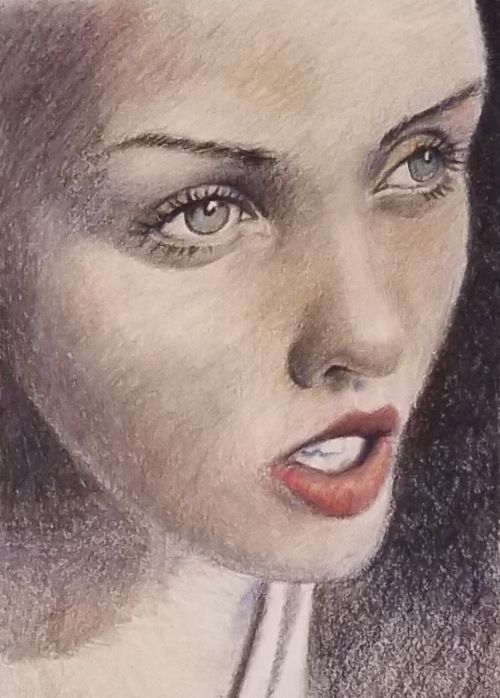
I was practicing color pencil technique because I have been inking like crazy and I needed a break. I drew a random face I found off the Internet as a reference and here it is (mind you it looks better in person)
On a whim, I decided if I might pump up the value and attempt to ease out some of the white graininess on photoshop. Here are the results:
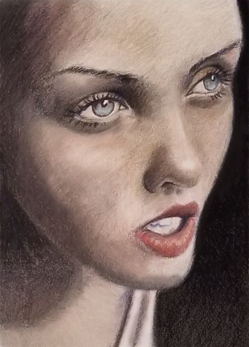
My question is... did that improve the picture? I kind of liked the old master's oil painting texture it gave it and I am wondering if this is another style/process I could pursue since I love and am as proficient with color pencil as I am with ink (not that I am a master but it is what I can do best).
So vote and justify your vote: (pretty please with sugar on top!!!)
A (unedited)
or
B(edited) -
@chrisaakins I had to look at them a lot. I think I like the unedited version better. I’m struggling to figure out why. Maybe I prefer colored pencil. It feels softer/less harsh to me.
-
@chrisaakins I honestly prefer A because of the texture. I think A is well done. However, I am not that in love with B. For me B looks splotchy, grimmy/ dirty looking even. I hope this wasn’t offensive tho. I really love the first one.
-
@chrisaakins To me it looks very much like the same rendering method but different lighting scenarios. I think they're both good, but I'm not drawn to one over the other
")
-
A

-
I like A, with B somehow the forms in the eye get blown out and looks odd. A has a really nice feel to it. Its soft and great job!
-
@Pamela-Fraley @Nyrryl-Cadiz @Braden-Hallett @Zachary-Drenski @Chip-Valecek
Haha Well okay. Thank you everyone. I do think A has a softer tone and B does look blotchy now that I see them again. I thought I was on to something. Maybe I'll try it again with a different picture but see if I can render it better.Or maybe I really have no taste and I just need to rethink my life...
Ugh. Art is hard enough and then the world had to throw digital at me... Maybe I just need a really good scanner and stick with traditional. -
@chrisaakins there’s actually a class called “mixed media watercolor and digital” something like that. I haven’t taken it yet. It’s on my list for when I get an iPad. But maybe that would be helpful. Don’t get discouraged. Trying to find new ways of doing things is where you learn. I heard recently that you grow by doing things just on the outside your Current skill set.
-
@chrisaakins I like A better because the contrast is balanced, whereas the re-worked image in B has too much contrast between the skin and background.
Well done, you did an amazing job with these!
-
I was surprised by such a unanimous answer! Personally, I didn't really find one particularly stronger than the other, they both have their appeal and I really like the contrast of B, but I will say that B needs a little more careful finessing. Some of the values/coloring of the light areas on B are looking a little muddy, almost like she's bruised. It's happening a little on A, but the contrast of the background on B emphasizes it more.
Website: www.tessawrathall.com
Instagram: www.instagram.com/tessawrathall_art/
-
@TessaW I thought so too about the bruising. I was trying a different technique than I normally use with color pencils. I layered in the values first with sepia and ultramarine but they made mud with the peaches and pinks. Lesson learned. I think if I do this again I will reserve my light values and not use the sepia and ultramarine to make my very lightest grey tones. Or maybe I need to improve my blending. The colorless blender dragged the pigment of the darker areas into the lighter ones and then I was stuck with it because you can't erase or undo color pencil.
I did really enjoy building up the layers. I am normally too impatient and try to go dark too soon.