Akins Dream Portfolio Excercise
-
I finally have gotten time to put this together. Here is a dream portfolio for me. Some of my artist influences are Bill Sienkiewicz, Peter Stier, Chris Van Allsburg, Graeme Base, Pascal Campion, Karl Kopinski, N.C.Wyeth (my favorite!) and a few others.
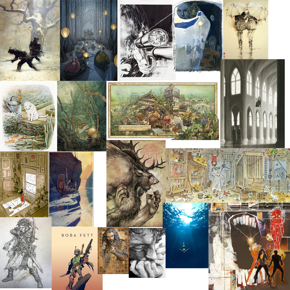
Here is what I noticed that they have in common:-
highly rendered
-
dramatic lighting and value contrasts
-
lots of texture
-
detailed backgrounds or conversely abstract backgrounds
-
limited pallet with a splash of bright color(this was a surprise to me)
-
realistic figures
-
dramatic compositions that almost become a central focus in and of themselves
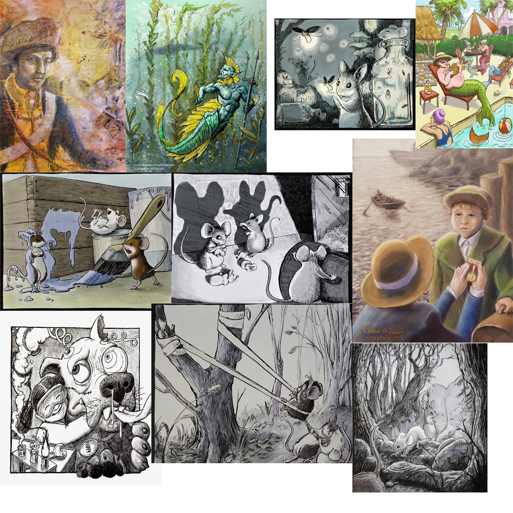
So what do you see? Here is my portfolio (limited and unpolished as it is)
-
-
@chrisaakins I see a lot of linework. I was also surprised by the colors in my dream portfolio.
-
@chrisaakins I see a lot of sketchy lines in your dream portfolio. Pencil renderings with simple colour spots. For the most part lots of obvious linework. Hope that helps
")
-
@Zachary-Drenski @Braden-Hallett thanks for the input. How does my actual work compare? What do you see that I need to work on?
-
@chrisaakins I think that your inktober mice are coming closest to emulating some of the pieces in your dream portfolio. Something to do with the full value range and the fine line work, I think.
-
@chrisaakins I was thinking the same thing about the mice as @Braden-Hallett and I think the one in the middle is your strongest piece.
Honestly, I don't think you are that far off from your dream portfolio. You definately have skills and nice compositions. I have a suggestion about how to get your work closer to the dream portfolio.
So if you step back and squint (or view these on your phone) you'll see that all the pieces in your dream portfolio (other than the Noah's ark piece) have very simple and deliberate value groupings. For example, if you look at Mr. Jake Parker's Boba Fett (eyes squinting) it's a dark figure on a light background. If you look at the one with the frog (who's work is that btw?) it's basically a gradiant from light to dark. I think you could mess around with your images digitally to figure out if you can get some more stark, simplified value groupings. -
@chrisaakins You definitely have a fantasy, detail, line work thing going! I agree with Braden that your mice are your best pieces, especially the one in the middle with the shadows. I also agree with Zachary's comments about value. In fact, you could take some of your portfolio pieces, and without changing anything else, adjust the contrast and see what that does to increase their impact.
P.S. Oh, and I forgot to add that a lot of the line work is tree branches, both in your dream portfolio and in your own work.
-
@chrisaakins One thing I noticed is that your dream portfolio has very muted colors. Whereas the color pictures in your portfolio are much more saturated.
I seem to recall seeing one of your mice ones that more muted (not the paint one) but I might be dreaming that... Anyway if I wasn't dreaming that, it might actually fit more with your dream portfolio.
-
A few years ago I went through a phase of watercolour painting just using sepia and indigo - the colour palette I ended up with looks like a lot of your dream portfolio. They are both muted colours capable of achieving a wide value range. I don't know if there is a more general colour theory type word for this palette! I also notice there is usually a light source in the image in your dream portfolio - a window, a lantern, a strong reflection from water or snow. I feel like if you muted the colours in your merman image and made the water light in the top left more prominent then it could sit fairly comfortably beside your dream images. Your line work seems close already.
-
I tried trying the sketchy inky look that is working for my mice in a comic book form, adding lots of texture and using a muted pallet. I like it. I like how it looks like a color pencil sketch on toned paper.
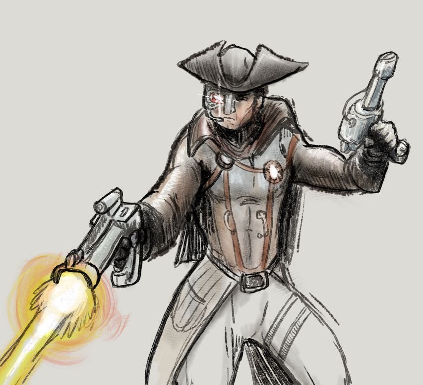
I got the legs wrong so I didn't finish them.