Society of Visual Storytelling

    SVSLearn Forums

    • Register
    • Login
    • Search
    • Recent
    • Tags
    • Popular
    • Users
    • Groups
    • Search

    Slowvember, slow start.

    Artwork
    10
    30
    2101
    Loading More Posts
    • Oldest to Newest
    • Newest to Oldest
    • Most Votes
    Reply
    • Reply as topic
    Log in to reply
    This topic has been deleted. Only users with topic management privileges can see it.
    • xin li
      xin li last edited by

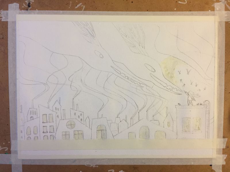
      Did some adjustments on composition. Thanks to @LauraA 's critique. I think I am getting really close to start painting :-).

      @Braden-Hallett It is really interesting about what you said about flipping the image. As you said, it changes the perspective of the story a bit, very sable. It gets me to think.

      @JoannaH thank you for the encouragement.

      sketch02.jpg

      Web: www.lixin.no
      IG: www.instagram.com/lixin.illustration/

      LauraA 1 Reply Last reply Reply Quote 0
      • LauraA
        LauraA SVS OG @xin li last edited by

        @xin-li Yesss!!!! Really clear now. You've got it!

        Instagram: https://www.instagram.com/lauraintorino/
        http://lauraaldersonart.com/

        xin li 1 Reply Last reply Reply Quote 0
        • xin li
          xin li @LauraA last edited by

          @LauraA thank you, Laura 🙂

          Web: www.lixin.no
          IG: www.instagram.com/lixin.illustration/

          1 Reply Last reply Reply Quote 0
          • xin li
            xin li last edited by

            Ready to paint tomorrow.
            IMG_5008.jpg

            Web: www.lixin.no
            IG: www.instagram.com/lixin.illustration/

            BichonBistro 1 Reply Last reply Reply Quote 2
            • BichonBistro
              BichonBistro @xin li last edited by BichonBistro

              @xin-li it's going to be BEAUTIFUL!

              https://www.instagram.com/bichonbistro
              http://www.heartfeltimpressions.com
              https://www.facebook.com/patty.burke.9655
              https://twitter.com/BichonBistro

              1 Reply Last reply Reply Quote 0
              • xin li
                xin li last edited by

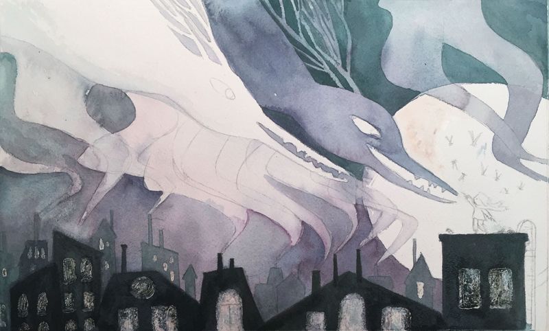
                WIP: I have no clue how much color I need to mix to cover an area. So I always mixed too little. Right now, the color is all over the place, due to I keep mixing color when it is run out, and every time I mix it ends up slightly different.
                Am I frustrated? yes. Is this fun? also yes.
                Is there a way to harmonize the color at this stage? would glaze on top work?
                IMG_5021.JPG

                Web: www.lixin.no
                IG: www.instagram.com/lixin.illustration/

                BichonBistro 1 Reply Last reply Reply Quote 0
                • BichonBistro
                  BichonBistro @xin li last edited by

                  @xin-li I like the variations! It is fun to watch what happens with watercolor 😊

                  You may already be doing this, but sometimes it helps to mix your colors (more than you think you need) in clear glass jars at the deepest shade, then use your palette (or smaller containers) to lighten the values of that mix.

                  If you really want to unify an area, a transparent glaze of one hue (I would not mix for glazing) can work, but I would not glaze over the darks at the bottom. You could glaze one area in a cool transparent hue, the focal point in a warm version of that hue, for example. But I would test the glazing on scraps first to see if it's an effect you like.

                  Glad you are having fun!

                  https://www.instagram.com/bichonbistro
                  http://www.heartfeltimpressions.com
                  https://www.facebook.com/patty.burke.9655
                  https://twitter.com/BichonBistro

                  1 Reply Last reply Reply Quote 0
                  • xin li
                    xin li last edited by

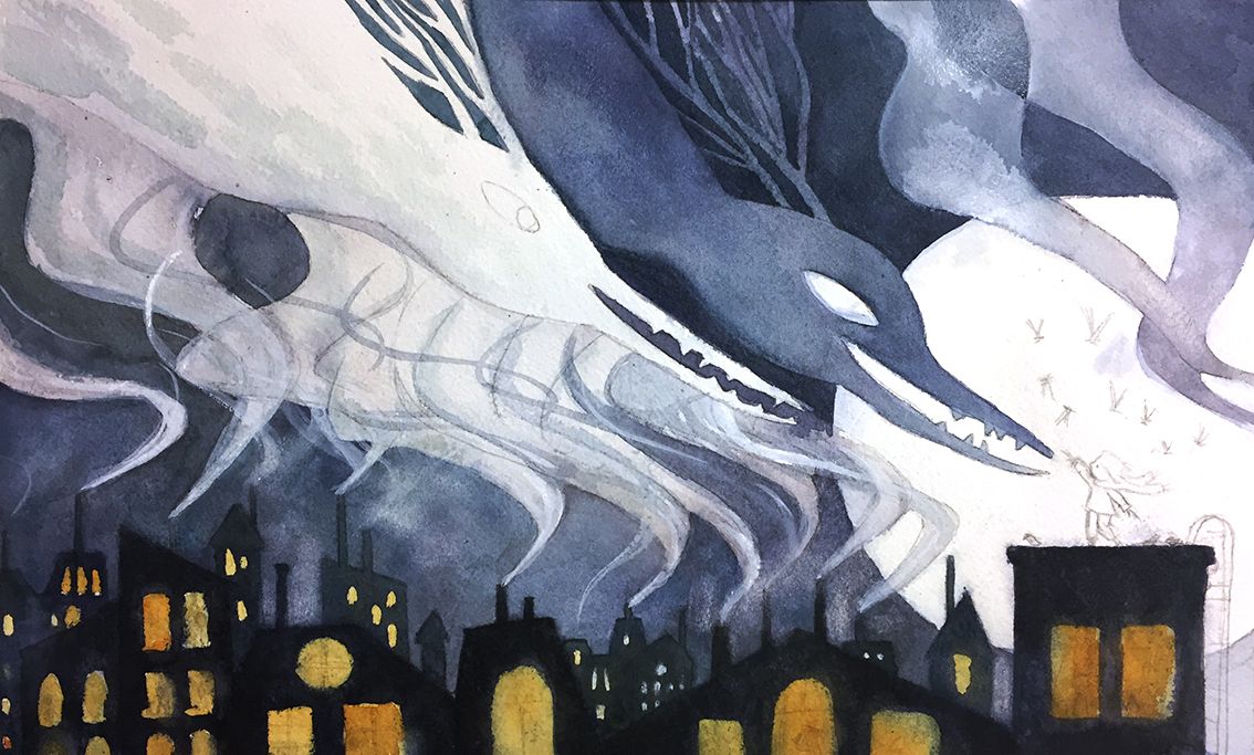
                    Progress so far. The color is way off compared to the color study. I might try to a glaze of green tone tomorrow to bring the color closer to the color study.
                    @BichonBistro thank you for the watercolor tip.
                    process02.jpg

                    Web: www.lixin.no
                    IG: www.instagram.com/lixin.illustration/

                    LauraA BichonBistro braden H KaraDaniel 4 Replies Last reply Reply Quote 3
                    • LauraA
                      LauraA SVS OG @xin li last edited by

                      @xin-li You said: "Am I frustrated? yes. Is this fun? also yes." Love it! This sums up why we make art!

                      Also, I like your warm windows. And I think the purplish-blue has enough harmony.

                      Do you do watercolors frequently? I thought maybe you did digital more, but I'm not sure.

                      Instagram: https://www.instagram.com/lauraintorino/
                      http://lauraaldersonart.com/

                      xin li 1 Reply Last reply Reply Quote 0
                      • BichonBistro
                        BichonBistro @xin li last edited by

                        @xin-li I think this is working well! Blue is complementary color of orange and purple complementary of yellow, so unless this goes against your vision for the piece, I wouldn’t worry about matching to your original color study.

                        https://www.instagram.com/bichonbistro
                        http://www.heartfeltimpressions.com
                        https://www.facebook.com/patty.burke.9655
                        https://twitter.com/BichonBistro

                        1 Reply Last reply Reply Quote 0
                        • xin li
                          xin li @LauraA last edited by

                          @LauraA I normally work digitally. But I learned a lot of working with wet media during this year's inktober. Color is tricky for me with watercolor. It helped a lot by followed SVS watercolor courses by Vesper Stamper and Lee. @BichonBistro also gave me lots of useful watercolor tips.

                          Web: www.lixin.no
                          IG: www.instagram.com/lixin.illustration/

                          1 Reply Last reply Reply Quote 1
                          • braden H
                            braden H @xin li last edited by

                            @xin-li said in Slowvember, slow start.:

                            The color is way off compared to the color study

                            The colour may not be the same as the study, but it still works really well. Blue and orange is always a winning combo 😃

                            1 Reply Last reply Reply Quote 0
                            • KaraDaniel
                              KaraDaniel @xin li last edited by

                              @xin-li looks great so far!

                              instagram.com/sha_kara
                              karadaniel.net

                              1 Reply Last reply Reply Quote 0
                              • xin li
                                xin li last edited by

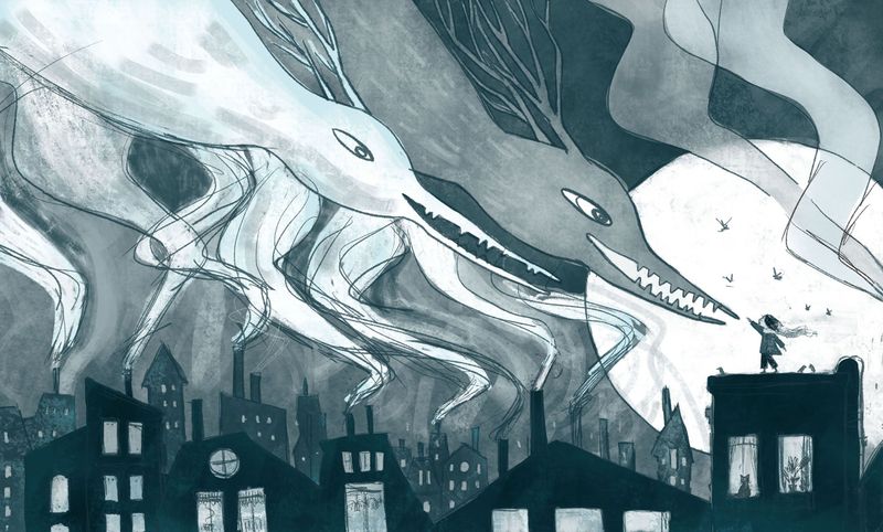
                                Thank you, everyone, for tips, supports, critiques, and encouragement. I finished the painting. The result is posted at the contest thread.

                                Web: www.lixin.no
                                IG: www.instagram.com/lixin.illustration/

                                1 Reply Last reply Reply Quote 4
                                • First post
                                  Last post