Dec. 3rd thursday sketch
-
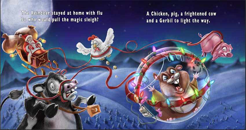
So here is another. The changes I made were to lower the brightness of some of the rim lighting on the cow, pig and gerbil. Lightened the background a bit then brightened the overall painting slightly as well as a slight bit more contrast. I'd love to hear anymore thoughts you guys might have for this image. Thanks a bunch
")
-
Yes! I like! (the changes are wonderful)
And now we will hear from the Text/Font/Grammar/All animals matter Nazi:
I love your rhyme - but I question capitalizing Reindeer, Gerbil and Chicken (but not pig, cow). Actually none of them should be capitalized unless you are doing a design (or those are their formal names). Then capitalize them all!
I would prefer a handwritten look to the text. But if you use a standard font, perhaps a more flowy, irregular placement, of the words, rather than straight blocky?
Text/fonts are my nemesis. I have a horrible time getting it right in my own stuff, and rarely succeed. So take my critique with a grain of snowflake salt (except for the capitalizing part).
-
ABSOLUTELY!!!! Yes, the text was the last thing I was going to deal with. I mostly threw it in there so I could get a feel for spacing and size but yes you are absolutely right about my capitalization issues :). I will definitely deal with those before turning it in.
If you have any ideas for some good fonts I would love to look for them online. I know it is a battle between making it very easily readable and at the same time being something that is visually nice to look at. My typography knowledge is... well, there is none. HAHA. But yes, if you or anyone else have any good thoughts about some quality fonts I could get that would be great! Thank you for the critique!
-
@Kris-Knight This has gotten better with each iteration. I really like the colors and value structure. A couple things you can look at that bother me about the image:
- Santa's eyes creep me out a bit. They seem to be completely popped out of the head.
- The eggs under the chicken do not add value for me. They are more distracting.
- Some of the reins look pasted on like around the cows muzzle, around the chicken's waist, and around the pig.
- I also am not sure the large moon is adding anything to your image.
By the way I really like the smiley face inside the ball. Nice detail.
-
Hi Kris!
I like this piece so much.
I wanted to say two things, which are more or less said by sean (@seanwelty) already.
I think that the moon is a bit distracting. I would make it smaller or would not show it at all, even if it is the light source.
The animals look a bit like cut and pasted. I guess this can be repaired by giving their edges a bit more blue light, so that they blend more into their environment.
The panic cow is my favorite! This whole piece will turn out great. -
Really like your painting and the way you have handled the lights on the ball and the reflection of them.
The one place I think is not working is the really large moon. It seems way out of proportion given that Santa and the crew are not really that high up in the sky. Also the value on the moon is less than the highlights you created for the the sack of toys Santa is delivering. I don't think they would be brighter than the light source itself (the moon) so I find that a bit distracting. I would either make the moon smaller and a bit brighter or remove it completely from the scene as you really do no need in in there.
But all of that said the expressions on the animals are all perfectly done. Really enjoy this image alot!
-
@seanwelty Thanks Sean. Santa's face has been a bit of an issue for me because of how small he is. I've actually painted his face/eyes a few different times. Up close it isn't bad but as you get further away his eyes don't read right. I'm attaching a pic of what he looks like up close. As you can see, he has a pair of glasses on. I may end up having to give him just black dot eyes or something. I'm not sure to be honest. I'll attempt to work on the reins as well. I actually like my moon lol. but I see there are a few people here that think it may need changing so I will paint over it and see what I come up with. Thanks for the critiques!
Always appreciated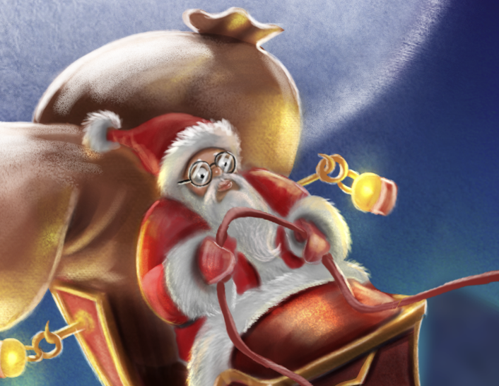
-
@Rich-Green
Thanks Rich... Yeah it seems there are a few people that feel the moon needs a change. I will mess around with that. Thank you -
LOVE IT!
-
@bharris Thank you!
-
@Kris-Knight Your rendering skills are very good. Love the image! The only comment I have is what if you de-saturated the background a little to allow your characters to pop. In specific the turquois lighting. My eye keeps going there. Just a thought....great job!
-
@Rob-Smith Hey Rob. Thanks for the critique, I'll definitely mess around with the saturation to see what it looks like. Thanks
-
NEW WIP
So here is another version of my 3rd Thursday. Based on critiques as well as painting in a different style.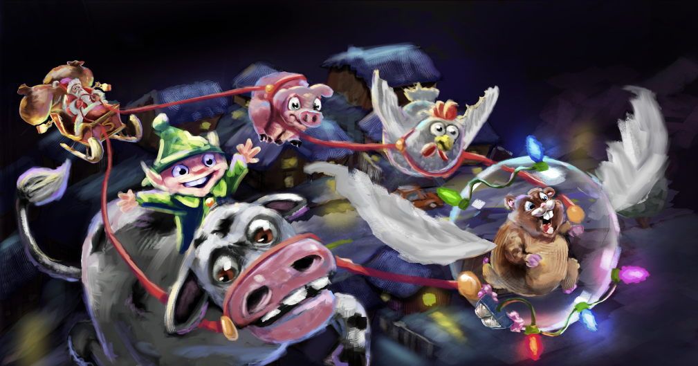
-
Hi Kris. I don't think their speed is coming through because there isn't a continuous line in the reins. The angles are all broken up. I liked their expressions in the original. The cow looks like he's going "meh" in this one. You know when someone takes off in a fast car and they get pushed back and look like they're straining against it? That would show how excited and surprisingly speedy that hamster is.
www.lydiamueller.com
Twitter @lydesigns -
Very nice Kris!
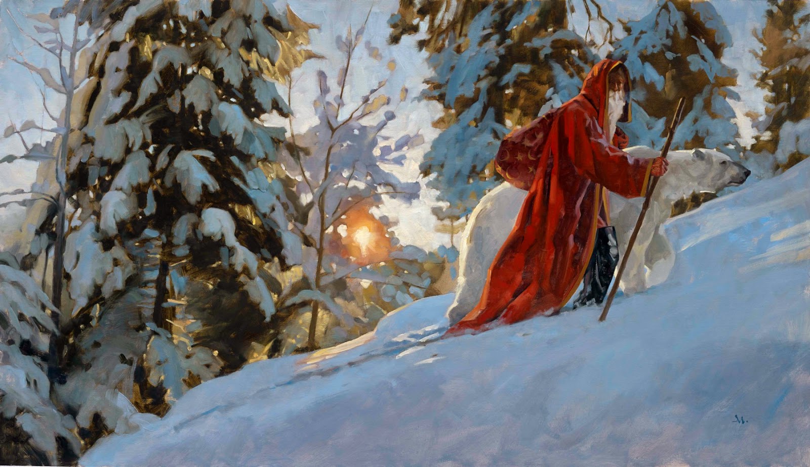
I think the original version is working much better than the newer one. Although it's fun to see the alternate style. Right now the most recent version feels like a sketch. I'm a big fan of loose painting, but it has to have a "finished" look to it as well. Check out Gregory Manchess to see what I'm talking about (shown here).
-
The big thing I'd watch out for in both versions is overlighting the scene. It's easy to get carried away with all the individual elements receiving a highlight, lit side, core shadow, shadow, and reflected light, but it's best to think about overall local value and then slightly brighten the lit side and slightly darken the shadow side. Reflected light should be a value or two darker than the main light.
In order to see what I mean, squint at your image and notice the value structure. there are brights and dark spots popping out everywhere. Now squint at gregory manchess's images. See how all of that broken paint work just calms down and goes into either the light or dark?
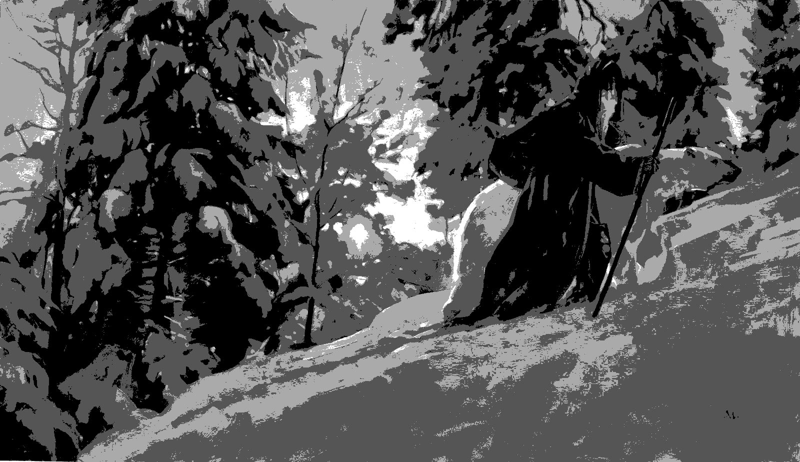
Here's a way to test that idea. I grabbed Greg's image and yours and ran them through the "posterize" filter in photoshop (set to 4 values). It basically simplifies detail down to it's local value and color. Look at how well Greg's holds up. It looks like a simple version of the original painting while yours gets a bit too spotty (Meaning there is too much highlighting going on).
Hope that helps some. : )

SVS Faculty Instructor
www.leewhiteillustration.com -
I like the new layout much better. Then hamster reminds me of Rhino from Bolt! Haha!
-
@Lee-White
Lee, I really appreciate you taking a look and giving me your feedback. I never did the posterize thing before so I will begin using that from now on.... I had been just desaturating everything to see if it was reading but now I see there is more to it. I'm a fan of the painterly style, for instance marco bucci and Zac Retz so I figured I would take a stab at it. Perhaps you would be kind enough to give me some direction about something. I'm worried that the "style" that I seem to be "okay" at is the more rendered type like in my first version but I have a big worry that it may not be a marketable style. I see everyone talking about attempting to make things look traditional.... so here is my question. What style should I be trying to achieve in children's book illustration? My goal (like others here) is to be an illustrator and writer/illustrator, so with that in mind I want to work towards a style that would be looked upon positively, so is the style in the first image I created marketable?.... or would it be better for me to really begin to work on finding a different style???? Thanks a bunch Lee I hope you can send me in the right direction. -
Haha yes. After I thought about using the gerbil for my image Rhino became one of my references
@Sharon-Sordo -
@gimmehummus Definitely a good thought. I'll be honest, I'm not sure how I would do that haha. On this version I was mostly trying to get it where it appeared like they were all working together. I'll have to think about that one.