January Prompt WIP (Critiques Requested)
-
@carlianne I wouldn’t worry about it, they’ll probably turn out way different regardless
")
-
Hey all! I rearranged things a bit. I think it’s more engaging now, you all
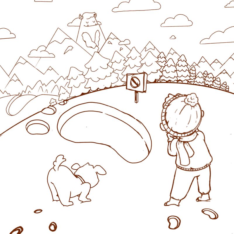
I have a question - is this sign too close to the center of the composition? Does it hinder or help? Maybe I’m overthinking?? -
@Kalimostlypaints I'm not sure if the sign is helping. Is it supposed to tell people not to enter there?
I wonder if you put the monster on the 1/3 to the left if the compassion would work a little better. He's kinda in the middle right now.
 ️
️ -
Hi Kali, thanks so much for sharing your process... it’s inspiring to see you utilizing suggestions. I am always in need of a good example of detachment when it comes to rough drafts.
It’s just my singular opinion - and others are surely free to disagree - but I think your first composition was stronger in a couple ways... 1. You could see all the characters’ faces and expressions, and 2. the composition had the potential to lead your eye in an arc around the canvas (from characters to footprint to mountain) instead of in a straight line as you have now. I think that gave your other piece more interest, and it allowed us to explore the picture for a second longer before getting to the “punchline” of your adorable mountain giant. I already mentioned how the idea of adjusting the footprint intrigued me... perhaps as a left foot print instead of right, or turned slightly more toward the mountain range. I love this piece and am looking forward to learning from the rest of your process. Thanks for sharing! -
@KathrynAdebayo I do think I prefer the original as well...without seeing their faces it's hard to sense how they feel. Also, the main character could be noticing the monster, she's facing that direction. I agree that a left footprint on the original would pretty much guide you toward the next. Again really cute idea overall!
-
@KathrynAdebayo Thank you so much! I really appreciate your thoughtful feedback. I might go back in and rework what I have so far. You’ve brought up some good points, it might be nice to have a way to lead the eye around the composition some more and show more emotion in the characters. I appreciate your thoughts
-
@Kalimostlypaints Good luck! And no problem. Your piece looks great, and I like the style of the other work you’ve shared on the forum! I like your sense of colors especially.
-
@KaraDaniel Thank you Kara, that is helpful to know! I appreciate the feedback!
-
@KathrynAdebayo Thank you Kathryn, I really appreciate it! I struggle with colors so I’m thankful to here that
-
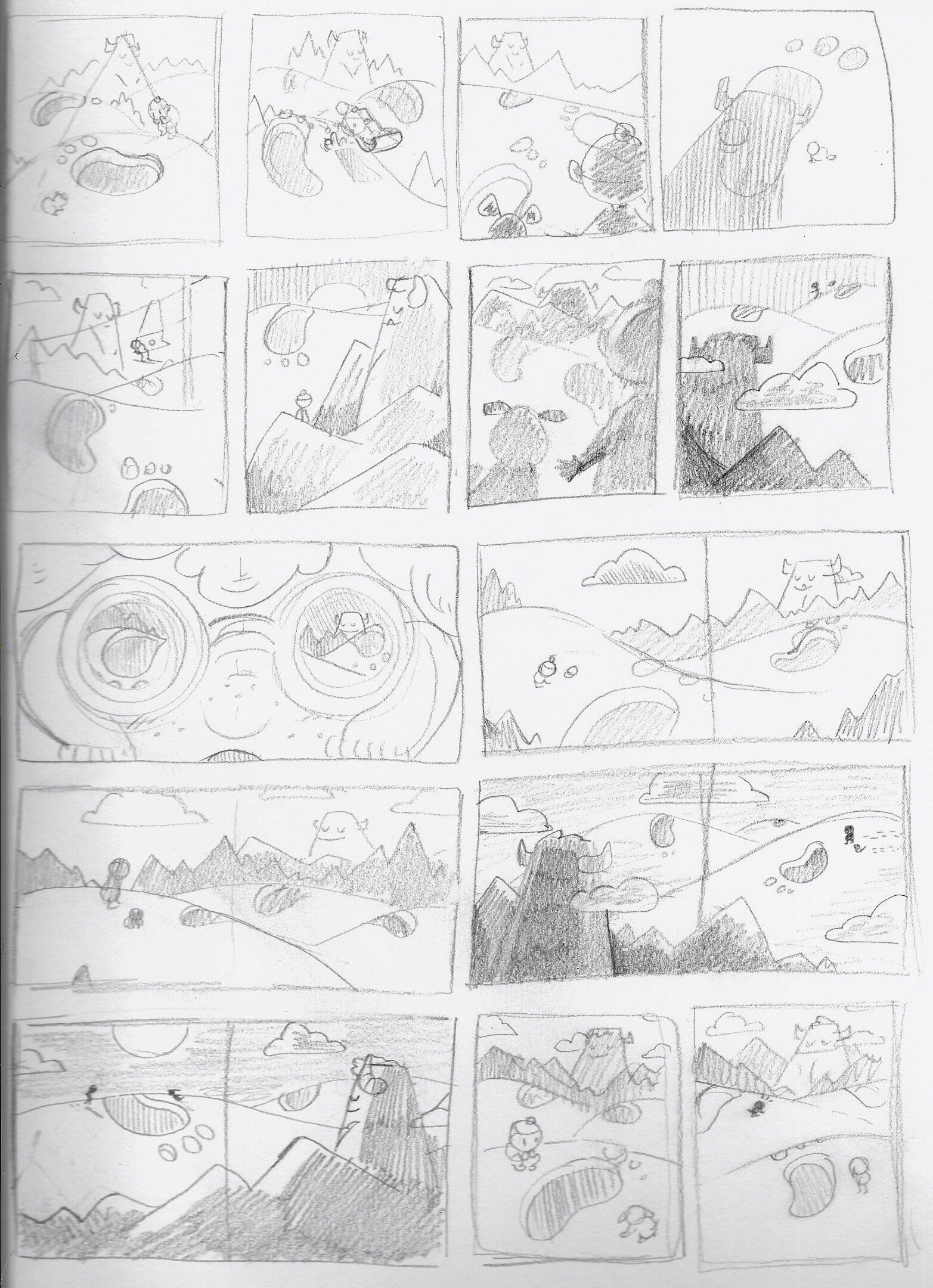
I drew a few more sketches last night, not sure if I’m happy with these though! Many are similar to each other and don’t seem to solve the main problem at hand with showing the character’s emotion/facial expression while also moving the eye around the canvas in a pleasing way. I guess my mind keeps prioritizing the size contrast between the character and the monster. I think I’ll keep plugging away at these after work
 I had some sketches previous to my original that I never posted. Maybe I should consult these for my next round of comps (ignore the failed sketches in the upper-right...)
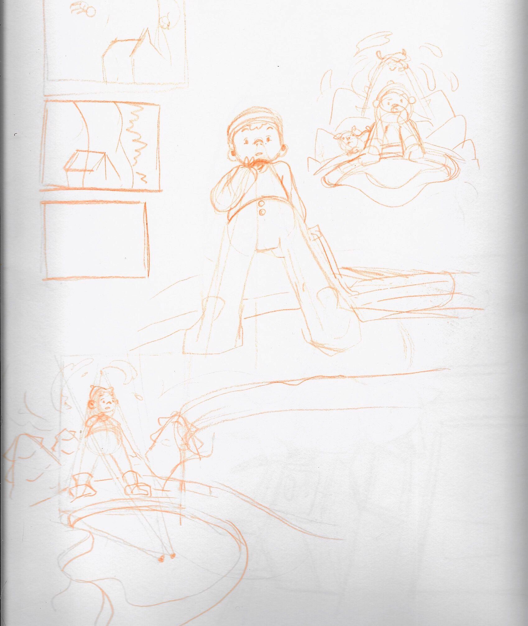
-
@Kalimostlypaints love to see your process and I like a lot of your thumbnails. I think there are so many workable ones, depending on what story you want to tell.
Talking about thumbnails, Lee made a youtube video about how to do thumbnails and how to choose. I found it very informative and inspiring. Maybe it could be something interesting for you as well?
https://www.youtube.com/watch?v=jghVE4V5FfU -
@xin-li Thank you Xin, I appreciate your recommendation
I’ll give this a watch tonight before I work on the thumbnails. I’ve always had trouble with them, especially with making them small enough! -
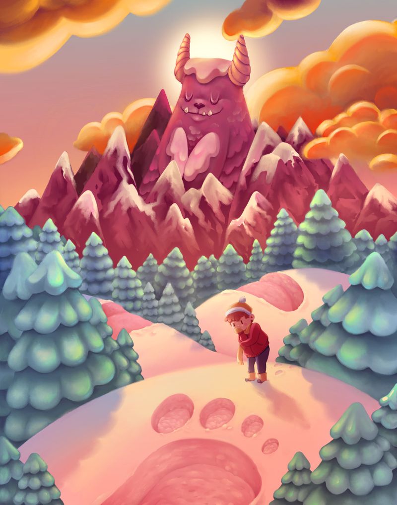
I think that I am just about done here... scared to call it finished until the end of January lol! Definitely not perfect but possibly one of my best lighting pieces so far (in my opinion, anyway)
-
@Kalimostlypaints super cool! In fact i have a similar idea... and now nobody will believe me;-) There is a mountain in Slovenia that looks like a giant and I wanted to use it in my illustration. I won't give up this idea but now i have a harder task having such great competition! Anyway well done
-
@aska Thank you!
I think a few others had the same idea as well, great minds think alike! -
Wonderful! My only thought on anything to change would be to have different values on the trees...closer to the viewer darker...would add a bit of contrast to the overall piece and get more of a sense of depth. I really love how you handled this challenge, great job!
-
@Kalimostlypaints it looks really good, my suggestion is to look at the balance of the little boy. I think the leg closest to is should be closer to the footprint than the one further away from the footprint... The feet look like you could draw a horizontal line right under them wish makes the back one look longer. It's a super cute idea and the composition is great!
-
the snow looks amazing, well rendered!