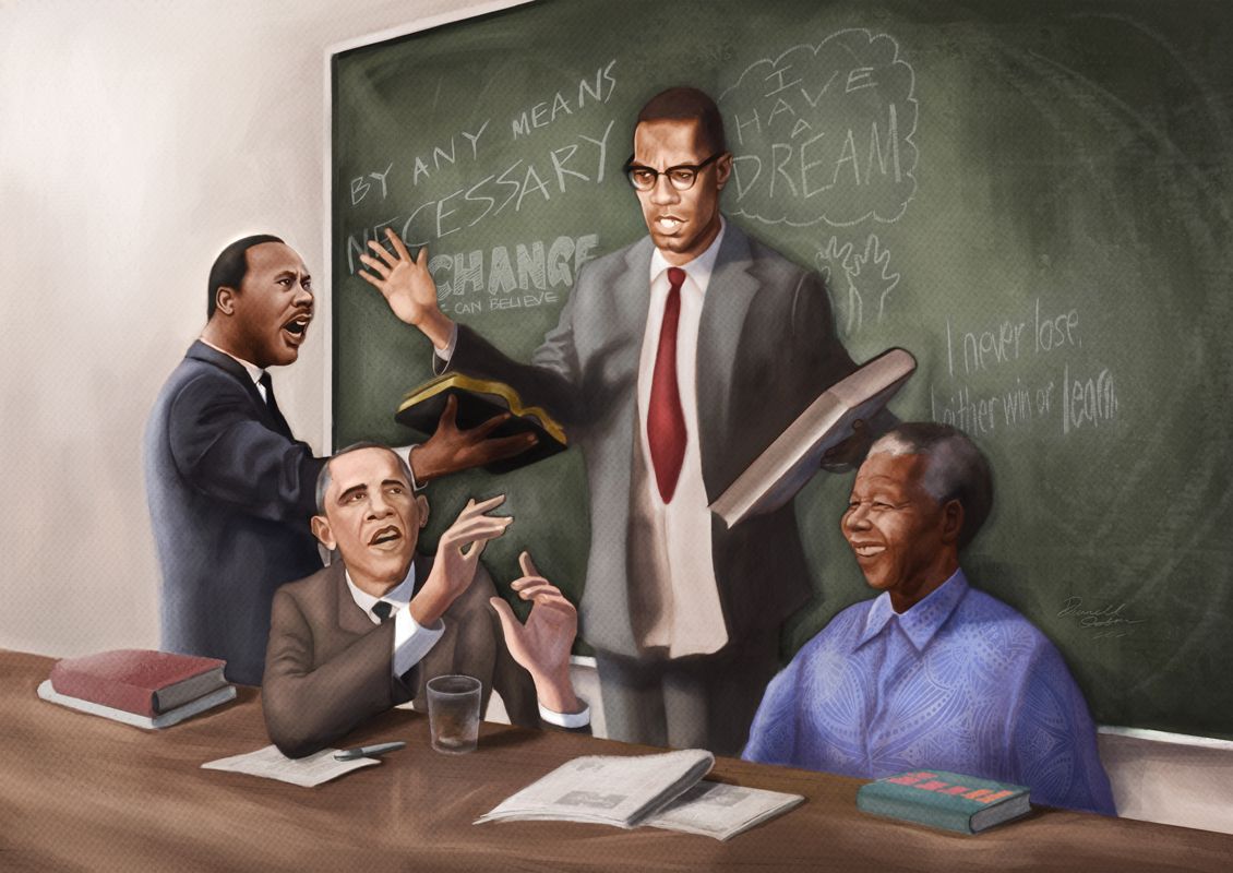
Completed project. Serious critiques/input please
-
Just finished a project here. Please let me know your thoughts. Thanks.
-
Hi @Durrell-Odom, firstly, it’s a beautiful piece! Nicely done!
You’re asking for a serious critique, so I’ll give it a go. Please keep in mind that I’m not a pro, so my feedback is merely peer review.
Thoughts:
The facial expressions all show different emotions, not sure if this is intentional as capturing the essence.
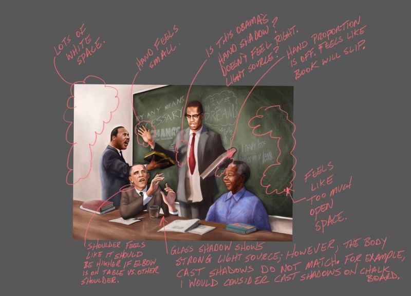
All other comments are shown in below.
Hope this helps.
-
This is a nice piece @Durrell-Odom! The facial expressions are great and your comfort in painting shows.
There are a few areas I'd like to crit. Although depending on the context of the image, they may not be important. The first thing is overall concept. I know they are all in the same room, but it doesn't appear that they are interacting with each other. This gives them the appearance of being painted individually and then collaged together (if that makes sense). Again, if this is going with a magazine article that has a headline to help clarify the scene, then my crit will not be as valid. But something to think about nonetheless.
The next thing is trickier and has to do with the art. They are sort of realistic in terms of proportion and pose, etc. and they are sort of caricatures like we are used to seeing from you. The snag is they are right in the middle and probably need to lean one way or the other. I think this may be due to the height/scale difference between MLK and Malcom X. I know that is tricky because Malcom was very tall and MLK was on the shorter side. I'm just guessing here on what gives it that quality. But something about it makes it seem like they are all separate and also slightly characterized. Anyone else have thoughts on this?
Those small crits aside, I think it's amazing how you captured the likeness of the people. No easy feat and one that I think many people wish they could do! : )
-
@Lee-White is there a slight problem with how the figures fill the space between the desk and the blackboard? It's as if Malcolm is standing alongside Mandela, both of them filling the gap between the desk and blackboard completely, but also simultaneously next to and behind Obama, who should also fill the gap between board and desk.