Critiques welcome
-
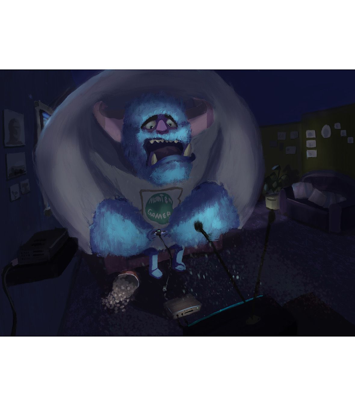
Hello guys , me again lol
I wanted to share with you my new study, I'm not sure if the perspective is correct and the colors inside the dark room,
I have a lot of difficulty with environments
-
This is cute!!
One thing I would suggest, to increase the depth and form of the monster is to ponder the impact of the light. Try finding some source material that indicates what it's like to play videogames or watch a movie in a dark room. You might find that the room itself becomes a bit more suggestive and not all the body of the monster might be see-able... In other words, I'd push the lights and darks a bit more, because it looks like you're leaning in that direction (the walls are all dark blue and shadowy)...
Just a thought.
")
-
This is such a fun image! I like the scene and oversized monster! It’s just cute and funny! Some things you might consider ...play up the fur texture along the edges ...cast some blue tv light on objects to help bring them out...use a ‘glow layer” to add light to the monsters face...hope this helps... thought I would try a little work over to test out some things...before I go to sleep...really fun image and idea!!!!! Hope this is helpful. Crit notes.png
-
-
@yuriqart looking good! I think you are really improving the image!
-
@yuriqart hey this is my first comment here, im not an expert of any kind so I can't critique that much, but this image is so much better than the first one. keep the good work.
-
Thanks man :

@Adolfito-Martinez said in Critiques welcome:@yuriqart hey this is my first comment here, im not an expert of any kind so I can't critique that much, but this image is so much better than the first one. keep the good work.
