Nightfall WIP Feedback Request
-
@jdubz I think the details look nicely balanced. If I were to add details it would be to your character at this point. It would also be really interesting to see you try texture. If you're interested Lee White has a YouTube video on how he does digital texture that's pretty great.
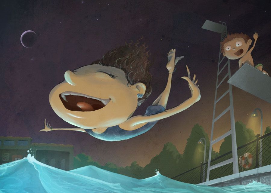
Also did you intentionally flip the moon so that the ends point away to the corner? I'm feeling a bit distracted by the moon like it's fighting to be a focal point. Might be because it's pointing away or too big or too bright? Just something to look at.
Overall it's looking really nice and polished! Kinda wonky in a fun and intentional way

-
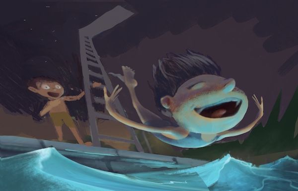
@jdubz Hey Josh - this is looking cool - i loved your January Piece!! super nice - you are way better with color than i am so i hope you will forgive my crude attempt but i did have a couple things that would be easier if i tried to show them - i think that this would be a 3 point perspective is the main thing - i am sorry i am chiming in so late since you asked about the perspective a couple of times - i really feel like the eye level is so low it would have to be three point and the diving figure seems to be drawn in three point also - tilting the ladder dramatically back seems to do the trick - was also wondering what it would look like with less action besides the diver and no moon too - the the moon is so commanding it is hard to look away from it - lastly i was wondering about lighting the bottom of the face and the top differently might be cool thing to do on this piece - my attempt is quick and not too well done but i think it does seem interesting - anyways...could be wrong on this stuff..very nice piece
")
-
@Kevin-Longueil Thanks for the feedback Kevin, I appreciate it! I'll see what I can do to the ladder. My main initial idea is I wanted it to feel a lot higher. Maybe I can try and fold it back a bit. You might be right about the moon.
@carlianne Yeah I did intentionally switch the moon because I was thinking the light from the sun wouldn't be reflected on the other side. Maybe that's detracting and it's less important to be accurate?
I think I've seen that same video from Lee about texture and I've got a huge amount of textures I can play with. I use it a lot in my day job, so maybe that's why I'm resisting use it a lot here hah.
-
Maybe just a super diminished moon comparatively that's turned back around so it points back to her?
-
This is such a fun image! Personally, I like the smaller moon, but taking out the ladder/diving board and other characters makes the image a little less fun for me. It also feels more about that one character, as opposed to a whole story, so I suppose it depends on what you're going for from a narrative point of view.
-
@jdubz yeah that doesn't distract me!
And I know what you mean about not wanting to do what you do at your day job. I don't get to use any texture at my day job so I do soooo much of it in my personal work
-
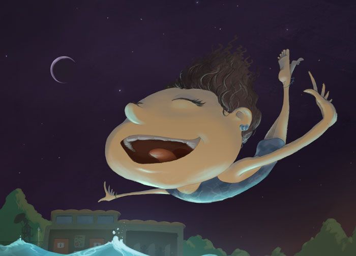
I've reworked a number of things so far just to see how it feels. I definitely agree with pushing that ladder back. I experimented with some ideas that didn't require a total redesign of that side, and I think I got something that's pretty good - the ladder and the boy on the 2nd board now intersect so it's a bit more interesting and less busy at the same time.
I also cropped the image significantly, moved her down, diminished the moon and flipped it back over. My hope is that is helps you keep your eye in the middle as you look around - whether I was successful or not I don't know lol.
Lastly I fixed her hand so hopefully it doesn't look too janky
 I also detailed her some more and added a good amount, and polished it with a few texture options from straight up canvas to this one here which was a bit more interesting and I liked how it accentuated the colors.
Does this seem too much??
-
@jdubz Wow! I think it looks great! I think it looks like a contender!
-
@jdubz I love all of the changes you made!! Beautiful.
-
Thanks all - really appreciate all the feedback!