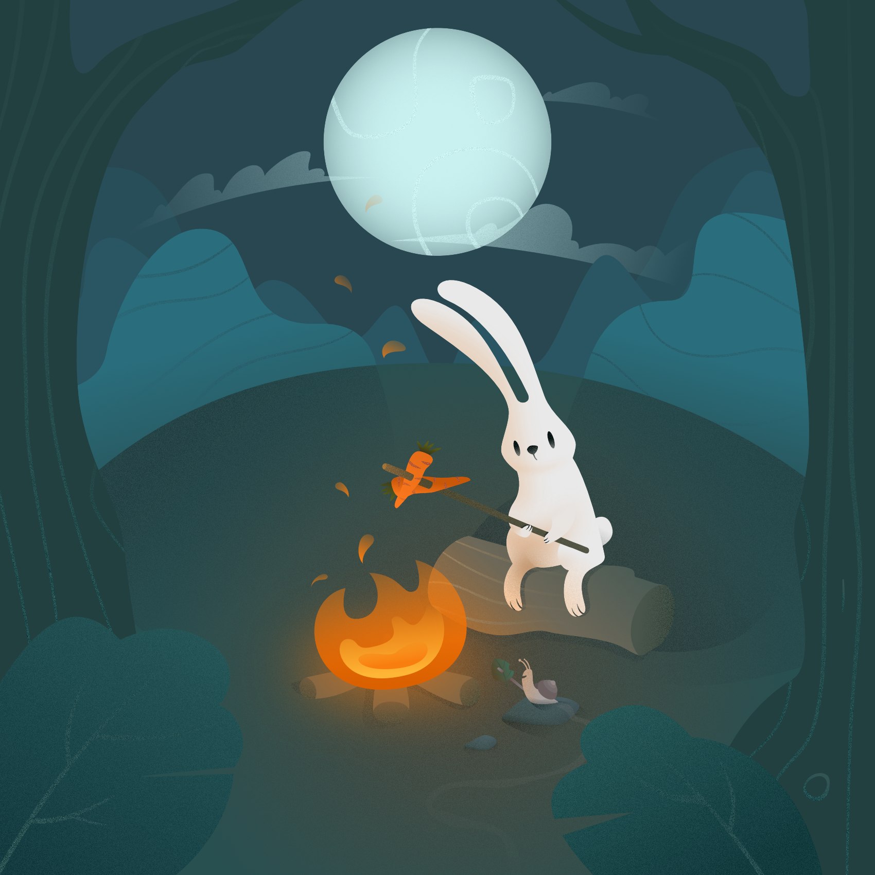
Critique request on Illustration
-
Hi SVS! I would love to get any and all kinds of critique on this one

I tend to not be able to take the opinions of people close to me seriously because I have a fear they might take pity and say nice things about the stuff just to not make me sad hehe... Really frustrating feeling
 I would love to just have some unbiased eyes looking at this
Have a great day everyone! Cheers

-
Hi @Johan-Schneider, cool piece!
Few things I noticed for your consideration. I’m no expert though, so feel free to dismiss.
-
Moon is taking a lot of attention. Also, it looks like an orb directly above the rabbit. Perhaps push it back and add saturation?
-
The carrots and fire are same color; perhaps consider changing to make one stand out?
-
The snail doesn’t standout; you almost don’t see it unless you look hard. Perhaps contrasting colors?
-
Since you have an open fire, you might want to add more warm colors around the fire?
Overall, I like the background and story!
Best!
-
-
Thank you for the critique! Great points
")
-
@Johan-Schneider Looks cute! Love the limited colour palette.
I agree that the snail doesn't stand out and I didn't notice it at first. I don't know if there's more of a story behind the characters but if not, I think you can get rid of the snail altogether. If he's essential, then put more of a focus on him.
Also (and I'm constantly guilty of this too), your composition is very centered. It's not necessarily a bad thing but you can try moving stuff around and see if it makes the overall image more interesting. Like having the character and fire a little closer to the bottom right corner and the moon more in the top left to balance.
The texture is nice too, you can even add a paper texture as well if you want to make it look less vector
-
Hi @Johan-Schneider ! I love your style and especially how you drew the rabbit.
I think it would be nice to add just a few multiply and color dodge layers to make what you already have pop : )
-
Hi Johan, overall this is really lovely! Your rendering a design are really attractive. The previous commenters have already given the critiques I would have given, so I'm just here to say I agree with their observations.
Thanks for sharing. Great job.
-
Thank you so much everyone for the notes and the kind words
I agree with all of them actually. The snail I added because I wanted to have a little something extra to find in the image, I'll see if I can add some more contrast to it to make it stand out a little more. And the draw-over was very helpful @Katie-Kordesh ! thanks for taking the time Great point also @Melanie-Ortins with the composition!I'm going to try doing some of these changes and then post it it again here if you guys are curious
Again, cheers to you all for taking your time, very helpful
