Vehicle Design course
-
@Aleksey very nice! I wish I had slowed down now on mine lol, I kind of rushed them. looking great, I love your strong and weak ones too. I haven't gotten to that yet
-
@Coley yeah I’ve been trying to teach myself patience because normally I’d rush through it because theres so much to learnnn and i wanna learn it allll but if I slow down I can nail it better.
-
@ArtofAleksey looks pumped up on good old gas. I can take on any road feeling.
-
Wow guys these are so fun! Makes me want to take the course.
-
@ArtofAleksey agreed. I typically even watch the videos a few times. It doesn't all stay in the memory banks. I have the same repeated Aha moments over the same information lol
-
@TessaW do IT


 lol no pressure but I actually didn't expect vehicles to be fun and they are!
 -
@Coley yes! Doing the assignments though (which I usually skip) helps me retain the info
-
@ArtofAleksey yes I always do the assignments. Except I haven't done the ones in Lee's storytelling class and keep meaning to!
-
@ArtofAleksey great work! Very interesting choices.
-
@shanehunt thanks! I kept trying different things that didn’t seem to working the way I envisioned though so this was my result.
-
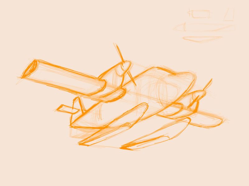
Part C of assignment 1
I had trouble with the propellery attachments but i think it turned out ok
-
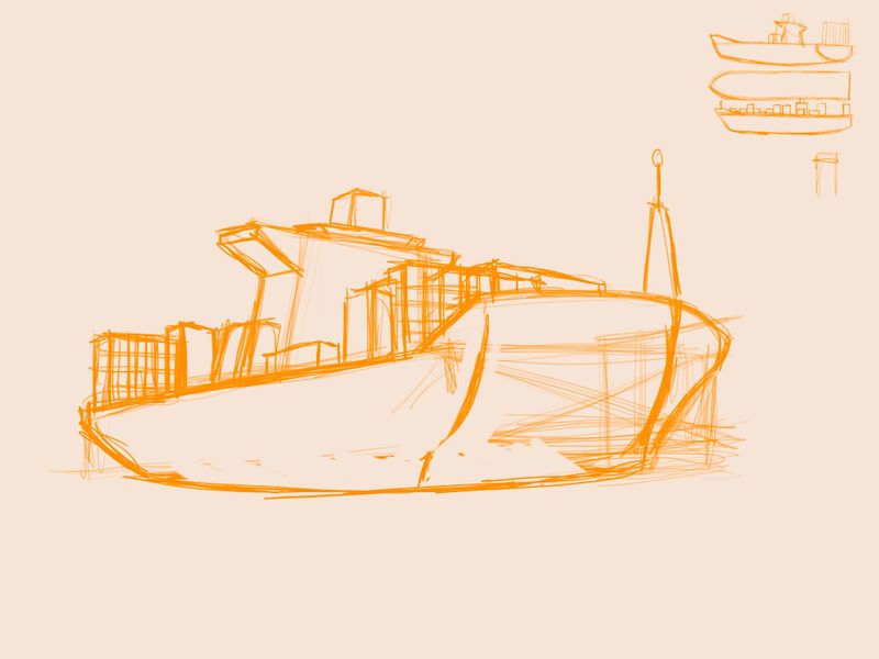
Ok part D of assignment 1
This one was really tough
I do not like cargo ships! Really struggled But i am better at them now.
-
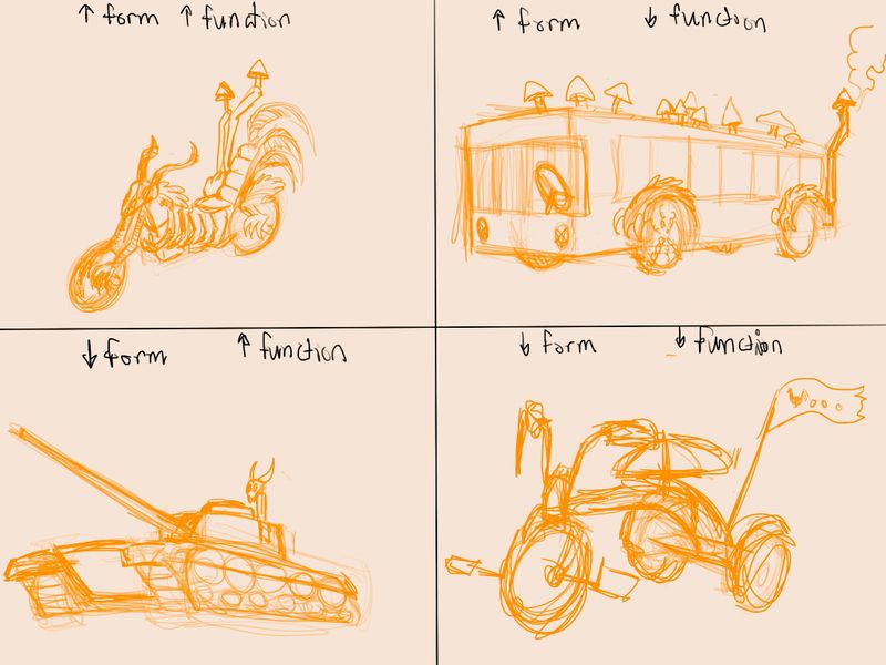
Ok by popular request here is assignment 2 with baba yaga in mind
High form high function- i did a hog with mushroom shaped exhaust and ribcage around the engineHigh form low function - moscow bus but with some magic forest elements? And chicken feets around the tire thingies
Low form high function - a tank with a skull on top
Low form low function - a tricycle
I think i could push some stuff if i worked on it more but im ready to Move on
-
@ArtofAleksey Cool choices on that form vs function assignment. Do you feel confident with the concept of form vs function? I feel it’s an invaluable design principle, but I want to make sure it is clear in my course.
-
@shanehunt I think so. I think more examples wouldnt hurt of things that have lots of form and low function, or vise versa. Like ones that exist. But it does make me think of scenarios where I would see those kinds of things and it reminded me of that episode Of JLA where superman Was stranded on a red sun planet and had to figure out how to survive. Functional but not pretty. Or silly contraptions that Joker would put together in Batman animated cartoons. Something that looks ridiculous and might blow up in his face.
-
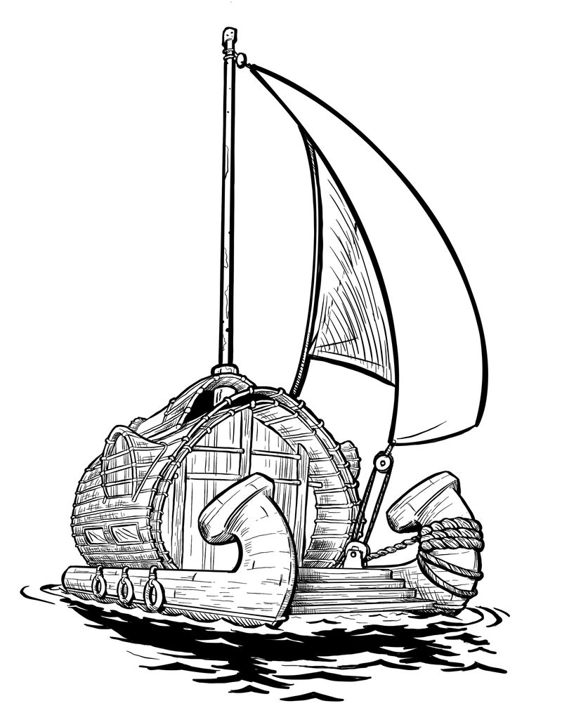
Ok for the reference assignment i combined a catamaran with an interesting looking houseboat. I really struggle with boats. I have no idea how ropes work and sails connect to things and google isnt that helpful But hopefully is convincing enough. Also @shanehunt i stole your water reflection style (or tried to) so ty
I really like how it turned out so I’m going to color it in eventually and stick it into my portfolio
-
@ArtofAleksey Okay, the boat is very cool and I like the design itself. As for the execution, I think one thing that would benefit your drawing is to use major forms to define the bounds of your object before you start drawing, specifically cubes. If you can think of everything as a cube first and lay it down as such in a very light initial sketch, it will be much easier to then “fill” those cubes with the shapes you want. You’ll get a more accurate perspective.
The view of the boat is pretty wide-angle, yet the fronts of the hulls seem to have the same shape. The hull on the left should be more foreshortened since it is closer to our eyeline. Also, the rope shouldn’t be changing in size so significantly. The distance from hull to rigging doesn’t feel great enough to warrant such a shift in size.
Lastly, the line weights are kinda all over the place. I suggest trying to use heavier lines to define the major forms (hulls, cabin, stairs) first. As it is the sail itself is getting a lot of weight and attention, but the sail should feel relatively light and breezy compared to the big, heavy, rigid shapes of the boat itself.
I like the cabin a lot and you nailed those side windows.Nice work!
-
@shanehunt awesome ty for the feedback ill keep these things in mind!
-
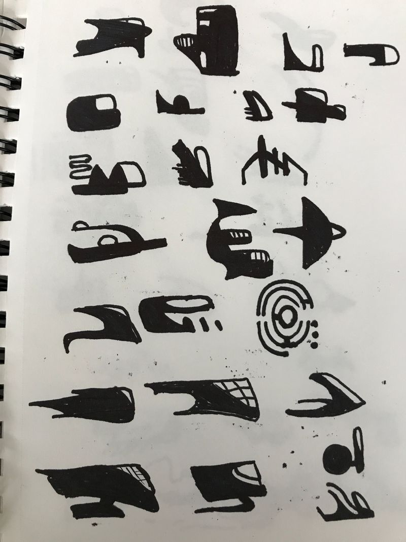
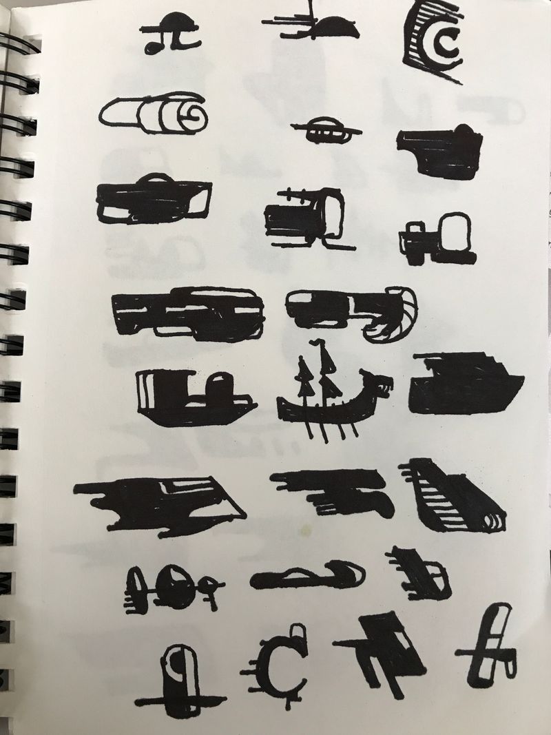
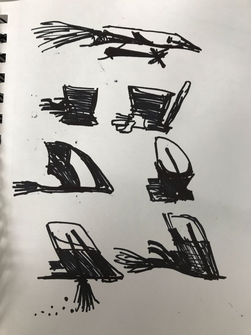
Ok here is part 1 of assignment 4 using silhouettes.
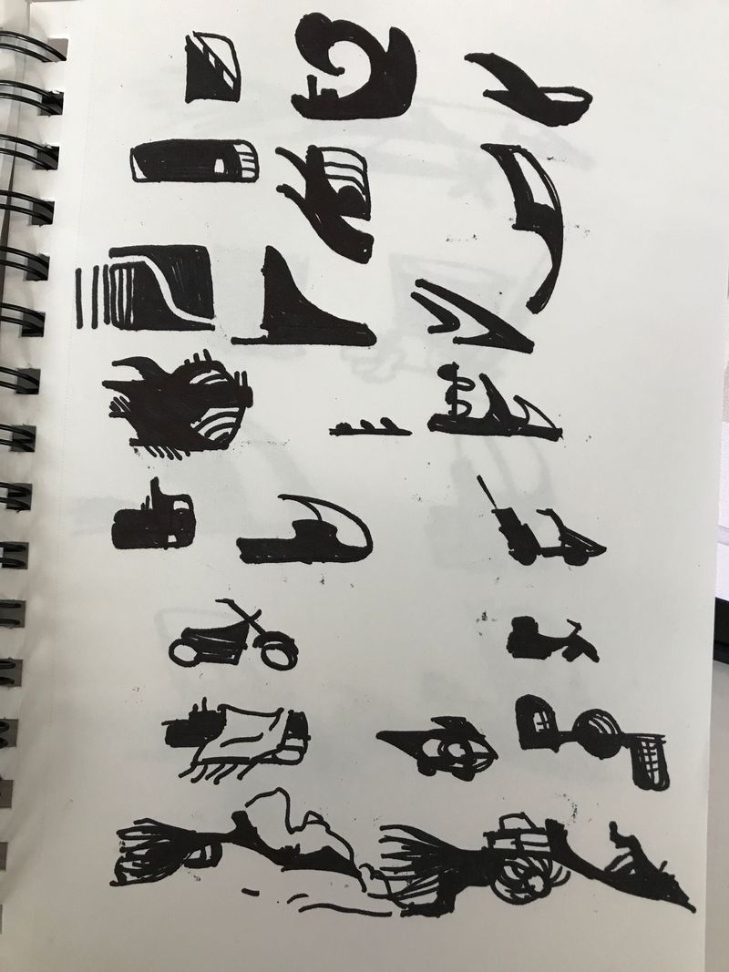
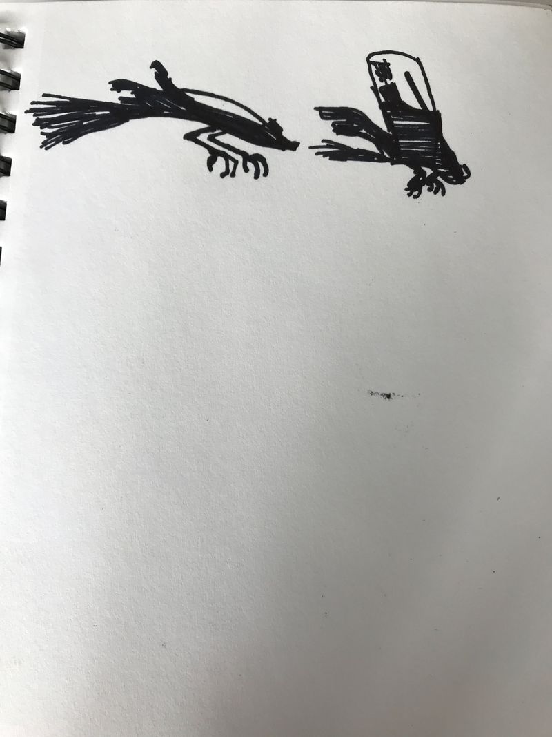
-
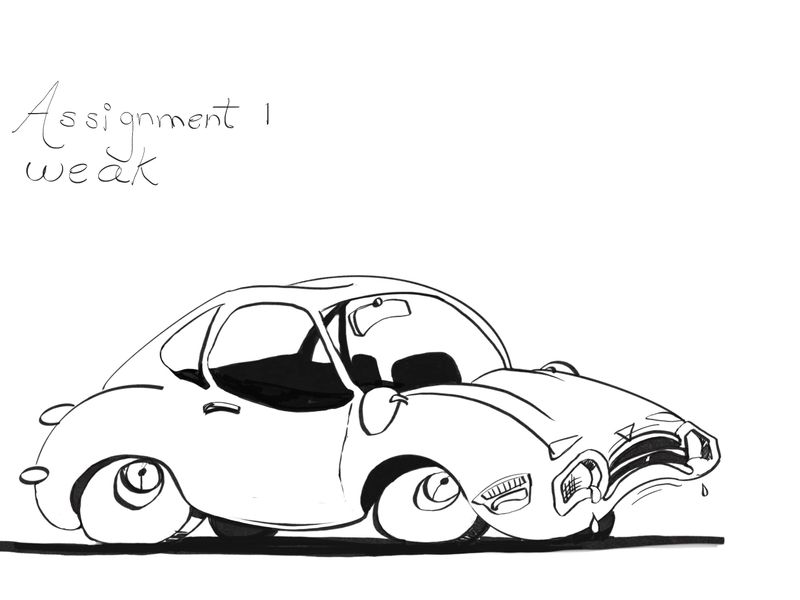
Ok @ArtofAleksey you have inspired me to keep going even though I’m going slowly! Weak car from assignment 1. I’m not much of an inker but got er done. Not sure my car looks weak enough but it does look sad I think. Maybe some of the lines in the mid section and rear of the car could have been a little wobbly now that I’m looking at it again. It’s great to start learning how to be aware of these things
