Society of Visual Storytelling

    SVSLearn Forums

    • Register
    • Login
    • Search
    • Recent
    • Tags
    • Popular
    • Users
    • Groups
    • Search

    Winter time illustration critique.

    Artwork
    6
    9
    325
    Loading More Posts
    • Oldest to Newest
    • Newest to Oldest
    • Most Votes
    Reply
    • Reply as topic
    Log in to reply
    This topic has been deleted. Only users with topic management privileges can see it.
    • cszoltan
      cszoltan last edited by

      Hello everyone!
      I was rely exited about the first art challenge of 2020, and I immediately started to sketch & paint, ironically since it was winter, in the last two weeks of January I got sick and I wasn't able to finish it, but here it is. šŸ˜„
      Please let me know what you think!

      Illustration_Snow_c.s.zoltan.jpg

      C.S.Zoltan
      Portfolio: www.behance.net/cszoltan
      Instagram: www.instagram.com/c.s.zoltan

      1 Reply Last reply Reply Quote 8
      • Neha Rawat
        Neha Rawat last edited by

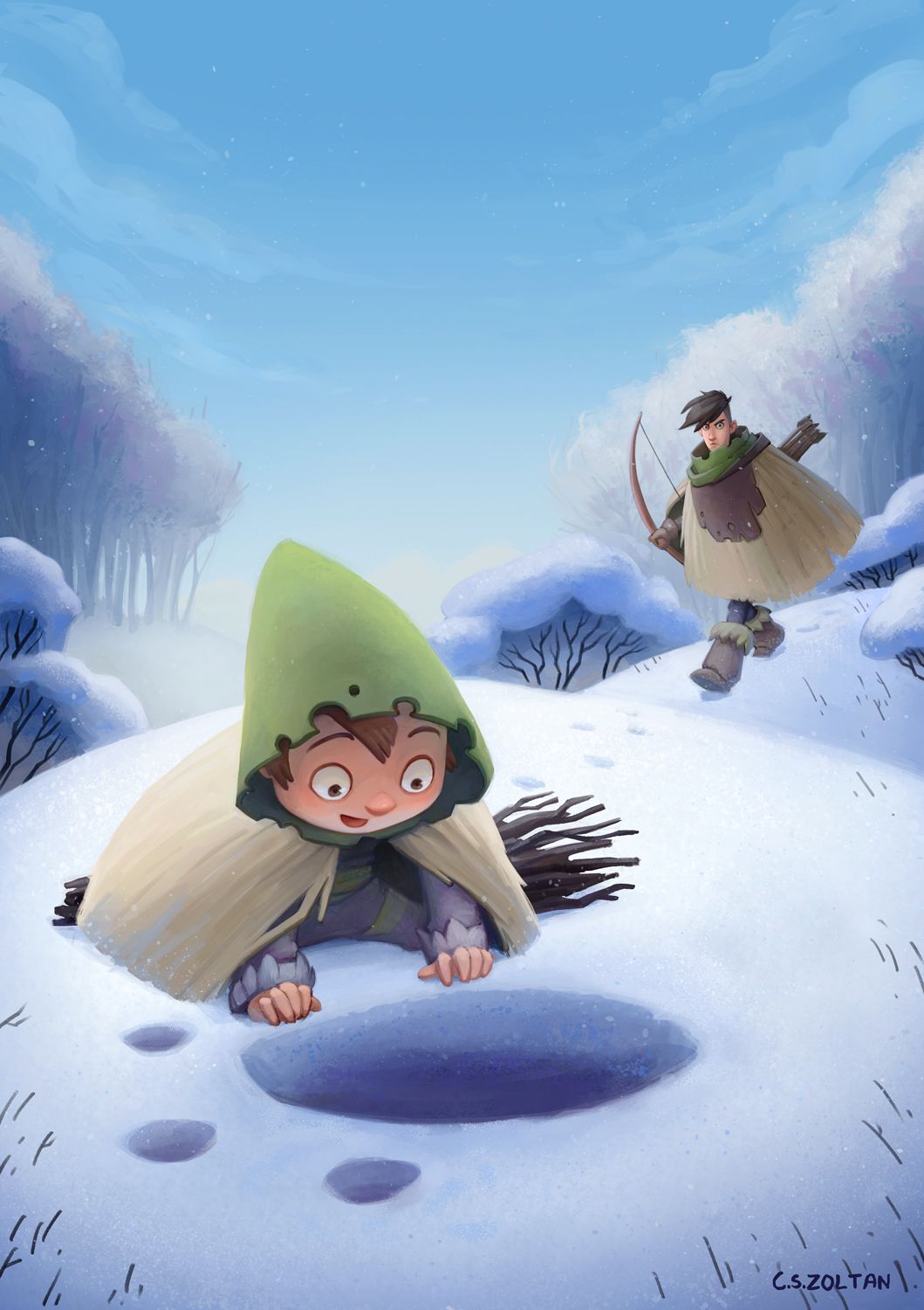
        Lovely work! I love the color palette and character design!
        I think the only thing is that I'd like to see the other arm of the hunter guy. Or at least an indication of it. Right now the cape feels like it doesn't have another sleeve opening.
        Great work! šŸ™‚

        https://www.nrbstudio.in/
        https://www.instagram.com/nrbstudio.in

        cszoltan 1 Reply Last reply Reply Quote 1
        • KathrynAdebayo
          KathrynAdebayo last edited by

          Wow, the characters are so well designed, and I love the scene. Since you have such nice atmospheric perspective going on with your background trees, I’d desaturate your walking character just a bit to make him fade back a little. Thanks for sharing!

          1 Reply Last reply Reply Quote 1
          • J
            Juli last edited by

            I was thinking the same as @KathrynAdebayo šŸ™‚ Maybe you could add fog to seperate the characters a bit? That would also lower the contrast of the branches in the back a little bit! But otherwise I really like it, especially the style šŸ™‚

            https://www.instagram.com/juliana.kralik/?hl=de

            Laurel Aylesworth 1 Reply Last reply Reply Quote 1
            • Laurel Aylesworth
              Laurel Aylesworth @Juli last edited by

              Strong perspective and storytelling here. Great job!

              www.laurelaylesworth.com
              instagram.com/laurelaylesworth

              cszoltan 1 Reply Last reply Reply Quote 1
              • cszoltan
                cszoltan @Neha Rawat last edited by cszoltan

                @KathrynAdebayo Thank you 😁 , I love designing characters, here is my concept sheet:

                Tracks-in-the-now-concept-art_cszoltan.jpg

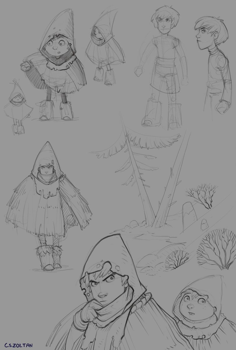
                @Juli I apsolutly agree, when my wife saw you post she said how could I miss something like this when I`m always so nitpicky šŸ˜†
                @Neha-Rawat Thank you Neha! Yes the "hay cape" appears to be too solid, it would be pretty difficult for him to shoot an arrow if he needed to this way

                C.S.Zoltan
                Portfolio: www.behance.net/cszoltan
                Instagram: www.instagram.com/c.s.zoltan

                1 Reply Last reply Reply Quote 0
                • cszoltan
                  cszoltan @Laurel Aylesworth last edited by

                  @Laurel-Aylesworth Hi Laurel, initially I had a strong idea of how I wanted it to look, but after a few thumbnails I ended up with something completely different.

                  C.S.Zoltan
                  Portfolio: www.behance.net/cszoltan
                  Instagram: www.instagram.com/c.s.zoltan

                  1 Reply Last reply Reply Quote 0
                  • ?
                    A Former User last edited by

                    Really nice, I like the composition & negative space- it really gives room for the story to come across (and great rendering too!)

                    cszoltan 1 Reply Last reply Reply Quote 1
                    • cszoltan
                      cszoltan @Guest last edited by

                      @CaroStoltz Thank you, the original idea was a book cover, and I left a lot of negative space in the upper half of the image, I still need to do the Title, something like "Winter tracks", illustrated by...
                      I will be updateing it soon.
                      Happy painting!

                      C.S.Zoltan
                      Portfolio: www.behance.net/cszoltan
                      Instagram: www.instagram.com/c.s.zoltan

                      1 Reply Last reply Reply Quote 0
                      • First post
                        Last post