Vehicle Design course
-
@shanehunt I think so. I think more examples wouldnt hurt of things that have lots of form and low function, or vise versa. Like ones that exist. But it does make me think of scenarios where I would see those kinds of things and it reminded me of that episode Of JLA where superman Was stranded on a red sun planet and had to figure out how to survive. Functional but not pretty. Or silly contraptions that Joker would put together in Batman animated cartoons. Something that looks ridiculous and might blow up in his face.
-
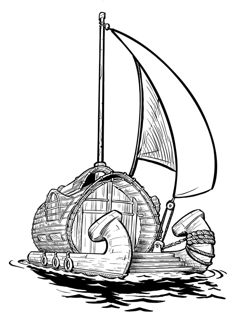
Ok for the reference assignment i combined a catamaran with an interesting looking houseboat. I really struggle with boats. I have no idea how ropes work and sails connect to things and google isnt that helpful But hopefully is convincing enough. Also @shanehunt i stole your water reflection style (or tried to) so ty
I really like how it turned out so I’m going to color it in eventually and stick it into my portfolio
-
@ArtofAleksey Okay, the boat is very cool and I like the design itself. As for the execution, I think one thing that would benefit your drawing is to use major forms to define the bounds of your object before you start drawing, specifically cubes. If you can think of everything as a cube first and lay it down as such in a very light initial sketch, it will be much easier to then “fill” those cubes with the shapes you want. You’ll get a more accurate perspective.
The view of the boat is pretty wide-angle, yet the fronts of the hulls seem to have the same shape. The hull on the left should be more foreshortened since it is closer to our eyeline. Also, the rope shouldn’t be changing in size so significantly. The distance from hull to rigging doesn’t feel great enough to warrant such a shift in size.
Lastly, the line weights are kinda all over the place. I suggest trying to use heavier lines to define the major forms (hulls, cabin, stairs) first. As it is the sail itself is getting a lot of weight and attention, but the sail should feel relatively light and breezy compared to the big, heavy, rigid shapes of the boat itself.
I like the cabin a lot and you nailed those side windows.Nice work!
-
@shanehunt awesome ty for the feedback ill keep these things in mind!
-
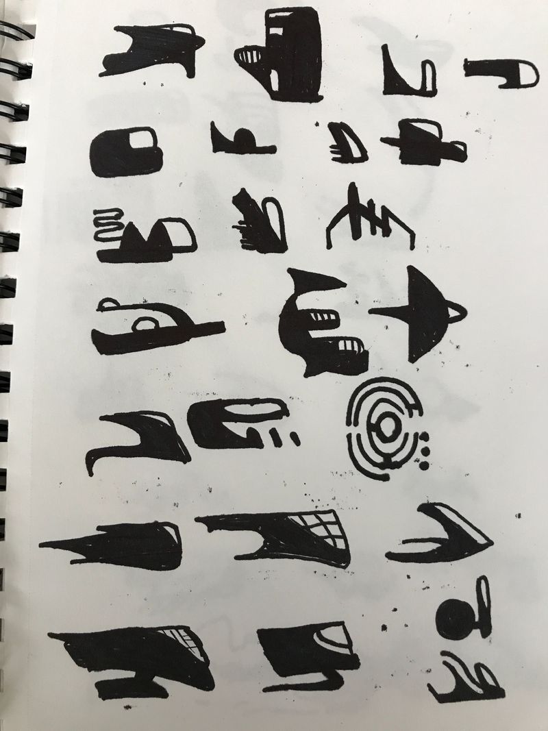
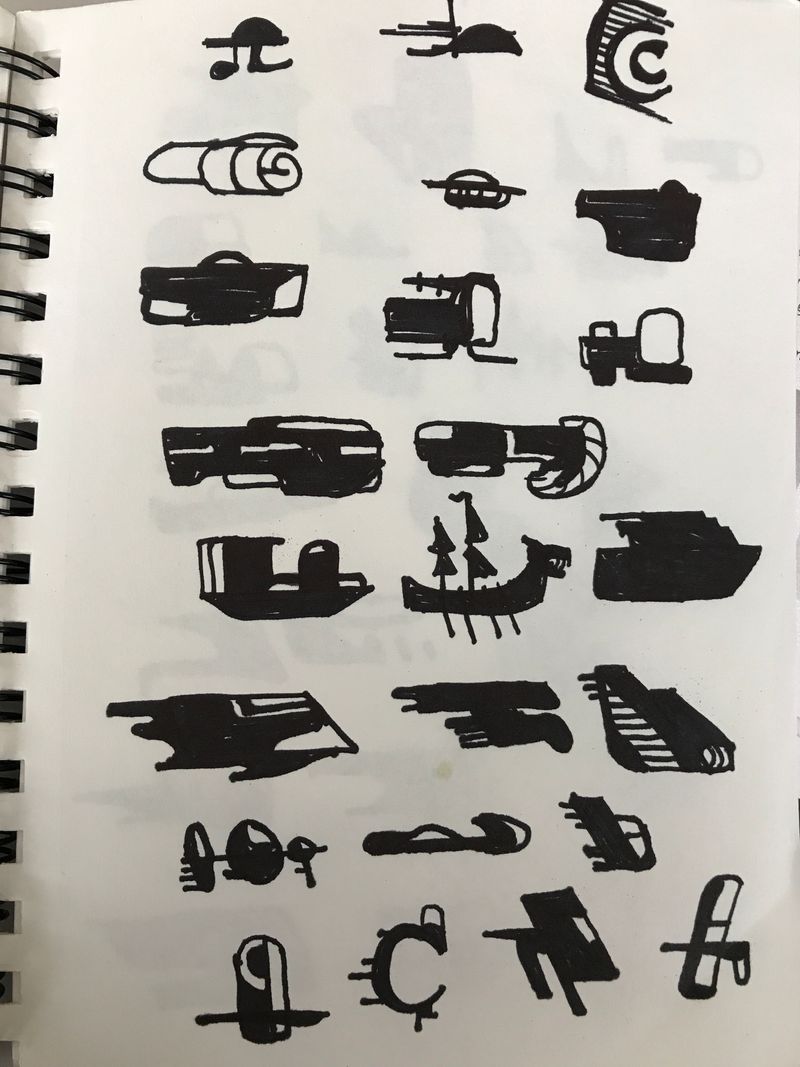
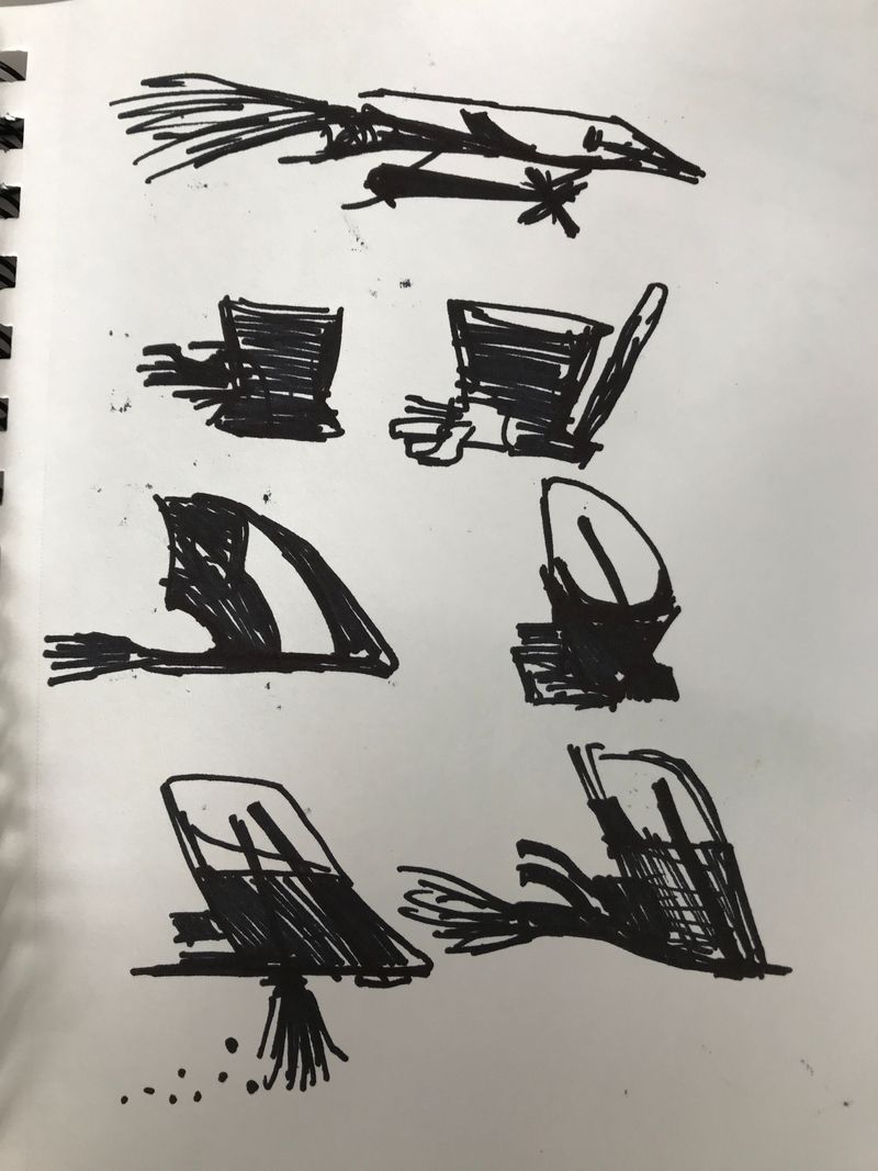
Ok here is part 1 of assignment 4 using silhouettes.
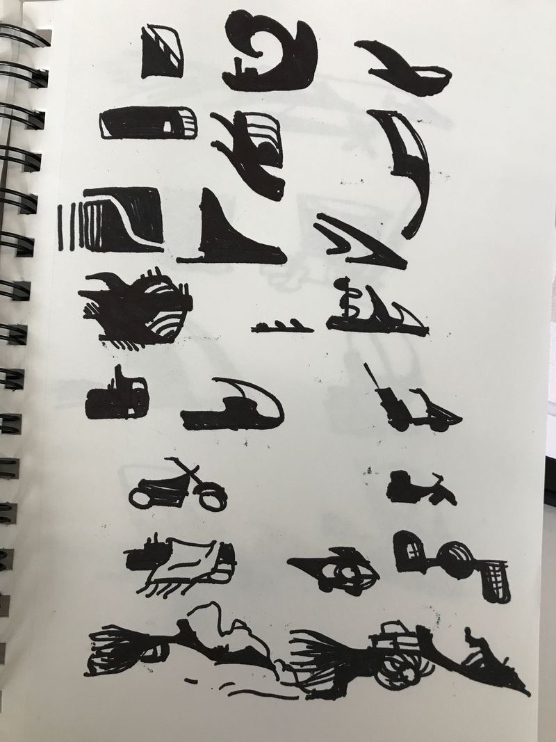
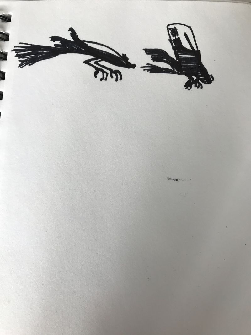
-
Ok @ArtofAleksey you have inspired me to keep going even though I’m going slowly! Weak car from assignment 1. I’m not much of an inker but got er done. Not sure my car looks weak enough but it does look sad I think. Maybe some of the lines in the mid section and rear of the car could have been a little wobbly now that I’m looking at it again. It’s great to start learning how to be aware of these things
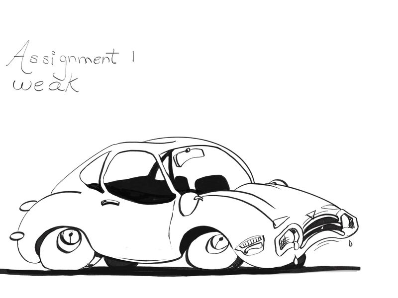
-
@Coley yeah it broke my brain trying to make a car look weaker. But it was fun!
Im glad you’re picking up the pencil again!
-
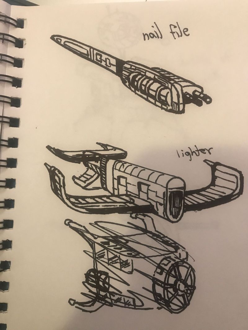
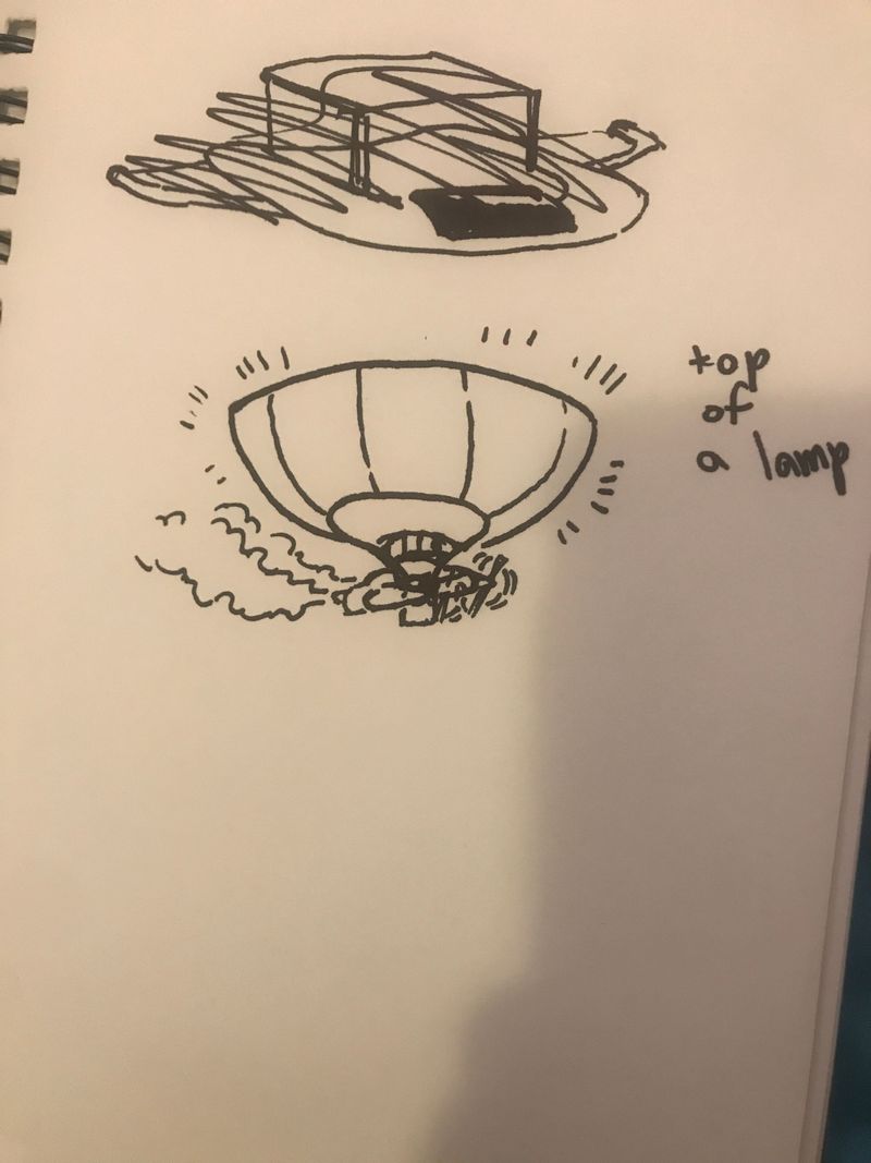
The rest of assignment 4. I reallly liked the Asymmetry exercise. I really struggled during the using everyday props. But i think i tried to turn them into vehicles like spacegoose does rather than use them as references to add to a spacecraft idea from my thumbnails. I might redo it.
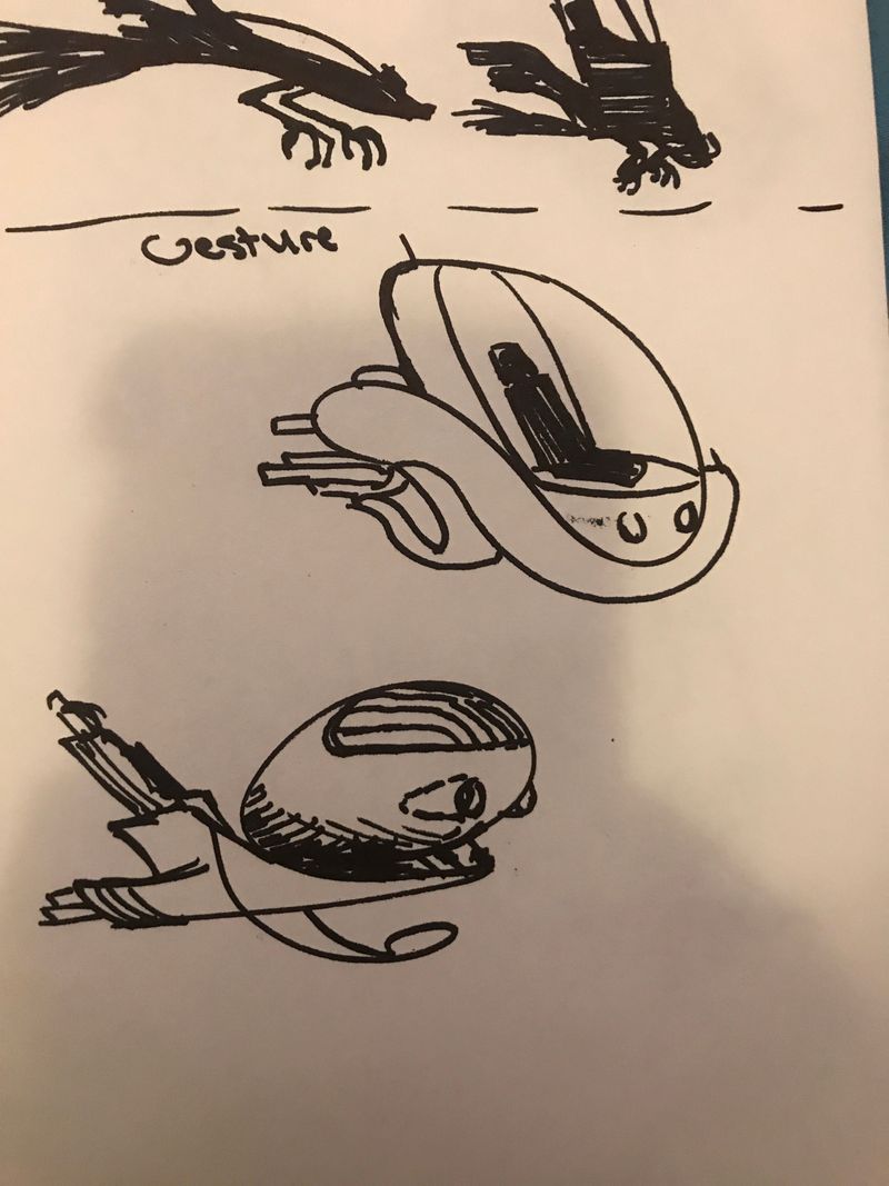
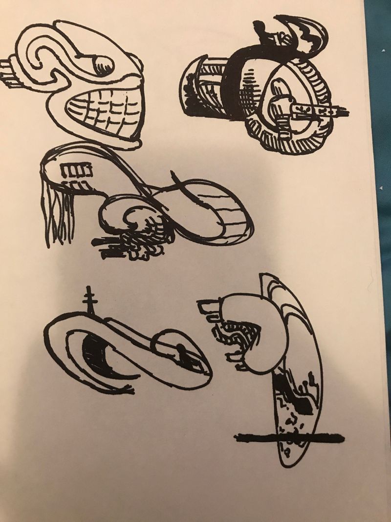
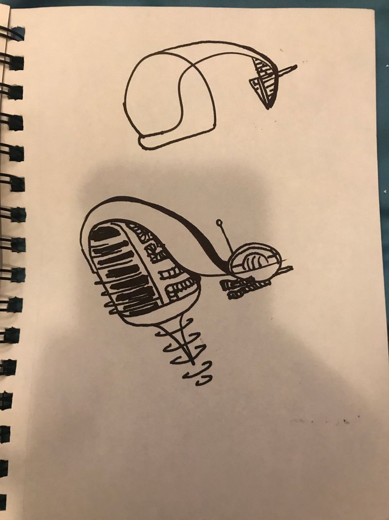
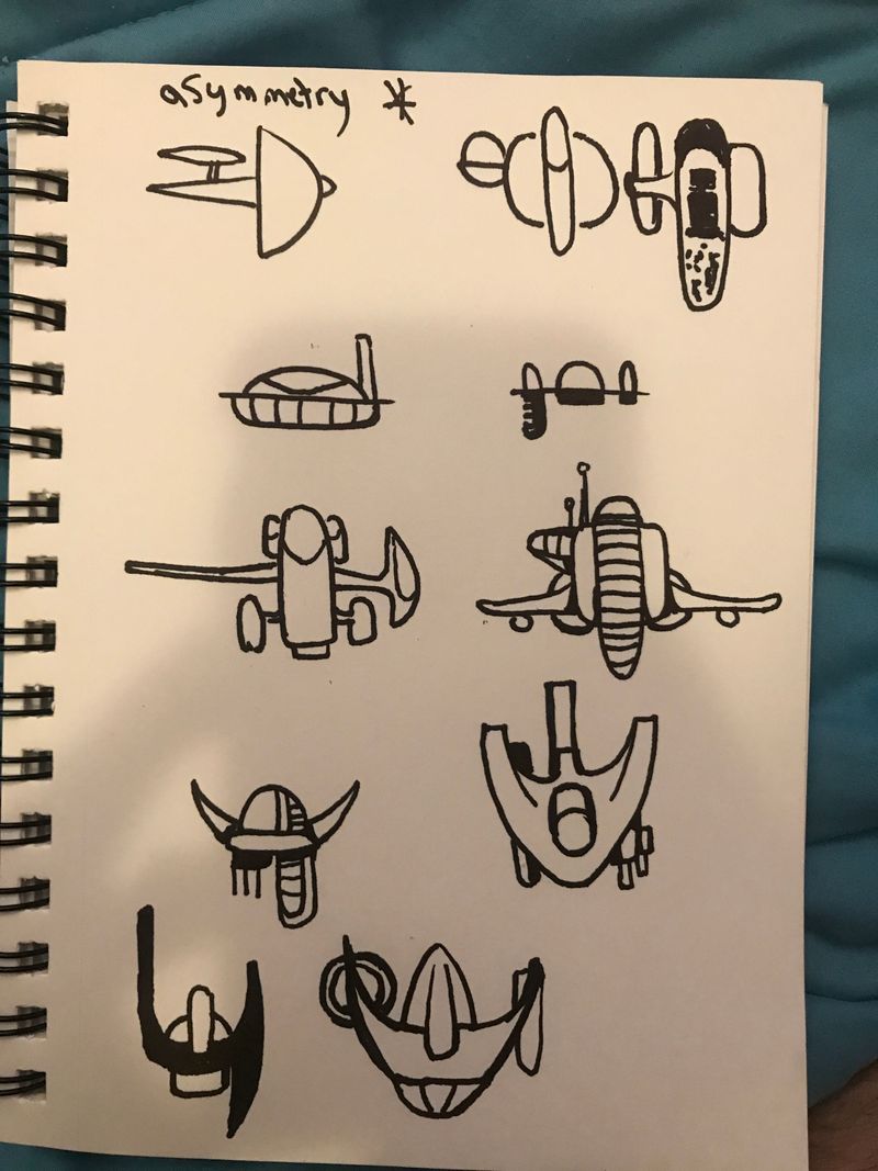
-
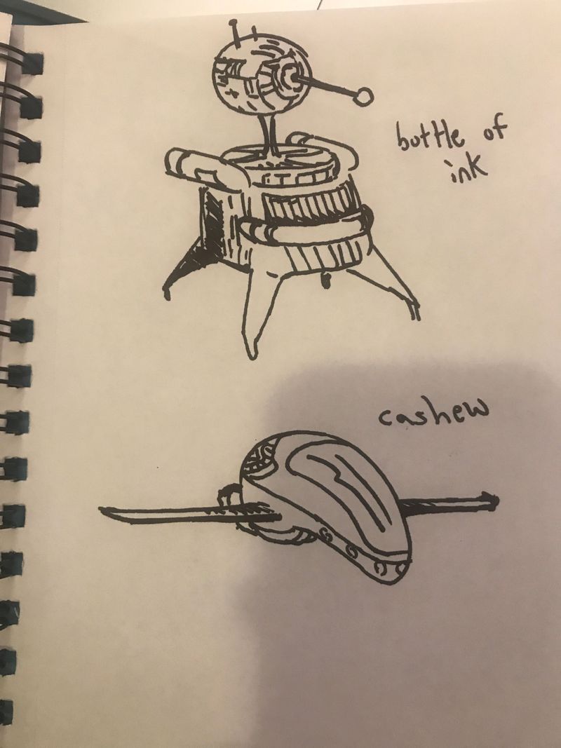
-
@ArtofAleksey I love the way your mind is working. Keep it up!
-
@shanehunt thats the first time someones ever said that! Hah thanks
-
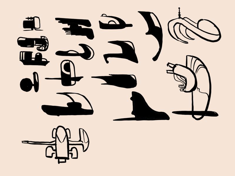
I have narrowed down which thumbnail designs i liked the most. Might do all of them one at a time after this course because i am enjoying this.
-
@ArtofAleksey Great choices. Remember, you don’t have to draw it at exactly the same angle as the thumbnail image.
-
@shanehunt oh yes I’m super excited about that part, playing around with what these would look like from different angles
-
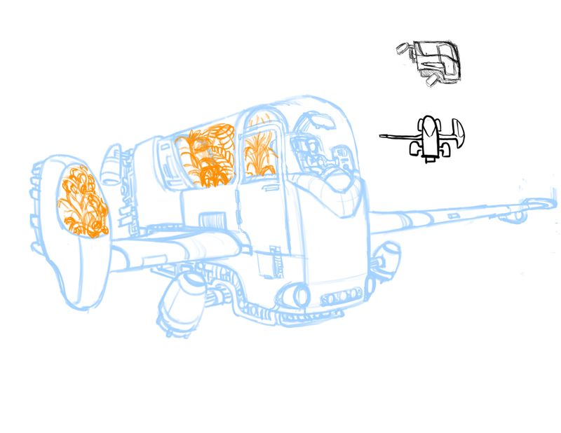
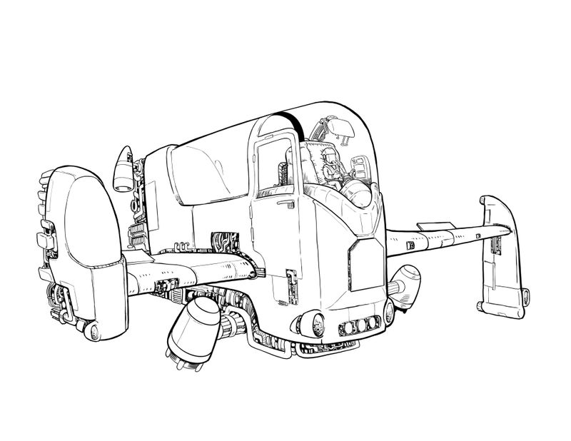
I have been watching too much star trek and thought about the kinds of jobs in space. Space botanist? It’s not done yet but i was excited to share my progress
-
I changed the back wing for drawing area reasons. I’m really into this. Gonna do colors next then move on to the next part.
-
@ArtofAleksey really really cool and fab you love it too

-
@Heather-Boyd thanks! Cant wait to color it
-
@ArtofAleksey super cool

-
@ArtofAleksey Damn you wizards of linework! I'm jealous of how good this looks. Well done!
