Kris Knight Art - Critiques always Welcome, as I am here to improve
-
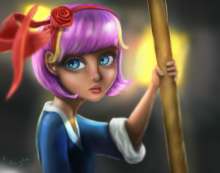
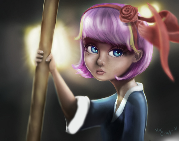
Subway Girl
CS6- Wacom Bamboo Create Tablet
-
points I see that you might find userful:
- dont use blur tool, if you want to use it mimic a photograph or a video frame that's blurry, so it's not that random (I used to abuse it myself when more noob)
- ear positoin is too close and too high if you compare to the eye, ear starts in the midle line that cut the circle of the profile head.
- draw hair like everything else, as a mass, then go to detail it, at the moment shading is not consistent as on the rest of the picture
- that rose is gud, but it's like another image pasted in because it's way more detailed than rest of the image
- skin cant be darked with black and wee see some blacks over there, only if you mind using magenta/blues to it, it will make it more readable and beilable. mid tones and highlights are good on skin
5 the yellow light that makes the edges should have some variation in thickness - eyes third eyelid should ve visible, if you want to make them more cute, avoid drawing a closed siluette dark line around it, make it softer
- the loop epic foreshortenig is in contrast with the calm composition and stable hair, it would be better without it at all, it's doing something weird with the image border, let it rest
- background yellow light spots could be white in the inside, it would be readen as white light more realistically and it would make the yellow push less that oversaturated hair (it's nice, but maybe with more darker and less saturated parts would make more volume
kudos for cute face
-
Thanks Alberto for your points. This is kind of a "Suckerpunch" inspired piece. So a bit more fantasy inspired which is why the ribbon is moving and nothing else is... almost like it's alive.
Yeah, I only used the blur tool on the ribbons coming forward, then used a "tilt-shift" blur on the rest of the image.
A lot of the dark I used was either blue or purple but perhaps too close to black if that is how it is reading")
Thanks for your points Alberto, I'll keep them all in mind on my next go round -
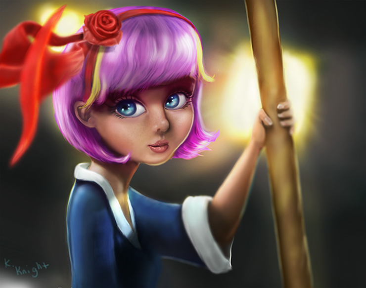
Here is some painting over I did based on your suggestions.
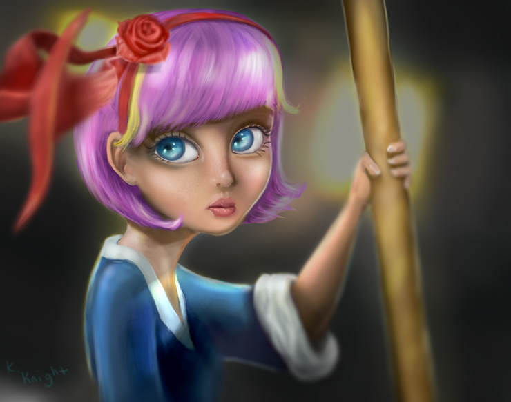
Worked on the ear position
I blurred the rose a bit so it didn't look pasted on the image
Lightened the shadows on the skin
Added tear ducts and a bit of the third eyelid
Eyeliner lightened slightly
The light in the windows was given a lighter center then the entire background was darkened to make the character stand out more.
A couple other things but Thats the main stuff.Thanks
-
I think it went worse:
muddy colors, it has less saturation contrast
it has less value contrast
it went gray
eye tears are so hard, ear betterlet me show my aproach to it
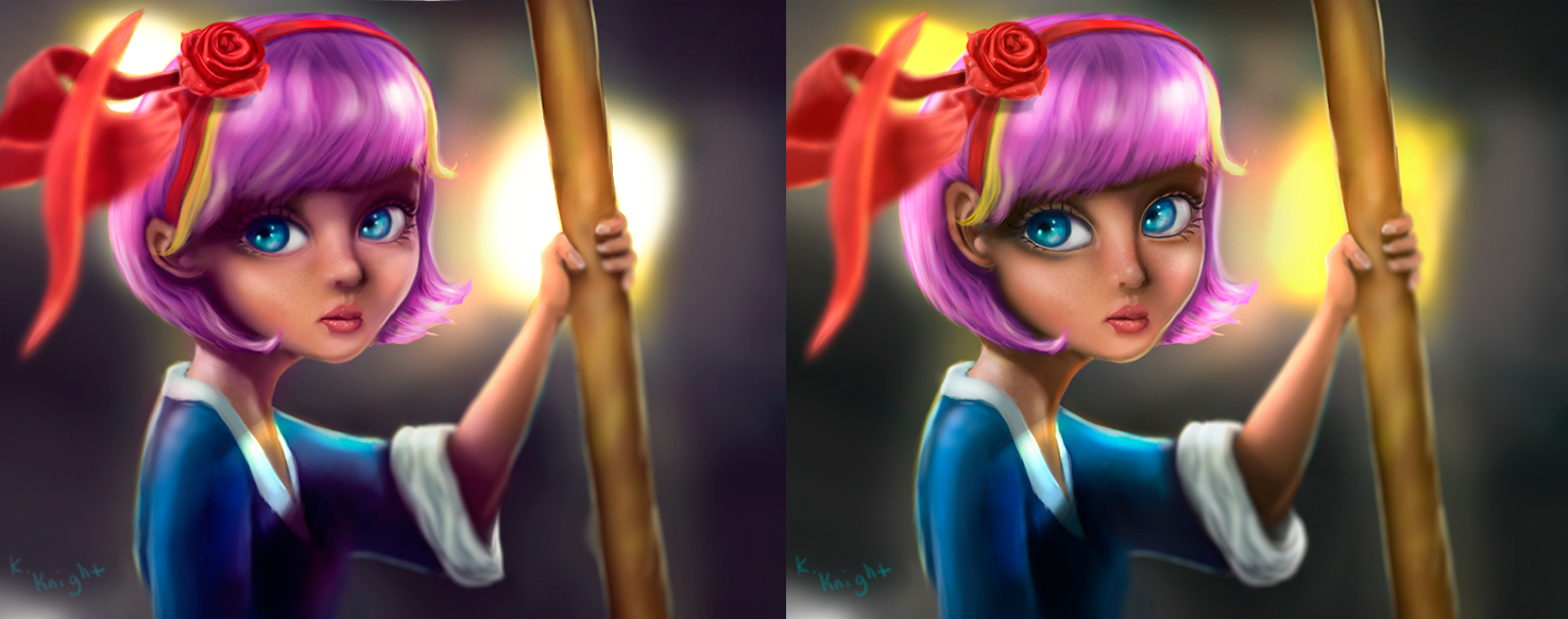
Darker and less saturated hair
Color level adjustements to make shadows go to blue/magenta
mid levels go to yellow magenta
light levels go to yellow
liquify tool to change proportions a bit, it's more cute when eyes are closer to the nose, eyes distance is bigger, ear is not just smaller, its more rounded, etc..
lights at bg are 0 saturation max brigh, transition to it's own color
few layers affecting only the bg to separate just a bit the values
eyes bottom with propper make up technicques, you gotta understand what makes a face prettier, where make up artists put the highlights and shadow is to fake volumes
eye borders should be soft rather that that closed ovaloid -
@Alberto-M
Thanks Alberto. I'll definitely be playing around with some of the things you are talking about. It may take me a while :). I guess I misunderstood on a couple of things... I had thought you were thinking I should lighten the character and shadows etc. There is a lot for me to think about... I'm just now starting to learn adjustment layers and how to control them so this will take me some time to figure out :). -
tools I used:
liquify(to change eyes size and position, arm, neck, ear, hair volume..)
new layers in different modes: overlay, color (to color even more the shadow zones with the hair's color), soft light, normal
color adjustment
hue/saturation adjustment (affecting only magentas) -
@Alberto-M
Thanks a bunch Alberto! :). If you can think of any tutorials anywhere that might help me I would love to hear your suggestions. Thanks again! I've got a bunch of stuff I have to do today but I will be playing with this image again when I get time and attempt your suggestions :). -
look the tool name and google it, that, then play around, I don't know the exact english name for them
-
@Alberto-M
I know where all the tools are and blending modes that you mentioned... I'm just not wonderful yet at using them to their potential
-
@Kris-Knight it's about messing around, remember to play with opacity too, because most times it won't help at 100%
-
@Alberto-M
Here we go again
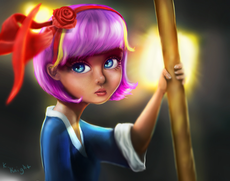
Played around with a few different adjustment layers as well as messing with the eyes, back, sleeve, chin, ear, hair, rose, background light. Hope this looks like the right direction lol.
-
@Kris-Knight Love the rendering and the concept. What I think is: why is she looking so sad, wile the colors are so bright? it doesn't seem to fit together. Why is the bow red? can you try to make a version where the colors are toned down? It al seems a bit out of place. The white of the sleeve has to much detail. the rest hasn't got any winkles and suddenly the sleeve has. that looks a bit awkward. If you flip the illustration you can see that the face needs some work, The nose should stick out more.
 good luck!
 -
Well, Good or Bad I'm going to call this one done. lol What was it Jake said, "Not perfect but done." Something like that anyway. I appreciate all the critiques!!! It gave me lots to think about as well as trying to fix some issues that others saw. Thanks a Bunch!!!
-
I think you ended up with an improved image Kris.
-
@Kris-Knight I agree with Rob. Evey time you make a new one, your improving yourself! Well done!