March WIP sketch, critique welcome
-
I wanted to do a really happy version of chaos.
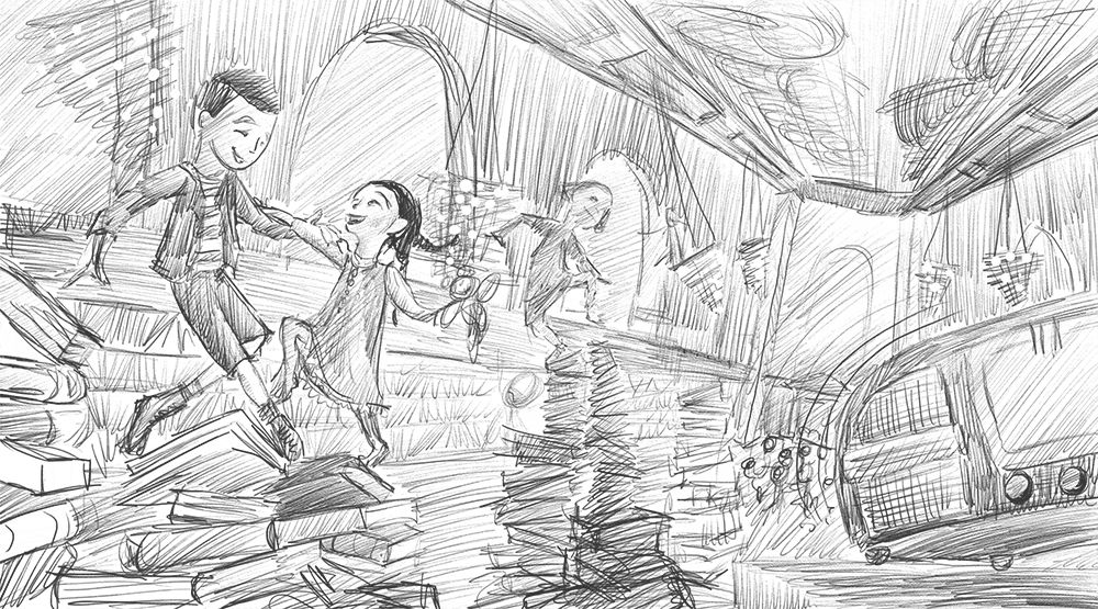
It's the Fedeler children that lived and grew up in the NYPL having a dance party in the unfinished reading room (historical fiction picture book, idek). I have so many classes to take, so I'll just tell you what I'm focusing on right now - using references and taking it to finish. Anything you guys would want to comment on, I would love to hear. -
Really lovely! Overall I think it's working great. Maybe if I could try anything, it would be to make the two foreground characters just a tad larger. I'd also watch proportions. Right now the boy's back leg is looking a little long and his elbow placement on his free arm looks a little off. Also maybe if there were a few items bouncing around on the surface the radio is on, it would further accentuate the feeling of vibration and music. Not sure what. a pencil, a library stamp, paper clips, glasses. . .or something along those lines.
Great job, I really love where this is going.
-
@carolinedrawing This is looking great. I don't really have any critiques at this point other than it could look a little more chaotic, but I assume it will when more rendered. Great job!
-
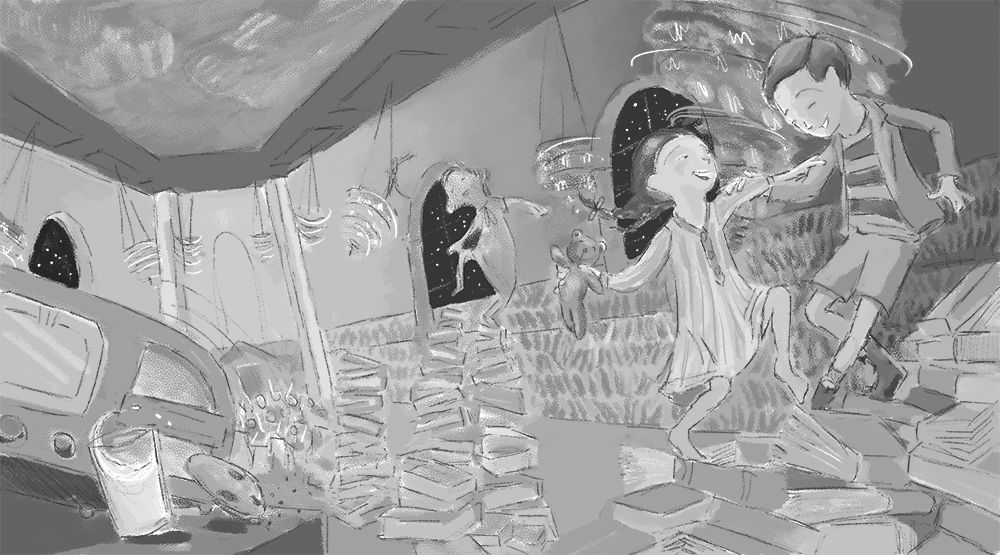
@TessaW @chrisaakins Thanks so much for your feedback! It has taken me over a week to get back to it, but your comments really motivated me. Here's a value study:
I'm soooooo sick of it. I've switched from trying to learn watercolor to trying to learn photoshop and it's a struggle.
Not enough chaos and not enough stacks of books, but I am not sure I'll finish in time as it is...
-
You are doing great! Finished not perfect! I think maybe just a few books falling/flying around and maybe a few crumbles from the ceiling? It's a super fun image.
I want to have a sleepover dance party in a library now.


-
@carolinedrawing I work traditionally and you don't have to use photoshop to do value work.
One technic I use to create value-based sketches is to draw the sketch in ink and then just use the fill option (I use Inkscape) to put in the values and change them until it working.
I have also used Copic markers and a light table to get similar effect.
-
@carolinedrawing it's so hard when you get sick of a drawing - sometimes it's hard to even look at it. My suggestion? put it away for a minute. and when you take it out. Look at it upside down and backwards. Flip it horizontal.
 Sometimes when you shake your brain up you'll start seeing the things that are missing, or even the things that you really enjoyed.
Another thing I'll recommend is how my dad taught me to watercolor and how he still works both digitally and traditionally. It's one of the simpler methods.
He starts with a wash of a warm yellowish, burnt umber color, soft, not too dark. but all over. This ties the whole piece together. Then he goes in with a blue/violet, desaturated, not too dark, and he blocks in everywhere where he knows it will be in shadow. This is his midtone. Once he has those - he goes in with what he knows the colors of. Say an apple, he knows he wants it to be red. So he will put a wash of red over the whole apple, even if it's already had a layer of shadow. The watercolor (if you're working light) will build up and layer.
Once he has the things painted that he knows the color of, he will pick the rest of the colors to suit what he needs.
Then details. - darkening darks, adding highlights with opaque watercolor etc.
He doesn't get fussy. He doesn't get too detailed. He works back in with some brown pencil to bring out lines that he wants to keep, but loses lines he doesn't like.He does this exact same method with digital - just using a lower opacity brush
")
I hope this might help you, as it helped me! It's a good starting point. -
@carolinedrawing This is a great start! I love the gestures of the characters. One thing I would tweak on the value study is using a less dark value for the sky/windows. When I squint at your piece my eyes go to the windows and the bottom left corner and not the characters. Make sure the highest contrast values are where you want the viewer to focus their attention. Maybe add a rim light around the girls hair so it pops off of the window behind her.
Also, if this were my piece I would consider not showing the ceiling...? I don't know. I would definitely play with that idea because the perspective lines draw my eye back the far wall. I know it might not be accurate, but perhaps removing the ceiling and make the chandeliers (?) more exaggerated would be the way to go. Again, I'm not sure about this, but I would try it.
Good work. I can't wait to see the finished piece!
-
@TessaW Didn't quite make it to the books flying around, but will someday add this. I did put the crumbles in and forgot the cookie crumbles and some other things.
Thanks so much. And the milk and cookies. Apparently she was supposed to be in bed when she discovered her older brother was having a dance party.@theprairiefox this is interesting, I will try this. Thanks.
@EliaMurrayArt I took a break from it and then saw your entry and the post by Shawna Calder Tenney in the march contest thread. I realized my drawing wasn't fun. So I stylized the whole thing and added as much chaos as possible. Your description of the watercolor sounds really great. Things are settling down with homeschooling and I'm starting to see that I might be able to do some watercolor paintings after all. Plus, this technique sounds more or less like what I saw Will Terry do in the live demo. Unfortunately the advice you and @j-sienkowski gave couldn't be applied this time because I barely filled up the drawing as a rough draft before time ran out. In other words, no value drawing this time!!! smh. And no chance to make adjustments with all the elements there.
 I took too long to figure out the direction I was taking. The ceiling was something I stuck to because it's meant to be the rose reading room of the New York Public Library, where these kids lived and grew up. I guess they used to play baseball there, something that I couldn't really make chaotic enough, so I turned it into a dance party. I'm definitely going to do some thumbnails of it to rethink it.
I definitely feel much differently about my entry because I was able to get a bit of outside perspective about it. This forum has helped me so much during a difficult month!
-
@carolinedrawing Well I for one think your piece turned out delightfully!
So definitely don't beat yourself up too much. On to the next piece!!! -
@EliaMurrayArt
 thank you!