Critiques welcome
-
one - this is quite beautiful. I absolutely love how you handled the sheep's wool, and how you lose detail as you move through the background.
I think the first thing though that jumps out to me is that the two characters don't seem to live in the same realm as the rest of the piece. Meaning, the whole piece is this amazing, textural experience and then you have two very flat characters that are relying on lines and flat colors.
Now perhaps this is purposeful? Is it for a video game? Or something like that? If not, then I might suggest spending a little more time on the characters to make them feel like they are more similarly styled to the rest of the painting.
It's like - I look at those sheep, and I can feel that you just had a blast making their wool. but then the characters, feel like they weren't given as much joy/expression? If that makes sense.
As for the background I think perhaps messing around with the values would be great. Currently they are of very close color/value throughout. I think if they got pushed a bit more, especially in the middle back hills. If you darkened and muted them more you would get even more atmosphere between your characters/foreground and the middle hills. Then you could brighten your characters so they would also pop more! When I squint at your image as it is now - I see the clouds and the middle hills first because they are the lightest areas.
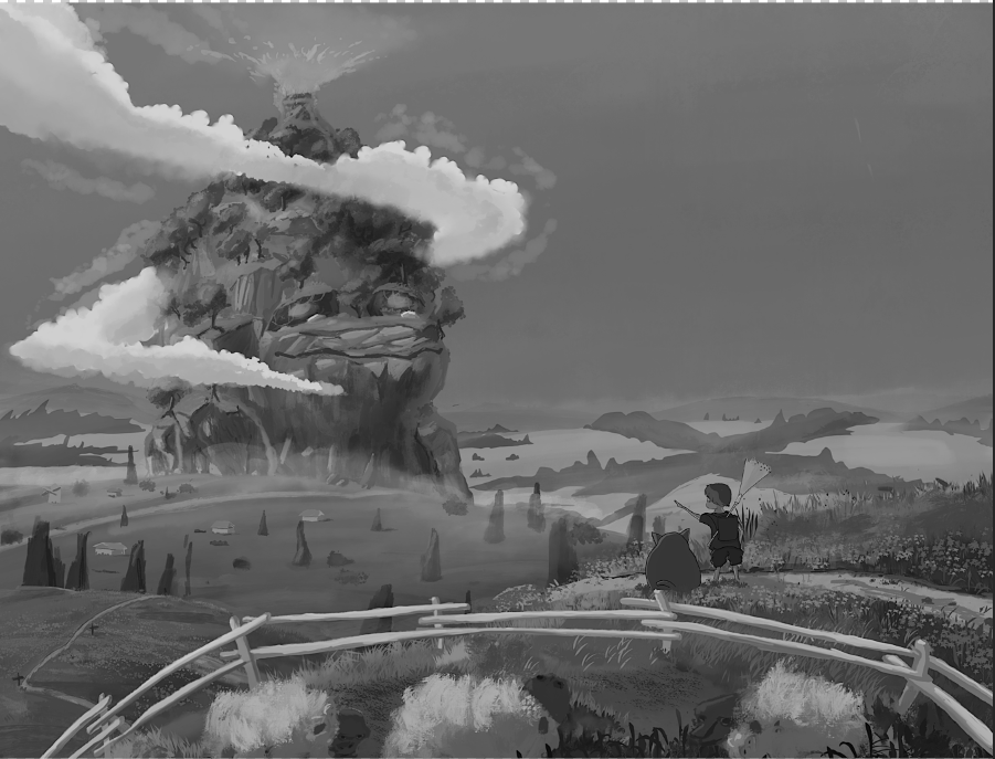
Here's your image in black and white so you can really see the values.
Anyways. It is really lovely - those are the things that are standing out to me though.
Instagram: https://www.instagram.com/eliamurrayart/
Portfolio: www.eliamurray.com -
This is really gorgeous! I think there are very subtle tweaks that could be made. If we are taking cues from Ghibli, putting in some cooler tones into the shadows of the rock dude and making the upper portion of the sky darker would give it a little bit more depth. I would also think about making the skin tone of the boy just a little warmer to contrast with the background fields and have him relate more to the area he's standing in.
Website: www.tessawrathall.com
Instagram: www.instagram.com/tessawrathall_art/
-
@EliaMurrayArt thank you very much for the feedback, the characters are purposely just like the ghibli studios films, a mix of painting and manga, I will do exactly like you said.
-
@TessaW yes, I'm doing this drawing and watching the ghibli studio films, thanks got you feedback
-
Love the colors and overall feel of the piece. I agree with Elia that the values of the middle ground just behind the volcano are actually quite high contrast. I would knock back the values so they are lighter and lower contrast. This should have the extra benefit of increasing the contast of the characters who are sitting in front of them. The dark wavy grass behind the child could be lightened too as they are merging with their sillohette making it less clear.
Is the focus the volcanic explosion? If so I would line up the child's arm with it (bit low at the moment) and have the clouds swirl around it (rather than below it) to draw attention? If you lowered the height of the mountain this would work. You could also have the fence draw a line towards it rather than bend to the left hand corner and make the path line towards it rather than to the left. All should guide the eye to the focus of the piece.
I would love to see it if you do make any changes. Keep up the great work. -
@wolfieap thank you so much
-
@yuriqart Can you try taking the fence out and cropping the image? I don't know if it would work, but as a viewer, I really would like to get close to the two characters. It feels like the fence is only there to keep me separate from them.
-
@carolinedrawing I agree. I feel like the fence doesn't compositionally serve a purpose and because is running parallel to the viewer it flattens the bottom section of an otherwise very depth-full looking piece.
-
@carolinedrawing yeah , it’s way better,thanks a lot
-
@carolinedrawing
