Isolation WIP - therapeutic process
-
@Coreyartus Oh man, thanks for your feedback. This is going to be way better than it would have been if I had just gone with the initial idea. I'm glad to get your reaction to the second one... I think it's growing on me too. I like the water/sky oneness as well. Now I wish I had done that color study with layers! It's all one layer and i feel like I'm going to mess up the sky effect if I change it.
") Thinking of trying to keep the image on the right softer and looser like you mentioned...
Thinking of trying to keep the image on the right softer and looser like you mentioned...Does anyone have other ideas about how to overlay the left image in a graceful way? I agree that the line around the edge is questionable.
Thanks again for the help!
-
@KathrynAdebayo THis is really looking great! I love what you did with the watercolor and the palette.
-
@chrisaakins Thanks, Chris! Any advice?
I've been watching your thread and like the piece you're doing this month! It looks great, and flipping the image really highlighted your main character and the nice lighting you have in the scene.
-
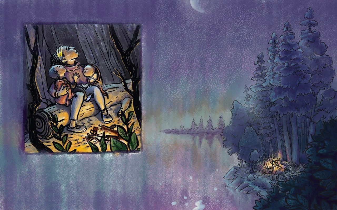
I like both A & B. I think the design of having the image overlay the background image is working.
Painting the two images with the same style/medium/techniques will help tie them together & reinforce the concept.
@Coreyartus mentioned vignette. I think the straight lines of the rectangle would set off the image without the dark line around it--especially since you've done a good job framing within the illustration with the dark branches and foliage. The light "shadow" around the rectangle helps too--maybe just add more of the white around the sides? (But I like how it's varied & fuzzy/blended, so I wouldn't make it solid.)
-
@KathrynAdebayo I like the lake better than the mountain but both are lovely. I really love your line work in the characters and they look finished. I think you biggest challenge will be to render the large spread in a way that complements your small picture. I would simplify your lines in the forest and/or use a lighter shade rather than full black for linework. It creates the illusion of space. Keep your detail for the figures rather than the shrubbery because they are getting lost.
-
This is such a lovely concept. I got goose bumps! Can't wait to see it progress.
Website: www.tessawrathall.com
Instagram: www.instagram.com/tessawrathall_art/
-
@Miriam Hi Miriam, thanks so much for your advice. I took to heart what you said about making the two parts of the illustration seem cohesive, and I hope it’s working well, but please feel free to let me know what you think.
-
@chrisaakins Wow, thanks so much for your valuable advice. I tried to make the characters on the right stand out and more detailed, but the line work in the trees did end up getting really busy... hmm... Do you think it's too distracting? Thanks so much for the advice about making the larger picture compliment the smaller one. Now that I've worked on the zoomed out image for a while, I feel like I might need to go back into the smaller one and tighten things up a bit. Thanks again for taking the time to comment.
-
-
Here’s where it stands now...
-
@KathrynAdebayo It's really beautiful

-
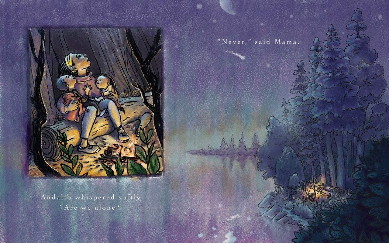
Thanks to the good advice given here, I thinned some of the line work on the image on the left and added flames to the fire.
Any advice at this point?
-
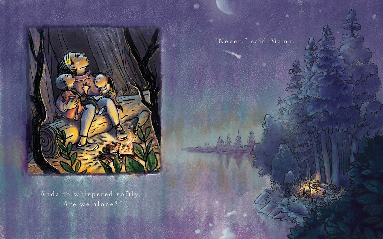
Well, after a few days of letting this sit and making some minor changes... maybe it’s done? Any other feedback or suggestions that could improve the overall feel? Thanks for the help so far guys.
-
@KathrynAdebayo Wow! That looks beautiful! I love your use of colors! Also, I think the shooting star placed under "Never" has a nice effect.
-
@KathrynAdebayo on the left illustration I should put a fire on that campfire, the rest looks great on that one. And the one on the other side I should make the overall illustration a bit darker but the vocal point. Especially between the trees, thinking where the moonlight would come from so there could be some castingshadows. But
that's my thought on it. Hope you know what I meant about that. Overall, great idea, love the layout and your personal style. -
@KathrynAdebayo this looks amazing, please forget my previous comment.
