help deciding how much to crop
-
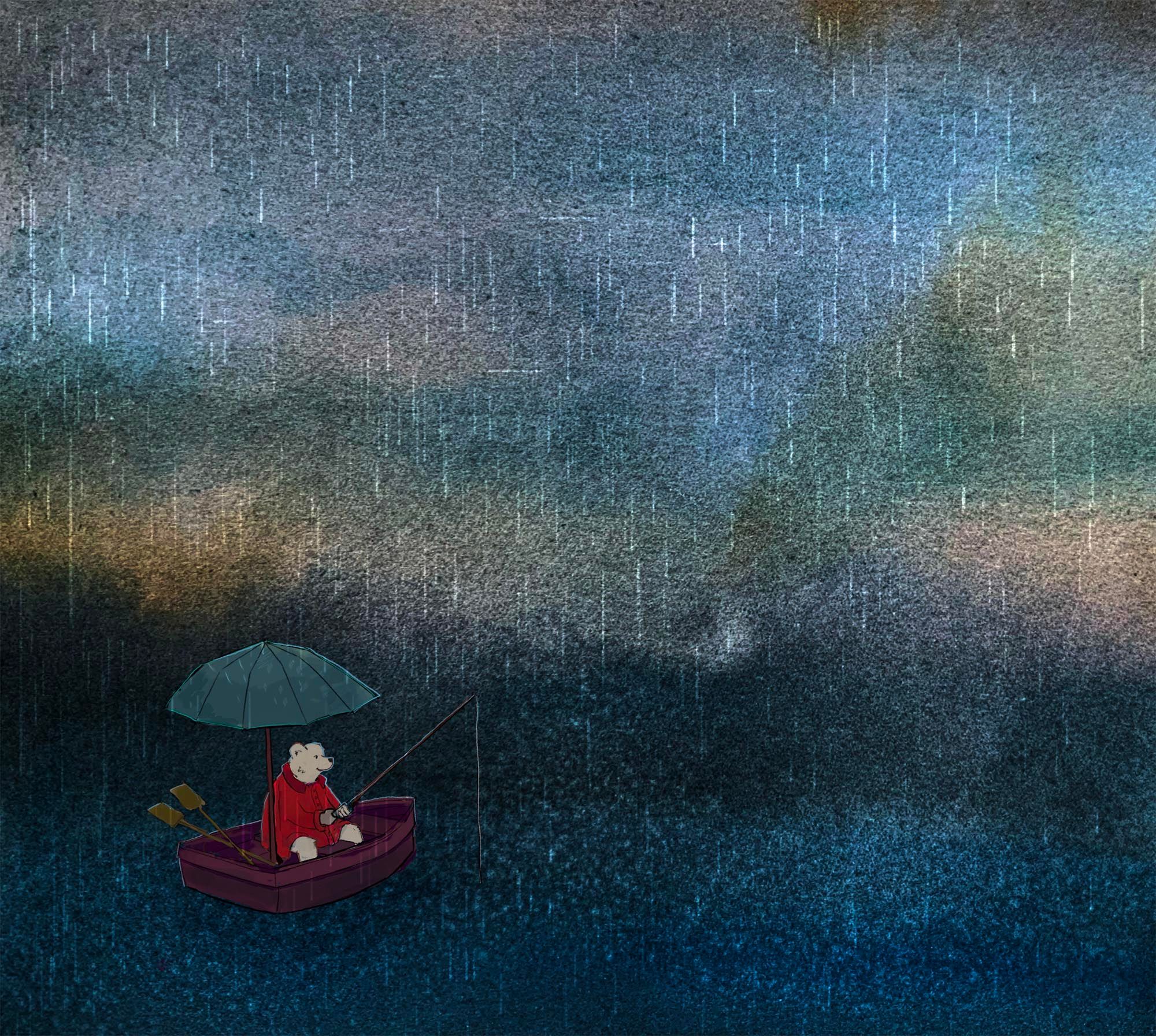
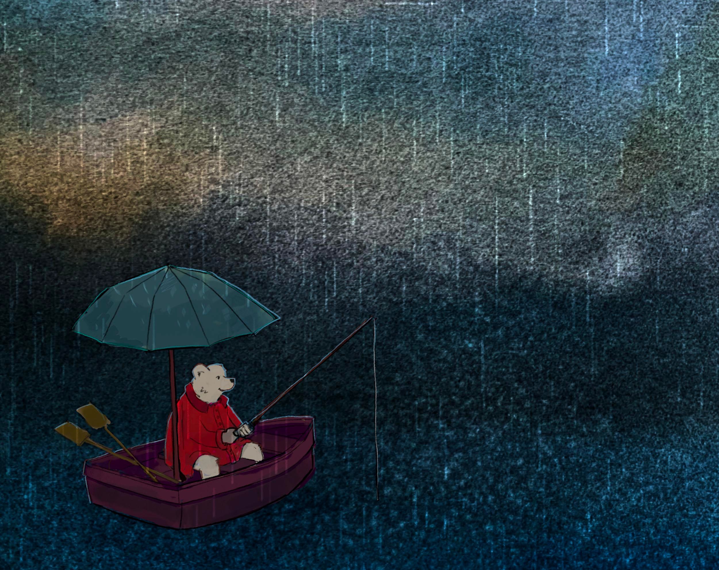
I already posted an entry for this month's contest, but now I'm having second thoughts on whether it should be much more cropped. I like the zoomed out version because it maybe communicates the concept of "isolation" more, but I wonder if the main character is just too small relative to total size? I've now been looking at it so long I can't see it objectively, so I'd to hear anyone's opinion!
-
Depends on what you want to emphasise, really.
The bigger canvas does communicate the isolation more and it makes the rain a bit more important.
The close up is way more personal, more about the character than about the rain or isolation.If you'd ask me, I think those both look good! Depends on what kind of message you want to push through.
That crop doesn't change the composition in any drastic way so its just a matter of emotional response you wanna get
Spreading art and positive vibes!
-
@IgorWoznicki nicely done! That is exactly how you go about deciding a composition.
-
Yeah I agree the zoomed out one focuses on the isolation feeling! Zoomed in one not nearly as much
-
@IgorWoznicki @Frost-Drive Thanks for the feedback guys
") I think as long as the composition works equally well for both, I'll stick with the more zoomed-out version since the more melancholy vibe emphasizing the environment/rain was what I was hoping to communicate.
I think as long as the composition works equally well for both, I'll stick with the more zoomed-out version since the more melancholy vibe emphasizing the environment/rain was what I was hoping to communicate. -
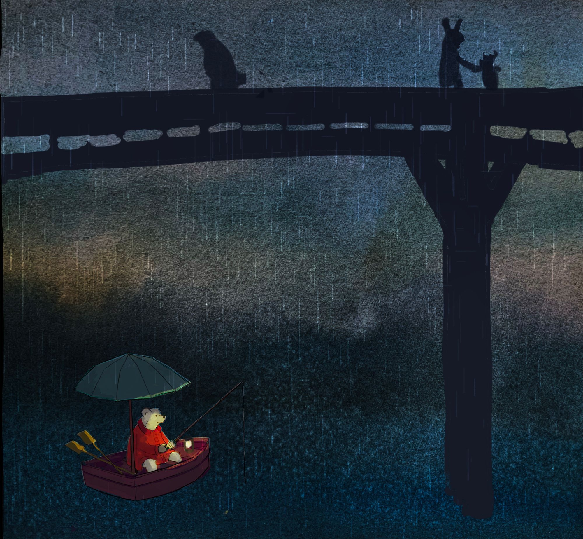
I've been playing with adding some additional elements to my contest entry, including a bridge with some additional characters walking on it. I'm not sure if the new elements feel totally integrated, or if the composition is working. Does anyone have any suggestions or feedback?
-
Hi @Braxton, I like original zoomed out version the best. Although the characters on the bridge are silhouettes, I feel they are competing for attention.
-
@Jeremy-Ross Thanks. It's possible I'm overthinking it and the simplest version is the best, but sometimes it's fun to tinker.
-
@Braxton I agree with @Jeremy-Ross , the original zoomed-out version communicates "isolation" more. The character is small, but it becomes more of an atmosphere piece. In that one I can definitely tell the character is alone, and he seems content with that.