Society of Visual Storytelling

    SVSLearn Forums

    • Register
    • Login
    • Search
    • Recent
    • Tags
    • Popular
    • Users
    • Groups
    • Search

    Bongo-bites - June Contest Prompt WIP

    Artwork
    10
    17
    682
    Loading More Posts
    • Oldest to Newest
    • Newest to Oldest
    • Most Votes
    Reply
    • Reply as topic
    Log in to reply
    This topic has been deleted. Only users with topic management privileges can see it.
    • Aaron_T
      Aaron_T last edited by

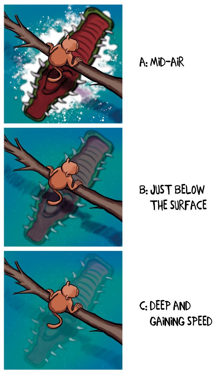
      Did a couple of sketches of different elevations of the pre-chomp moment, but having always been a fan of the top-down Jaws style POV I feel like this is more my speed, although painting with this soft an airbrush to get that blur is killing my eyes. Might just draw it normally and then Gaussian Blur it into submission.

      I started with the mid air version, which follows the text of the prompt, but then playing around with the layers I'm finding that having him still submerged behind the in-focus foreground is a nice effect. Deep underwater I might have to close his mouth a little just for accuracy, but I like the "oh I didn't see that back there". Do I get dinged for not having Clyde on the surface of the water the whole time?

      Thoughts?

      Monkey_Bite_v1-3.jpg

      https://www.instagram.com/aaron_t/

      Jeremy Ross Heather Boyd 2 Replies Last reply Reply Quote 3
      • Jeremy Ross
        Jeremy Ross @Aaron_T last edited by

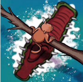
        Hi @Aaron_T, I like C! You might try the voting poll next time.

        https://www.instagram.com/jeremyrayross
        https://www.jeremyrayross.com/
        https://twitter.com/jeremyrayross
        https://jeremyrayross.substack.com/

        1 Reply Last reply Reply Quote 0
        • Aaron_T
          Aaron_T last edited by

          Oh, nice, @Jeremy-Ross Didn't realize we had that. Thanks!

          https://www.instagram.com/aaron_t/

          1 Reply Last reply Reply Quote 0
          • Heather Boyd
            Heather Boyd @Aaron_T last edited by

            @Aaron_T I like c too, not such an eye strain or a distraction for the monkey (focus).

            Instagram: www.instagram.com/heatherboyd.illustration/
            Website: https://heatherboydillustration.ca
            Shop: https://www.inprnt.com/search/products?q=HeatherBoydIllustration
            Ko-Fi: https://ko-fi.com/heatherboydillustration

            Be blessed,

            1 Reply Last reply Reply Quote 0
            • A
              aprilshin last edited by

              Ooh, great perspective! I'm hopping on the C train as well!

              1 Reply Last reply Reply Quote 0
              • Jacy13
                Jacy13 last edited by

                @Aaron_T I like either B or C! I think they both would work well 🙂

                I think it depends on whether Bongo is the focal point, or if Clyde is the focal point in this scene. If we're focusing on the monkey, it might be better to push Clyde deeper into the water like in C. Or vice versa if the focal point is Clyde 😃
                I hope that helps!

                Deviantart: https://www.deviantart.com/jacy13
                Instagram: https://www.instagram.com/jacy13draws/?hl=en
                Portfolio: https://jacy13.artstation.com/

                1 Reply Last reply Reply Quote 1
                • TessaW
                  TessaW last edited by TessaW

                  Wow, @Aaron_T that viewpoint is so cool and it's impressive your mind went here. I'm thinking B or C, with C pulling ahead. I can just feel feel the movement and anticipation of what will happen next, even though the image itself is very still and calm. I wonder if it's too plain? Does it need some leaves or water waves? I'm not sure, maybe it would take away from it's impact, but it's something to consider.

                  Website: www.tessawrathall.com

                  Instagram: www.instagram.com/tessawrathall_art/

                  1 Reply Last reply Reply Quote 0
                  • Aaron_T
                    Aaron_T last edited by

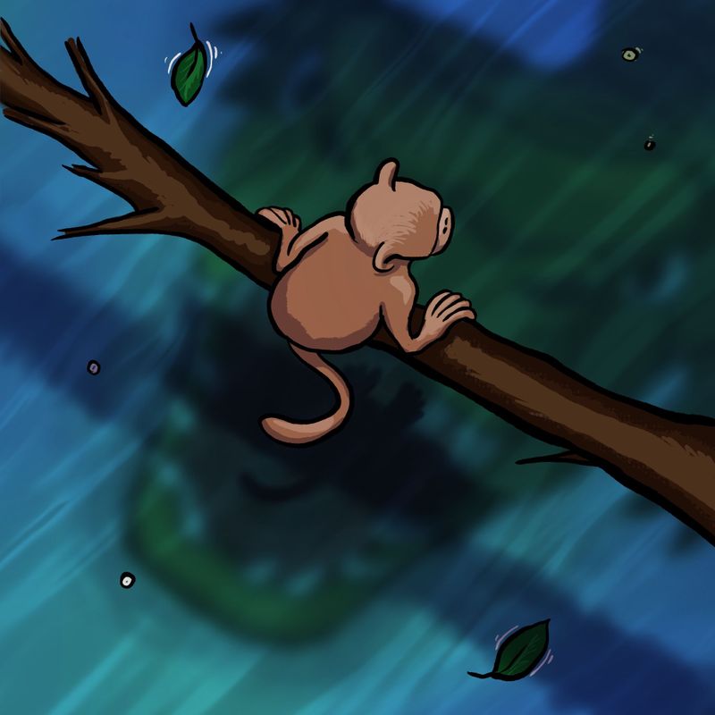
                    Ha ha...sounds like C is the way to go. I'll work on it a bit and muddy the water so it looks like its a river moving and not a still pond. Thank you everyone!

                    https://www.instagram.com/aaron_t/

                    1 Reply Last reply Reply Quote 0
                    • Aaron_T
                      Aaron_T last edited by

                      For a prompt that seemed lighthearted enough I seemed to make it as dark as possible.

                      FDA80B83-3827-471F-A4AE-59099BA6F3F4.jpeg

                      https://www.instagram.com/aaron_t/

                      1 Reply Last reply Reply Quote 2
                      • Neha Rawat
                        Neha Rawat last edited by

                        What an interesting perspective! I liked C as well for the anticipation but agreed it looked a little too clam.
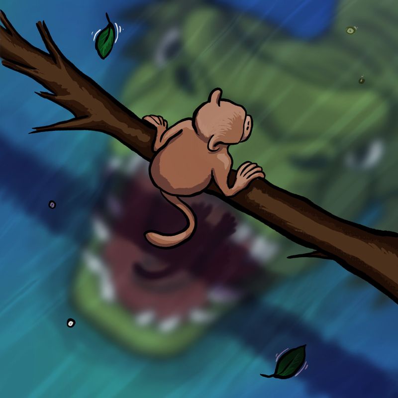
                        In your latest render is better with clydes glaring eyes, But I’m just wondering about the relative sizes of bongo and Clyde. Clyde’s head seems huge considering he’s further away under water.

                        https://www.nrbstudio.in/
                        https://www.instagram.com/nrbstudio.in

                        Aaron_T 1 Reply Last reply Reply Quote 0
                        • Aaron_T
                          Aaron_T @Neha Rawat last edited by

                          @Neha-Rawat Yes, I’m struggling with that too. My goal was to make sure clydes mouth was big enough to get the monkey in between his teeth. I may be over thinking it but I don’t want the next scene to be a monkey in thirds 😂

                          https://www.instagram.com/aaron_t/

                          1 Reply Last reply Reply Quote 0
                          • J
                            jdubz last edited by

                            I think side-by-side i liked the original C better than the newer one with the larger mouth. Clyde looks too blurred in my opinion on the new one - the previous one felt like a really good level of obscurity based on where he was located in the image.

                            Josh White
                            https://www.instagram.com/joshwhiteillustration/

                            1 Reply Last reply Reply Quote 0
                            • TessaW
                              TessaW last edited by

                              I also liked original C better. The colors were more striking and the viewpoint of the jaws were unexpected in a really good way. Really amps up the anticipation of a "chomp" and displays those sharp teeth nicely. If you're sold on the new pose, then I'd suggest playing with the size like Neha suggested.

                              Website: www.tessawrathall.com

                              Instagram: www.instagram.com/tessawrathall_art/

                              Aaron_T 1 Reply Last reply Reply Quote 0
                              • EliaMurrayArt
                                EliaMurrayArt last edited by

                                Im going to throw a curve ball and vote A with adjustments. For me C doesn't make much sense because the croc would be getting a giant mouth full of water. If you watch videos of them jumping out of water they open their mouths quite late in the jump. I also think it does feel too calm. I find A to be the most exciting with the water splashing around and the teeth on full display. But I do think that the values need to be adjusted.

                                I hope you don't mind - but i did a fast paint over where I did an overlay of yellow on top of the monkey and branch, and then did a multiple layer of a light blue over the croc. I think if you played with the values you'd be able to make the image less distracting but equally as impactful.

                                c91a82fd-264f-42a3-8317-94c938550ff5-image.png 772d7a6e-dc4a-4b34-a8ac-81dd838a4264-image.png

                                Instagram: https://www.instagram.com/eliamurrayart/
                                Portfolio: www.eliamurray.com

                                1 Reply Last reply Reply Quote 1
                                • Aaron_T
                                  Aaron_T @TessaW last edited by

                                  @TessaW @jdubz Good point...moving it up in the timeline by just a few seconds like the original C does give it a little more anticipation.

                                  Kind of an un-related note, but does anyone else notice how dark Procreate is when you export and then post? I feel like I always have to run it through Photoshop just to lighten it up so I can see it before I post it. The same image as above, just lightened up slightly in Photoshop, where as the one last night was exported and posted without the Photoshop pit stop. Wonder if my settings are out of whack. @EliaMurrayArt I just saw you mentioned the same thing while I was typing! Nice fix...I haven't got in and highlighted the foreground yet but I really like what you did with the yellow!

                                  Monkey_Bite_v1-4.jpg

                                  https://www.instagram.com/aaron_t/

                                  baileyvidler 1 Reply Last reply Reply Quote 0
                                  • baileyvidler
                                    baileyvidler @Aaron_T last edited by

                                    @Aaron_T said in Bongo-bites - June Contest Prompt WIP:

                                    Kind of an un-related note, but does anyone else notice how dark Procreate is when you export and then post? I feel like I always have to run it through Photoshop just to lighten it up so I can see it before I post it.

                                    When I notice that happening, I usually first check how bright my screen is. When the screen is too bright, I unconsciously make the image darker to compensate. The brightness of the room can also affect how you see the screen. If that's not it, then it might be a Procreate/ipad thing.

                                    Bailey Vidler
                                    Portfolio: baileyvidler.com

                                    Aaron_T 1 Reply Last reply Reply Quote 0
                                    • Aaron_T
                                      Aaron_T @baileyvidler last edited by

                                      @baileymvidler That's got to be it...I mostly draw in the evenings, and keep my screen blindingly bright. Who needs sunlight anyway?

                                      https://www.instagram.com/aaron_t/

                                      1 Reply Last reply Reply Quote 0
                                      • First post
                                        Last post