Society of Visual Storytelling

    SVSLearn Forums

    • Register
    • Login
    • Search
    • Recent
    • Tags
    • Popular
    • Users
    • Groups
    • Search

    Critique please, my take on a classic

    Artwork
    5
    8
    310
    Loading More Posts
    • Oldest to Newest
    • Newest to Oldest
    • Most Votes
    Reply
    • Reply as topic
    Log in to reply
    This topic has been deleted. Only users with topic management privileges can see it.
    • T
      Taigyo last edited by

      3 pigs color small.jpg

      Melanie Ortins Nyrryl  Cadiz ? 3 Replies Last reply Reply Quote 0
      • Melanie Ortins
        Melanie Ortins @Taigyo last edited by

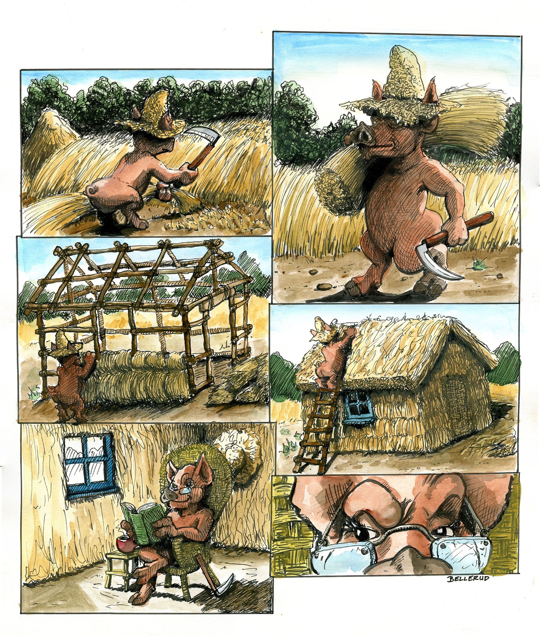
        @Taigyo Love the pen and ink textures! My feedback would be that the composition and the pig's pose is very similar in the 3rd and 4th panels so maybe switch one of them up a bit or crop the 3rd one tighter to give some variation? And the trees in the background of the first two are very dark/textured so they distract a bit from your character. Other than that, I think you're on the right track! I also really like the close up expression at the end 😂

        http://www.melanieortins.com/
        https://www.instagram.com/melanieortins/

        T 1 Reply Last reply Reply Quote 0
        • Frost Drive
          Frost Drive last edited by

          I'm curious if you intentionally made these to be viewed as a comic page of sorts? Or if it's just all of the pages mishmashed into one photo.

          Are comic panels ever present in kids books? I've never seen them in one before.

          My Drawing Show: https://www.youtube.com/ArtParlor
          Instagram: https://www.instagram.com/frostdrive/

          T 1 Reply Last reply Reply Quote 0
          • Nyrryl  Cadiz
            Nyrryl Cadiz SVS OG @Taigyo last edited by

            @Taigyo I think they look lovely! which aspects do you want critiqued?

            Portfolio: nyrrylcadiz.com
            Instagram: https://www.instagram.com/nyrryl_cadiz/
            YouTube: https://www.youtube.com/channel/UCbJCF1Im8ZO7hpGWTKOJMuA

            T 1 Reply Last reply Reply Quote 0
            • T
              Taigyo @Frost Drive last edited by

              @Frost-Drive Yes I did. I have seen the comic panel style in some English children's books, or perhaps they were children's comic books? They were definitly printed on the book type format rather than pulp paper and floppy cover

              1 Reply Last reply Reply Quote 0
              • T
                Taigyo @Melanie Ortins last edited by

                @Melanie-Ortins Thanks for the feedback. Need to plan out the tone/color a bit more next time. 3 and 4 are similar because I wanted to express the passage of time, does it work that way?

                1 Reply Last reply Reply Quote 0
                • T
                  Taigyo @Nyrryl Cadiz last edited by

                  @Nyrryl-Cadiz Thank you for the kind words. Any areas that you feel could be improved

                  1 Reply Last reply Reply Quote 0
                  • ?
                    A Former User @Taigyo last edited by

                    @Taigyo These are really well done. If they are intended for children I think you might want to take out the distinctly human aspects of the pig. I could be the only one that feels this way, so take it with a heap of salt (i have very hit or miss advice on here and am trying to learn how to critique images), but there is a really strong suggestion of nudity here because of the human aspects of the pig character and the color and texture of his fur looks like skin!

                    What are your main ideas with this character design? Then I can tell you if my perception matches what you intend. I've seen a couple things you've done on here, but I'm not quite familiar with your work yet.

                    1 Reply Last reply Reply Quote 0
                    • First post
                      Last post