Should I finish this book project for my site?
-
@Corlette-Douglas I don't think it matters if the text isn't super poetic haha... It also doesn't have to be graphic designer level typography, but if looks actively BAD then it might hurt you. If you prefer you can leave the text out, HOWEVER do still leave open spaces for text so publishers know that you're able to compose an illustration for a book spread. In these example, except the second one, there is no designated space for text. Let's take the colored one for example, where would you put the text in there? There's drawing everywhere
vanessastoilova.com
instagram.com/vanessa.stoilova/Check out my Youtube channel for tips on how to start your career in illustration! www.youtube.com/c/ArtBusinesswithNess
-
@NessIllustration i would put it along the bottom and just give a light wash or white box from where the lemons are to the brown sugar bag.
I hope that makes sense the way im saying it.
-
@Corlette-Douglas I also thought about putting the text innthe sugar bag itself and juat redesigning it. But then I was like Im not to sure how much I would write. But if I had to choose I'd want it on the bag and I'd just redo the bag without the additional lettering on it.
-
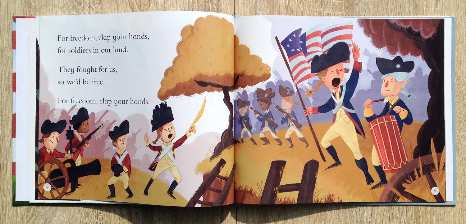
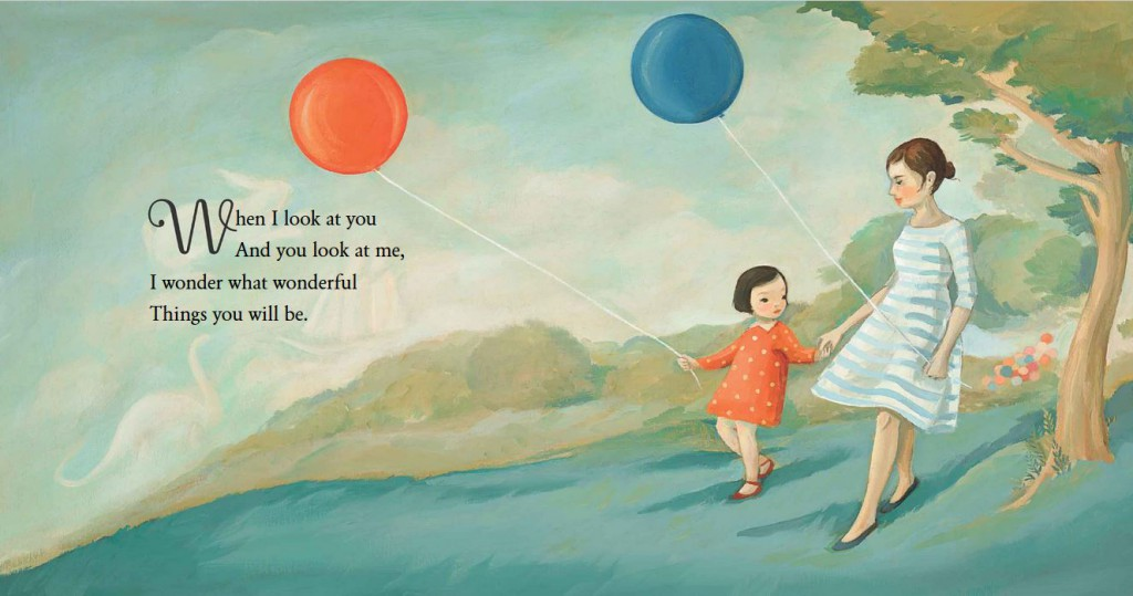
@Corlette-Douglas It's possible, but I think wouldn't be ideal. It's very busy. I think you are used to making an illustration without words where you fill up the whole page, and it doesn't yet come naturally for you to leave empty space for text. I've noticed in professional children books that they like to give a lot of breathing room for all the text and elements. No over-crowding, and no enormous text that covers everything. They like small/medium size text with lots of breathing room on all sides. It's also a trend nowadays that they like white backgrounds for a very clean, airy look. Professional art directors and editors can absolutely tell the difference when you properly planned the illustration with text in mind, and when you haven't.
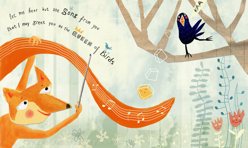
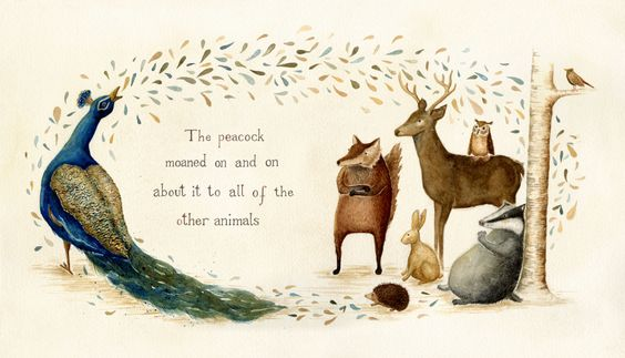
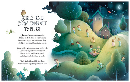
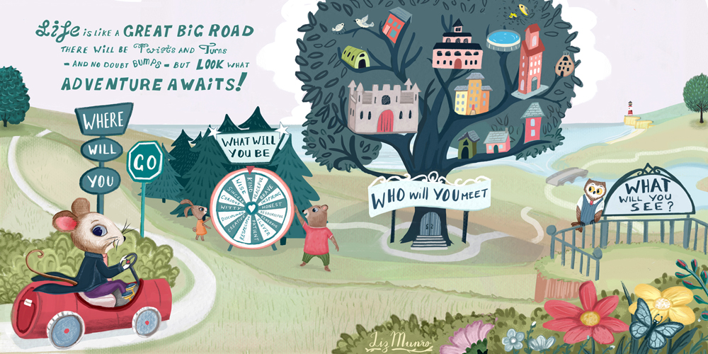
Here are some examples. You will see it is clear that they thought about the text placement from the start and left it a lot of breathing room:
vanessastoilova.com
instagram.com/vanessa.stoilova/Check out my Youtube channel for tips on how to start your career in illustration! www.youtube.com/c/ArtBusinesswithNess
-
@NessIllustration thank you for these Im going to work on my layout a little more then. I do enjoy white space in illustrations myself I just remember my professor telling me not to leave blank spaces and always have a background so I told myself I would listen to that cause I didnt think was bad advice.
But over the week I'll reform these layouts and doing alittle text sampling as well.
-
@Corlette-Douglas infact ill see if I can relay these out when I get home today
-
@Corlette-Douglas Gosh that is terrible advice!! I'm sorry, sometimes teachers can really screw us over haha... Negative space and blank space in illustrations is not to be feared, it's only one more tool to use to achieve the result you want. It can be used to great effect to convey loneliness, isolation or boredom, among many other things. You certainly don't have to cover ever inch of the surface of the page in order to make a good illustration. In fact, it's a lot harder to create a good composition if you cover ever inch of the page. You have to attract the viewers's attention on the important parts of the illustration, that's the crucial part. Good luck
")
vanessastoilova.com
instagram.com/vanessa.stoilova/Check out my Youtube channel for tips on how to start your career in illustration! www.youtube.com/c/ArtBusinesswithNess
-
@NessIllustration it's alright I'm learning now so it helps. I think he said that cause he works in tradtional oils and he uses backgrounds to describe hes characters it works for his books so I think he was telling me the same i hopes it would read the same for my layouts. But im not really a background person I mean ill use it but I do get overwhelmed when trying to put it together at times.
But ill will use your advice and hopefully have new pieces for my portfolio soon.
Thanks a ton
-
@NessIllustration oh and one more question when doing books do we ask illustrators put in the text for the author or is that someone elses job to do ? I know we need to know where to put the words in the illustrations but im just wondering.
-
@Corlette-Douglas When working with a professional publisher, most always they have a book designer or graphic designer do the text. However in some cases for instance when working with a self-published author, it's possible they will ask you if you're able to do type as well. If you're not confident you can do a professional job you can always say no, because bad type can ruin a book and your name will be on it. I usually say I can't do it and they need to hire a graphic designer. I think one time, the publisher gave me the text and said they wanted Bodoni in 14pt so I was like alrighty then, I can put that in. But if I have to take any of the creative decisions on the type, I better be sure I know what I'm doing (and I don't, so I refuse).
-
@Corlette-Douglas You have a fun project going. As Ness pointed out, it is really good to include some picturebook spreads in your portfolio. As I am currently working on character design improvement myself, I started to pay a lot more attention to fellow artists' character design. I notice that your characters look kind of similar in your current spreads. I am not quite sure if there is just one black girl character, or 2-3 characters. If there is suppose to be 2-3 different characters in your current spreads, you might want to take a look of your story, and decide personality of each character, and design their look and feel based on the personality of the characters. Hopefully they will look very different from each other :-).
-
@Corlette-Douglas i like your story but I’m seeing a lot of wonky anatomy on your characters, a lot of tangents, and faulty perspective. You should really take note of them from here on out.