Less or More Color?
-
Quick opinion question...
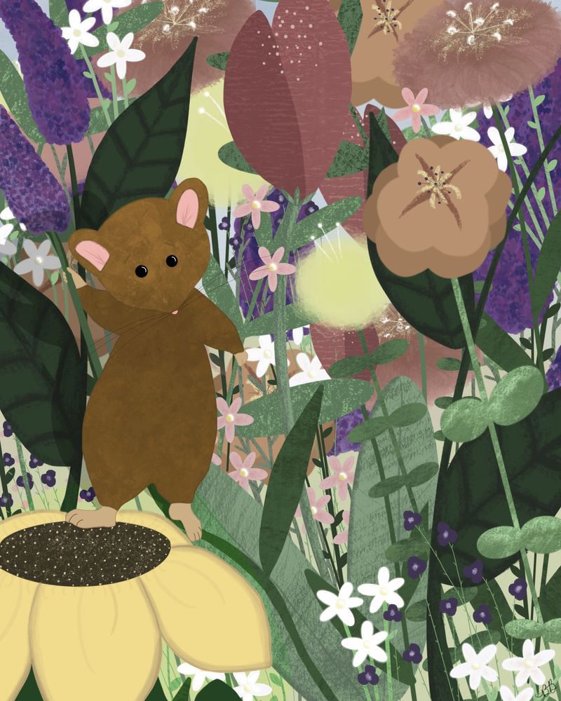
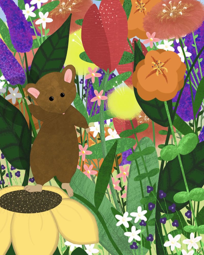
Is the less saturated image or the bolder image more appealing for a children’s book illustration? I’ve been looking at them so long I don’t know what to think anymore!
I started playing with it after reading several children’s books and noticing many with more muted colors, even the flowers and foliage...but flowers usually make me think of bright colors, so I don’t know what looks better.
I’m also wondering if it’s too busy? I kind of went crazy adding more and more flowers and leaves! Too much?
-
This is beautiful! I like the option with more color personally. Your oranges and some of your yellows are already a bit muted with that option and I think the pops of purple and reds add a really nice contrast. You could keep the brighter colors more in the foreground and mute the colors as they move back if you wanted to try something different.

-
@Annaaronson - Thank you! I hadn’t thought of varying the foreground and the back that’s a good idea to try instead of making it all or nothing. I appreciate you taking the time to share!
-
@BreannaB Hi.
I like the first one more though I tend to like more vibrant colours so I think it also depends on what colours you use where and it also depends on what type of mood, atmosphere or feeling you want to project. Your image is super cute!
-
@Heather-Boyd - Thank you! I’m going to keep working on it!
")
-
Hi @BreannaB! This is a really cute image! I love the wide variety of plant shapes and colors. And the mouse's face is adorable.
I am personally finding that I like the bright colors because they go well with your graphic and bold shapes. A suggestion that I've heard frequently is to put desaturated colors next to saturated ones. They contrast, which makes the bright colors seem ever brighter, without being too overwhelming.
I feel like it's a little busy. I love the tiny little flowers down in the righthand corner. But the tiny little flowers in the background (to the right of the mouse) are drawing my attention a lot more than the mouse.
-
Thank you so much for the feedback @baileymvidler! I’ll remember that as I’m reworking it! Appreciate you taking the time!
-
@gavpartridge thank you for taking the time to give me so much feedback! I really appreciate it!