Critique Wanted: Bongo and Clyde
-
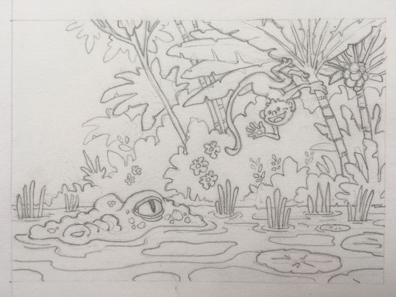
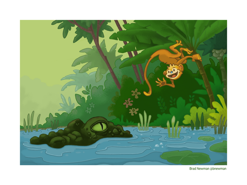
Hi everyone, I'd welcome some feedback on my June entry. I tend to struggle with color and with the transition from pencil to digital. I am comfortable working in pencil and I'm happy with where I end up but then I get it into Photoshop and while I'm generally happy with the final outcome I do feel it could be better. I've posted the sketch and final below. Thanks in advance!
-
@Brad-Newman I think you have done a pretty good job with your colors. Though I am no expert.
A couple of tips I have been trying to work in lately that I think help are:
- Use as few colors as possible, if I can go monochromatic all the better. There is less chance of color clashes and colors pulling you to the wrong the focal points.
- I think you are doing this pretty well you only really have 3 colors Orange, Green, and Blue. One thing you might entertain is to make the tree stems less of a red-brown and more of an orange-brown. If you wanted you could make the water green instead of blue (I did that in my piece to remove a color)
- My second thing is to make sure the values work even after applying color.
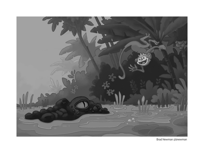
- As you can see below your values are working pretty well even after applying color. Though you might want to lighten up Bongo just a hair. Clyde's value contrast with his background really bring him out.
-The Prairie Fox
https://www.instagram.com/theprairiefox
https://www.theprairiefox.com - Use as few colors as possible, if I can go monochromatic all the better. There is less chance of color clashes and colors pulling you to the wrong the focal points.
-
Hello!
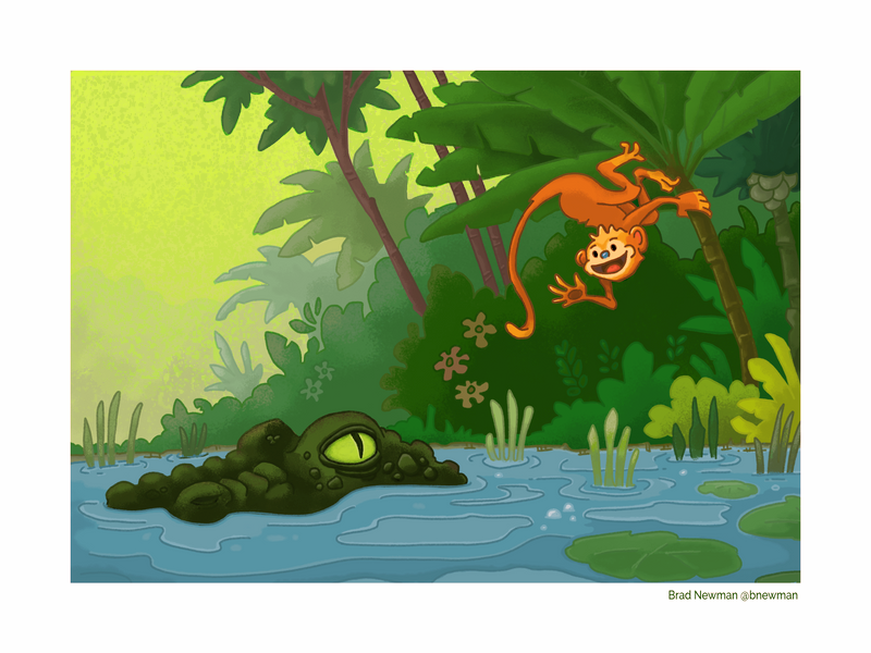
I saw this an thought that your image would POP a bit better if you lighten the background, so I made this quick mock up. I also tinted the monkey slighter more red to contrast with it’s environment better. These small changes with improve the overall contrast in the image. Hopefully this is helpful to you

Instagram: https://www.instagram.com/artzieren/
-
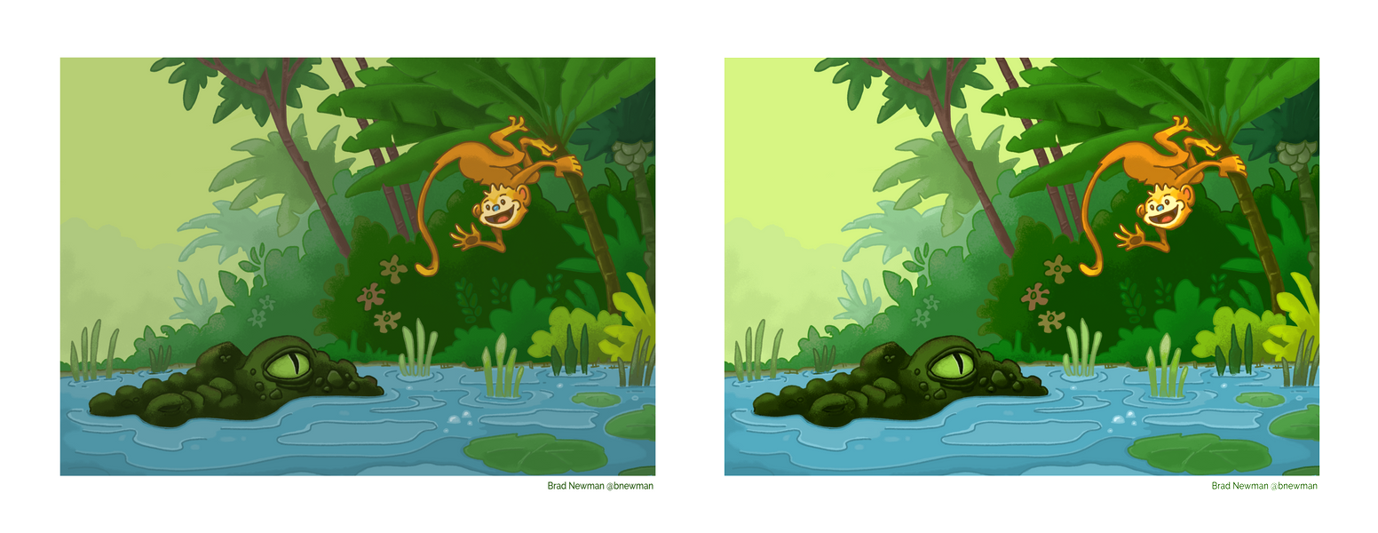
I agree with the @theprairiefox’s comments. In particular, looking at the image in greyscale is often really useful (I do this by adding a top layer set to a blend mode of saturation and then filling it with white). Looking at your piece in greyscale, it feels like the values might be a bit too clustered around the middle in terms of brightness. You might experiment with applying a levels adjustment to make the darks a little darker and the lights a little lighter. Here's quick example of what a small layers adjustment could look like (original on the left):
-
@theprairiefox Thanks very much! I'll have a look making that water a bit more green and the trunks more orange-y.
-
@Braxton Thanks for the reply! Yeah, I do tend to stick to the middle. It's hard to add contrast. Good advice.
")
-
@Brad-Newman One suggestion a friend gave me is to take an illustration where you like the distribution of lights/darks/contrast, turn it to greyscale and keep it visible as a guide while you're drawing. You're not trying to copy it per se, just using it as a guide if things start to skew too light or two dark (or not enough contrast).