Society of Visual Storytelling

    SVSLearn Forums

    • Register
    • Login
    • Search
    • Recent
    • Tags
    • Popular
    • Users
    • Groups
    • Search

    Santa sketch 3rd Thurs-Update

    General Discussion
    3rd thursday
    14
    22
    9429
    Loading More Posts
    • Oldest to Newest
    • Newest to Oldest
    • Most Votes
    Reply
    • Reply as topic
    Log in to reply
    This topic has been deleted. Only users with topic management privileges can see it.
    • Chris Perry
      Chris Perry @joanie stone last edited by

      @joanie-stone I like it. The elephants really have a drawn through shape.

      1 Reply Last reply Reply Quote 0
      • bharris
        bharris last edited by

        I like your light/organic feel in your drawing! Very sweet!

        www.brittanyharrisillustration.com/
        www.instagram.com/britillustration/

        1 Reply Last reply Reply Quote 0
        • Lee White
          Lee White SVS Team SVS Instructor Pro SVS OG last edited by Lee White

          very nice Joanie! I love your concept and your expressions on the elephants make them look so sweet! Really nice.

          A few suggestions:

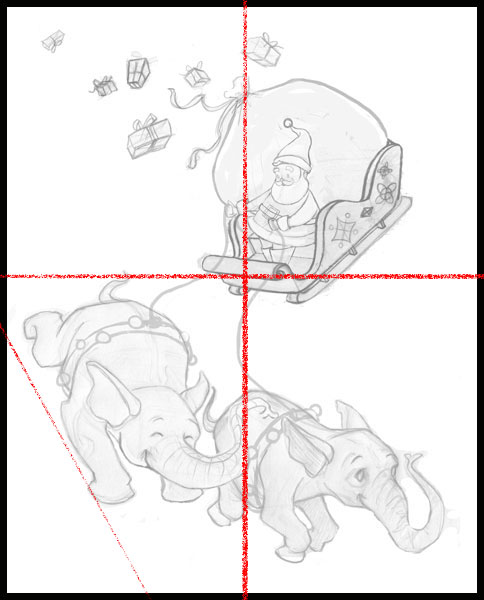
          1. When posting a sketch or image with white as the background, always add a border (this goes for all of you!). The white space defines the compostion and it's hard to really see how the image is working when we can't see where the background ends (especially since the background of the forum is also white).

          2. Once I added a border, you can see that your compostion is neatly divided into 4 quarters which may not be the best option. It's important at this stage to really think about rhythm and flow and all the other little compositional details without getting lost in the subject matter (which isn't easy to do).

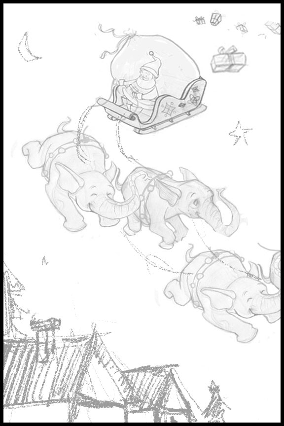
          3. After seeing the image divided into quarters, I chose to mess around with a more dynamic design. Feel free to discard it if you like, it's just a sample of what you can do to add interest to the image. I chose a tall vertical format which I really like. It seemed like it needed some other imagery to balance it, so I thought it might be cool to see the top of some houses. I also added two more elephants which adds more flow and allows for some cool cropping (which I'm a big fan of).

          I banked his sleigh a bit more to make it seem like it's "leaning" into the corner and then changed the presents to be falling out the back in that direction as well.

          Hope that helps. Let me know if you have any questions or concerns with it. It's a great image and I can't wait to see where you take it! : )

          -L
          1448042861058-santas_ride_sketch.jpg

          1448042861058-santas_ride_sketch 2.jpg

          SVS Faculty Instructor
          www.leewhiteillustration.com

          carlossketches 1 Reply Last reply Reply Quote 4
          • carlossketches
            carlossketches @Lee White last edited by

            @Lee-White Great composition tips and techniques!! I'll use this feedback in my own work. Thank you

            "The unexamined life is not worth living." - Socrates

            1 Reply Last reply Reply Quote 0
            • Naroth Kean
              Naroth Kean last edited by

              the elephant idea is very adorable XD

              http://narothkean.com
              https://twitter.com/narothkean
              https://www.instagram.com/narothkean

              1 Reply Last reply Reply Quote 0
              • joanie stone
                joanie stone last edited by

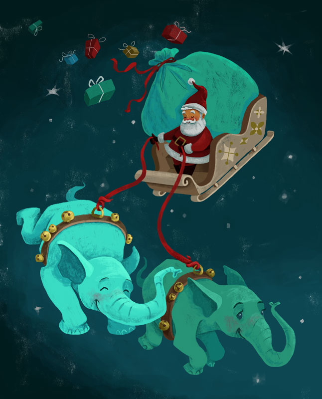
                Ahh, I wish I had seen Lee's critique before I submitted this one. He had some awesome ideas. Ayways, here's the finished piece but I may go back and incorporate Lee's ideas just for my own sake. Thanks everyone.

                santas_ride_small.jpg

                1 Reply Last reply Reply Quote 9
                • bharris
                  bharris last edited by

                  @joanie-stone I love the color scheme you used in this. the whole thing has a wonderful vintage feel to it! I agree with what Lee was saying, but this works for a stand alone piece! Great job!

                  www.brittanyharrisillustration.com/
                  www.instagram.com/britillustration/

                  1 Reply Last reply Reply Quote 0
                  • mattramsey
                    mattramsey last edited by

                    Those colors are beautiful

                    https://www.inprnt.com/gallery/mattramsey/
                    https://mattramsey.artstation.com/
                    https://twitter.com/mramseyART

                    1 Reply Last reply Reply Quote 0
                    • Dulcie
                      Dulcie SVS OG last edited by

                      It's beautiful, I love the way you paint in that vintage-yet-defined style. Really nice!

                      www.dulciemascord.com
                      https://www.instagram.com/dulciemascord
                      https://twitter.com/dulciemascord
                      https://www.facebook.com/dulciemascord

                      1 Reply Last reply Reply Quote 0
                      • Stephanie Hider
                        Stephanie Hider last edited by

                        Love the color scheme. the green is lovely.

                        http://stephisdoodling.com
                        http://stephaniehider.com
                        https://www.instagram.com/stephhider/

                        1 Reply Last reply Reply Quote 0
                        • First post
                          Last post