Society of Visual Storytelling

    SVSLearn Forums

    • Register
    • Login
    • Search
    • Recent
    • Tags
    • Popular
    • Users
    • Groups
    • Search

    Book Cover Inspiration & Tips!

    General Discussion
    9
    10
    564
    Loading More Posts
    • Oldest to Newest
    • Newest to Oldest
    • Most Votes
    Reply
    • Reply as topic
    Log in to reply
    This topic has been deleted. Only users with topic management privileges can see it.
    • carriecopadraws
      carriecopadraws SVS OG last edited by

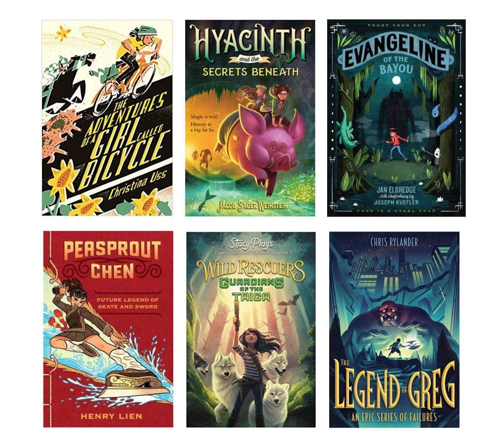
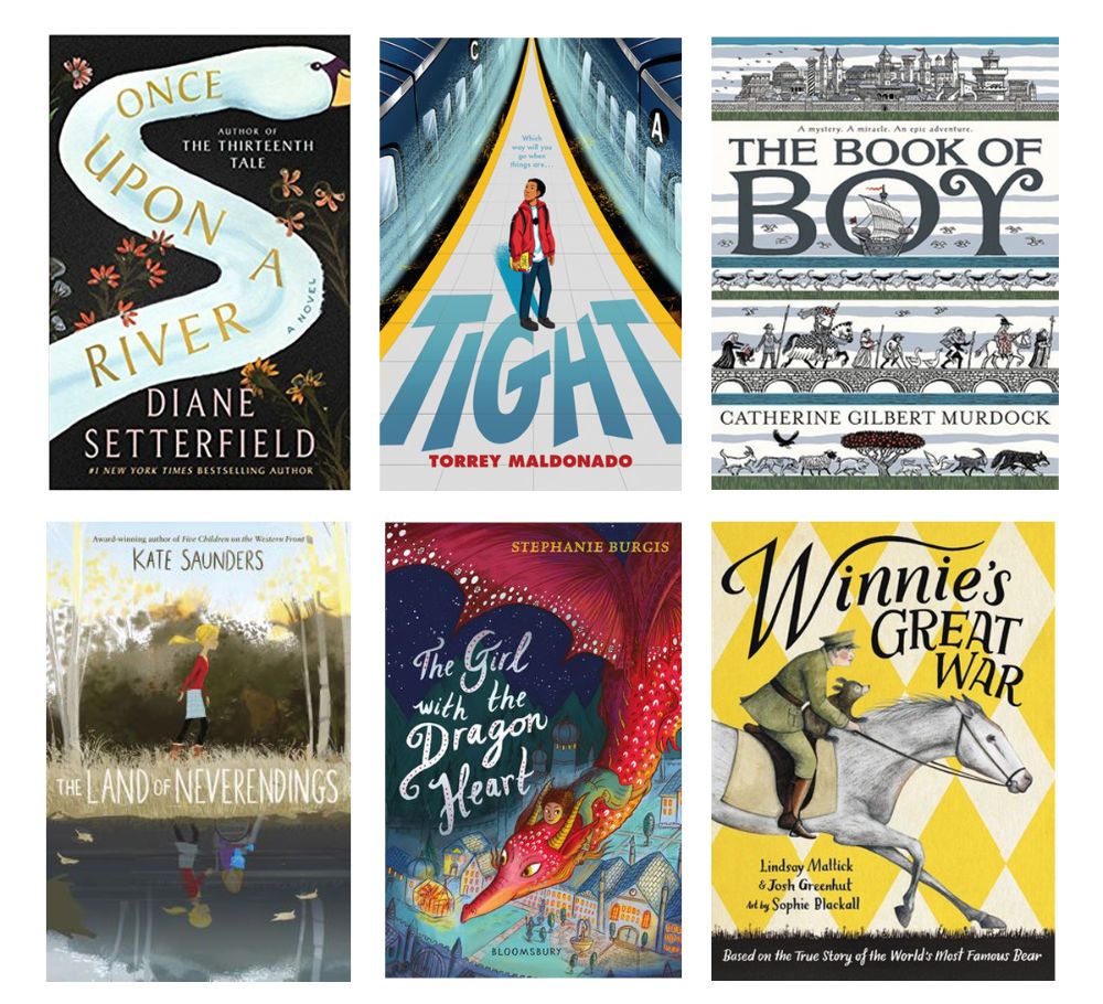
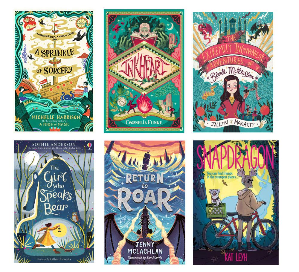
      I've been building a library of cool book covers for awhile, and wanted to share some inspiration for this month's contest challenge! I'd visit the library or book store every month or two and just snap photos of anything that caught my eye. It's a great way to study what makes a cover captivating.

      book-cover-roundup-0618.jpg

      book-cover-roundup-Dec2018.jpg

      book-cover-roundup-July2020.jpg

      TIPS!

      • Consider how the title and author name will fit in the thumbnail stage! A general rule of thumb is the title takes up 1/3 of the cover space.
      • If you can, use real fonts. Or trace over fonts for and embellish them. It will make your cover look more polished. The title treatment conveys the tone of the book as much as the illustration. There are several free font resources out there.
      • Book covers differ from narrative illustration because they are not usually showing a straight scene from the story, but elements of the story put together in an interesting way. It is a layout/design challenge instead of a storytelling challenge.

      Was this helpful? Please share more tips if you have 'em!

      Carrie Copa
      https://carriecopadraws.com/

      Jeremy Ross holleywilliamson Johanna Kim 3 Replies Last reply Reply Quote 12
      • Jeremy Ross
        Jeremy Ross @carriecopadraws last edited by

        Very helpful @carriecopadraws! Thank you!

        https://www.instagram.com/jeremyrayross
        https://www.jeremyrayross.com/
        https://twitter.com/jeremyrayross
        https://jeremyrayross.substack.com/

        1 Reply Last reply Reply Quote 0
        • baileyvidler
          baileyvidler last edited by

          Thank you for sharing! These are fantastic examples. Definitely going to save these!

          Bailey Vidler
          Portfolio: baileyvidler.com

          1 Reply Last reply Reply Quote 0
          • Pinky
            Pinky last edited by

            Thanks for doing this -- very useful information!

            1 Reply Last reply Reply Quote 0
            • carlianne
              carlianne last edited by

              This is so great! I am also going to rewatch Will Terry's YouTube video on it

              https://youtu.be/ybh2Up_0XuM

              Check out my art and tutorials :)

              Instagram: www.instagram.com/carliannecreates/

              Youtube:
              https://youtube.com/c/CarlianneCreates

              Shop: www.carliannecreates.com

              1 Reply Last reply Reply Quote 3
              • Sasha Contreras
                Sasha Contreras last edited by

                @carriecopadraws Great finds!! I think my favorites where the Peasprout Chen and The Girl Who Speaks Bear.

                The Peasprout Chen gave a beautiful description to the reader of the character's personality, style, and values. The skates were designed so creatively. 👌🏼

                The Girl Who Speaks Bear has an great hidden image within the hill created! The type placement is great and I'm a sucker for a good script font!

                Thank you for sharing these!

                Instagram: https://www.instagram.com/chiquis_studio/
                Portfolio: https://sasharc.myportfolio.com/home

                1 Reply Last reply Reply Quote 0
                • holleywilliamson
                  holleywilliamson SVS OG @carriecopadraws last edited by

                  @carriecopadraws thank you, great tips. Here are some more favorite covers I have collected on Pinterest

                  https://pin.it/WUyIVr5

                  https://www.instagram.com/holleywilliamsonart/
                  http://holleywilliamson.com

                  carriecopadraws 1 Reply Last reply Reply Quote 1
                  • carriecopadraws
                    carriecopadraws SVS OG @holleywilliamson last edited by

                    @holleywilliamson Your Pinterest cover collection is fantastic! Where the Red Fern Grows is on my list of covers to redo someday.

                    Carrie Copa
                    https://carriecopadraws.com/

                    1 Reply Last reply Reply Quote 0
                    • Johanna Kim
                      Johanna Kim SVS OG @carriecopadraws last edited by

                      @carriecopadraws WOW, this is fantastic. Thanks so much for sharing. I also LOVE your work.

                      http://www.johannakim.com
                      http://instagram.com/johannahkim/

                      1 Reply Last reply Reply Quote 1
                      • idid
                        idid last edited by

                        @carriecopadraws said in Book Cover Inspiration & Tips!:

                        ! A general rule of thumb is the title takes up 1/3 of the cover space.
                        If you can, use real fonts. Or trace over fonts for and embellish them. It will make your cover look more polished. The title treatment conveys the tone of the book as much as the illustration. There are several free font resources out there.

                        Thank you for putting this together. I feel the rule you summarized are pretty helpful, although not even some publishers understand this, to my surprise.

                        1 Reply Last reply Reply Quote 0
                        • First post
                          Last post