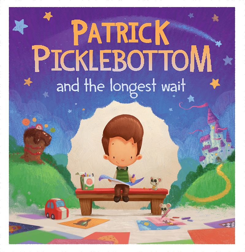
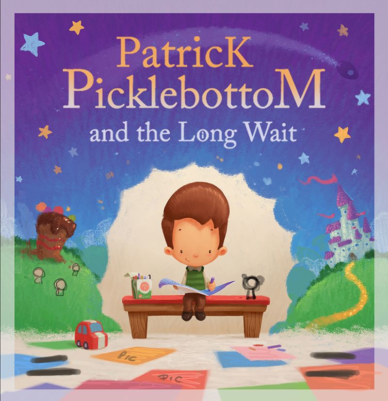
Front Cover WIP
-
Working on finishing the front cover for a new book and i'd like some feedback as to whether you feel its working at this stage. The font and styling of it is a placeholder at the moment, but I think the color choice for it is working. I'd also like to add in a couple of characters, on the floor, that appear in the book as well as some of the drawings the main character has done.
As a brief summary for the story. It's about a boy who hears there will be a book reading and sits and waits for it on a bench under a poster about the event. He waits and waits, but he feels like he is waiting a long time and begins to use his imagination (and crayons) to create random characters and stories.
In the book I use 2 different styles of brush to simulate his crayon so i've tried to make the imagination part more akin to that.
Still a bit left to do, but any thoughts to help improve it are appreciated
")
-
This looks really appealing, I love the chalkiness of his drawings.
When you've published the book, I will give you money for a copy, yes indeed.
-
@Gary-Wilkinson I love everything about it, great work
-
Feels very appealing and the colors work nicely. Feels like a story I would want to read.
-
@Gary-Wilkinson Love it! I think you're going in a wonderfully fun direction. Keep going!
-
@Gary-Wilkinson I really love your character and prop design. It's consistent with your other work and that's something to be proud of. The colors here are harmonious and well planned. I'm new here and I stalked your work recently. It's obvious that you are at the top of the class.
I'm confused because there is no distinction between where the boy's environment and the imagination world collide. He is so crisp which makes me think he and his drawings are in front. But then I get the feeling that the crayon world is in front because of the high chroma and strong texture.
If I had any suggestions it would be to:- define what's in front and what's behind
- maybe a drop shadow would help to separate the two spaces
- muting the colors of the crayon world
- bringing down those highlights in the crayon world to keep the contrast lower.
(I'm assuming you want the boy to be the subject since the book is about him. That's why I'm suggesting taking down the intensity of the of the crayon world.) I hope these suggestions help. I know personally I benefit from detailed feedback. Overall I really like it.
- define what's in front and what's behind
-
@kimmypie thank you for the feedback. I agree with a lot of the points you mentioned and I think it will help moving forward. Im hoping that the paper on the floor will help create more of a distinction when developed more and maybe I can add in a couple more props to separate the imaginary background from the real world
-
@Gary-Wilkinson Yeah obviously this is a work in progress. I'm going to respectfully disagree with Kimmy in that I like the saturation of colour in the crayon world, I think it would be a mistake to mute it, if anything I would make it more intense than the real world, as imagination can be.
Just my 2 cents -
@MattBaker @Gary-Wilkinson That’s a valid point Matt. When looking at book covers, especially for children’s books, saturation is probably going to turn some heads faster.
I still think there needs to be a way to separate the two worlds, however he chooses to solve the problem. Maybe desaturation isn’t the solution. At this stage there’s a lot invested and it’s hard to make changes. I’m curious to see how it turns out in the end, even if he does leave it exactly as is. It’s still strong. -
@Gary-Wilkinson Question on the typography - is there a specific reason the last letters are capitalized, like a continuation in a series?
It might just be be because I'm a typography nerd, but the "M" is really bothering me when I'm reading it and kept pulling my eye up from the character. The "K" less so, probably because it's less pronounced at the top based on what letters are near it.
-
@jdubz the title is just a placeholder at the moment and I'll be exploring other options, but it's mostly left up to the publisher to choose the type anyhow.
I do agree about the M though
-
As the editors at Chronicle books are fond of saying, don't forget to view your cover from across the room. That's how gatekeepers encounter books at the store and readers encounter books at the library. You want yours to stand out and to communicate what you intend even from (especially from?) a distance. Great work!
-
@Joanne-Roberts Is that to say it stands out across the room or doesn't ?

-
Another update for the cover. Made some small adjustments and added in a few missing pieces. Tried out a new font for fun (though that part will mostly be out of my hands). Hoping to add the names at the bottom over the paper, so might have to rearrange a few things in that area, but it's getting closer I think.