AUGUST Prompt follow up!
-
Here is my follow up work on the august prompt. Could be a cover if a slap some dope lettering on it.
Updated:
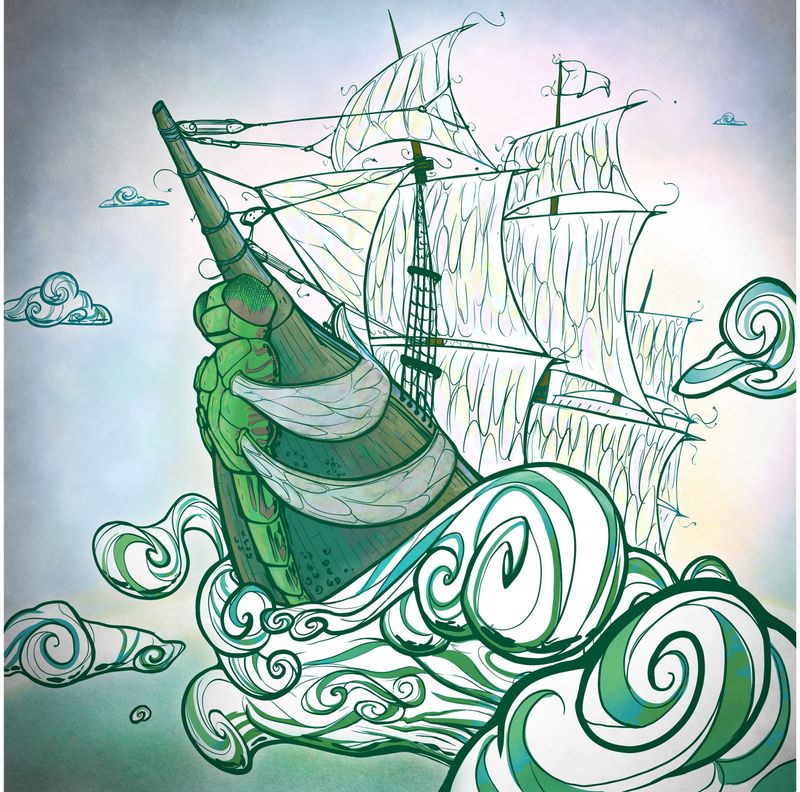
The things that draw my “critiquing eye” are:
the colors for the background.
The tint on the front of the boat
maybe the coloring on the ship
the structure of the ship.
Probably should not have chosen a green overlay.Do you have any thoughts? Critiques welcomed.
I am still kind of prefer the original (minimum color) better.
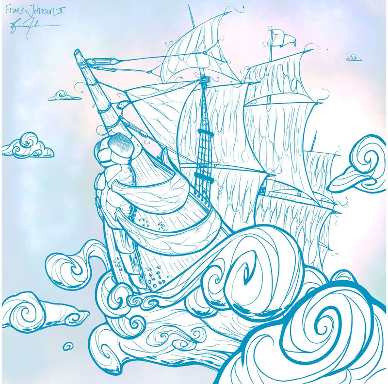
Original:
Much love, and thanks! ONE!
-
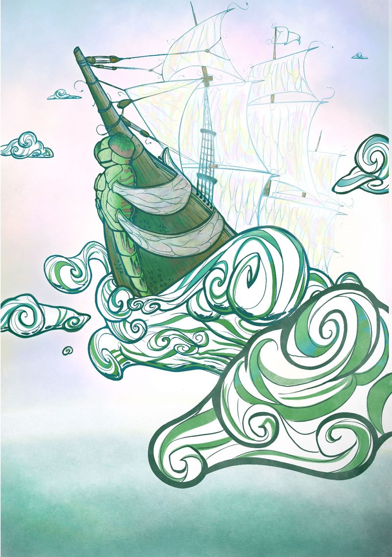
This is really cool! A a few ideas:
I think the format could be longer vertically or wider horizontally to really sell the epicness. For me, the almost-square format deadens the impact of such dynamic circumstances.
Even with all the busy textures, I think you've done a great job establishing the dragonfly as the focal point. I do think a lighter linework on the texture of the sails might be a good move. The vertical direction gives it a nice lift, but I feel the darkness of the texture makes the piece as whole a little too busy and it also disrupts the circular flow you've established to lead the eye around the piece.
Not sure if you need to go quite as dark with the vignette at the top.
I love you'r overall color palette. The warm accents pair well with the greens. Lovely job!
-
@TessaW You always have great responses. I can follow some of your comments quickly with the starfish profile picture
 ️
️Thank you for your insight and time to share it.
I love the eye you have for the flow and consideration for the audience. When you have time, you may have to teach me how to see that!

It doesn't cross my mind to consider the format to complement the feel and the emotion of the piece.
-
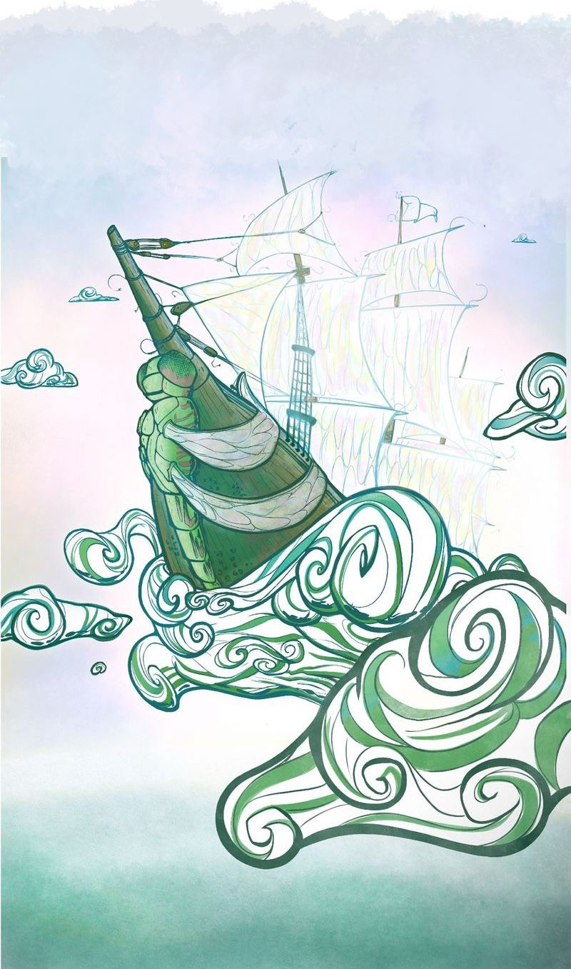
@dafoota I agree! @TessaW always gives the best critiques. I love this dragonfly with the colors. Reminds me of NC Wyeth. I agree with expanding the canvas to give it a nice airy feel.
-
@TessaW @chrisaakins ???
-
@chrisaakins thank you for your support.
-
@dafoota I think even more like this:
-
I wonder if you brought back the darkness of the outlines of the sails? It was mainly the heaviness of the inside texture that I was iffy about. I do really like how @chrisaakins has extended it upwards.
-
@chrisaakins oh I see!
Thank you. It's amazing to me the artistic instincts you both have! Thank you!