Society of Visual Storytelling

    SVSLearn Forums

    • Register
    • Login
    • Search
    • Recent
    • Tags
    • Popular
    • Users
    • Groups
    • Search

    How do you choose colors?

    General Discussion
    16
    27
    1522
    Loading More Posts
    • Oldest to Newest
    • Newest to Oldest
    • Most Votes
    Reply
    • Reply as topic
    Log in to reply
    This topic has been deleted. Only users with topic management privileges can see it.
    • Nyrryl  Cadiz
      Nyrryl Cadiz SVS OG @NessIllustration last edited by

      @NessIllustration this is so beautiful!!! I love you color choice.

      Portfolio: nyrrylcadiz.com
      Instagram: https://www.instagram.com/nyrryl_cadiz/
      YouTube: https://www.youtube.com/channel/UCbJCF1Im8ZO7hpGWTKOJMuA

      NessIllustration 1 Reply Last reply Reply Quote 2
      • NessIllustration
        NessIllustration Pro @Nyrryl Cadiz last edited by

        @Nyrryl-Cadiz ❤ ❤ ❤

        vanessastoilova.com
        instagram.com/vanessa.stoilova/

        Check out my Youtube channel for tips on how to start your career in illustration! www.youtube.com/c/ArtBusinesswithNess

        1 Reply Last reply Reply Quote 2
        • CaseyKinseyArt
          CaseyKinseyArt @jdubz last edited by

          @jdubz Now that’s a new perspective for me! I’ll definitely try these tips! Thank you!!

          CK•XXII

          1 Reply Last reply Reply Quote 0
          • CaseyKinseyArt
            CaseyKinseyArt @NessIllustration last edited by

            @NessIllustration wow, this is awesome!! Thank you for this!

            CK•XXII

            1 Reply Last reply Reply Quote 0
            • CaseyKinseyArt
              CaseyKinseyArt last edited by

              For anyone wondering, this is what the final piece ended up looking like. It’s not perfect, but I’m pretty happy with it! Thanks for all the wonderful advice everyone!

              cd19ef45-017d-4a49-af92-c34122eae315-image.jpeg 
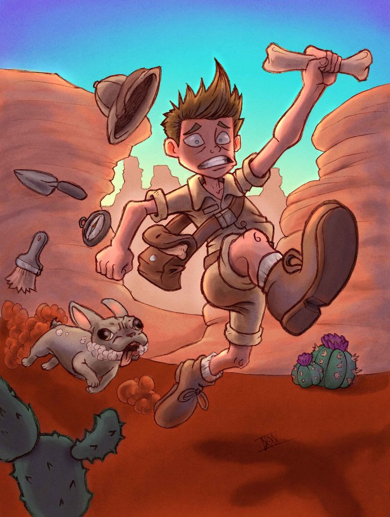
https://forum.svslearn.com/assets/uploads/files/1599360116556-desert-run_2.jpg

              CK•XXII

              1 Reply Last reply Reply Quote 2
              • deborah Haagenson
                deborah Haagenson last edited by

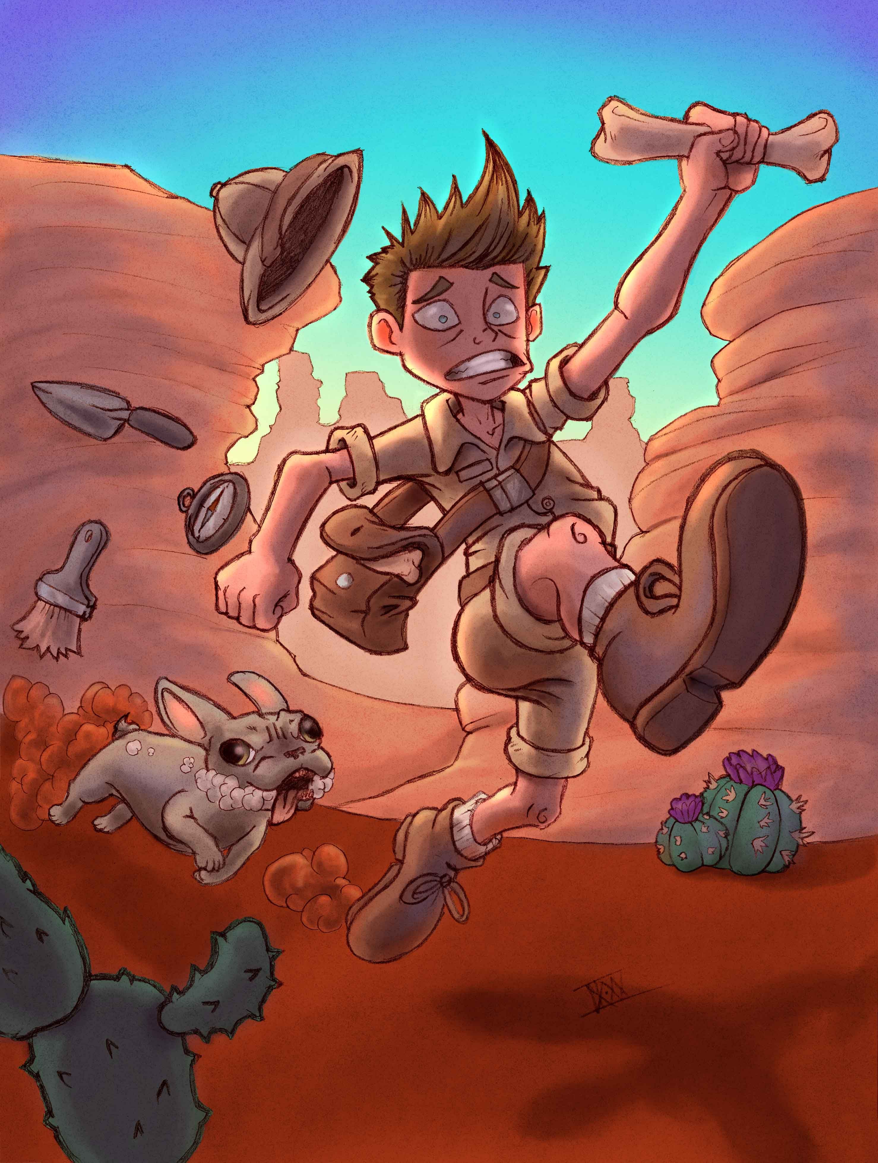
                So much great advise!! I just wanted to add one thing that I was told recently. When you use a lot of line work your colors should be more saturated.

                CaseyKinseyArt 1 Reply Last reply Reply Quote 1
                • CaseyKinseyArt
                  CaseyKinseyArt @deborah Haagenson last edited by

                  @deborah-Haagenson Interesting! Just curious, but do you know why that is?

                  CK•XXII

                  deborah Haagenson 1 Reply Last reply Reply Quote 0
                  • deborah Haagenson
                    deborah Haagenson @CaseyKinseyArt last edited by

                    @CaseyKinseyArt Yes, because the linework and the colors compete and together can overpower the piece. When I was told this I went and looked at illustrations online and found that many followed this. Of course all rules are made to be broken, but it's something to consider when choosing colors. Especially if something looks off.

                    1 Reply Last reply Reply Quote 1
                    • Sasha Contreras
                      Sasha Contreras last edited by

                      I'm a little late to the color party but check out this website! I use it when I have art block in terms of choosing a color palette.
                      https://coolors.co
                      It's a free color generator. You can either screen shot the color palette or download it and place it into your procreate/photoshop. Pretty cool and easy to use website.

                      Instagram: https://www.instagram.com/chiquis_studio/
                      Portfolio: https://sasharc.myportfolio.com/home

                      1 Reply Last reply Reply Quote 0
                      • EliaMurrayArt
                        EliaMurrayArt last edited by

                        I know the piece is done (excellent work!) but I wanted to share these because I STRUGGLE with color and this artist's demos really really helped me gain some confidence! I essentially try not to worry about the "color" as much anymore and focus more on the "values". It helped me sort of step out of my color box, and have more fun just experimenting with a variety of colors. As long as the values are correct then the colors end up looking much better together!

                        https://www.youtube.com/watch?v=Fbo6ZAuF914&list=PLS2oTl89g8i7C7gNl8xARB8ufGS2dX5wC&index=6&t=1s

                        https://www.youtube.com/watch?v=lJitss58XKc

                        https://www.youtube.com/watch?v=4LhcNbFMkTw

                        Instagram: https://www.instagram.com/eliamurrayart/
                        Portfolio: www.eliamurray.com

                        1 Reply Last reply Reply Quote 0
                        • First post
                          Last post