Serious critique requested.
-
@kimmypie I love your piece, and it was one of my favorite entries in the contest. Character designs are great, the octopus tentacles are awesome, and it's delightfully weird. I think some consistency in lighting would help you out, so you could remove the top left hand light bulb. That will keep that from competing against the "z's" and being a focal point, and then you can have all your light coming from the top right hand corner of the piece. I love that the fairy is wearing a black dress, but you could add some rim light to bring out definition and details. Here's a quick draw over for how those changes could look:
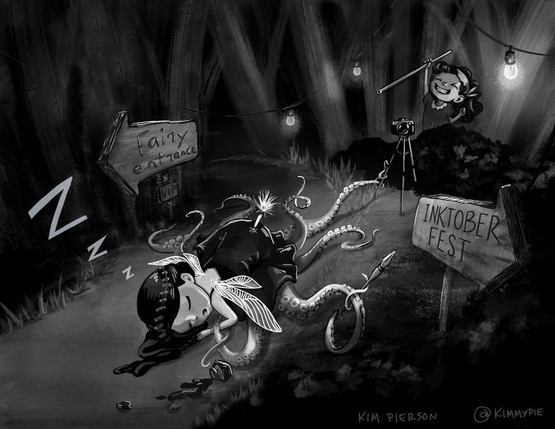
From a conceptual view point, I think "Inktober Fest" is awesome, but maybe the duel signs might make the trap a little confusing. You could consider replacing the fairy entrance sign with a table that has a bunch of bottle of ink set out to entice the fairy. That placement would still give Ellie a good shot at snagging her fairy.
-
@ajillustrates Thanks so much for the feedback. Those are all great suggestions. I will tuck them away for the next entry. BTW I enjoyed your more realistic image of Ellie. The line work was beautiful.
-
@kimmypie Thank you! I wanted to use the contest to really focus on working with my brush pen.
-
@chrisaakins Hey that really does make a difference. I just figured she had to have a black dress. I guess nothing should be set in stone. Thanks Chris.
-
@Nyrryl-Cadiz That seems to be the consensus. Thanks so much for the feedback!
-
Hi @kimmypie, it’s an interesting piece and great quality! I’ll share some feedback.
-
Definitely too dark. When I look at it from a distance, I can’t tell what’s going on. Check out the SVS Course Art Critique with Marco Bucci and Will Terry. They go into great depth on contrast and values. I just took this course last night after my piece failed the value test.
-
The ink fairy is a squid; however, the story takes place in the forest. I’m not sure the environment makes sense. For example, the squid piece that made it th the sweet 16 was in the ocean.
-
The Inktober sign kept taking my attention, mainly because it was well lit and rendered. I’m not sure if you wanted the audience to focus on the signs. Also, many outside the art community don’t know what Inktober is.
Overall, your artwork is great and this piece would have probably made it with the right play on values.
Hope this helps!
-
-
@kimmypie What if in the distance in the left, just above the curve of the road, through the trees you could see what looked like reflection on the water? maybe even distant waves breaking. That would answer the question of place and why a squid fairy is in the forest. You could push the Inktober sign into shadow a little more so it doesn't pull our attention out of frame.
-
@kimmypie My critiques would be:
Others have mentioned the signs so I might just be saying the same thing. I think the inktober sign is distracting because if we're supposed to be sucked into the scene, having an inktober sign seems out of place and pulls me right out. Also, it's pointing right off the page so my eye is going out of the picture because it's so close to the edge.
The other sign I think the lighting is off on the front end. The lit parts of the left-side arrow wouldn't be catching that light. The top right side would be, but that left side would still be in shadow except for the very top. That's kind of knit-picky so I don't think it's a huge problem but it's definitely drawing the eye there.
The second thing is I think the background trees are rendered inconsistently with the rest of the piece. They don't need to be as detailed as everything else for sure since they're in the background, but the angles and brush strokes don't really match the foreground.
I agree the top right lightbulb is a bit too bright for where it is - maybe swapping the brightness of that bulk with one of the middle ones would make more sense because it would pull your attention back that direction.
On it being too dark - I'm not sure I agree with this. Being too dark seems more of a preference than anything else. Unless we're missing details... but taking it down to like 100px wide, it's pretty clear we're in a forest, and there is a squid-type character front and center, and it's asleep which is the focal point - so it's definitely reading.
-
@jdubz @David-starfas @Jeremy-Ross Thanks so much for the feedback. I really appreciate you guys taking the time to comment. I will keep these things in mind in the future.
")
-
@kimmypie Interesting anecdote I just realized that I previously hadn't thought of before. On my home computer and iPad, that image is not too dark. But it definitely looks too dark on my work computer monitor. So that is something I personally need to account for because we all may be seeing it a bit differently than we think