Inktober day 15-31!critiques are welcome!
-
Hello guys! I ll be uploading Inktober days 15 to 31 everyday!
I am going with digital inks this year, in order to polish this skill more.
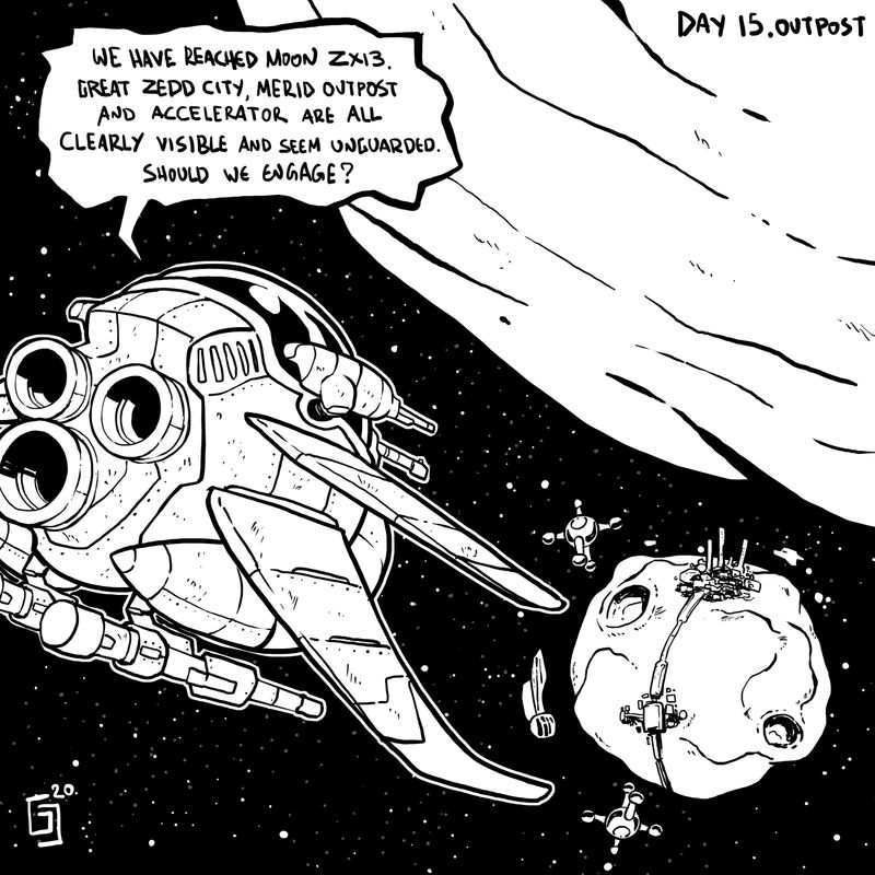
Here is day 15 outpostCritiques, opinions and suggestions
 are more than welcomed here!
Instagram : https://www.instagram.com/g.chris.artwork/
Deviantart : https://www.deviantart.com/g-chris -
Hi @Georgios-Christopoulos I really like your comic style; it's very clean without being too clean (if that makes any sense...).
My only critique is that the city was probably the last thing that my eye went to, and based on the text, I'm assuming it should be the second or third thing. I think the size is good, so maybe it's that it has less contrast than the other items in the area (or maybe if you want the outpost to be featured more ((given the prompt)), make that more prominent and give it more priority in the text).
(Also, I really love your snowboarder for the slippery prompt)
-
@miranda-hoover thanks for taking the time to critique!! actually, I see what you mean regarding the contrast.
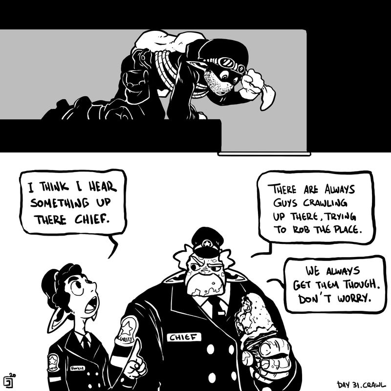
I wanted not the outpost itself presented with heavy dets, but the idea of this spaceship invading and assaulting both the city,outpost and accelerator!
But you area right on the contrast thing.Thanks again!
-
Day 16! Rocket!
A malfunctiong vehicle led to this poor fella finding his sirens..
Inktober sure presents us artists with new and interesting choices regarding concept and storytelling.I for one have last drawn space back in 2015!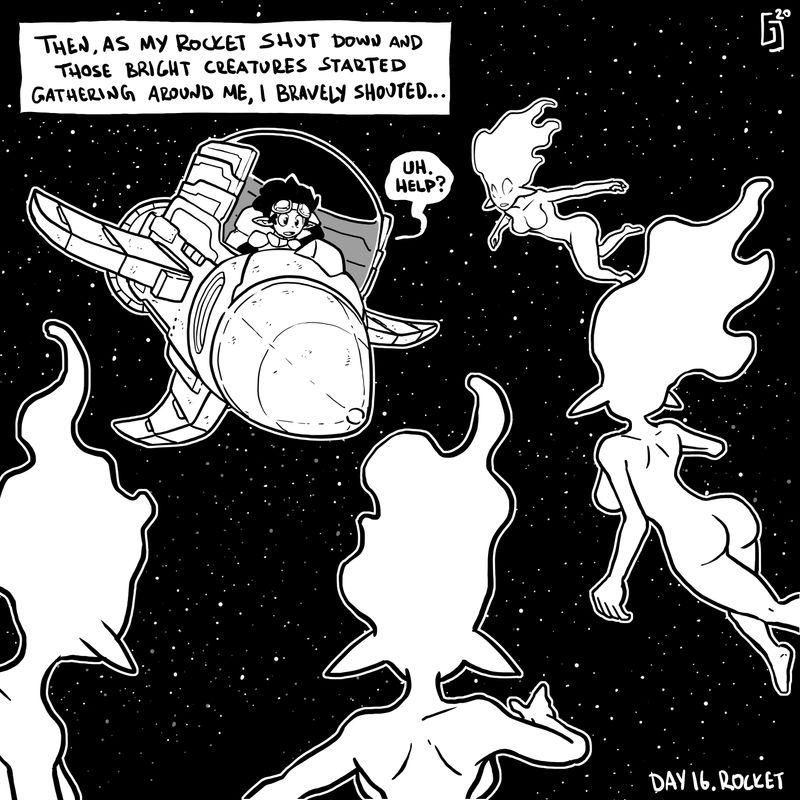
-
I would get rid of the white outlines. As long as you dont need them as rimlights you dont need em. placing objects in space without em works too. on the first image, the big asteroid on top is kinda confusing in term of is it infront of the spaceship or behind the spacestation.the thickness of the lines would suggest its infront of the space shit from our perspective but it has less details then the small one the station sits on.
-
@Molambo thanks for the opinions and suggestions my friend!!!
-
Day 17.
Stormy night for the young ones.
Timmy will sure handle it!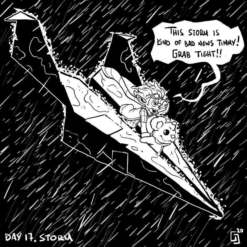
-
Day 18!
Trapped in the dungeon!!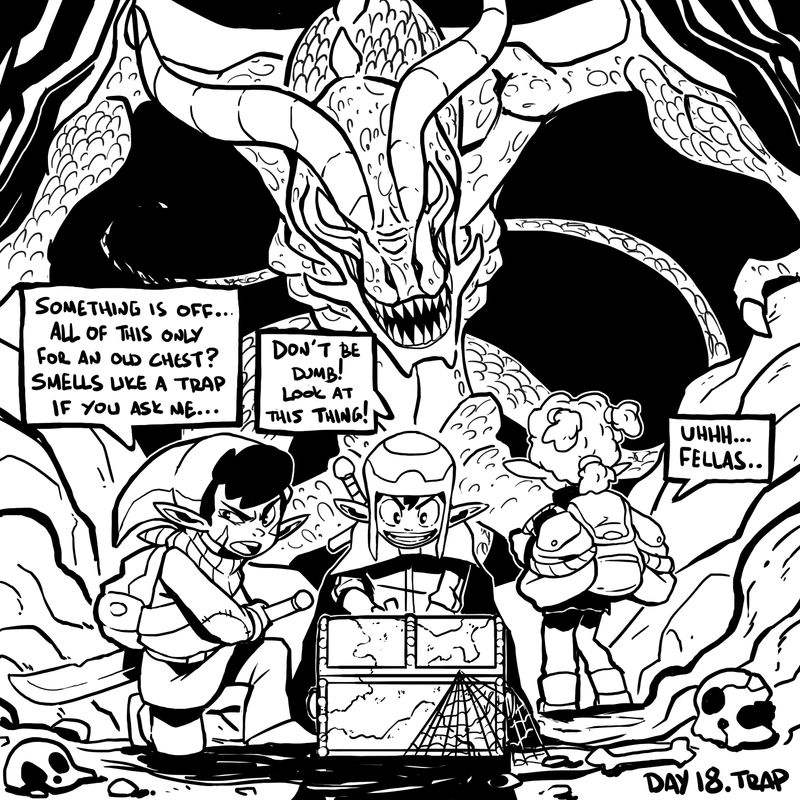
-
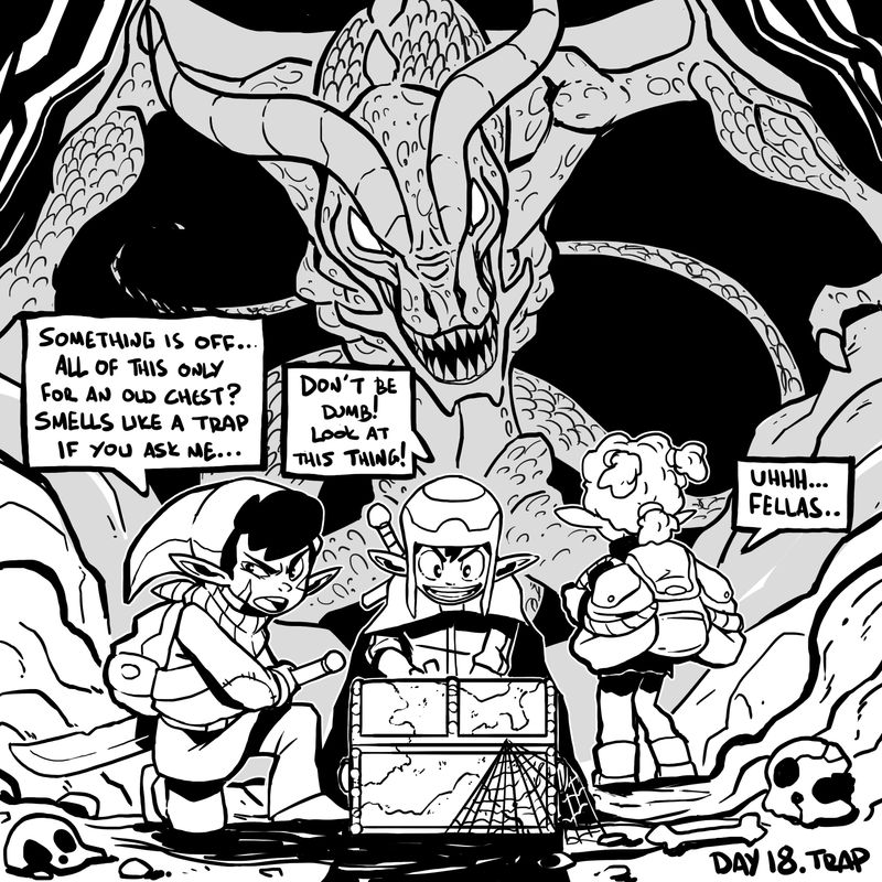
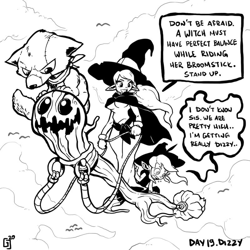
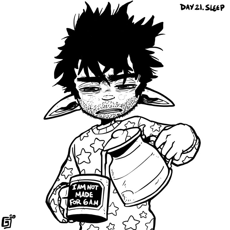
Day 19 and Day 20!!
-
-
DAY 22!!!
Little demon is either a trainee chef or a bad concience...
What do you think??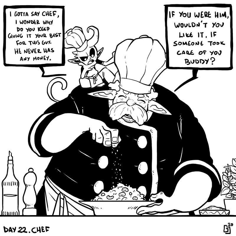
-
DAY 23-RIP
Cap'ain could not handle the jungle very well...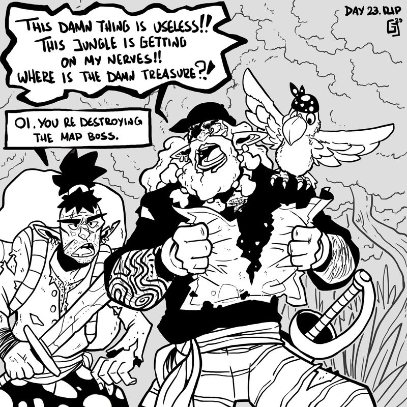
-
-
Day 25.Buddy!
Can't get up even if a dragon tells you so..
Almost done with inktober. Let's see how these last days go!!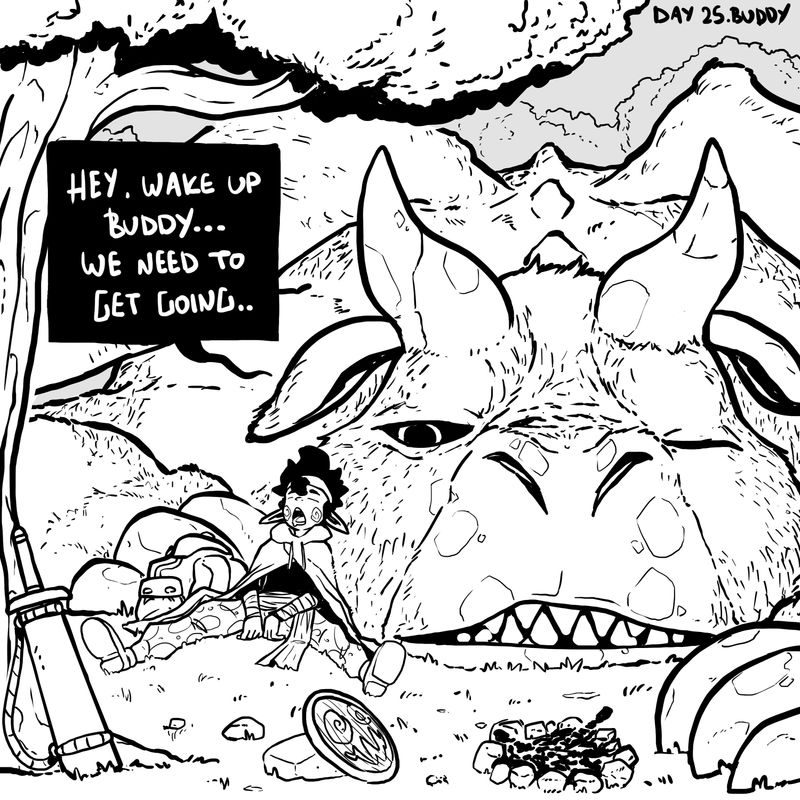
-
-
-
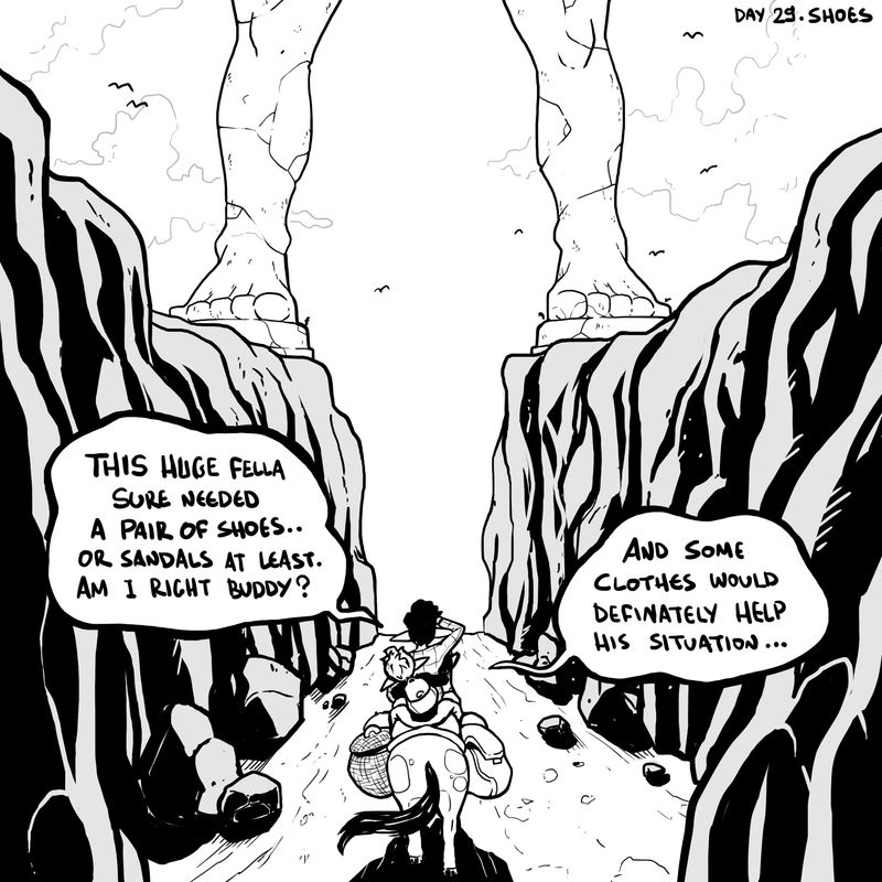
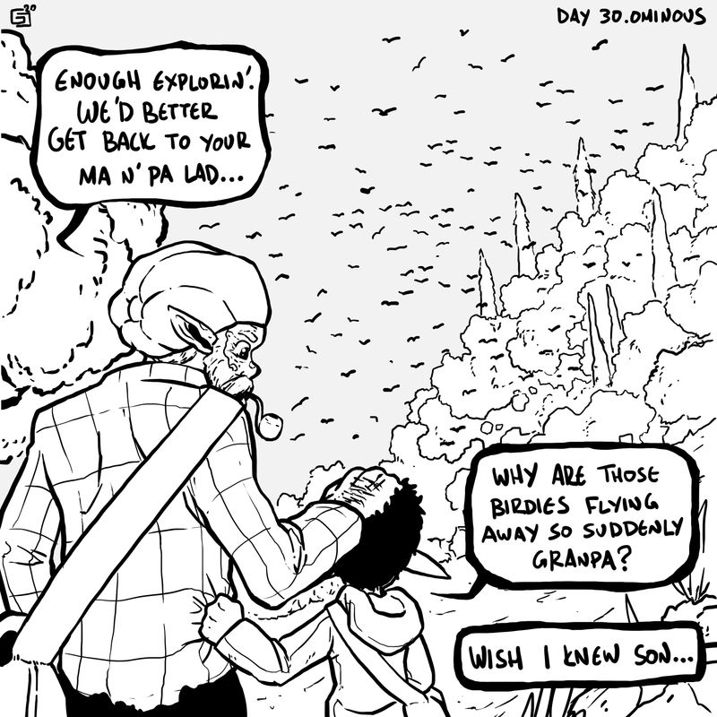
Days 29 and 30 is up!!
(lack of)Shoes and Ominous readings from the elder..One day left!!
-