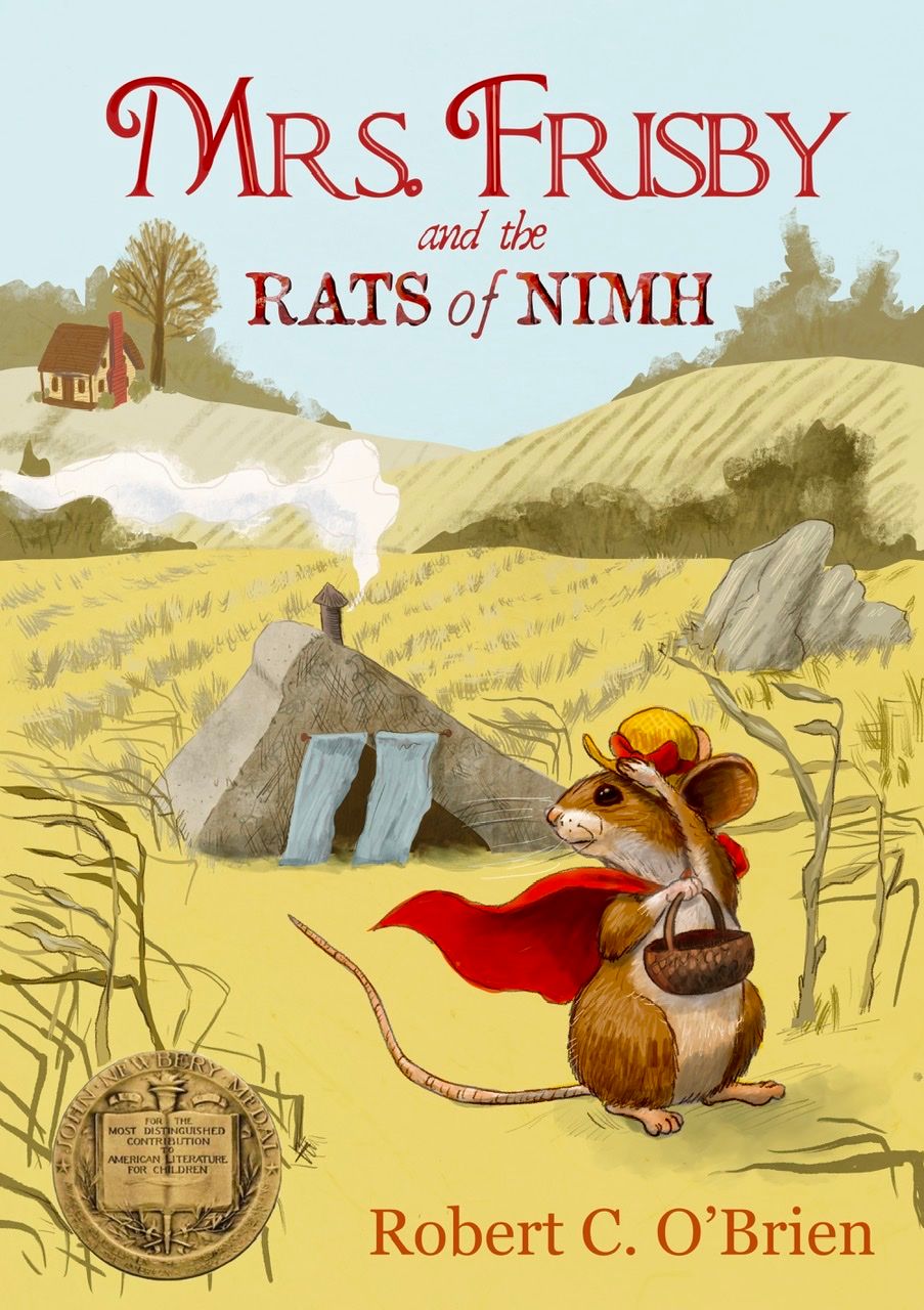
Book Cover WIP Serious critique requested.
-
Hi @chrisaakins, nice work! Here are few suggestions fir your consideration.
-
I feel the title text is too small and too light. It doesn’t screem for my attention when I zoom to a thumbnail. Also, the font type feels too traditional. I would go for something more fancy.
-
Suggest you remove the Newberry medal since it pulls attention from piece.
-
The gray rock on the right feels out of place since it’s the only gray rock.
-
The home seems out of perspective or scale feels off. Perhaps it’s the point of view?
-
The rendering of the mouse and house differs from the background rendering, but that might be because it’s not finished as you noted.
-
What if you bring the majority of the illustration to lower 1/3rd, and scale up title?
Hope this gives you something to think about it.
Cheers!
-
-
@chrisaakins Hi Chris! This looks so lovely! I really like the style and charm
")
The only thing that seems amateur to me is the text... And I know, text is not our strong suit as illustrators! Not sure about the font, and the orange color especially for the author name. The placement for the author name either... My best advice would be to look at recent children's books covers and emulate the title style of something you like!Also agreed on removing the Newberry medal. For the windy look, it might not be necessary to draw the wind if you add some small trees and tall grass being bend by that wind! It might also help dress up that background a bit, especially if you remove the medal.
I really like the color palette!
vanessastoilova.com
instagram.com/vanessa.stoilova/Check out my Youtube channel for tips on how to start your career in illustration! www.youtube.com/c/ArtBusinesswithNess
-
@Jeremy-Ross said in Book Cover WIP Serious critique requested.:
Hi @chrisaakins, nice work! Here are few suggestions fir your consideration.
-
I feel the title text is too small and too light. It doesn’t screem for my attention when I zoom to a thumbnail. Also, the font type feels too traditional. I would go for something more fancy.
The text is just a placeholder so I agree. -
Suggest you remove the Newberry medal since it pulls attention from piece.
Aww...I agree now, but it made it look official, haha! -
The gray rock on the right feels out of place since it’s the only gray rock. Okay so the rock is a major part of the story. Should I change the color?
-
The home seems out of perspective or scale feels off. Perhaps it’s the point of view? Its a cinder block buried in the ground. Knowing that, does it still seem off? What would you suggest?
-
The rendering of the mouse and house differs from the background rendering, but that might be because it’s not finished as you noted. Yeah, its not. Even thought I like the simple shapes look, I plan on rendering it more.
-
What if you bring the majority of the illustration to lower 1/3rd, and scale up title? Hmmm. Let me play with that.
Hope this gives you something to think about it.
Cheers
Thanks for the input! I tried to reply but I will have to wait til I get to my laptop! My replies are right under your text.
-
-
Agree @NessIllustration! I was thinking the same about adding grass in the foreground blowing in the wind to show movement.
-
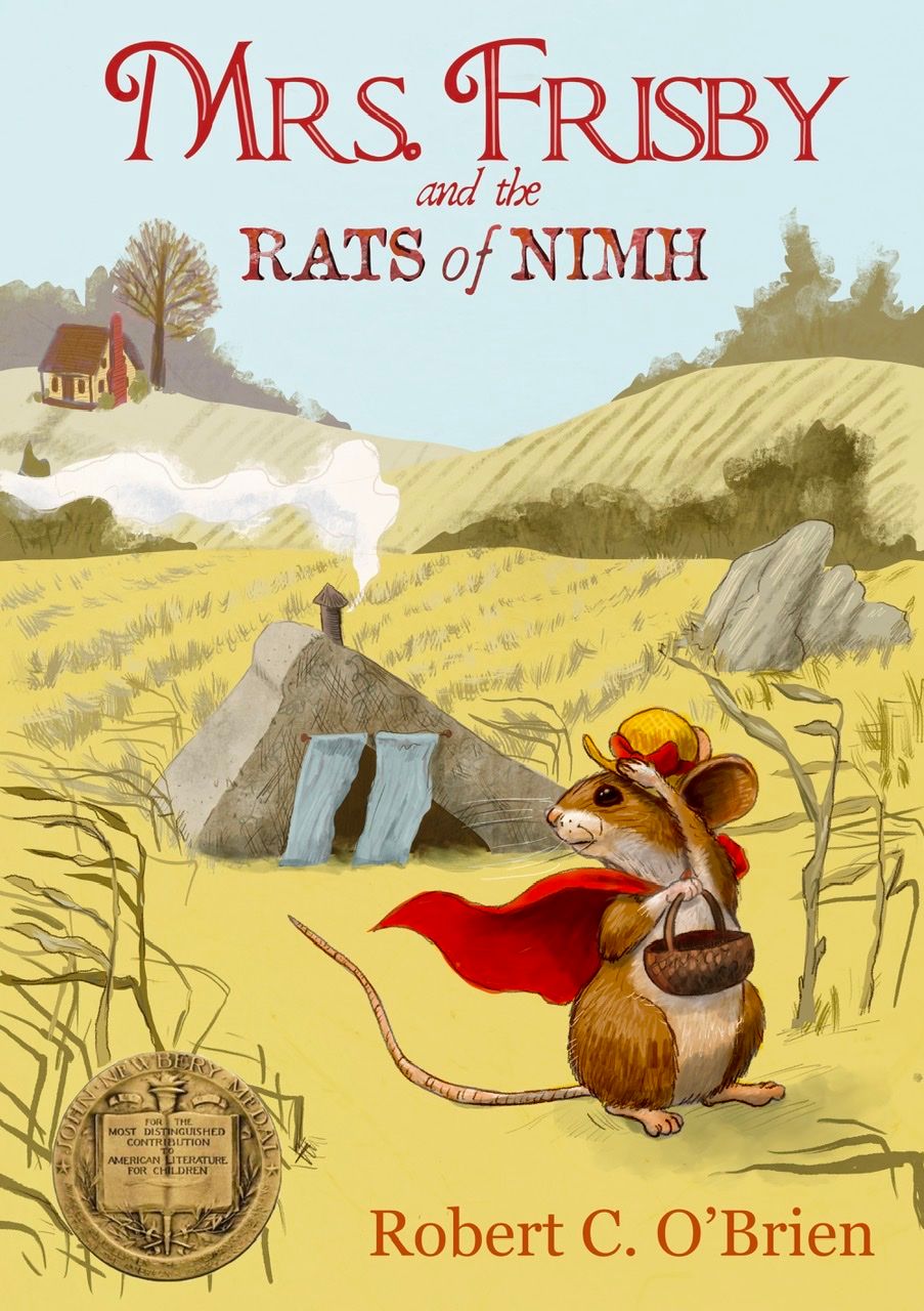
So @Jeremy-Ross and @NessIllustration I took your input into consideration and made some changes. What do you think?
-
@chrisaakins Nice!! That looks so much better Chris! I think maybe if it were me I'd give the title a smidge more breathing room. But it's up to you! And maybe some atmospheric perspective on those far away hills
-
Thank you @NessIllustration ! My wife even approves of this now. Haha!
-
@chrisaakins Bwahaha!! If I recall, she's very honest and picky about what she likes so kudos!
-
@chrisaakins Great work! I love the rendering on the mouse.
I personally prefer the 2nd version where the "Rats of NIMH" fit in the valley area. Maybe just reduce the size of that part and you'll automatically get breathing room.
In the 3rd one, since you've shifted the text up, the space between the title and the top edge seems a little less.You also have 4 different fonts on the cover page. I'm also still learning graphic designing and text placement but I think 4 fonts is a little much.
-
@Neha-Rawat I know. I don't necessarily think thats the best, either. I would have preferred an italicized version of the top font but the font I imported didn't have one. I think however in the real world an art director or graphic designer would be choosing it anyway and I would provide the illustration. Is that a correct assumption?
-
@chrisaakins said in Book Cover WIP Serious critique requested.:
I don't necessarily think thats the best, either.
Yes, that is a correct assumption that the AD/graphic designer would be handling the text layout.
But I feel since we're all visual artists, we still need to try OUR best for the whole presentation (not only the illustration) even if something doesn't fall in our domain. So the fact that you yourself aren't confident about the fonts matters more especially because it's a portfolio piece.
For eg. many of us aren't website designers, yet we spend so much time making out portfolio websites look good. But we're not getting hired to design websites. I think this is similar
-
@chrisaakins wow that really made a huge difference! Love the added details.
-
Nicely done @chrisaakins! Personally, I would lose the house in the top left since it’s competing for my attention, though I’m not sure why.
I think @Will-Terry said it best when he said, “Every item in the illustration has to have a reason in carrying the story forward.”
All in all, definitely a portfolio worthy piece as it is!
-
@Jeremy-Ross @chrisaakins Yeah I was about to say the same thing then saw your comment. I think it might simply be the red chimney that's fighting for attention. It might also be the contrast difference. The trees behind it are being obscured by atmosphere but the house is much sharper. Maybe you could keep a house in there, but put it over the hill so we only see some of it and make it similarly obscured by the atmosphere?
Lookin solid all around though!
-
@chrisaakins Also, just from a world-building perspective, maybe it should just be "Mrs. Frisby" and the Rats of Nimh is a series that this is a part of (something like "Rats of Nimh vol 1?"). Based on your work, I don't think you're going to run out of rodent material or subjects
-
@jdubz this is an actual book.
-
The flow of how this carries your eye in a circle is genius. It looks amazing!
-
@KathrynAdebayo Thanks so much!
@jdubz @Jeremy-Ross sorry my answer was so short before, I was typing on my phone and then got interrupted. So Mrs. Frisby is a children's book published in the 1970s. The farmhouse , rock, and everything in the picture is relevant to the story. (Except the tree, it was my imagination). I appreciate the feedback.
@Neha-Rawat I think the only thing that I would change at this point is the font. You really shouldn't have so many fonts on a cover. But I will probably leave it as is for now. I've got other irons in the fire, so to speak. Haha!
@NessIllustration @K-Flagg
I appreciate all your comments! Thanks, everyone for helping me make this better! -
@chrisaakins Hah no problem. I had assumed this was a book YOU were writing based on your mouse characters. Reading fail on my part! I still didn't realize it until I saw the picture on your IG account that referenced it was an existing book

That being said, you should actually make a book
