Society of Visual Storytelling

    SVSLearn Forums

    • Register
    • Login
    • Search
    • Recent
    • Tags
    • Popular
    • Users
    • Groups
    • Search

    Where can I make this better?

    Artwork
    5
    7
    378
    Loading More Posts
    • Oldest to Newest
    • Newest to Oldest
    • Most Votes
    Reply
    • Reply as topic
    Log in to reply
    This topic has been deleted. Only users with topic management privileges can see it.
    • djlambson
      djlambson last edited by

      I think I've worked that last 10% on this one, which is one of my biggest weaknesses. I'm needing more eyes to show me where this can be improved!

      snowmancrashfinL.jpg

      https://www.instagram.com/deborahlambson_art/
      https://deborahlambson.com/folio

      Asyas_illos 1 Reply Last reply Reply Quote 0
      • Natalie Lundeen
        Natalie Lundeen last edited by

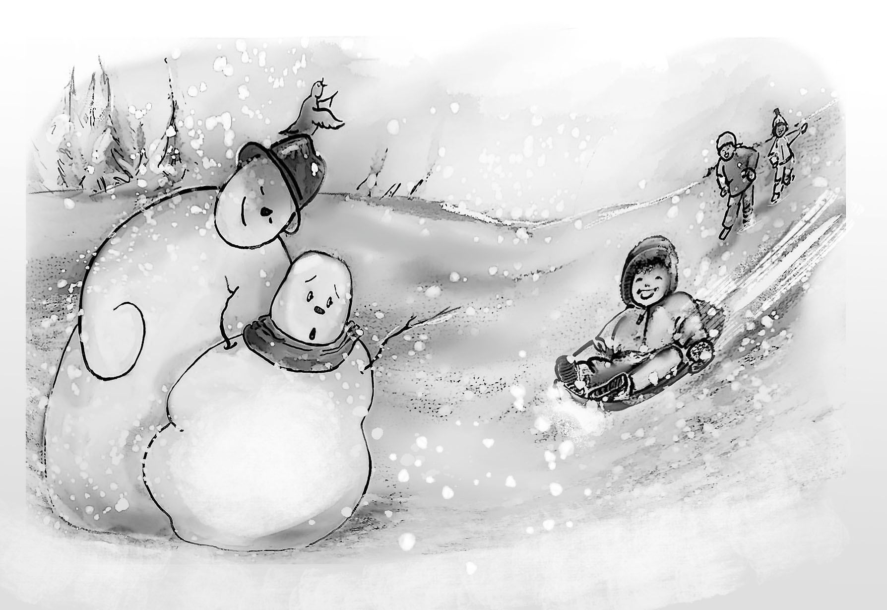
        Hi Deborah! Very nice! I would lighten up the shading on the snow, and keep it even a little lighter on the snowmen than the background so they stand out a bit more. It all looks pretty dark to me, and that way you'd have your human figures standing out a bit more, and it would look more like snow. I really like your sledding kid and the expression, very cute!

        djlambson 1 Reply Last reply Reply Quote 0
        • djlambson
          djlambson @Natalie Lundeen last edited by

          Thank you @Natalie-Lundeen

          https://www.instagram.com/deborahlambson_art/
          https://deborahlambson.com/folio

          1 Reply Last reply Reply Quote 0
          • Asyas_illos
            Asyas_illos @djlambson last edited by

            @djlambson I think your pencil work is very nice, I agree it could lighten up a little. Also I think composition-wise everything is being pulled toward the center of the image where as will says it’s an “eye trap” . I love the snow men’s expressions but I think for the comp you couldve positioned them a little differently. I would pull that bigger snowman towards the upper left corner. I tried to screenshot your image and show you changes but it wouldn’t let me save in my photos. Otherwise good job!

            Asyasewardillos@gmail.com
            www.Instagram.com/asyas_illos/
            https://asyasewardillos.wixsite.com/mysite

            1 Reply Last reply Reply Quote 0
            • chrisaakins
              chrisaakins last edited by

              @djlambson Hi, I like the fun idea. One thing that looks off is the perspective on the kid’d head. You should be able to see more of his hood on the right side rather than the left. It kind makes everything seem warped, like you stretched out the image at some point. Another thing that Jkae and Will said about my painting is that circular compositions are boiling but to arrange objects as triangles. Maybe you can arrange the friends farther up the page and more to the center to create a nice triangle.

              I hope that helps! Have fun creating!

              Chris Akins
              www.chrisakinsart.com
              www.instagram.com/chrisakinsart/

              1 Reply Last reply Reply Quote 1
              • Matthew Oberdier
                Matthew Oberdier last edited by

                I would think about local color more. Is the sky the same value as the white snow, or is it darker? Is the kids jacket as light as the snow, or should it be darker too?

                Instagram.com/mattoberdier

                1 Reply Last reply Reply Quote 0
                • djlambson
                  djlambson last edited by

                  Thanks so much for your thoughts guys..I will lighten and brighten and tighten. 😁

                  https://www.instagram.com/deborahlambson_art/
                  https://deborahlambson.com/folio

                  1 Reply Last reply Reply Quote 1
                  • First post
                    Last post