Serious critique requested - Halloween Feast submission
-
@seelliott I've just realised the little pumpkin mice were yours. I really loved this piece! It was one of my favs!
-
Just thinking about perspective, it looks like our eye level is at the witches' knees, so the vampire running toward us should also have his knees around our eye level.
-
@ruth thank you. I was really pleased to make the top 16!
-
Hi Ruth, i really like your concept, i think it reads well and you have super funny designs on the objects and animals coming from the pot.
The picture might profit from some more consistant light (depending on light direction, material and local color of the objects and their distance). For instance matt black dresses of the witches would stay almost the same value even hit by a strong light. The skin and reflective objects otherwise would get much more affe ted. This could help to get some stronger silhoulettes and value structure and better read. (Did a little color scribble over your nice picture to see what i meant)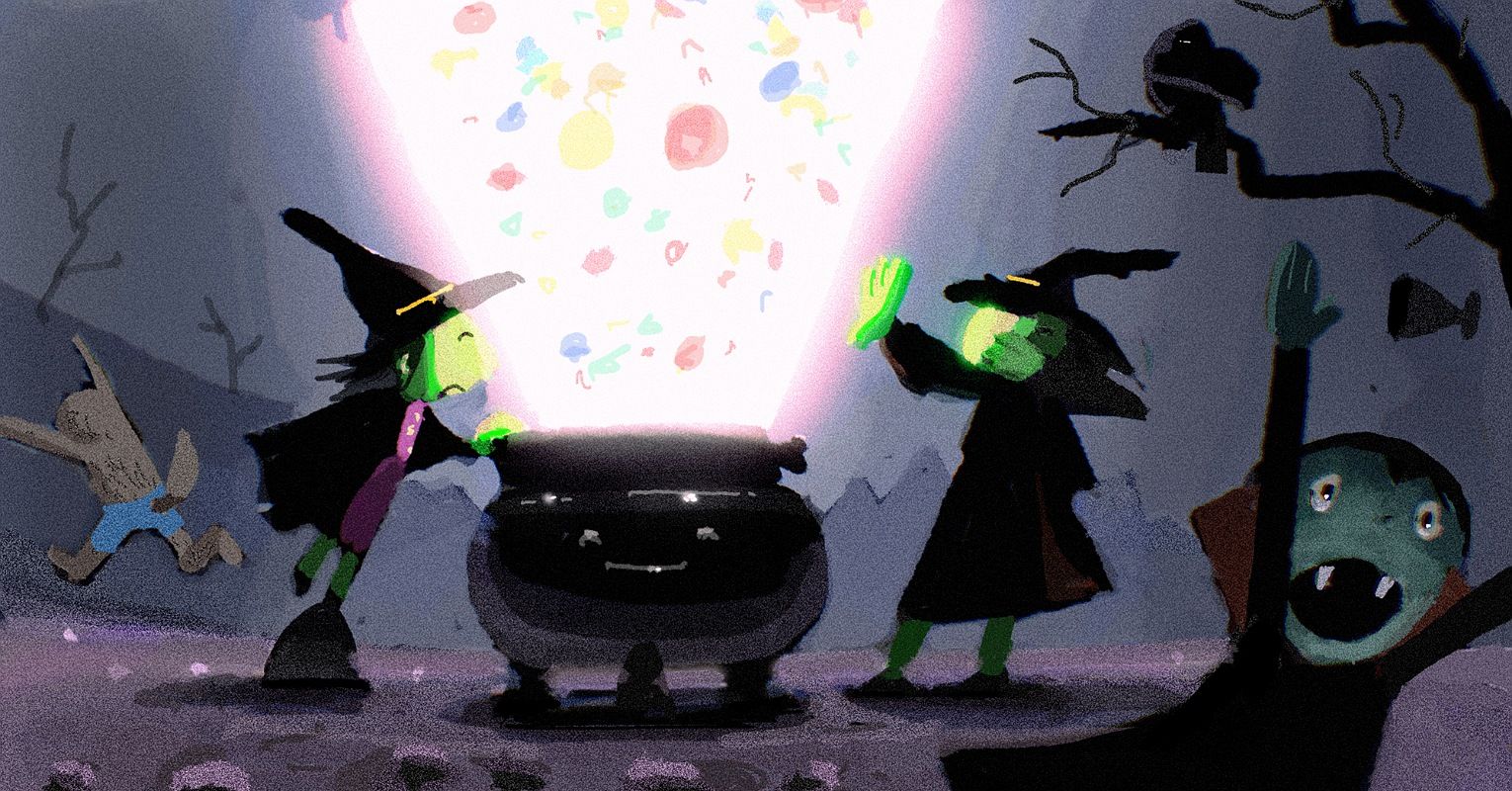
-
Hi @ruth, great piece! I agree with others and think more reflected light on the witches would brighten the image up.
Congratulations again on making Sweet 16, it was my first time making it too and you knocked me out of the race! It’s tough out there!
-
@marek-halko I like how they pop off the lighter background
-
@ruth Fun concept. my main critique would be that this piece is too dark. @marek-halko makes a great point on how you could fix your lighting and values.
-
It's a really great piece, but looking at it at first, I got confused by the witch on the right side. Especially her hand covering the face, I couldn't see at first which direction her face is looking at. I think it's because the colour of her green hand, green face and green hair (or really thin dark hair on green face), are of the pretty much the same value. I think the advice with the lighting could also help with this.
-
@marek-halko oh wow! Thank you! This looks great. Yes I see what you mean about the light and separation - the dark witches definitely read better against the lighter background.
I love your work by the way, and congratulations for winning this month!
-
@Jeremy-Ross Thank you. Yes, it's incredibly tough! There's so much amazing work each month. Congratulations to you too!
I'm trying to focus on a much lighter, brighter piece this month")
-
@ruth thank you
 ! There is for sure more ways how to play with the light (to serve the story), using silhoulettes helps a lot usually. I like actually how dark and desaturated everything than the light is, i think it helps the story. Maybe even keeping it dark and pushing color in the light/lid areas like this could be ok. Anyway really funny picture!
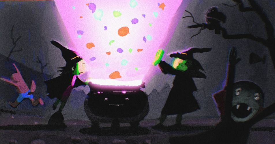
-
@seelliott, @Matthew-Oberdier, @marek-halko, @Jeremy-Ross, @Nyrryl-Cadiz, @TamaraDomuzin Thank you for all your great comments, advice and suggestions. Really helpful and very much appreciated.
-
I would echo what a lot of others have said about it being too dark. Something else I’d like to point out though is the brush work you used on the characters. It looks like you used an airbrush tool and these tools are very easy to get sucked into because they can easily smooth out changes in value. This can be a bit of trap, it can cause you to over render and in this case it doesn’t with the rendering style of the rest of the image. On the podcast and in critiques they have talked about avoiding this airbrushed look because it often just causes problems and everything ends up looking too soft and doesn’t create much interest for the viewer.