Society of Visual Storytelling

    SVSLearn Forums

    • Register
    • Login
    • Search
    • Recent
    • Tags
    • Popular
    • Users
    • Groups
    • Search

    Nov. prompt work in progress.

    General Discussion
    6
    14
    747
    Loading More Posts
    • Oldest to Newest
    • Newest to Oldest
    • Most Votes
    Reply
    • Reply as topic
    Log in to reply
    This topic has been deleted. Only users with topic management privileges can see it.
    • erinrew
      erinrew @Heather Boyd last edited by erinrew

      @Heather-Boyd Thank you Heather. I was hoping to tell a story in just one illustration, but you’ve given me some food for thought.

      @Coley Thank you Coley. I’m leaning towards the cropped in one too, but I’m just not sure where to take it.

      erinrew.com
      Twitter: @rew_erin
      Facebook: @erinrewauthor
      instagram.com/erin_rew_author_illustrator

      Heather Boyd Coley 2 Replies Last reply Reply Quote 1
      • Heather Boyd
        Heather Boyd @erinrew last edited by

        @erinrew No I didn't mean you to make more than one image, just multiple approaches to a single image.

        Instagram: www.instagram.com/heatherboyd.illustration/
        Website: https://heatherboydillustration.ca
        Shop: https://www.inprnt.com/search/products?q=HeatherBoydIllustration
        Ko-Fi: https://ko-fi.com/heatherboydillustration

        Be blessed,

        erinrew 1 Reply Last reply Reply Quote 1
        • erinrew
          erinrew @Heather Boyd last edited by

          @Heather-Boyd ok, I see. Thank you for the clarification. 🤦‍♀️

          erinrew.com
          Twitter: @rew_erin
          Facebook: @erinrewauthor
          instagram.com/erin_rew_author_illustrator

          1 Reply Last reply Reply Quote 0
          • Coley
            Coley @erinrew last edited by

            @erinrew just keep playing with it. Did you do thumbnails? You could do a pile very quickly to generate ideas 💡😊

            https://www.instagram.com/nicoleledrewmay/

            1 Reply Last reply Reply Quote 1
            • chrisaakins
              chrisaakins last edited by

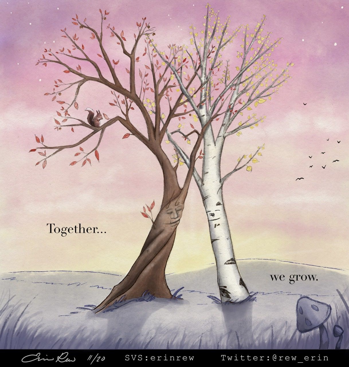
              @erinrew I love trees as characters! As a kid I drew so many tree people because of reading Tolkein's work about ents. What if you made the trees more anthropomorphic? Like looking like a slender rowan woman with a strong oak man. Kind of like they are dryads or something? Maybe intertwined branches in the shape of a heart? I am just throwing out ideas.

              Chris Akins
              www.chrisakinsart.com
              www.instagram.com/chrisakinsart/

              1 Reply Last reply Reply Quote 1
              • Neha Rawat
                Neha Rawat last edited by

                @erinrew Cute concept! I think it's ok to leave the background empty but definitely add some other element of life to it. Maybe 2 small squirrels or birds (I personally like having characters in an illustration).
                I second Nicole's feedback on making the trees not look similar. I can see you've tried some variation, but maybe push it a little more? Mainly right now they're the same width, height and the branching also starts at the same height.

                I like the idea of the branches making the heart shape. It could be made a little more prominent.

                It also depends how realistic you want to create your piece. You can exaggerate the twining of the trees further and actually have the branches wrap around each other.

                My main feedback is the background color. It's too warm for me and almost looks fire-y. I'd add more purples/pinks and tone down the orange-yellow. The white bark would pop more against them too.

                Even if you draw faces in the trees, how about having them face each other? I can see they still have a nice pleasant expression but they're book looking away so a part of the "togetherness" feeling is slipping away.

                https://www.nrbstudio.in/
                https://www.instagram.com/nrbstudio.in

                1 Reply Last reply Reply Quote 1
                • erinrew
                  erinrew last edited by

                  Thank you everyone wonderful feedback!

                  erinrew.com
                  Twitter: @rew_erin
                  Facebook: @erinrewauthor
                  instagram.com/erin_rew_author_illustrator

                  1 Reply Last reply Reply Quote 0
                  • erinrew
                    erinrew last edited by

                    Constructive feedback welcome before I call it quits and submit it.

                    Thanks.

                    D711566E-B86F-4A30-972D-805966CC6F92.jpeg

                    erinrew.com
                    Twitter: @rew_erin
                    Facebook: @erinrewauthor
                    instagram.com/erin_rew_author_illustrator

                    ajillustrates 1 Reply Last reply Reply Quote 0
                    • ajillustrates
                      ajillustrates @erinrew last edited by

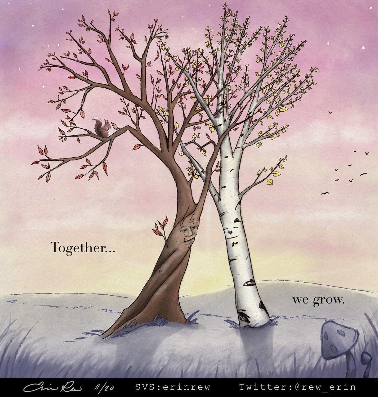
                      @erinrew Perhaps darken the lines in the face of the brown tree? It's a little softer than that of birch, so it receeds a little bit.

                      https://ajillustrates.com
                      https://www.instagram.com/aj.illustrates/

                      1 Reply Last reply Reply Quote 1
                      • erinrew
                        erinrew last edited by

                        @ajillustrates I also have this version where the lines are darker. Which do you think works better?

                        50712AF9-32D1-42D6-B7C8-E77D4681852A.jpeg

                        erinrew.com
                        Twitter: @rew_erin
                        Facebook: @erinrewauthor
                        instagram.com/erin_rew_author_illustrator

                        ajillustrates 1 Reply Last reply Reply Quote 0
                        • ajillustrates
                          ajillustrates @erinrew last edited by

                          @erinrew My vote is for the darker lines. I must admit that I am a fan of bold linework, so it could just be a personal taste issue. I do think that they darkness in the lines of the brown trees face are perfect, and the rest could be dialed back about 50% to rest between the two options.

                          https://ajillustrates.com
                          https://www.instagram.com/aj.illustrates/

                          1 Reply Last reply Reply Quote 1
                          • First post
                            Last post