Ladybug, Frog, House and DUCK! Designs
-
I really like 4 or 5 for that description. 1, 2 and 3 seem to young to me, and 9 and 10 too old. 8 is fun, but a bit too human to clearly be a ladybug in my eyes. I feel expressive poses with 6 and 7 could get challenging.
-
I like 8 and 9. I think 8 is very cute but the glasses on 9 automatically make her look smart. Glasses are a good way to automatically convey smart in a simple image. Maybe combine the two?
-
@Gary-Wilkinson #9 all day
-
I agree with the others, 4 suits the description. I fell in love with 5 and 7 tho

-
Love all your designs Gary! May favorites are 4 and 7
-
My favorite is 7, but if you need it to look more human I also like 8. All of them are very cute!
-
@Gary-Wilkinson Hi I like 7 and 10. They are so expressive!
You could teach a character design class! -
@Gary-Wilkinson wow they are all impressive! But I really like 4 and 9 the best! Good work!
-
7 strikes me s the best design but I saw someone mention that it would be challenging for poses. You could convey a lot of "gesture" in the face though. I think it’s still a viable option. 4 or 8 would be good alternatives if you want to work with poses more but 8 should have more human like eyes to feel more relatable I think.
-
@Gary-Wilkinson Wow these are all so cute, and such nice designs! My personal favorite is 7 but it looks too young for your target audience. 9 and 10 are better for an 8 year old target audience! 4 is also great but I think it's still a bit young, maybe more appropriate for a 6 year old.
vanessastoilova.com
instagram.com/vanessa.stoilova/Check out my Youtube channel for tips on how to start your career in illustration! www.youtube.com/c/ArtBusinesswithNess
-
@Gary Wilkinson For what it's worth my 8 year old likes 2, 6, and 7 (personally I really like 2). I love your profile image by the way.
-
I really like the face of 7! It's a cute face, but it still has an older feeling rather than the other ones before it. I think with how my brain sees this, the bodies between 8 and 10 have an older feeling because the body is taller and longer, which makes them relatable characters to an older kid. When I draw, I usually make younger characters have a cutesy, squished, smaller body. Sometimes when I draw, I also squish an old person to make them appear cuter. Haha. And when I draw older kids, I do the opposite. I think for this age group, I like 10's stance and body! She has more action to her. What if you combined the face of 7 and the body of 10? I think that would make her seem like an older kid, but still cute and innocent. I also love 10's coat with buttons or patches on it! And the scarf! It makes her feel like she's a main character
")
-
Sorry for writing a novel on your post, lol... I also would just like to add, I work in researching trends in toys, activities, games, etc. and one thing I have seen over and over again is that kids at this age group like feeling older than they really are. So a character like 10 is muah perfecto

-
Thank you for everyone's suggestions and comments, they will really help push the concept towards a final stage. I really appreciate you all taking the time to lend your knowledge and would love to reply to every comment individually, but I got a lot more replies than expected
As it stands 9, 4 and 7 have had some great responses, so I will try to focus on those and see what can be improved to get it down to a final choice. The character designs were also posted on facebook and got over 400 replies for which a majority went for 7, however as some of you mentioned it could suffer due to restrictions in it's poses (i'm sure I can use it as a side/background character in a future project though...)
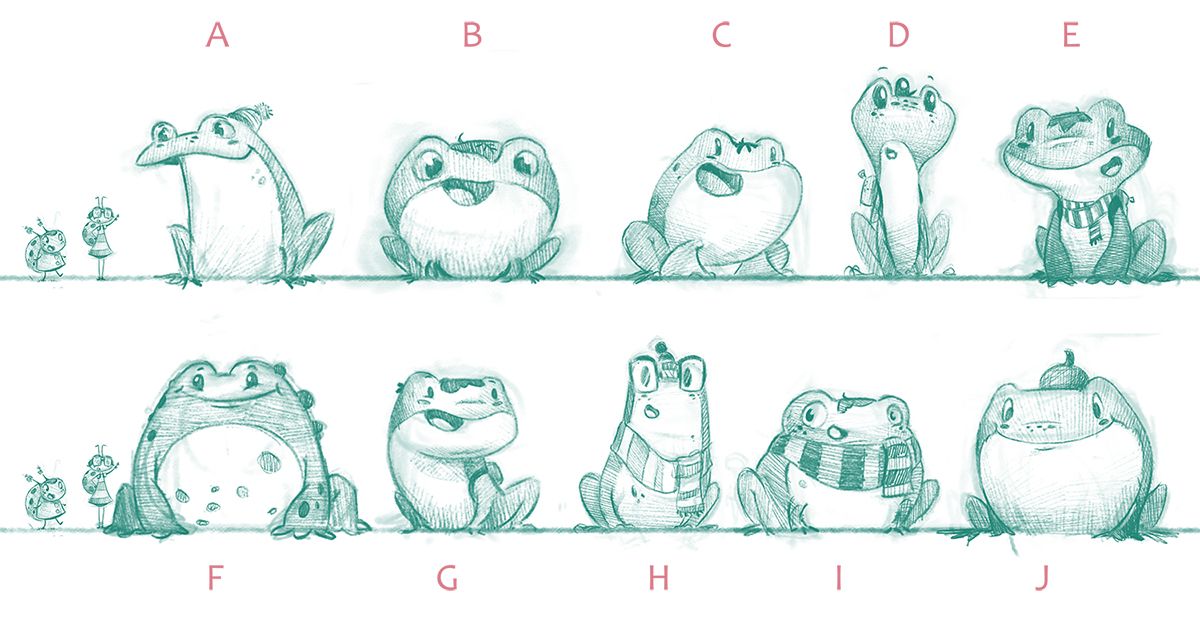
One thing that will be a big factor in the ladybug's design is the shape of her friend the frog, as both are of equal standing in the story and have similar qualities, but I still want to make them work together, yet stand out on their own design. I've played around with about 10 designs, but it's felt more of a struggle than the ladybugs. Personally I like G if it were to go with 9 or H if it were to go with 4.
-
For what it's worth my kids really like ladybug 4. I think the face on 7 is very appealing. Maybe you could combine the two?
Frog H is a great design!
-
@Gary-Wilkinson I really like C! I think the rounder frogs really complement the tall legged ladybug. C, G and J all have "gentle giant" vibes which work really great.
-
E, F, J says my 8 year old. I like J. My son seems to like the larger characters which I think translates consistently across that age group.
-
@Gary-Wilkinson I really like F and I for the frogs
They're all so cute though. -
@Gary-Wilkinson I totally agree with 4 and H as a great combo!
-
Again many many thanks for the comments and advice! So at the moment it feels like we might be going for 9 for the ladybug and I still have to work out the design of the frog to make them fit together, but E, G and H are the forerunners. I really want to do H, but I think the design is too similar so i'll play around to see if there is some room for it.
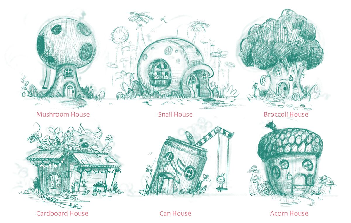
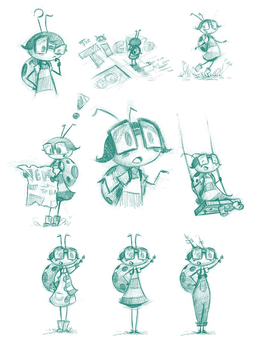
In the meantime I did some character studies for the 9 ladybug and so far it feels like is quite a solid character, but no final thoughts yet.... I also did some sketches for her "quaint little house", however it's only on 1 page so it's not a major thing, but all design is important right