WIP Thumbnails on Together Concept
-
Hi there!
I have some thumbnails I'd like to share for the November contest, Together!
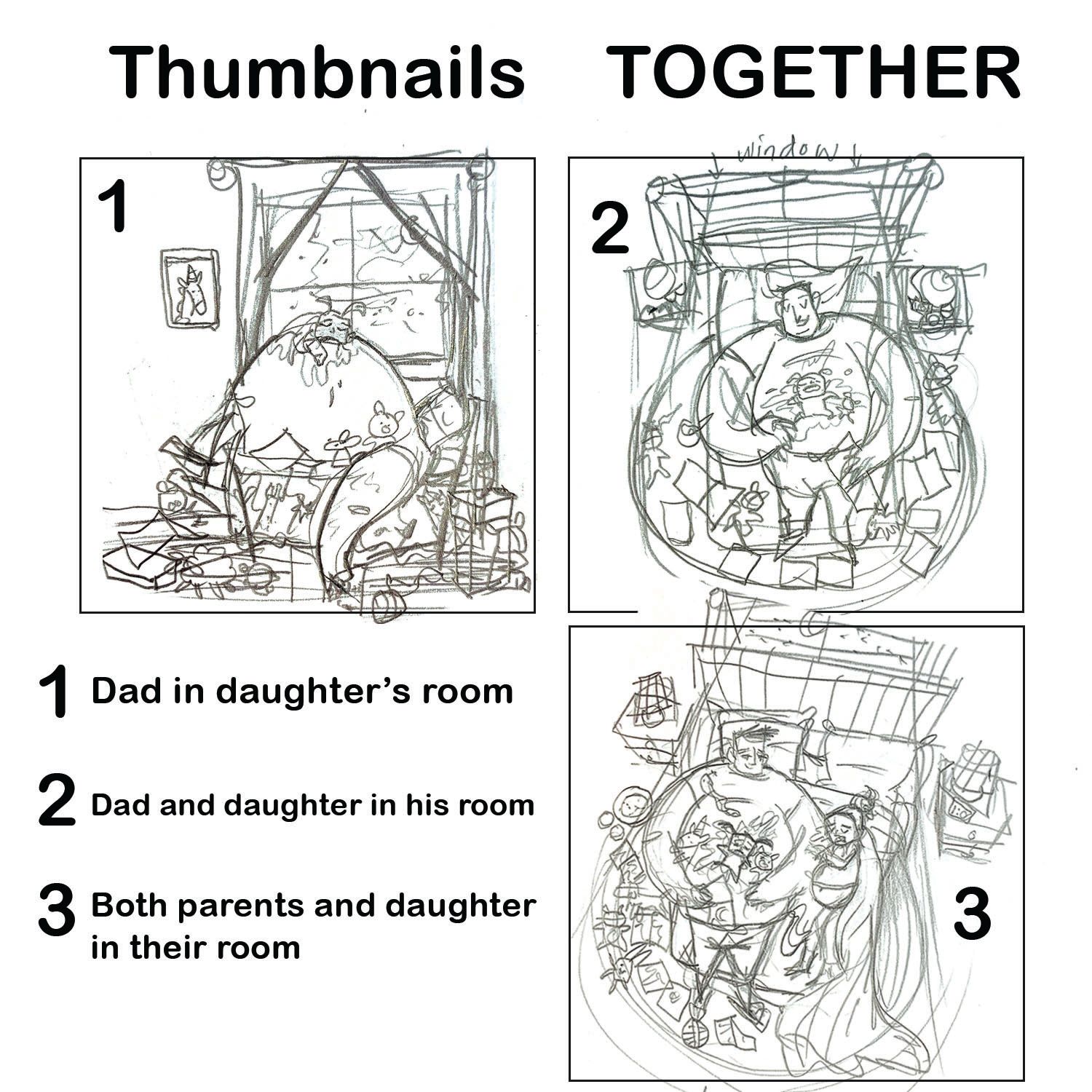
My idea is to draw a father lovingly laying in bed with his tiny yet silly and rambunctious daughter. The story I'm going for is that the father was using toys, bedtime books, a snack (plate full of crumbs), milk (empty glasses) to get her to fall asleep hence all of the stuff around the bed and on the floor. She's finally asleep and she's an ugly sleeper, hence the puddle of drool and drool coming down her cheeks. And she's sleeping on her dad's tummy for comfort instead of the bed, so the dad has nowhere to go. He'll either be a little awake a looking down smiling at her, or drifting to sleep and smiling at her. Moonlight coming from a window.
I also tried adding a mother in the third thumbnail who is taking all of the covers and is drooling on her husband's arm. And all of the toys and things are on his side of the bed while he lets his wife sleep soundingly. Still smiling at his family. (She's also pregnant)
Which one do you like and why? I'm stuck

“We must stop eating!' cried Toad as he ate another.”
https://www.mirandalbranley.com
https://www.instagram.com/drawnbymiranda/ -
@Miranda-Branley I like 3 because everyone in the family and everything in that room seems to be there. It shows activity and rest, the different things we do with others.
-
@Miranda-Branley
Hi Miranda!Cute idea! I really like the design of the characters in the first thumbnail. Having the kid on top of the dad's large belly like that really stands out and (imo) has a more unique look than the other ones. But the composition does look a little unbalanced to me (there is more weight on the right side of the image). Maybe try adjusting the position of the different elements, or making the image more horizontal then adding something else to the left of the image (maybe the mom is standing there smiling at them?).
Looking forward to seeing it finished!
-
@miranda-hoover Thank you for the feedback! I like that idea a lot! I can have the mother resting on the opening of a door way and have her smiling at them. Love that! Yeah I agree, the right got heavy. I didn't want to show much of the wall where the headboard and the end table is. I'll probably give more width to the canvas then!
-
All three are lovely! I like 1 most. Because it is most dramatic and fun. For 3, the size of mother makes it looks like another child. If you add some details to suggest her age, it may work. Perspective of 2 is a little bit "usual", maybe tilting the image can help. Still, I like all of them
")
-
@idid Thank you! Oop! Sorry that wasn't clear! My B. Overall, I was trying to make the father appear big and teddy bear like, kind of like Pacha from Emperor's New Groove. Lol. But, yeah I'm planning to make her look her age and not childlike- I think that would be a bit disturbing because she's pregnant
 Thanks for the feedback I'll keep these comments in mind!
-
I'm sold on number 2. Please do number2 XD It's typical but most impactful. The 3rd one could work but the message changed from Dad and Daughter to Family Together. In which case I would prefer if the mom and dad were looking at the daughter so they look like a united team.
idid has a good point that 2 is typical but the straight forward angle makes it more powerful. Perhaps you can solve that problem with interesting lighting. Overall, GREAT JOB!
-
#1 looks like the strongest silhouette and fastest read.
-
I agree with @Matthew-Oberdier and @Miranda-Branley, #1 reads really well, and has a comical, but heart-warming feel to it. I can't wait to see what you do with these!
-
@Miranda-Branley I gravitate towards number 1! I think the composition really showcases your main idea
-
Another vote for the first one! The window and picture aren’t feeling balanced though, I would experiment with different ideas there
-
Hi there! Here's an update!
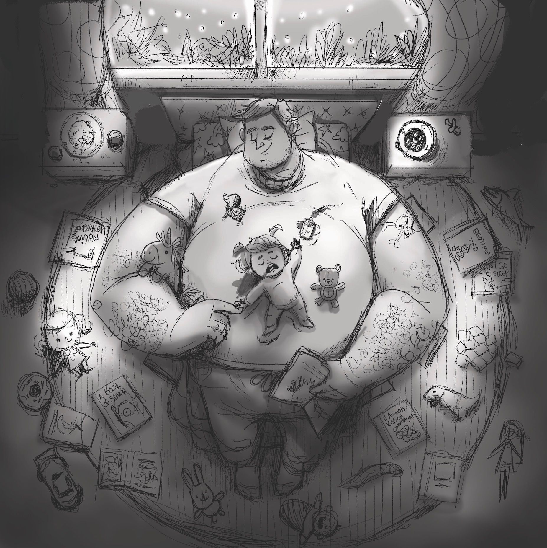
Thank you all for the feedback! This has been eye opening! I tried my hand at all 3 to see how I can use your suggestions and still follow what I would like to do. Plus with the time I have left and considering what would make it in time for entering! I chose to do the second one because I wanted to go for more of a emotionally powerful and protective feeling that you'd get from the second one.
Explanation: The dad looking like a giant teddy bear and his arms turning inward to feel like he's cradling his daughter. I did decide to use the first one's idea of them being in the daughter's room because that made more sense story wise, as the dad is trying to get his daughter to sleep in her own bed. I added his index finger on the right hand so that is shows the comforting feeling that his daughter has with him being there. And all of the books on the ground are bedtime story books that actually exist
 The lighting will be coming from the moonlight and the little kid alarm toy that will give off a soft blue light. I know the perspective has been done before, but also... my thoughts make me wonder what hasn't been done. As long as I make it uniquely mine! I'm so excited!
My question now, is what do you think of this tighter sketch?
-
@Miranda-Branley I love where you are going with this. The only thing that bothers me is the proportion of the head. I get that you want an exaggerated look but I think it might be too small. Maybe it's the neck. A guy that big would have a neck to match his arms and shoulders. If you look at Pacha, he has no neck. I don't know what the solution is. I love the sentiment though. As a dad, there was nothing better than having my babies sleep on my chest and holding their little tiny hands. That's my favorite part of your drawing. You captured it so well.!
I did a quick draw over to show what I mean:
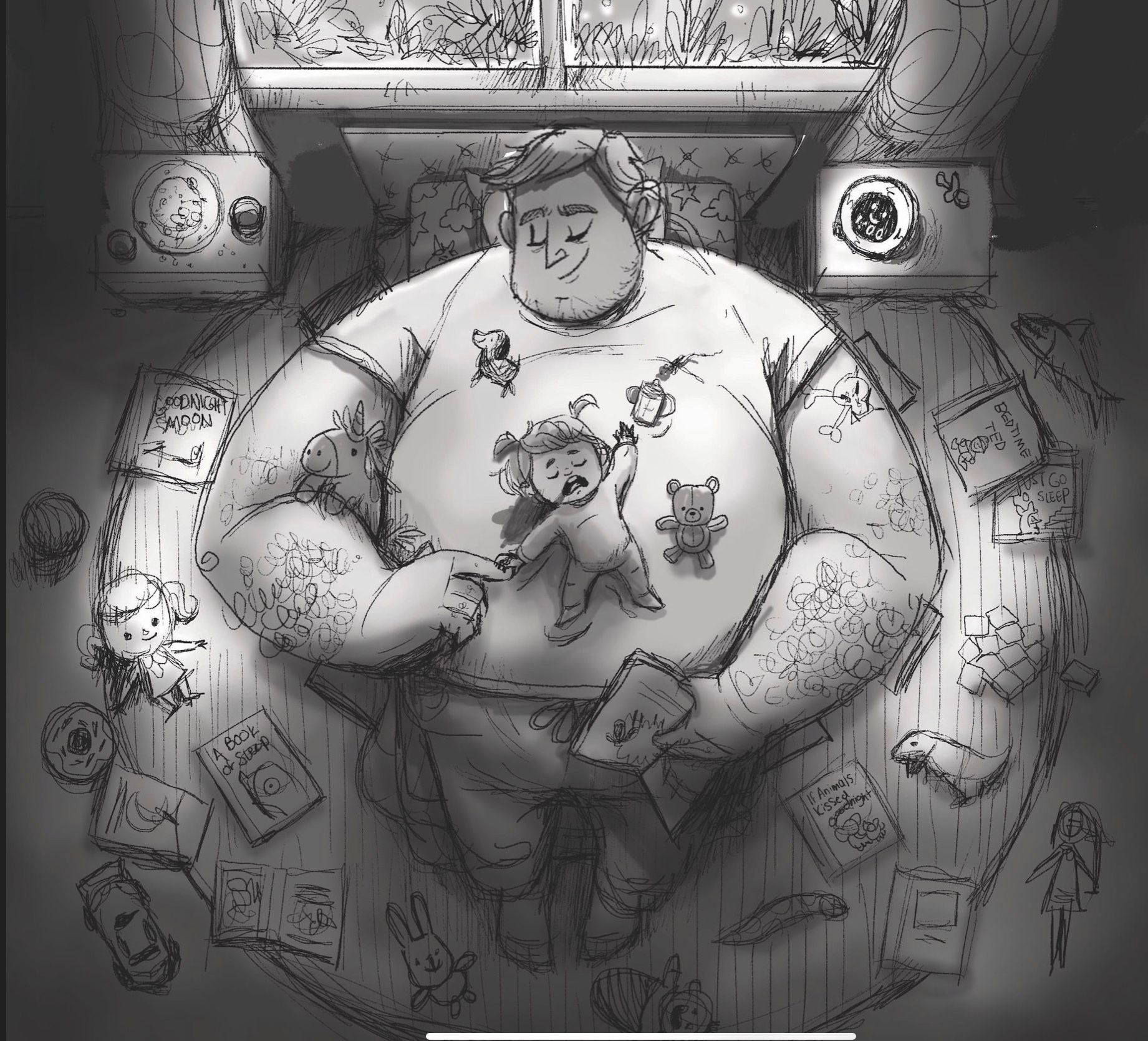
All I did was enlarge his head and hid his neck. What do ya think? -
@chrisaakins Oh wow! Thanks for pointing that out! And thanks for the edit!!
That makes a lot more sense. The edit makes it so much easier to understand rather than someone just telling me. I had struggled with some anatomy in my last contest piece when I drew a werewolf girl and I don't want that to happen again  Also thank you so much! I was trying to make it have that exact feeling! I wanted it to be special. I'm so glad that I fulfilled it.