Society of Visual Storytelling

    SVSLearn Forums

    • Register
    • Login
    • Search
    • Recent
    • Tags
    • Popular
    • Users
    • Groups
    • Search

    Looking For Advice. Something seems off

    Artwork
    8
    15
    569
    Loading More Posts
    • Oldest to Newest
    • Newest to Oldest
    • Most Votes
    Reply
    • Reply as topic
    Log in to reply
    This topic has been deleted. Only users with topic management privileges can see it.
    • ajillustrates
      ajillustrates last edited by

      @Stephen-Dueck Based on the the shadows direction on the tapestry, left side column, and her dress, it looks like you should have some lighting on her left side. Maybe just some rim lighting, but I think that will help sit her in the environment better.

      https://ajillustrates.com
      https://www.instagram.com/aj.illustrates/

      1 Reply Last reply Reply Quote 0
      • Elisa Miko Price
        Elisa Miko Price last edited by

        I agree with what A.j. said about rim lighting. My suggestion for you would be to reposition the sword to be turned slightly upward to point at the tapestry. I think swords can be interesting leading lines, so you can use it to your advantage by having the sword's point leading my eyes to where you want me to look next.

        Also I would remove some of the toes, they're giving the feet a sort of duck feet look.

        Here's a draw over where I added the rim light, upturned the sword and edited the feet. Hope it helps! Good luck with your contest!

        Untitled_Artwork 12.jpg

        DaveLeekArt Stephen Dueck MichaelMattocks 3 Replies Last reply Reply Quote 3
        • DaveLeekArt
          DaveLeekArt @Elisa Miko Price last edited by

          @Elisa-Miko-Price agreed. Great suggestions. This draw over looks solid.

          Instagram: @daveleekart

          1 Reply Last reply Reply Quote 1
          • Stephen Dueck
            Stephen Dueck @Elisa Miko Price last edited by

            @Elisa-Miko-Price
            I agree with all of your points! Thanks so much. I’ll work in the edits and send what I come up with.

            1 Reply Last reply Reply Quote 0
            • Meghan Burch
              Meghan Burch last edited by

              I was going to suggest moving the sword as well. One more thing I'd add about the character - I think her sword am should be slightly bent. A relaxed pose would have a bend in the arm. OR - Maybe even better- what if the character's pose mimics the pose of the warrior princess. It would make for a more dynamic composition and the reason for the scene would be even more clear. Good luck!

              1 Reply Last reply Reply Quote 1
              • Matthew Oberdier
                Matthew Oberdier last edited by

                Are those lanterns lit? I would make them the brightest thing in the scene.

                Instagram.com/mattoberdier

                1 Reply Last reply Reply Quote 3
                • MichaelMattocks
                  MichaelMattocks @Elisa Miko Price last edited by

                  @Elisa-Miko-Price I agree. The light seems intense so maybe the design is actually "magically" bright and that's whats casting the light on her would bring it in.

                  Michael Mattocks
                  Https://instagram.com/mattocksdesign/

                  1 Reply Last reply Reply Quote 0
                  • MichaelMattocks
                    MichaelMattocks last edited by

                    another suggestion is either make the stone wall go into the dark or make the stones get closer together. or make the lines just blur out. Seems like a lot of detail in a nonfocused area. also The pillar against the wall I think the base should line up against the wall. The top seems flat against the wall and the bottom seems like there is a space

                    Michael Mattocks
                    Https://instagram.com/mattocksdesign/

                    Stephen Dueck 1 Reply Last reply Reply Quote 0
                    • Stephen Dueck
                      Stephen Dueck @MichaelMattocks last edited by

                      @MichaelMattocks Yeah that third board was supposed to be a baseboard but I will just get rid of it.

                      1 Reply Last reply Reply Quote 1
                      • Stephen Dueck
                        Stephen Dueck last edited by

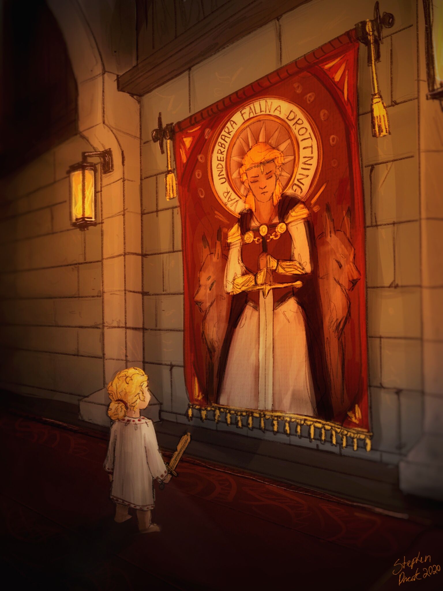
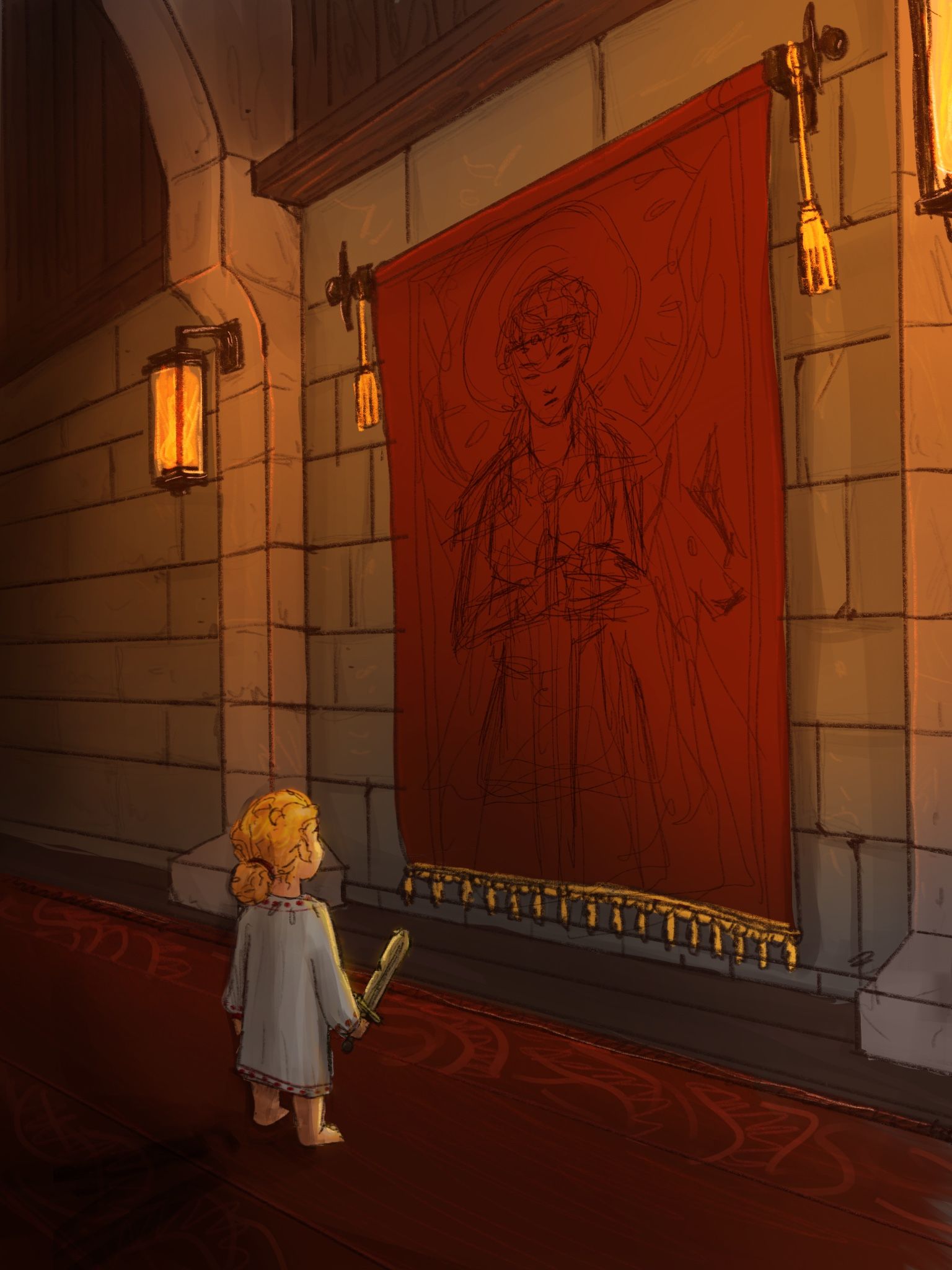
                        Thank you all so much for the suggestions. Here is the piece with the edits and a sketch of the tapestry. If you see anything else that seems off please let me know!!F0287744-4ADA-42D3-AE0B-81309A38EEAA.jpeg

                        Kevin Longueil Stephen Dueck 2 Replies Last reply Reply Quote 3
                        • Kevin Longueil
                          Kevin Longueil SVS OG @Stephen Dueck last edited by

                          @Stephen-Dueck this is looking great - for me I’m thinking the sword is not necessary and is very focal at the moment. I would love to see it without the sword and with the puppy version of the beast at her side that is in the tapestry instead... I think that would be more effective in showing that the character in the tapestry is also the little girl. Possibly having a slight gesture to her pose might be good too - she is very straight up and down at the moment - really nice piece!

                          Portfolio: kevinlongueil.com
                          https://www.instagram.com/kevinlongueil/

                          Stephen Dueck 1 Reply Last reply Reply Quote 1
                          • Stephen Dueck
                            Stephen Dueck @Kevin Longueil last edited by

                            This post is deleted!
                            1 Reply Last reply Reply Quote 0
                            • Stephen Dueck
                              Stephen Dueck @Stephen Dueck last edited by

                              @Stephen-Dueck I completely understand what you are saying. The lady in the tapestry is actually the girls mom and I wanted to give her the sword to clearly show that she wants to become a warrior when she grows up. Thanks for the input tho!

                              1 Reply Last reply Reply Quote 0
                              • Stephen Dueck
                                Stephen Dueck last edited by

                                Here is the final piece! Thank you so much for all your input. I can see how valuable this community is. I look forward to learning more from you all.9F023631-7CAD-4571-8109-B21F66B27AEE.jpeg

                                1 Reply Last reply Reply Quote 3
                                • First post
                                  Last post