Illustrations for Agency Catalog - Critiques Welcomed
-
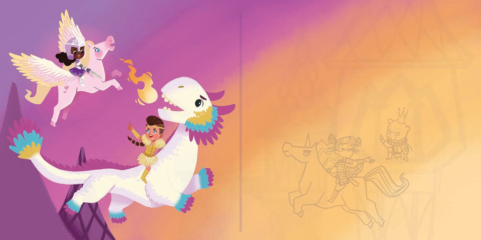
Hello Nyrryl, I love the tertiary pastel color palette you've chosen for this concept art. I know that I'm still working on my own skills art skills such as gesturing and emoting, but I think the feedback I can offer will focus more on the color options you've provided, since I personally feel like color theory is my biggest strength, if you can agree...
If I were to narrow your options down, I would pick somewhere around the 3 to 5, with 3 being my strongest pick. I say #3 because I think it helps pronounce the main image with the castles and children riding on mythical creatures. I think the orange on #4 is a bit too strong and kind of distracts me just a bit. I think #5 is a good option too, but I feel like the sky is too simplified, and kind of makes it not as exciting as the two other options. Also, I think the palest yellow at the bottom right corner of #5 kind of makes the white castles blend into the background. I think is also an issue with #3 as well, but perhaps you could remedy this with shading.
Are you going to add a lot of shading to the final piece?
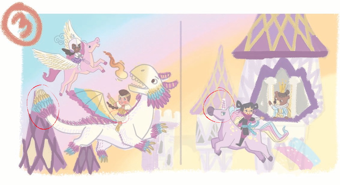
My only suggestions here is to find ways to make sure that certain pieces of the image don't blend into each other. I think the dragon's tail might get lost because the purple at the end is too similar to the color of the roof it's overlapping with. I'm sure shading will fix this. I think for the valkyrie-esque girl on the dragon, you could also add a yellow hue to her fluffy skirt so it doesn't blend in with the dragon's skin? The unicorn's body also kind of blends in with that one castle's roof. I understand that you probably diluted the color on that roof to convey distance, but maybe make the horn bigger and more white, with the purple streaks being more subtle on the horn?
My only issue with anatomy for this piece is the girl on the unicorn. I hope you can understand my advice on this.
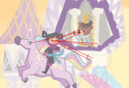
Where is she looking at? It feels like in this thumbnail she's supposedly waving at the bear, as the bear is also waving and looking at her. But she's below him and her eyes don't look like they're directed at him. Is she waving at something off screen? The unicorn looks like it's looking at the bear prince. Maybe if you shifted the pupils up just a bit, this could work. I hope this was useful to you in some way and I wish you the best of luck on your catalog
")
Finis Coronat Opus
Instagram: www.instagram.com/madgcartoons/
Behance: www.behance.net/madgcartoons
Website: https://michaelangelodgo.wixsite.com/madgcartoons -
@Nyrryl-Cadiz really nice!! I love the line art with the faded desaturated background! For feedback my thought is that the silhouettes are strong but they do not show well with the background values and I’m thinking saturation too. The bottom left and top right rooftops really grab my eye in the painted thumbnails - I think that the darks in a piece are very strong guides for our eyes and the rooftops are very dark without sending us somewhere...I think because of the strong pattern that crisscrosses...nothing wrong with any of it of course..I just think the combination of strong value and pattern really traps my eye...super nice drawing!! I know this will look awesome when you are finished!
-
@Kevin-Longueil Thank you, Kevin! I agree. I’ll have to think of some clever way to keep the pattern and relative hue of the rooftops at the same time decreasing the value contrast.
-
@Michael-Angelo-Go hi! thank you for sharing your input. I do agree on increasing my value contrast a few of the elements in the scene. I think I’ll color that unicorn with a darker purple to distinguish it from the background.
However, with the bear princess and the ninja girl, I think it’s too early to get into these finer details. I think it’s unfair to judge it for its accuracy when I only spent 2 seconds coloring it in, you know? A haphazard color comp may not be the best stage to delve into the nitty gritty stuff.
Overall, Thank you so much for sharing your thoughts. They’re always appreciated.
-
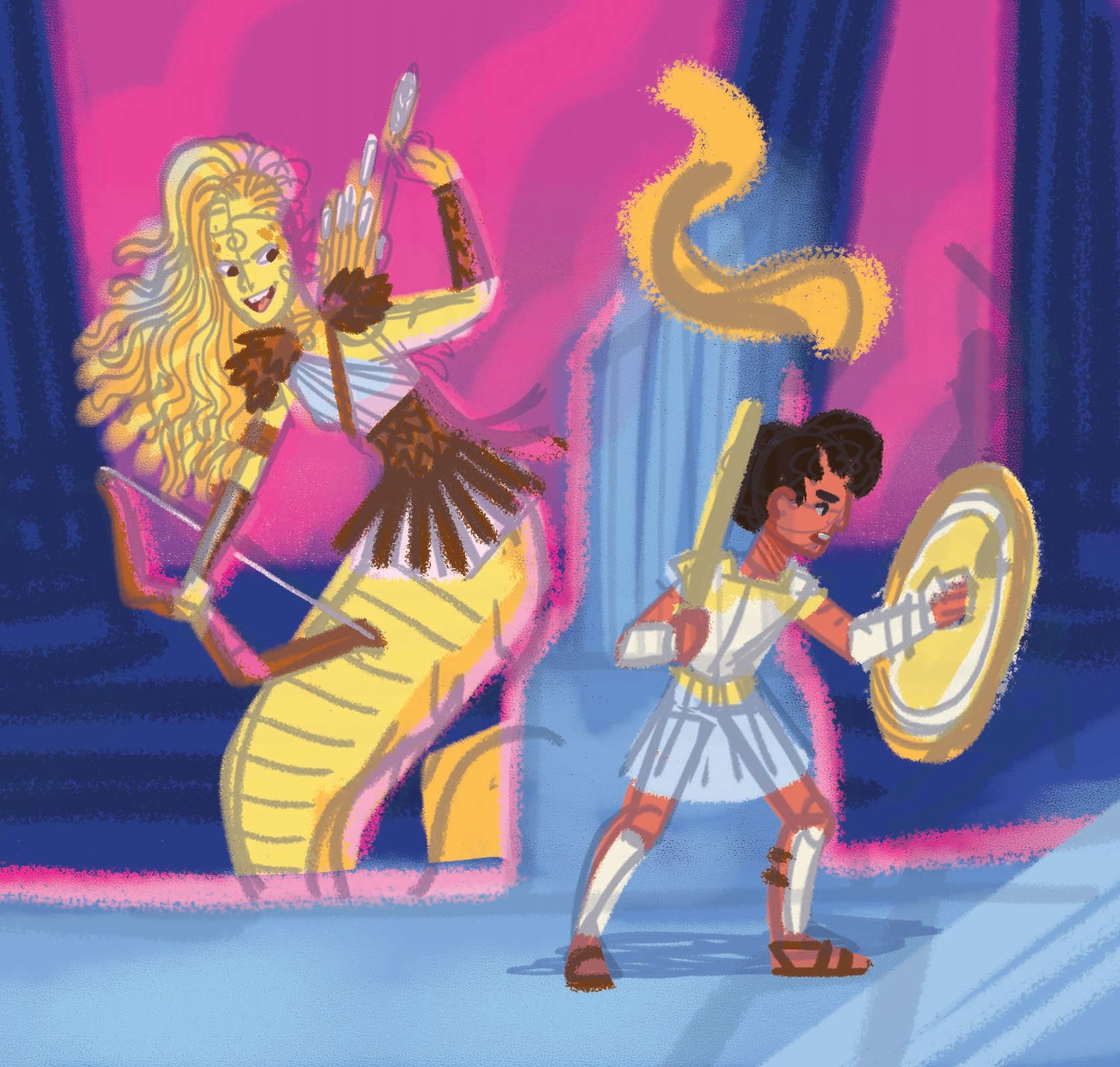
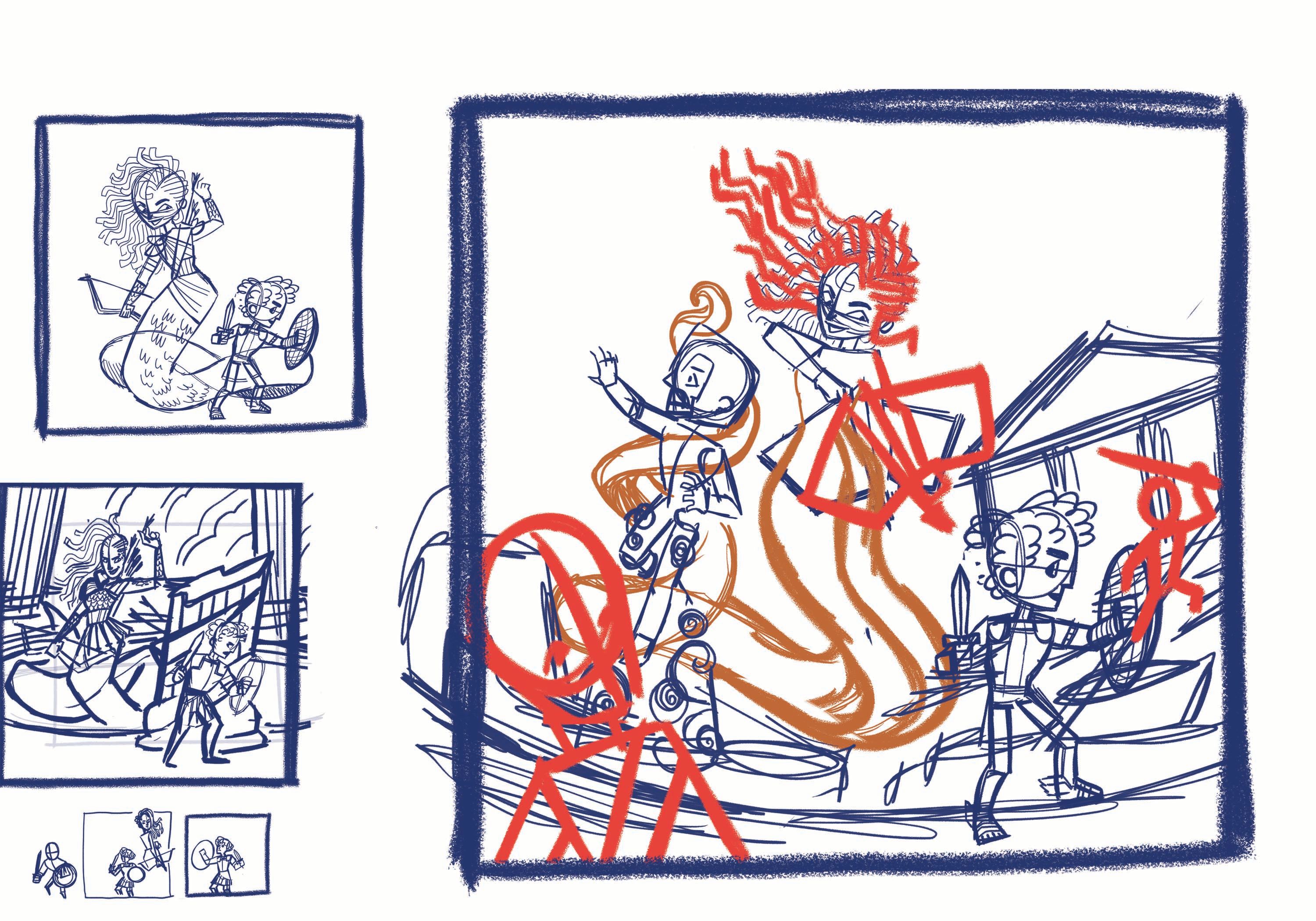
Hi, everyone! So i'm toying with this new idea about Medusa vs. Perseus. I did not want to go with the traditional green gorgon look so I went with yellow instead. Before anything else, I first need your thoughts. Do you think this scene is too dark/ scary for the children and/or the middle grade market? I personally think it's ok but I need to know what other people think. Thank you!
P.S. I like to colors so I think I'll keep that but I think I'll definitely change the composition/sketch.
-
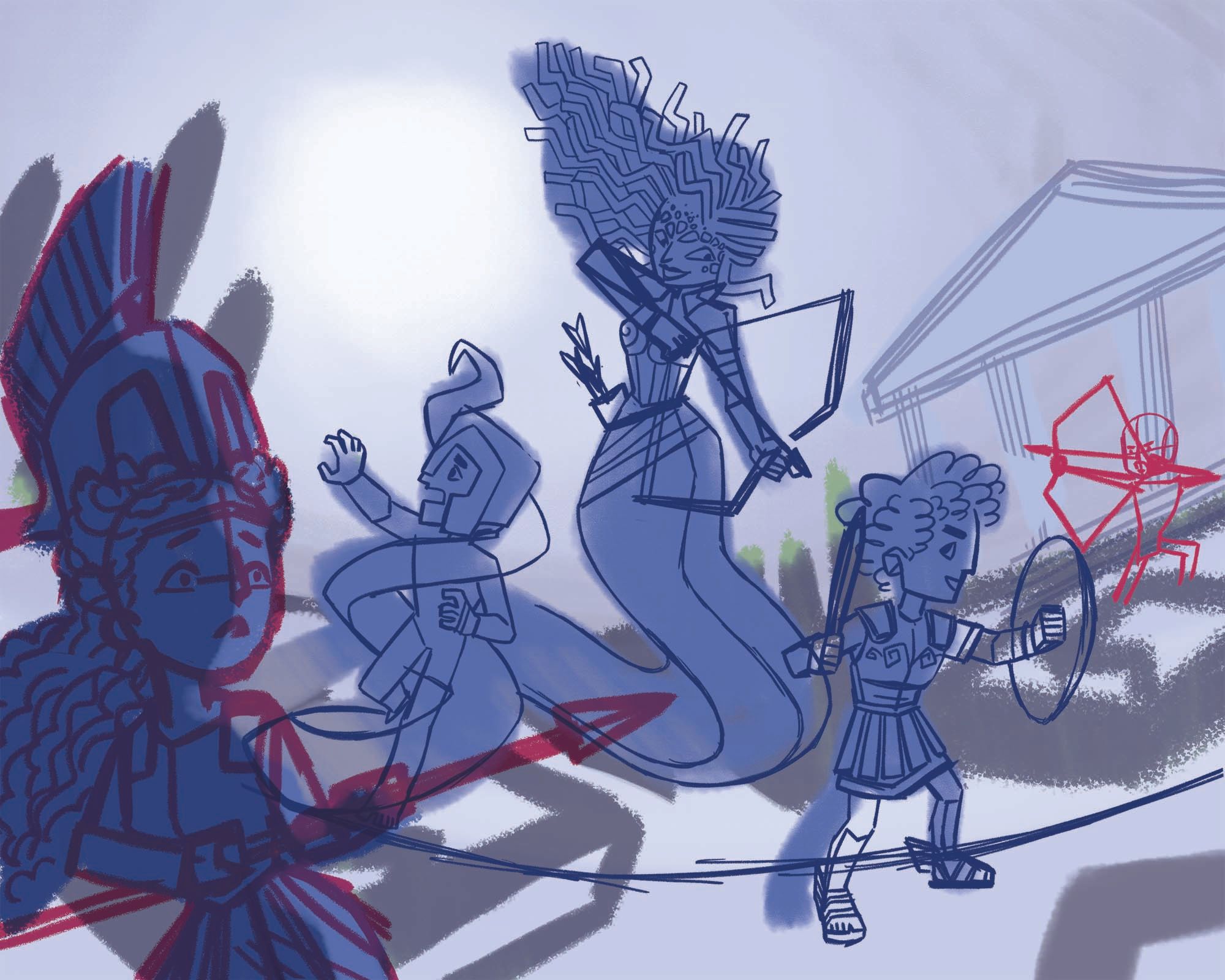
i've been experimenting on new sketches. I think I've settled on the look I want.
Portfolio: nyrrylcadiz.com
Instagram: https://www.instagram.com/nyrryl_cadiz/
YouTube: https://www.youtube.com/channel/UCbJCF1Im8ZO7hpGWTKOJMuA -
@Nyrryl-Cadiz I'm very impressed by your motivation and hard work, Nyrryl! I create maybe 1 or 2 new personal pieces for my portfolio each year outside of contract work haha... You're making like half a new portfolio for your agent's 2021 catalogue! I'm very impressed by your work ethic
Your themes and sketches so far are also all very lovely. I love Greek Mythology!!vanessastoilova.com
instagram.com/vanessa.stoilova/Check out my Youtube channel for tips on how to start your career in illustration! www.youtube.com/c/ArtBusinesswithNess
-
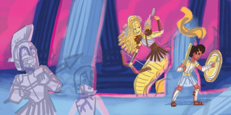
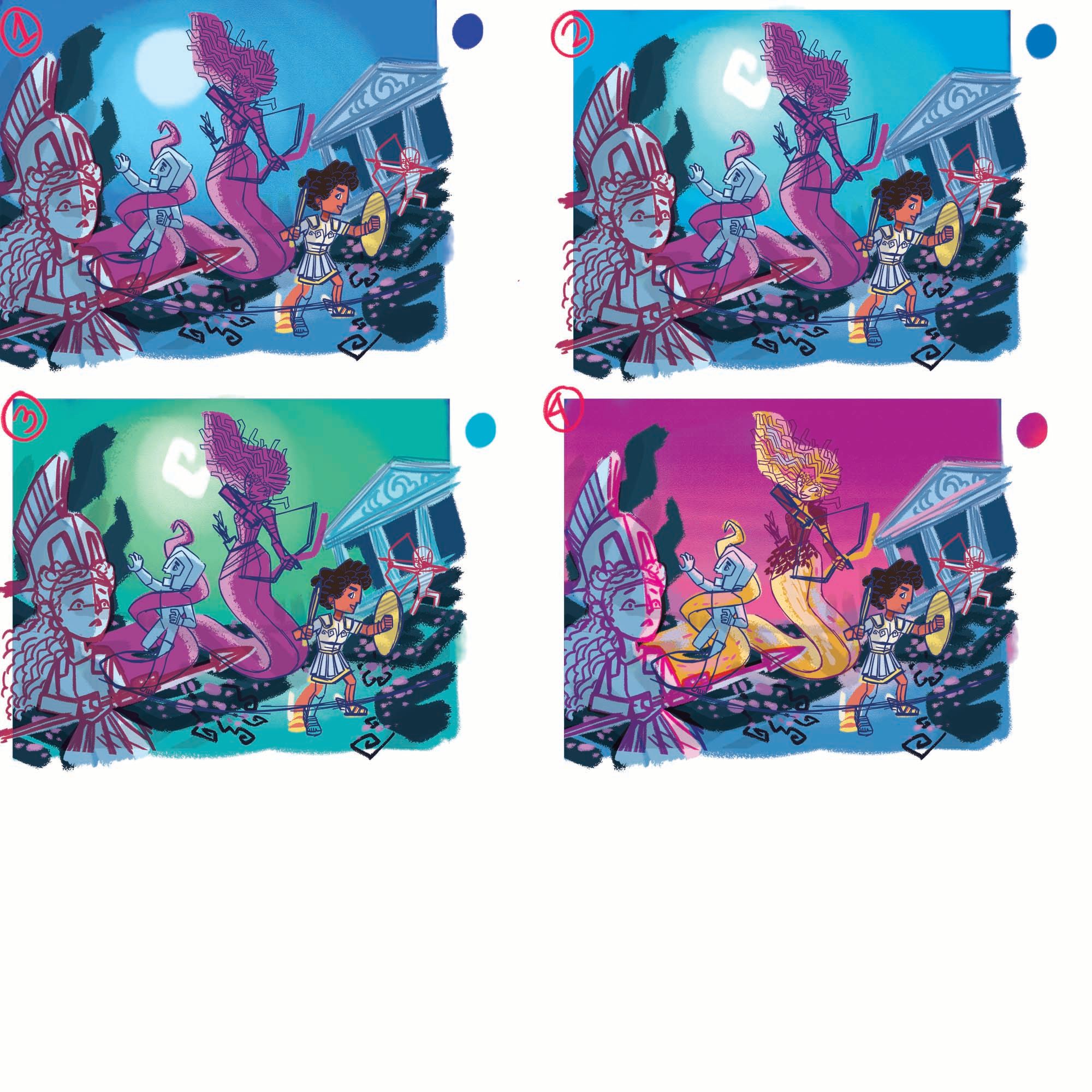
hi everyone! So I made the color comps for the medusa piece. I experimented with conventional night time colors but they just weren't hitting the feeling I was going for. Finally, I went back to the color palette I initially used and I love it. The pink sky gives off this feel of chaos in the air and medusa's yellow skin just pops against the background. I don't know about you guys but I've made up my mind. #3 was a strong contender but #4 is just more dramatic.

Portfolio: nyrrylcadiz.com
Instagram: https://www.instagram.com/nyrryl_cadiz/
YouTube: https://www.youtube.com/channel/UCbJCF1Im8ZO7hpGWTKOJMuA -
@Nyrryl-Cadiz Yeah I agree with what you think. I like how you implemented colors such as teal or pink to define the sky, it makes the pieces look more atmospheric when you aren't using a shade of blue or purple.
Finis Coronat Opus
Instagram: www.instagram.com/madgcartoons/
Behance: www.behance.net/madgcartoons
Website: https://michaelangelodgo.wixsite.com/madgcartoons -
@Michael-Angelo-Go thanks, Michael. I agree the blue sky was just too calming and serene for this scene. So I tried to move away from it.
-
Hi, @NessIllustration! Thank you so much! I’m very happy you like my work.
 ️
️ ️
️Aside from my agent, updating my portfolio seems to be one of the most effective ways I could attract clients with (at least one I can control). I have little luck cold emailing and social media is doing nothing for me job-wise.
 My best bet is developing my portfolio and standing out within in agency’s roster.
You’re probably getting more projects than I do and you’re running your own shop. Those are amazing accomplishments in of themselves. I’ve tried and failed starting my own shop.
i just don’t know how to sell stuff to people.Covid has opened my eyes on how fickle our industry can be, how all of our jobs could disappear in just one disaster, and if you don’t have money saved up, that disaster might just be the end of you.
 That’s why now that things are starting to go back to normal, and jobs are starting to come in again, I’m going to do my best to work and save up money for the rainy days ahead.
I’m not sure if I can illustrate all the items I listed. Realistically, I think I can only complete about 4 pieces. Like most of my plans, I aim high and miss my mark.
 it’s still fun to challenge myself tho and sometimes, I end up surprising myself. I have so much personal projects in the back burner. I need to stop making up new ones and finish my old ones.
 Portfolio: nyrrylcadiz.com
Instagram: https://www.instagram.com/nyrryl_cadiz/
YouTube: https://www.youtube.com/channel/UCbJCF1Im8ZO7hpGWTKOJMuA -
Hey @Nyrryl-Cadiz the portfolio work you've been doing has given me an idea. I've thought about making a magazine catalog as an addition to my website's newsletter. What do you think @NessIllustration could publishing a magazine on Issuu help a bit more? I currently cannot find any more agencies myself online to submit to, and the one that recently responded (Astound Us) told me that none of their agents were looking for illustrators in my style

I hope this comment doesn't seem too invading and off-topic @Nyrryl-Cadiz.
Finis Coronat Opus
Instagram: www.instagram.com/madgcartoons/
Behance: www.behance.net/madgcartoons
Website: https://michaelangelodgo.wixsite.com/madgcartoons -
@Michael-Angelo-Go hi, no problem. go ahead. I assume that you applied just recently? it usually takes months before agencies reply back to submissions so the fact that astound us responded immediately means that they see you have potential. You just have to develop it more. Instead of a "NO", think of their response as a "not yet".
my biggest advice to you is to improve your skills and make new portfolio pieces. target at least 8 pieces this time and send submissions again. don't lose hope. It took me about 3-4 rounds of submissions over the course of 2 years before I found my agent. Approach this smartly and it might be quicker for you.
-
@Michael-Angelo-Go I agree with @Nyrryl-Cadiz Nyrryl! Getting a response in and of itself is an accomplishment. First time I submitted to Astound, I didn't get an answer at all! And now they're my agent. This answer could mean many different things with the way it's worded. Maybe their roster of artists is full at the moment and they're not looking. That's very likely since it's right before Christmas, a time where not much is happening. Maybe they still have a couple spots and want to fill it with a very specific kind of style that's missing in their catalogue, and you don't happen to fit that. In any case, work on your fundamentals and re-submit at a different time of the year - you may have very different results!
-
Nice work so far! Honestly enough I'm impressed at your ability to narrow down what you want to work on. I think I'll do the same!
I've really gotta get to work on my own submissions for this... Blurgh.
-
@Nyrryl-Cadiz I really like the moon shape and the colors on the number 3.
You said:
"I have so much personal projects in the back burner. I need to stop making up new ones and finish my old ones."
This is my struggle every day... glad I am not the only one.Jose A. Galue
www.instagram.com/artofjosegalue/ -
hello, everyone! Here's what I got so far. I prefer the sky colors in #1 but the characters are blending into the light background. While in #2, the characters are popping off the background, providing great readability.
I'm torn between the 2. Which should I choose? Please leave your vote below. Thank you!
1
2
-
@Braden-Hallett Hi! Thank you! I'm very happy you like it. Yes, this year I've decided to put more thought on my pieces for the catalog. I want to dazzle clients because this will be the one physical mailer that Advocate Art will be sending out throughout the year. ( as far as I know) I want my spread on the catalog to summarize my skills, the type of subjects I want to work in, and the type of books I'd be a great fit for.
I'm looking forward to your pieces for the catalog too! The deadline is fast approaching we need to up our speed.
-
@ArtofJoseGalue Thanks! Yes, I have a lot of ideas swirling in my head. I tend to jump from one project to the next without finishing the previous one. It's really a bad habit for me too.
-
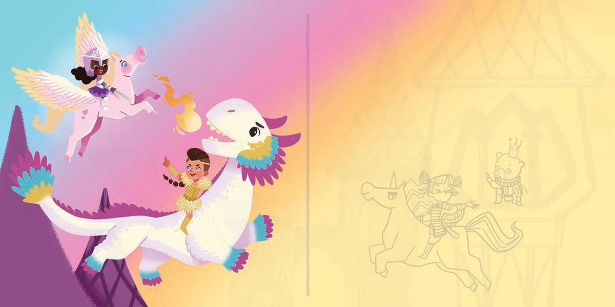
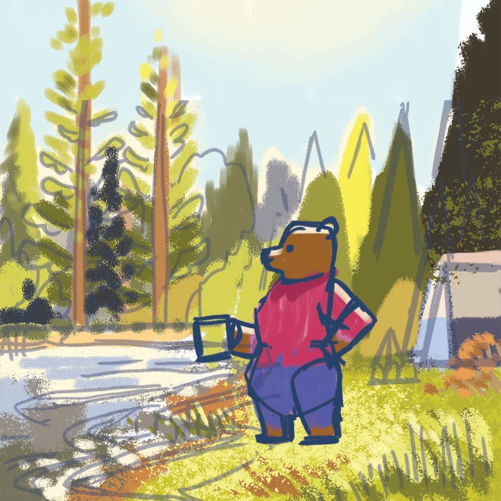
trying out something new. There's been a lot of nature books lately. including a forest scene is always good to your portfolio.
Portfolio: nyrrylcadiz.com
Instagram: https://www.instagram.com/nyrryl_cadiz/
YouTube: https://www.youtube.com/channel/UCbJCF1Im8ZO7hpGWTKOJMuA